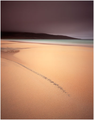
A few days ago I titled a blog entry 'finding the essence'. I felt the title was apt at the time because my posting was about objectivity. When reviewing your own images after a shoot, being able to see the essence or beauty that is there, rather than being blinded by a desire to see what we wished the image to be.

Well, I've been thinking about the word 'essence' and also the particular image of Harris I showed on the blog in that particular posting.
I responded to that image of Harris (reproduced here - image #1), because there's a lot of harmony going on in it for me. The tones really resonated with me and I also felt the composition was very simple too. When these two elements are married together, often the resulting image seems to be a more powerful statement. I think this image works so well for me because the 'essence' of the landscape has been conveyed very clearly - the message is strong.
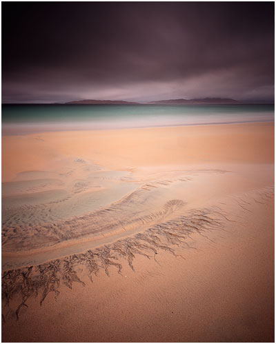
Compare image #2 that you see further on in this post. It's got similar light, and was shot on the same evening. Except I think this image does not work so well. It's missing that extra 'something'. I think it's failed to reveal the 'essence' of the landscape.
 I often feel that simplification is a complex thing to pull off. What looks simple is often harder than it appears. Landscape images for me, must contain a soul, they must resonate with you on an emotional level, and breaking things down to colour, tone and form is the best way forward to make images that do that.
Image #2 is too clever. There's too much going on in it, even though there's not that much at all in the shot. But things are competing with each other. There's perhaps too much texture in that sky to sit in the background and let the eye fall on the patterns in the sand in the foreground. It feels as if I've put the wrong sky in with the wrong foreground. Both are not working in harmony.
Image #1 on the other hand is a different case. That sky sets a mood, but there's almost no texture in it. That lack of texture complements the lack of texture in the sand in the foreground. It is as if the sky and ground are working together - a form of visual empathy. And then we have that diagonal streak in the sand. It's allowed to be the focal point of the image and everything else around it is there to support it - not take away from it.
As much as I've tried to explain the images, and get you to think about why one works better than the other, I don't think there's such a thing as a rule book, and I have to confess that although image #1 is my favourite - it was a complete surprise to see it in my processed transparencies. In other words - I did not plan it. And i don't think I could have.
That's what I love about photography. It's those surprise elements. You only know what it was that you were looking for, once you've found it. That was certainly the case with this image.
