
For the past while I've been noticing that many of my more recent efforts have been leaning towards a muted colour palette or towards a monochromatic look.
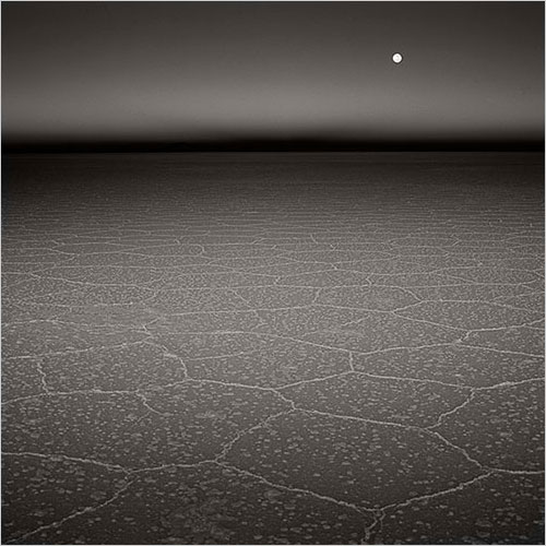
I've often said on this blog, that it's possible to see where you're going by looking back at where you've been. There are often clues and signs in your previous work which suggest the direction you are headed. For the past while I've noticed signs that monochrome might be an avenue for me to explore. I've encountered some locations that have dictated a more muted or monochromatic feel in my colour work. The black volcanic beaches of Iceland is one obvious example of this, as the following images may demonstrate.
The black volcanic sand beaches of Iceland is one area where I think I was given permission to accept that pink skies don't always suit the subject matter. Rather than looking at a landscape and wishing for sunset tones, it's best to find beauty in what is actually there. Work with what there is and if the tones are muted, and the sky is overcast - then embrace it. It has its own kind of beauty.
This is something I find many workshop participants have to overcome. What appears to be boring light or disappointing as it does not match a pre-visualised ideal of a certain location can, and often is great light to work with, providing you can see that this kind of light and muted tones are actually quite beautiful.
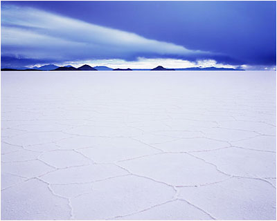
I think I've been working in a monochromatic way even before I visited the black sand beaches of Iceland. If I look at this shot of the Salar de Uyuni in Bolivia taken in 2009, it's really monochrome-in-blue.
But black and white isn't easy. I think that's one of the reasons why I've steered clear of it for so long. The medium is unforgiving when it comes to noticing any errors in tonal relationships. I feel it's a medium that is actually harder to work in despite common sense telling me that it should be simpler. It's often the case that what looks simple is actually very difficult to pull off well.
I've always felt I needed to gain a good grounding in darkroom interpretation skills - knowing where to dodging and burn rather than how, has taught me a lot about how the tones in an image interact. So for me, working in colour, and reducing the components of the scene down to a much simpler set of tones and colours has been a good primer for working in monochrome.
With this in mind, I've decided that it would be great to start exploring the world of monochrome a little bit more, in addition to my colour work. I'm sure both will influence each other over the coming years. But at the moment it's just a hunch and I'm really keen to see where things may go.
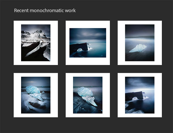
I've set up a new website for my monochrome work here: www.monochrome.brucepercy.com
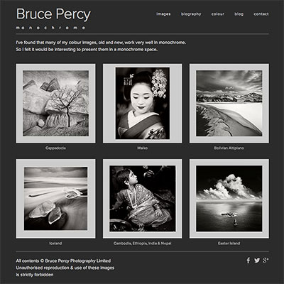
The site currently contains some re-interpretations of some of my better known colour images along side some new images.
Lastly, my reasons for setting up a dedicated website for my monochrome work was purely aesthetic. I feel mixing colour and monochrome work together under the same space is trying to do too many things in one go, and that kind of approach never works. One will dilute or weaken the message of the other. Plus, I feel that the viewer should be led into a body of work and whilst there, enjoy a sense of continuity rather than being flung from monochrome work to colour and back again. It's unsettling for the viewer and it breaks any spell they may be under (hopefully) from immersing themselves in the work.
For me, the importance of how ones work is presented, should never be underestimated.