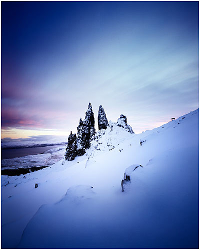
I've been thinking about this for the past year or so now. Each time we come round to discussing composition on my workshops, it's very clear to me that there are two big stumbling blocks for beginners in photography:

1. Ultra-wides
2. 3:2 (35mm) aspect ratio
Let's cover each of these.
1. I'm surprised at just how many folk turn up at workshops with 10-20 mm ultra wide angle lenses for APS, or 17-20mm ultra wides for Full frame, yet, they haven't mastered how to use a 'standard' wide angle lens. I personally feel this is due to the photography magazines pushing these lenses on consumers.
To be able to make good photos, you need to be able to 'see' in the focal length of the lens you use. Starting with a 24mm or 28mm lens is a good way to go. If you're on APS, then 18mm or 20mm is about right. Anything less than that, and you're dealing with extreme distortion - which is hard to control, esp for the beginner.
2. 3:2 aspect ratio.
Perhaps I should write a good article about this one. But the aspect ratio is simply too wide and narrow. Turn it portrait and it's too tall and too skinny. Most folk tend to use ultra-wides to stretch the landscape across the width (landscape) or height (portrait) to use up the real-estate of the sensor. This makes for shape and tonal relationship between objects within the frame more of a leap from one object to another than it should be. Using a square format, or a 'fatter' rectangle such as 4:5 allows you to keep all the objects in the scene in close proximity, and therefore, allow them to have a tighter relationship between each other. 35mm, in my opinion sucks (most of the time).
I would like to finish by saying that not all scenes work in one aspect ratio all the time. I often find that most scenes do work in 4:5 for instance and don't translate well to 3:2, but conversely, I've sometimes found that a scene I've got to work really well on a 3:2 camera doesn't translate well to 4:5. It seems that some scenes were made for 35mm while others were made for 4:5. My personal preference is for 4:5 or 6:7 though, and moving towards 1:1 allows you to become even simpler with your compositions.
