Tonight I'm listening to the 'new' album by Kate Bush. I'm a fan.
The album in question is a re-interpretation of previous songs from two of her albums. I think it's a lovely effort, which shows someone who's much more comfortable and able to let a lot more space into her music than she did back in the 90's. Her voice has matured a lot and some of the songs had to be transposed down to fit her new lower register.

I bring all this up because I think there's a lot of parallels to what Kate's done revisiting her older work and what most artists do as they get more experienced. And that is the subject of giving your work more space.
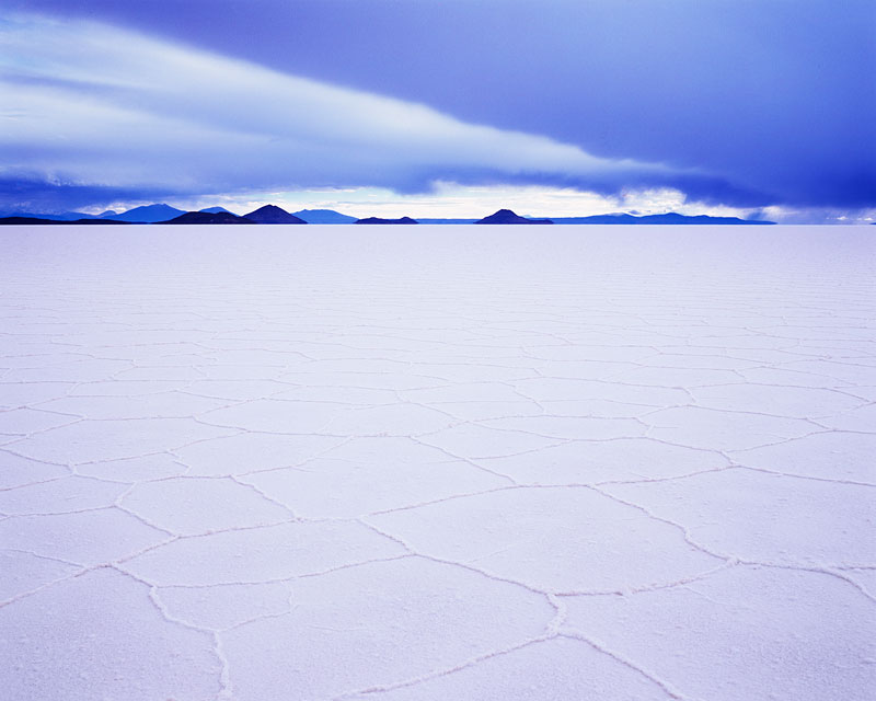
If you suffer from low confidence in what you do, you'll tend to over complicate things, and make images too busy. Certainly, I've had many a correspondence from photographer's telling me that they find it hard to shoot 'minimalist' landscapes, finding it a 'frightening' experience. I certainly think that if I look back at my own work, I started out making busy images. It's a natural thing to do. Our first efforts are of recording 'scenery', and as we progress, we stop thinking about 'scenery', like bridges, mountains, streams and start to think about form, tonality and the relationships between them all inside our frame. And I think, as we progress further, we start to seek out space in our work, because space provides simplicity.
We know how to say what we want to say, and we need a lot less 'props' with which to do it.
I think that's what Kate Bush has been doing with her reworked songs. They have a lot more space to 'just be themselves'. Less of the production where there's so much going on that you can't take it all in. Now you can. And it's much more satisfying for it too.
So I'd like to put forward my argument that space in an artists work, is a sign of maturity. Knowing when to leave be, when to let something be blank and empty shows confidence. Like someone who's just happy to be in your company but doesn't feel the need to fill the space with chat. The experience is a much more natural one.
But above all else, space shows that the artist has been able to distill the essence of the image and remove anything that does not add, help or support the main message. The work becomes bolder because of that space. It's something to work towards.
