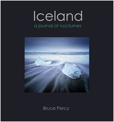
I'm heading down to Nottingham on Monday to work on my 2nd book layout. Darren has been sending me some ideas on the cover and slipcase, and these have been feeding back into my own mind and resulting in more changes.

The choice of a font, can really make a huge difference to how a books is received. We conjure up expectations based on how the cover of a product looks, and in these mock-ups, the font is more 'modern' than the one's in the previous mock-ups.
I find this all very exciting, and full of surprises. I've been living with the previous mock-up in my mind for some time, and was imagining the book sitting on my bookshelf, and now, what was becoming 'real' is now becoming fiction for me again... something fluid, changeable. It makes me wonder just how different the book will actually look once we've got the design complete, which I would imaging, should take a few more weeks of fine tuning once Darren and myself have gone through setting up the initial look.
The other good news is that the preface has been written by my very special guest photographer. More news about this at the end of the month in my monthly newsletter.

