Triplekite publishing has released a very beautiful soft bound book by David Baker. ‘Sea Fever’ is a photographic monograph about the power of the sea.

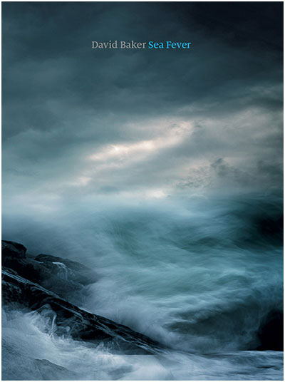
Like a Turner-esque painting, the cover image sets the stage well for what is to be found within its pages. I particularly like the cover image. With a break in the clouds situated right at the heart of the image, I felt drawn in - invited almost, to come and engage with this book.
Making a book is not an easy process. Having published two books myself, I fully appreciate that there are many design considerations, and plenty of discussions that happen along the way. And often the way a book ends up looking is the work of a very long and thoughtful process.

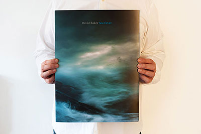
This book is tall, and large - a decision I think to enable the power of the sea to be conveyed to the reader when viewed as two-page spreads. It is also a soft back book, and very light to hold. I enjoyed going through it as it was never a cumbersome book to handle. It felt like a very large, luxurious magazine that encouraged me to engage with it. This was possibly due to its flexibility, which worked well with the content it conveys, because it enabled me to twist and re-shape the contours of the sea to my own pleasing. Rather than the images being fixed and my viewing being forced to settle on the work from one static aspect only, I felt I could engage, and play with the book more. I liked this aspect very much.
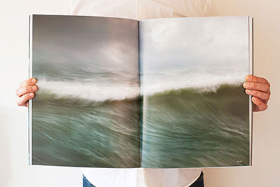
I’m no fan of images spanning two pages and I often dislike images bleeding over the very edge of the paper, for me, I like to be able to take in the entire compositional aspects of an image in one go. Often a break in the middle of the image (due to spanning two pages) can be irritating or unpleasing at best. Many of the sea images in this book do exactly that, but I was surprised to find that it actually enhanced my viewing experience, rather than detract from it. In this instance, spanning big images of turbulent sea across two pages works like an IMAX cinematic experience - these images fill your entire field of view and the result is that we are told that the sea is powerful, the sea is overwhelming. The same can be said about the images bleeding to the very edge of the page. I think it was a very effective design choice to do this because it conveys the message that there is no end to the power of a raging sea.

Also, because of the very abstract nature of many of the images contained within this book, there is less of a need to avoid page splitting. The images are less about order, and more about conveying power. We are not here to study graphic forms, but more to enjoy nature when things get dramatic - as the title of the book conveys. So I have to give a lot of praise to Dav Thomas whom I think was responsible for many of the design considerations of this very beautiful and engaging book.
With regards to what this book has to offer, it is a monograph. It tells a story in visual form only. There is very little text, and that is fine by me. I often feel that many photographers wish to learn from the photographer, and they think that learning will come from reading text. I think you can learn a great deal about the photography and the photographer by simply studying their work - the answers are in the imagery. All we have to do, is be open and let the photographer take us on their journey. Submit rather than dictate. The photographer has a lot to tell us, so sit back and let him do that. And a good book will do exactly just that, and in this respect, this is a very good book.
I am looking forward to seeing what other subjects Triplekite will handle in future.
Sea Fever is available from Beyond Words book store for £25.
