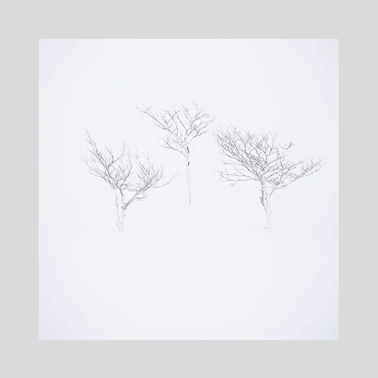
I’ve just completed work on some new Hokkaido images. The past few weeks have been a journey in colour reduction and more specifically: colour use. Reduction can be done by anyone, just turn the colour down. But to apply colour sensitively, takes skill and a whole lot of consideration and doubt.
Now that I’ve finished the Hokkaido images, I’m struck by how little colour there is in them. Yet if I try to put the colour back in, they just sit wrong. They don’t work. They need to be the way I’ve edited them.
Looking at my website main page today, I was struck by a feeling that there is simply too much colour. I don’t think that’s true one bit, but what it is telling me is that I’ve been working with such quiet, muted tones this past week, that somehow, every colour feels strong for me at the moment.
Our visual perception is often changing, and I think for me, it’s as if it all depends on how I feel today. Tomorrow I may feel otherwise, find that there isn’t enough colour. All I know is, that colour needs to be used carefully, and applied only when it’s required. You can create some noisy, complex images if you let the colour run riot.
Perhaps my sensibilities are changing yet again. Perhaps it’s just a moment. A passing phase. All I know is, that today, colour seems louder than it was yesterday.


