Proofing has begun for next book

Printing is the final stage in finishing your images. If you don’t print, you are trusting your monitor 100%. I’ve learnt that even if my monitor is very tightly profiled and calibrated correctly, I still can’t see certain discrepancies in the image until it is printed. And once I see it in print, I am now able to notice it on the monitor also.

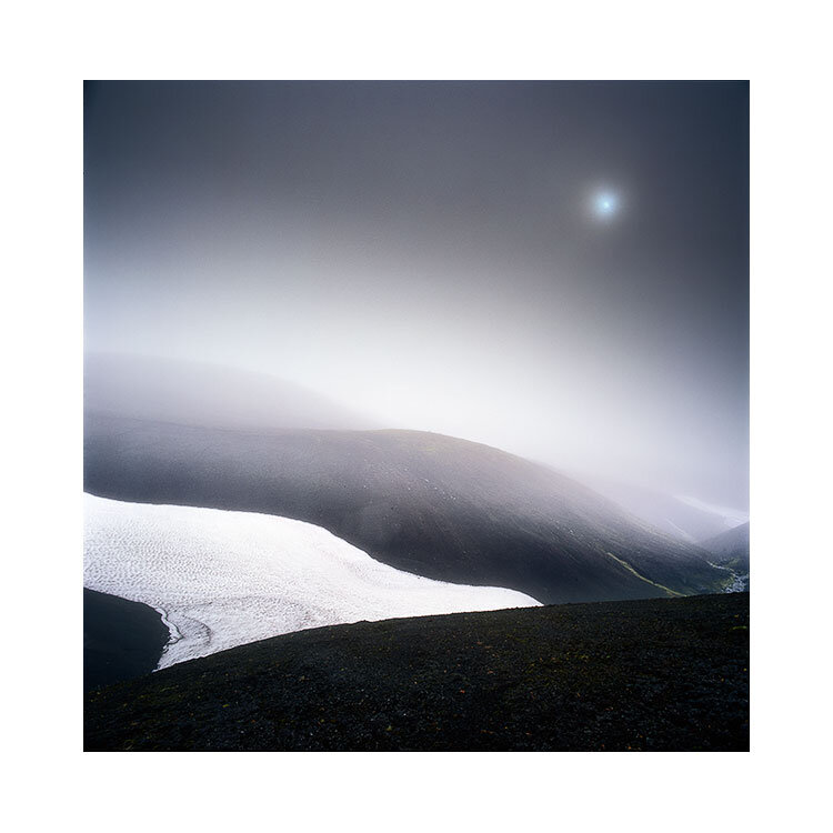
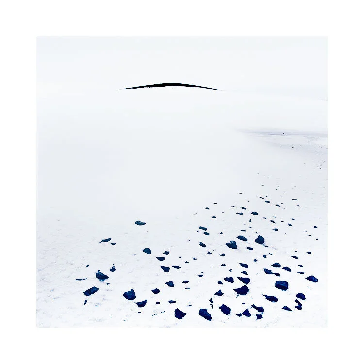
Two images from the forthcoming book, printed on Epson Soft Proofing paper.

Two images from the forthcoming book, printed on Epson Soft Proofing paper.

So each time I come round to preparing images for a new book, I print every single one of them. I’ve done this now for the last two books and it has allowed me to get the best out of my work. I have often found just about every image needs some further work to tune it as best as it can be. For me, that extra 5% or 10% is crucial because I think printed images are more exposed, more vulnerable to inconsistencies than a computer monitor will show.

Screen grab from my computer monitor. I’ve got the proofing switched on to simulate the Epson Soft Proofing paper.

Screen grab from my computer monitor. I’ve got the proofing switched on to simulate the Epson Soft Proofing paper.

Through this process, I have also learned to ‘interpret’ what my monitor is showing me. I now understand that shadows and highlights and hues in those areas are more obvious in the print than on monitor (yes, I’ve profiled and adjusted the black point of my monitor). I have also learned that colour casts become more visible in print than on the monitor.

I think most importantly for me, is the luminosity or ‘dynamics’ of the print that I’ve noticed more in print. The eye is adaptable, and after staring at a monitor for too long, the eye adjusts and you start to believe things that aren’t true. We can convince ourselves that a duller luminance is brighter than it actually is. For instance, what you may interpret as white in the image may actually turn out to be around 50% L: a mid-grey tone. Printing out helps you recognise if the image is as vibrant as you think it is.

So a few weeks ago, I asked Neil Barstow from Colourmanagement.net to build me a custom profile for the Epson Soft Proofing 205 paper. This paper is a pretty good standard paper to convey what the images will be like when printed on an offset press.

I printed the Verification test image that I bought from him, and compared it with the proofing switched on in Photoshop.

I’m really pleased to have a ‘standard’ to print to. I can evaluate my images for offset printing.

One final thought: when you send your actual files to the printer for printing, I always send a printed copy of them. You can’t get more truthful than a hard-copy and I think it is always prudent to give this to your printer, as it means that you can avoid any possibility that their colour management is different from yours. They should be able to match the offset press to your hard copy prints.

Colour management for book production

I’ve been busy working on the image selection / sequencing and text for my forthcoming book. I’m really pleased with how it is all going. But I am now at a stage where I want to print all of the 100+ images.

I don’t trust monitors for image review.

IMG_1436.jpg

As much as I am very confident that my monitor has been calibrated correctly, and profiled well, I still find that when I print, I’m forced to see things in the print that weren’t so obvious on the monitor. For one, luminance levels of a print can easily be misread on a monitor because our eye is highly adaptable. What may appear bright after staring at it for so long may appear much darker in print. So printing the images out allows me to get a real-world grasp on how the luminance levels are on the print.

That’s one reason to print. But there are many reasons to print and those reasons only become apparent once you have a print in your hands to review. So many times I’ve noticed colour casts, fine detail distractions that weren’t so obvious on the monitor, but once printed, I now notice them - both in the print and more interestingly, on the monitor as well.

Our eyes are highly adaptable, which leads us into tuning out colour casts ‘in our head’. So I’m always looking for a way to force my eye to see things that it has become blind towards. The more you stare at a picture on the screen, the more desensitised you become to it. It’s like tunnel vision of a sort.

So I definitely wish to print out all of the images that have been selected for inclusion in the book. But I want to go one stage further: I’d like to simulate how the images will look when printed on standard proofing paper:

“Standard Proofing Paper has a Fogra 39 certification, which is becoming the European standard. Offering the widest colour gamut available for accurate colour reproductions, this paper provides a base colour, weight and gloss level designed to match colour-critical commercial offset, press applications. Optimised for proofing applications, when used with our Epson UltraChrome K3 Ink with Vivid magenta, this media delivers outstanding short-term stability”

So this week I’ve been printing off some targets to get measured, so that I can have a custom profile built for this paper.

I’ve always printed my images out to verify them, and to give as a hard-copy to the printer. I was advised years ago that having a hard-copy is the ultimate reference when getting someone else to reproduce your work. I’ve been pretty happy with the colour reproduction on the last two books. But this next book will be a test of sorts, because we are working with some extreme edge blacks and off-colour whites.

I think that my optimising of the prints will go a lot smoother, and will be much finer if I am printing them on a standard kind of proofing paper that is close to an off-set press.

I realise this is perhaps of little use to many of you, but I suppose the big message here is - your photographs are never finished until you have them printed and verified. I always find errors and inconsistencies in my work once it’s printed, and if I tune the print to look good, then I know it will also look good on the monitor also. But not the other way around.

Screen Grab

Today I was image selecting for my forthcoming Hálendi book.

I had already made a rough sequence of the images for the book, but today’s task was to dig out the master PSD files, and collate them.

And here are some of them. Badly named I might add.

I have maps of Iceland laid out on my desk, and like a detective, I am piecing together where each of the 100+ photos were made. It is bring back memories, and I am realising that the location of an image may not be where I had thought it was.

Once I have them named, I will need to sequence them. And once I’ve sequenced them, I will need to print each one of them out for review.

And no doubt, I’ll need to fine-tune / optimise them for print. That’s going to take me some time, but I am finished my workshops and tours for this year, so I now have plenty of time to work on this.

Loving it. It’s like a review of sorts. It’s a way of checking in on where I am, and where I have been.

Book update

I’m pleased to say that all of the text for my next book is now complete.

halendi.jpg

I will be spending next week working on the sequencing of the images, and printing every single one of them out for evaluation purposes. Those of you who follow this blog may have read me talk about this before, but images are never finished until they are printed. For one single reason: verification. You can’t evaluate an image on a monitor successfully. No matter how accurately profiled your monitor is, there is still a ‘reality-distorition-field’ at play. Printing allows you to see the smaller issues that the monitor doesn’t show so easily until you print. Once you print and notice the errors in the print, you begin to see them on the monitor also.

So this is what I will be doing next week: printing over 100 images and then ‘re-mastering’ them so to speak. Tying up the discrepancies in order to bring them to where they should be.

I find this part of the process fascinating. When you’re forced to review your work in such a way, you do it with a 3rd-person’s point of view. You see the work as if someone else created it. It’s a learning process about yourself.

I also find it hugely enjoyable printing my work, and above all, sequencing it. Sequencing is a way of telling a story.

I’m sure once I’ve completed the sequencing, I’ll probably want to write more text, more things to include as pauses between the sequencing. We will see……

I hope to publish the book around Summer next year. But that is all dependent on other things outside of my own control such as the printers, shipping, etc, etc. Let’s see.

Once more, with feeling

I’m in the process of text revisions for my forthcoming book. I’ve come to realise that part of the creative process is repetition. Of endlessly going round and round the same material, auditioning it, fine tuning it, re-auditioning it, re-tuning it again, and again. And again.

halendi.jpg

There must come a point when the revisions get smaller and smaller, until there are no more revisions left to do. That’s when I let things sit for a while. Forget about it for a week or two, and then - review. Again.

That was the process for the Altiplano book. I think I stopped writing the text about 9 months before it was completed. We had so many revisions, so many alterations due to realising the flow wasn’t quite there yet. We also had translators turning the English into Spanish. It was a long haul.

With the forthcoming book, I’ve been working on the introduction by my guide / driver today. His English is amazing (as all Icelanders seem to be) and his knowledge of his own back yard is second to none. It’s been fun reading about his experiences, and how we started to work together - particularly about the interior tours we do.

I’ve also got some essays that need to be expanded upon. It’s a lot of fun thinking about the concepts for a book.

Oh, and we’re hoping this one might be a hardback this time. We will see.

Next book project is underway.....

Book No.5. Who would have thought it?

halendi.jpg

…. I’ve got over 100 images for my next book. But I feel there’s a missing gap, so this summer I aim to fill that gap with a return to a special place that I’ve gotten to know over the past while.

Thanks for buying my books. It has allowed me to be the creative person I am. I could not live on running workshops and tours alone. I need to have my own personal projects / art to do, and producing books, working on the concepts behind them, the layout, and the images is all very fulfilling for me.

nostalgia

A feeling of nostalgia is hitting me tonight.

As I sit here, after spending the whole week preparing copies of my Altiplano book to be shipped out, I can’t help reflect upon the journeys I’ve made over the past decade or so.

I’ve said many times, that the time we spend outside making images, is a way of us marking our time. Photography gives us a great chance to stop and think about where we are ‘right now’, and then as time goes on, we can look back at images we created and they bring us right back to that moment.

altiplano-books.jpg

Who we were, what was going on in our lives. Photography gives us a chance to not only relive the past, but also to draw contrasts with where we are now, who we are now, and how we’ve changed.

I can’t think of a better way of marking my time. Photography has given me a way of remembering the past, and of noting just how much I’ve done with my life.

And for that: I can’t help but feel rather nostalgic tonight.

I’m not entirely at ease with the emotion. I think nostalgia is sort of interlaced with a sense of loss. I think that’s ok though. Isn’t it? We must all accept that what water has passed under the bridge won’t return. What we experienced, what we felt and saw, happens only once.

For me, I think the feeling of nostalgia tells me one thing: to cherish every. single. moment. Who we are, are our memories. We are the culmination of everything that went before us. To revel in what we did, where we were, who we were, what we were doing, is such a precious gift.

Great times are often happening right now, except we lack the foresight to know it. You may be forming some of your most precious memories this year, except you won’t know it until much later on in life.

Well, I digress….. but it does have a point. I can’t help thinking about the amateur photographer I was, with a few friends around me who said ‘you should go pro’ (Don’t all friends tell you that?). Except I was daft (stupid) enough to believe. it. It hasn’t been easy, but it’s also been the best thing I ever did.

My Altplano book wouldn’t have happened without the past. I needed to go create some memories, and I needed to go and live. I went to the Altiplano of Argentina, Bolivia and Chile several times, so much so that I can mark my life by it. I know where I was in 2009, 2012, 2013, 2015 and 2016.

My Altiplano book couldn’t have happened without the culmination of experiences. As I said a few days ago, you don’t create work by watching YouTube tutorials, or by reading loads of blogs. You create work by finding out who you are. And to do that, you need to go explore.

That’s exactly what I did. I went exploring.

My Altiplano book couldn’t have happened any other way. And looking back, I realise it’s given me more than just a nice book, and some nice images: It gave me some special memories and markers for my life.

Nostalgia. Well, sometimes it serves us well :-)

Only 5 copies left of Altiplano book

Dear all,

Thank you so much for all the wonderful support. The Standard edition and the Black edition of my Altiplano book have sold out, and we only have 5 copies of the special edition left.

Dn-PEX3W0AATsdR.jpg-large.jpeg

I’m quite surprised by the level of interest for this book. I wasn’t sure if it would be of interest to you because of last year’s ‘best off’ collection in my Colourchrome book. I felt that perhaps the Altiplano is too specific an interest, and may only appeal to a small number of people.

I’m sorry if you wanted a copy of the standard edition, but didn’t get one.

It is hard to judge how many books to print…. it is a difficult one to judge because printing books is an expensive operation, and profits / margins are very low. To make money at all on printed books is hard.

But I so wanted to print this book. I felt it might be a vanity project (in other words - my desire to produce this book may be at odds with the interest in it). But I love books. I have a huge collection of them at home and I think photographic books are very important. Just like prints are. Photographs aren’t finished until they are printed or reproduced in books. Uploading them onto a website is nice, but it doesn’t really convey the detail and subtleties of the image.

I also love designing books. The concept is important, the laying out of the images is very satisfying, and then of course, having it all bound up into a final product just seems to feel like something greater than the sum of its parts.

There has been months of discussion and work between myself and my friend Darren Ciolli-Leach, who as a graphic artist is behind the finer details of my book designs. Without Darren, my books wouldn’t be as beautiful as they are. He has a fine attention to the medium of print, paper types and fonts. It is his level of expertise in book production that I admire, as he is always able to take my initial fuzzy idea and turn it into a professional product.
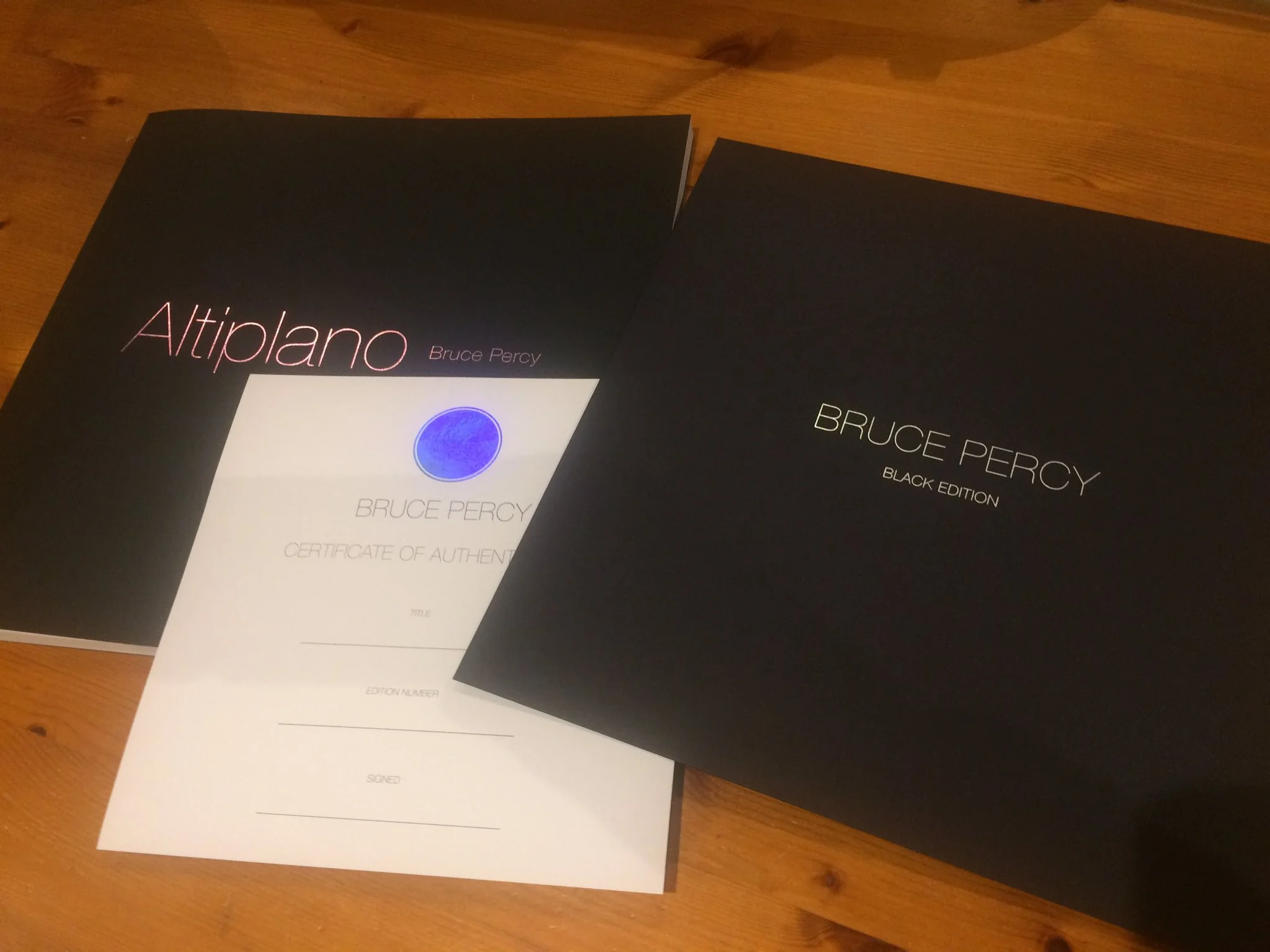
Both Darren and myself produced this book because we both love photographic books, and we love to try to create something beautiful. It’s all about the passion for doing something special.

I would love to continue to publish a book each year, so I am now busy working on some future concepts, and busy making new images in the central highlands of Iceland. Perhaps for that next book…..

Thank you for the support. It means a great deal to me.


Working Titles

In a short while, I will be announcing a new book about the south American atacama. The book encompasses photographs from the Argentine, Bolivian and Chilean high plateau. It has been a work in progress for around 8 years.

I had the 'working title' for this book earmarked around six years ago. I find titles a great way to conceptualise and to think about which way to steer my creativity. Once I had the title 'altiplano', I felt I knew what should be in the book, but also perhaps more importantly - what shouldn't.

The proposed title for my future central highlands of Iceland book. I hope to publish this in the next year or two.

The proposed title for my future central highlands of Iceland book. I hope to publish this in the next year or two.

I find projects or themes a great way to steer myself forward. My creativity is more focussed once I have the 'correct' theme in mind. But the theme doesn't always surface straight away and I find that 'working titles' can morph into something else if I live with them for some time. 'Working titles' are like clothing: you try them on for size and to see how they feel. You need to wear them for a while to see if you grow into them or to find that they really don't suit at all.

Altiplano was one title that stuck from the moment I had it. It made me realise that I couldn't add in other landscapes from around Bolivia - I had considered the mines and some other areas but they weren't part of the region that is defined the altiplano. Boundaries are important in focussing attention.

I don't know if I've discussed this on this blog before, but my graphic designer friend Darren and I have been playing around with themes and designs for a set of books. The first of which is coming out soon. We pretty much hope to publish a further two books over the next few years.

I'm hoping to publish one about the central highlands of Iceland - this will be a book with no 'popular' landscapes in it. No classic waterfall shots, etc. It's all about the remote interior, and I hope for it to include my images from my winter shoots in the interior, and also the dark landscapes I encounter throughout the rest of the year. 

The proposed title for my Hokkaido book.

The proposed title for my Hokkaido book.

The other is about Hokkaido. You can see 'mockup's' above. I wouldn't take the designs or titles too seriously right now - I'm showing you these to illustrate the process I go through - these are just 'working titles'. Hálendi means 'Highlands', and Shiro means 'white'. Just working titles and it's too soon to say whether they will stick.

What these working titles give me, is a way of visualising the final books. I've already been collating the work from each landscape, and I've managed to choose around 50+ images so far. But I can already see gaps in the work - areas where I need to look for images to fill out areas of the landscape that I have either missed out on at times in the past, or that I know are still there to be photographed.

Working titles are a great tool to help steer you forward. Making individual photographs isn't enough. If  you find yourself feeling rudderless, not sure where to go with your photography, but at the same time know that you are creating good individual images, then I would suggest you need a concept: something to help you glue your work together. 

The whole is always greater than its parts, if you get a really strong theme or 'working title'. It can propel you and give your creativity focus.

Altiplano

Some advanced copies of new book have arrived, and I'm delighted with the reproductions: they are amazingly spot on. 

The new book is 12 inches square - larger than last year's Colourchrome book which was 10 inches square, and has a lot more pages.

I'm very excited about it, and there will be an announcement this September 25th about the book. Only 315 copies, so if you want one, better be quick :-)

IMG_0885.JPG
IMG_0882.JPG