Page Sequencing & Balancing

A few days ago I began work on proofing the images for inclusion in my next book. As suspected, I’ve found loads of issues with the images once printed. Some of them it’s to do with the blacks and white points of the images, but also, clipping that is incurred by the reduced gamut of the paper I’m proofing onto. I am finding I am having to calm the higher tonal registers to allow the image to sit on the page without any flat-wall-clipping occurring.

I knew I would have a challenge ahead of me, in terms of sequencing the work. In the proof snapshot you see above, I spent a lot of time matching images to each other so that images on the left and right page compliment or sit well with each other. For me, this is about choosing the right images to begin with. Then once I have them sitting next to each other (I use View / 2-up vertical in Photoshop to view two images side by side, I can notice if there are luminosities that jar between the two side by side images, or colour casts - perhaps in the blacks that work against each other. For instance, one black desert may have more blue in it while the complimentary image that is to sit on the opposite page may have more of a reddish black. These things can sometimes be ‘tuned’ to sit better together and other times, I just find that the image doesn’t work when its colour balance is tuned away from its current colour temperature.

To me, this is ‘mastering’. I am trying to get the entire set of images to sit well together, and for that to happen, it’s never really about subject matter, or geographic location. It’s all about whether the tones and colours (or perhaps for some of you, monochromatic tones) that matters. Images have to sit on opposite pages in a way that they work together as a set. But the work also has to flow through the book as well.

I’m really enjoying this process. Images that I thought were nice, become something special when I print them out and notice further adjustments and enhancements. It’s like putting the icing on the cake.

Printing is indispensable in really getting the best out of your work. And it is giving me a lot of confidence in knowing the work is as good as it can be for publishing in my forthcoming book.

Proofing has begun for next book

Printing is the final stage in finishing your images. If you don’t print, you are trusting your monitor 100%. I’ve learnt that even if my monitor is very tightly profiled and calibrated correctly, I still can’t see certain discrepancies in the image until it is printed. And once I see it in print, I am now able to notice it on the monitor also.

Two images from the forthcoming book, printed on Epson Soft Proofing paper.

Two images from the forthcoming book, printed on Epson Soft Proofing paper.

So each time I come round to preparing images for a new book, I print every single one of them. I’ve done this now for the last two books and it has allowed me to get the best out of my work. I have often found just about every image needs some further work to tune it as best as it can be. For me, that extra 5% or 10% is crucial because I think printed images are more exposed, more vulnerable to inconsistencies than a computer monitor will show.

Screen grab from my computer monitor. I’ve got the proofing switched on to simulate the Epson Soft Proofing paper.

Screen grab from my computer monitor. I’ve got the proofing switched on to simulate the Epson Soft Proofing paper.

Through this process, I have also learned to ‘interpret’ what my monitor is showing me. I now understand that shadows and highlights and hues in those areas are more obvious in the print than on monitor (yes, I’ve profiled and adjusted the black point of my monitor). I have also learned that colour casts become more visible in print than on the monitor.

I think most importantly for me, is the luminosity or ‘dynamics’ of the print that I’ve noticed more in print. The eye is adaptable, and after staring at a monitor for too long, the eye adjusts and you start to believe things that aren’t true. We can convince ourselves that a duller luminance is brighter than it actually is. For instance, what you may interpret as white in the image may actually turn out to be around 50% L: a mid-grey tone. Printing out helps you recognise if the image is as vibrant as you think it is.

So a few weeks ago, I asked Neil Barstow from Colourmanagement.net to build me a custom profile for the Epson Soft Proofing 205 paper. This paper is a pretty good standard paper to convey what the images will be like when printed on an offset press.

I printed the Verification test image that I bought from him, and compared it with the proofing switched on in Photoshop.

I’m really pleased to have a ‘standard’ to print to. I can evaluate my images for offset printing.

One final thought: when you send your actual files to the printer for printing, I always send a printed copy of them. You can’t get more truthful than a hard-copy and I think it is always prudent to give this to your printer, as it means that you can avoid any possibility that their colour management is different from yours. They should be able to match the offset press to your hard copy prints.

Colour compression & colour spaces

I’ve been working on some notes about printing lately. So this post today is all about colourspaces and what happens when we move an image from one colour space to another.

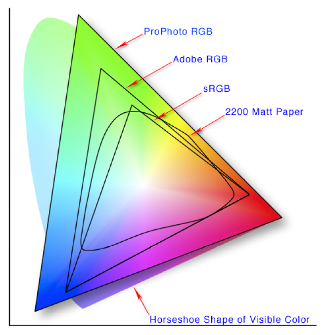
In the article I point out that colour management is not about colour accuracy, but more about how we choose to work around physical limitations as we move from one device to another, each with different colour gamuts.

2200 Matt paper has a small colour gamut, than Pro Photo RGB. So what can we do to make our image look good on 2200 Matt Paper even though it is physically impossible to do a direct conversion?

2200 Matt paper has a small colour gamut, than Pro Photo RGB. So what can we do to make our image look good on 2200 Matt Paper even though it is physically impossible to do a direct conversion?

The problem

Each device has its own physical limits to the range of colours it can record or reproduce. This is the problem: what do we do as we move an image from one device to another?

For example, when sending a file with a wide gamut of colours to a monitor or printer with a smaller gamut of colours, something has to be done with the colours that fall outside the physical range of the device’s effective gamut. Do we ignore those colours, or should we do something else with them?

The solution : Rendering Intent

The answer is : we decide, and we tell the colour management system our decision by way of a feature called Rendering Intent. Rendering Intent is where we tell the colour management system which rules to apply with respect to out of gamut colours.

There are several different rendering intents available. The two most commonly used rendering intents are Perceptual and Relative Colourmetric, which kind of do this:

Perceptual : shrink all the colours from the larger colourspace to fit the destination colourspace.

Relative Colourmetric : out of gamut colours are clipped, moved to their nearest relative within the new colourspace. All the other colours remain unchanged.

That’s a brief summary. Let’s consider them in more detail:

Perceptual

This rendering intent as the name suggests tries to adjust the content of the image so you perceive it as similar to the original image even though the colourspace is smaller. It does this by adjusting all the colours while keeping their relationship to each other intact. Although it is not ‘colour accurate’, most photographs look about right when it’s chosen as more often than not, it’s the relationships between the colours in the picture rather than their colour accuracy that is important. Here is an illustration to show how all the colours are shifted to fit the new colourspace:

Rendering-Intent-Perceptual.jpg

The other most common way of working around out of gamut colours is to choose relative colourmetric:

Relative Colourmetric

This rendering intent keeps all the colours that were within gamut unchanged. It’s a useful rendering intent when you want to ensure colour accuracy for certain colours - perhaps skin tones for example. Only the colours outside the gamut are clipped. They are moved to their nearest available in-gamut colour relative. As you can see below:

Rendering-Intent-Relative-Colourmetric.jpg

As you may now realise, colour reproduction is a compromise. And colours often have to get compressed if we are moving from a device with a wide gamut to a device with a smaller gamut.

We have to make the decision about which rendering intent to use. And the best way to choose the right one, is to demo them. If you are printing, then under the proofing preview, you can move between the different rendering intents to see how the colours are changed. Choose the rendering intent that suits your image the best.

No right or wrong way

Rendering Intent is best auditioned on a per image basis. Further, although an image may suit one rendering intent when printed on paper X, you may find that the same image prefers another rendering intent when printed on paper Y.

So you need to experiment on a per image basis.

But what about monitors? Do we have to compromise with them also?

As it happens, yes. Standard monitors have their own colour spaces (profiles), and when viewing something that comes from a larger colourspace on the monitor, a compromise has to be made.

Monitor Profile Rendering Intent

From what I understand, Monitor profiles are matrix based and this means that they have no idea how to deal with out of gamut colours. So they are simply clipped. In other words, when displaying out of gamut colours on a monitor, the monitor is essentially using a rendering intent of ‘Relative colourmetric’ (as illustrated above). We don’t have a choice about rendering intent when displaying an image on a monitor. It’s always ‘relative-colourmetric’.

In the diagram below, I have a Pro Photo colourspace image open in Photoshop, but I am viewing it on a monitor that has a smaller colourspace than Pro Photo. The colour management system responsible for the conversion from the image profile simply displays the colours unchanged, and any colour that it can’t display is just clipped to its nearest relative within the monitor colourspace.

monitor-profile-rendering-intent.jpg

In summary

  • Colour management is not the same thing as colour accuracy.

  • To manage colours, we need to have profiles that describe the colour gamut of each device, but we also have to make decisions on how to deal with colours that fall outside the gamut of a particular device. This is called the rendering intent.

  • We can choose which rendering intent to use when printing.

  • But we have no control over how out-of-gamut colours are displayed on computer monitors, they are just clipped to fit the nearest colour within the destination colour space.

Is it a good thing if RAW isn't Really RAW?

It has become increasingly apparent to me, that RAW files are more saturated and punchy than they used to be. When I look back at the RAW files that came out of camera's a decade ago, they were very neutral in colour. That is not the case now.

Shot on Fuji Velvia, which comes with pre-programmed colour, punched in for me by Fuji.I know this film is highly-unrealistic. It's why I use it. But if I were to shoot RAW, I would expect to have the colours as neutral as possible so I can choose m…

Shot on Fuji Velvia, which comes with pre-programmed colour, punched in for me by Fuji.
I know this film is highly-unrealistic. It's why I use it. But if I were to shoot RAW, I would expect to have the colours as neutral as possible so I can choose my own colour programming.

I was reading the online photographer only a few days ago while I tried to get my head around the reasons for why this is so. Specifically this article. It seems that RAW was never truly RAW and there has always been a degree of processing involved as camera manufacturers try to get the best out of their sensors. For example, many camera manufacturers apply tonal curves to try to get more DR out of their sensors, and they also apply their own calibration for ISO.

I used to think that ISO was a global standard. One where if you set the ISO of all cameras the same, and give them the same amount of light, the exposure would be the same for all cameras. This appears to not be the case as this article also explains. To utilise the best response of a digital sensor, camera manufacturers set their own sensitivities for their sensors to give the most pleasing result.

So there has always been a degree of pre-processing done at the capture stage. RAW is not RAW in this regard. But it goes further than that. I have noticed that many RAW files these days have saturated colours that don't correspond to the real world.

I have been advising participants to shoot their cameras on 'Daylight white balance' for years, because that is what all colour film is balanced for. In the days of film only, we would always shoot a daylight balanced film for landscape photography. Daylight balance means we retain the colour casts apparent at sunrise and sunset.  

Auto-White-Balance, on the other hand, tunes them out.

Well, It used to be the case that Auto-White-Balance would attempt to tune out colour casts to make everything look like it was shot in the middle of the day. Sunrise and Sunsets would lose their colour as the AWB attempted to tune out their lovely colour casts to make everything look like daylight, and additionally, twilight shots would lose their blue hue as they were transported to become middle of the day shots. This is not what we want as landscape photographers. We wish to have these colour casts as they are one of the reasons why we get up early in the morning to shoot. 

However, this logic doesn't seem to be working with some of the more recent sensors. I am seeing cameras like the Fuji XT2 oversaturate their files. Setting the white balance to daylight does not improve the situation as the saturation is now applied to a different colour temperature and the file looks funky. In fact the XT2 seems to look better if one leaves it on Auto White Balance, because it's the only thing that tames down the over-saturation of the files.

If I choose to set it to Daylight Balance, so I can re-introduce those lovely colour casts that sunrise and sunset offer,  I find I need to desaturate the colour by about -40 in ACR to make them look more natural, less Dysney. That never used to be the case with RAW files.

I'm sure that Fuji are not alone with this approach and I would hazard a guess that most camera manufacturers are souping up their RAW files to give more instantaneous pleasing results.

I guess it depends what we want, and what we all think RAW should provide? 

For me, I had assumed that RAW would mean that the camera would try to record a neutral rendition of what is there. I realise there has to be a degree of interpretation to do this, and also, that manufacturers have to take some decisions in order to get the best out of their sensors. 

I think it's gone beyond this. We are now seeing camera manufacturers give us their own 'look' to the RAW files. Whether that is a good thing or not remains to be seen. Personally, I've always felt that RAW files were too flat, too neutral and that colour manipulation is not something most of us are good at, so leaving it up to us to do that work would result in some very ugly over-processed images (the web is full of very overly processed files). So I think it might be a good thing. Buying a digital camera for its 'look' is just the same as buying film for its 'look'. If Fuji are going to soup up their RAW files to give a more pleasing result, then perhaps that is something to take into account when you buy their cameras: perhaps you buy them because you like the look of their RAW files? Rather than buying it because you assumed RAW was an honest, neutral rendition of what is there.

So I guess I'm wondering: if RAW isn't really RAW, then what is it meant to be? If camera manufacturers are taking control of colour into their own hands and giving us souped up RAW files, is this a good thing, or should we be more in control of that?

RAW isn't RAW, but maybe that's ok?

The proof is in the print

I've been working on my images for next year's exhibition (I know, it's a long way away, but I really need to utilise my free time - which is in short supply, when I have it). 

Despite having a calibrated monitor which I feel gives a very close representation of what I might expect to see on my prints, I have found that the only way to truly spot errors or inconsistencies in the tones of my images, is to print them and leave them lying around my house.

This does not mean there are any short comings in my monitor, nor any errors in the calibrating or profiling of it either. In fact, any issues I notice in the final print can often be seen on the monitor if I go back to check. This suggests a few things:

1. The human eye perceives electronic images differently than printed images

2. To get the best out of your work, you really need to print it.

I pride myself in having a tightly calibrated system as you can see below - my Eizo monitor is so well matched to my daylight viewing both, that I seldom find prints 'way off'. But this doesn't get round the fact that once I see an image in print form, I may find that either it's tonal aspects aren't as strong as I thought they were. Going back to the monitor to look again, I will find that the print has shown me problems in the work that are visible on the monitor, but somehow, I only became aware of them once I saw them in print form.

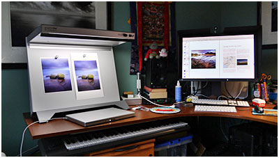
Daylight viewing booth and verification test print to confirm monitor is actually calibrated! (it's the only way to confirm calibration and profiling).

Daylight viewing booth and verification test print to confirm monitor is actually calibrated! (it's the only way to confirm calibration and profiling).

As much as I think that *all* photographers *should* print. I realise that many of us don't. Now that we live in the digital age, it seems as if printing is becoming something that many of us don't require. We edit, we resize for the web and we upload.

But if you do care about your work, and wish to push it further along, then I can think of no better thing to do than print it out. If you have a calibrated, colour managed system, then any problems you see in the print are most likely problems that you somehow weren't 'seeing' on the monitor. It is a chance for you to 'look again' and learn.

I've gained so much from my printing. I've realised that my monitor can only be trusted up to a point, and that if after reviewing prints I further tune them to give me a better print, I also improve them in electronic form also. But mostly, I'm teaching my eye to really see tonal inconsistencies and spot them more easily in the future. And that's no bad thing indeed, as photography is after all, the act of learning to see.

Colour Proofing.......

Today I'm colour proofing...... But I have to calibrate my monitor first, to ensure that what I see on it, is a close representation of what's actually in the files.....

Most people choose 'native white point', but that may result in the monitor being too cool in tone. The only way to confirm your monitor is calibrated, is to compare it against an icc profile verification print - essentially a  file that has been accurately measured and is guaranteed to be close to the file it was created from. I put this file under a daylight viewing booth (as shown below) and compare it with the source file it was printed from, with proofing switched on in Photoshop. If the 'perception' is that they are similar, then I've got the monitor calibrated & profiled well.

For essential colour accuracy, one must use a daylight viewing booth to confirm the profiling of your monitor. If the print target does not match the monitor - then the calibration / profiling is off. You also need to have a torch and an Icelandic P…

For essential colour accuracy, one must use a daylight viewing booth to confirm the profiling of your monitor. If the print target does not match the monitor - then the calibration / profiling is off. You also need to have a torch and an Icelandic Puffin in your studio too :-)

On a side note - daylight viewing booths such as the one I use from GTI have a colour temperature of 5000k. But there's more to it than just assuming that if the viewing booth is 5000K, then my monitor should be set to the same colour temperature. This won't work. GIT have an article that explains what 5000K actually means if you really need to know this stuff, but for most purposes, you'll find a 5000K viewing booth will be comparable to a monitor running at a temperature much higher than 5000k. (If you put your monitor down to 5000K - it will go seriously yellow and it definitely won't match your viewing booth at all).

For me, the most critical aspect is the neutrality of the black and white tones. In the  icc profile verification print you see above, there is a monochrome section in the top left of the file. If I have the monitor white point set too high, the monochrome picture may appear too cold (it should theoretically go blue but some monitors don't - see below for more on this). Conversely,  If you have the white point set too low, then the monochrome area will look too warm on the monitor. By fine tuning the white point of my monitor (through the calibration software I use) I can get my monitor closer to what I see on the print. This is an iterative step that I do until I find the right white point.

Lastly, as mentioned above, it's easy to assume that computer monitors should become bluer (cooler) as their white point is increased. This isn't always the case. Some monitors may go either green or magenta when their colour temperature is turned up too high, I find that my Eizo goes a little green.  Apparently setting the white point only alters the blue to yellow colour axis and not the green to magenta tint.

So If you do find your monitor is going a little green or magenta, then you may have to compromise and stick to the native white point. I would suggest however that you experiment.  For me, I found moving my monitor down to just below 6000K seemed to work nicely but your findings may differ.

Josef Albers - Interaction of Color

I've been saying for a while now, that digital-darkroom skills take a lifetime to master. It is a continuous journey of self improvement. Simply buying a copy of Lightroom or Photoshop and learning the applications may give us the tools, but it does not make us great craftsmen. We need to delve deeper than simply adding contrast or saturation to our images to truly understand how to get the best out of our editing and to move our photographic art forward.

Josef Albers fascinating 'Interaction of Colour'. It's quite an old publication now, but it's great for getting a better grasp of colour theory.

Josef Albers fascinating 'Interaction of Colour'. It's quite an old publication now, but it's great for getting a better grasp of colour theory.

Lately, I've been taking more of an interest in tonal relationships and more specifically, the theories behind how we interpret colour. It's something that has grown out of my own awareness of how my digital-darkroom interpretation skills are developing.

Simply put, I believe we all have varying levels of visual awareness. Some of us may be more attuned to colour casts than others for example. While others may have more of an intuitive understanding of tonal relationships. 

Ultimately, if we're not aware of tonal and colour relationships within the images we choose to edit, then we will never be able to edit them particularly well. I think this is perhaps a case of why we see so many badly edited (read that as over-processed) images on the web. Many are too attached to what they think is present in the image, and there's a lack of objectivity about what really is there. 

So for the past few weeks I've been reading some really interesting books on the visual system. In Bruce Frazer's 'Real World Colour Management' book for instance, I've learned that our eye does not respond to quantity of light in a linear fashion.

An overly-simplified illustration. It demonstrates that the human eye is not able to perceive differences in real-world tonal values. Our eye tends to compress brighter tones, which is why we need to use grads on digital cameras, because their respo…

An overly-simplified illustration. It demonstrates that the human eye is not able to perceive differences in real-world tonal values. Our eye tends to compress brighter tones, which is why we need to use grads on digital cameras, because their response is linear, while our response is non-linear.

We tend to compress the brighter tones and perceive them as the same luminosity as darker ones. A classic case would be that we can see textural detail in ground and also in sky, while our camera cannot. Cameras have a linear response to the brightness values of the real world, while we have a non-linear response.

Similarly, when we put two similar (but not identical) tones together, we can discern the difference between them:

Two different tones. Easy to notice the tonal differences when they are side by side.

Two different tones. Easy to notice the tonal differences when they are side by side.

But when we place them far apart - we cannot so easily notice the tonal differences:

Two different tones, far apart. Their tonal difference to each other is less obvious.

Two different tones, far apart. Their tonal difference to each other is less obvious.

Our eye is easily deceived, and I'm sure that having some knowledge of why this is the case, can only help me in my pursuit to become more aware of how I interpret what I see, whether it is in the real world, or on a computer monitor.

Josef Albers fascinating book 'Interaction of Colour' was written back in the 1950's. I like it very much because it:

"is a record of an experimental way of studying colour and of teaching colour".

His introduction to the book sums up for me what I find most intriguing about how we see -

"In visual perception a colour is almost never seen as it really is - as it physically is. This fact makes colour the most relative medium in art".

Indeed. How a viewer of your work may interpret what your image says may be totally subjective, but there are certain key physical as well as psychological reasons for why others are relating to your work the way they do. But most importantly, if we don't 'see it' ourselves, then we are losing out during the creative digital darkroom stage of our editing.

"The aim of such a study is to develop - through experience - by trial and error - an eye for colour. this means, specifically, seeing colour actions as well as feeling colour relatedness"

And this is the heart of the matter for me. I know when I edit work, that sometimes I need to leave it for a few days and return later - to see it with a fresh eye. Part of this is that I am too close to the work and need some distance from it, so I can be more objective about what I've done.

But I also know that I don't see colour or tonal relationships so easily. I need to work at them. I am fully aware that I still have a long way to go (a life long journey in fact) to improve my eye. And surely this is the true quest of all photographers - to improve one's eye?

The memory of a colour

While I was in the Fjallabak region of the central highlands of Iceland this September, I encountered a number of vast black deserts. I've been in vast landscapes of nothingness before, such as the Salar de Uyuni salt flats of the Bolivian altiplano, and also the pampas of Patagonia.

These places are captivating endless nothingnesses that make the eye hunt and hunt for something to latch onto. At least, that's what I think happens when humans encounter something so vast and featureless.

One of the many black deserts of the central highlands of Iceland. Black can come in many shades and hues, as I discovered.

One of the many black deserts of the central highlands of Iceland. Black can come in many shades and hues, as I discovered.

This was nothing new for me. But what was new for me, was that I discovered that black isn't really just black. There are many different types of black desert to be found in Iceland. One of them - near the volcano Hekla, is so jet-black (it feels as if nothing can escape it's pull) that you realise every other black desert you've witnessed has to a large degree - some kind of colour to it.

There's a lot of psychology at play when it comes to interpreting colour.

Bruce Frazer's excellent book on colour management. Every photographer should read this.

Bruce Frazer's excellent book on colour management. Every photographer should read this.

For instance, I've been reading Bruce Frazer's fantastic book 'Real World Colour Management', and in it he describes the psychological factors involved in how we interpret colour. Colour is as he describes it 'an event'. It is light being reflected off a subject and viewed by an observer.

We have what he describes 'memory colour'. For instance, we know what skin tone looks like, and we all know the kind of blue a blue sky should be. We know 'from memory' how these colours should be. There are psychological expectations that certain colours should be certain colours. 

I think this applies to how I perceived the black deserts of Iceland. If i say a desert is black, we think of it as jet-black, even though it might be a deep, muddy brown-black, or a deep muddy purple-black.

I think most of the time, many of us simply go around looking at colour but not 'seeing it'. We use memory colours all the time with little thought to what the real colour of an object might be.

For example, last year during a workshop, my group and I were all working in very pink light during sunrise. Knowing that the entire landscape was bathed in a pink light, and that many of us don't notice the colour cast so obviously, I asked my group individually what colour the clouds were. Half of the group correctly said that the clouds were pink, while the other half incorrectly said that they were white. My feeling on this matter is that those who said the clouds were white - were attaching a memory of what they think clouds should look like. They were, in other words, not really noticing the colour of the object at all, but just attaching a common belief that clouds are white. This is a good example of memory colour.

But let's go one stage further. This might actually not be colour-memory at play though. It could simply be our internal auto-white-balance working. It's known that the human visual system is very good at adapting to different hues of white light. If we are in twilight, we may not see the blue colour temperature of the light on the landscape (but we sure would notice it's twilight if we take a photo on a digital camera and look at the histogram - there will predominantly be a lot of information in the blue channel, and very little in the red and green channels). Likewise, if we are sitting in tungsten light at home, our visual system adapts and tunes out the 3000k warm hue that we're being bathed in.

I think I was applying 'colour memory' to the black deserts of Iceland - I wasn't aware of the subtle differences in hues between one black desert and the other, because I had just attached a memory of what I know black should be (all blacks are black right?).

Being aware of the subtle differences in colour is hard work, because our visual system has evolved to adapt to whatever context we exist in. If we are sitting in pink sunrise light, we tune it out. If we do detect any pink at all,  it's in the more obvious region of the sky where the sun is. That's why most amateur photographers point their cameras towards the sun at sunrise (I tend to point 180º the other way, because I know the pink light is everywhere, and the tones are softer and much easier to record).

If I see clouds, I assume they are white because my visual system has its own auto-white balance. If I see skin tones, I use colour-memory to assume all skin tones to be the same, regardless of what kind of light the person is being bathed in. For example, if someone is standing underneath a green tree, there will be a degree of green-ness to their skin tone which I won't see, because of colour memory.

We lie to ourselves all the time, but our camera doesnt. It tell's it like it is, and I think this is the nub of todays post: being a good photographer is about being as colour-aware as we can be.

This is not an easy thing to do, because we are hijacked by our own evolution: our visual system tunes out colour casts all the time, and we also apply colour memory to familiar objects. We expect certain things to have certain colours, and as a result, we tend to ignore the subtle difference that the colour temperature of the light we're working in can have.

As I keep saying to myself as I work on my new images from Iceland "Not all black deserts are black".

Screen Calibrators

You may remember a few weeks ago, I wrote a very brief report on my purchase of a BasICColour Discus screen calibrator/profiler (see photo). The Discus is a 'relatively' expensive screen calibrator, built of extremely high quality components.

I'd read a lot of reviews of the product before buying it, and the calibrations I'd seen were so tight, that I felt that this was the product for me. My old screen calibrator broke last year, and I'm in the process of preparing my images for a 2nd book, so I really wanted to make sure the images were as accurate as possible on my screen.

I've just done some tests comparing the Discus to a Spyder 3, but before I show you the results, I'd like to make some things very clear about calibration and profiling:

1. Not all screen calibrators are created equal.

2. Not all screens are created equal. I've found some screens - particularly laptop screens - a nightmare (or impossible) to profile.

3. Yes, when your calibration software says 'calibrated successfully', what it is really saying is that the device has calibrated/profiled your screen to the best of its ability under the circumstances.

4. The circumstances that can affect a successful calibration are things like - type of monitor you have, how well it can be calibrated, and also, the settings you wish to calibrate to. For instance, I had difficulty getting good calibrations out of my Eizo CG241W monitor and BasICColour support (which was excellent and very responsive) told me that my monitor, or a lot of modern monitors don't like to be calibrated below 120cmd. By moving the brightness up a little on the monitor from 110cmd (my preferred luminance), I got a tighter calibration. They also asked me to adjust the black point calibration too. So I know my monitor is not ideal, but i suspect that this is the case with everything - everything is a compromise right? The other circumstances are the kind of calibrator you have, and how 'tight' it is calibrated itself. As I say, everything is a compromise.

Below are two graphs, showing you how 'tight' the Spyder 3, and also the Discus calibrations are. In essence, the colour graph shows you how far the calibration was (the achieved value) compared to the desired value. Green and amber suggest calibrations that are 'acceptable' while red indicates anything that is not. You can see in the Spyder calibration that it failed to calibrate the blacks well, and the achieved result is quite different from what was intended.

BasICColour-Display (the software used to calibrate and profile my monitor) says it failed to get the screen within an acceptable range under the conditions I wished to have it calibrated to, by using the Spyder 3. This does not mean that the Spyder 3 is a bad device - you get what you pay for to some degree, and I would argue that the profiles it creates on most systems are more than acceptable for most users - if you're an amateur looking to get your screen 'within range', then I'd say it's fine.

Now comparing the results from the Discus above, you can see that the delta-E (the difference between the target and achieved profiling) is much tighter. The calibration / profiling has been successful. You can see there's still a difference in dark tones - particularly the dark blues for some reason - are a little off, but overall, I know the calibration is within an acceptable range.

I think the Discus is a very professional, tightly-calibrated device. Apart from the build quality (like picking up a piece of Tank accessory), it does seem to deliver on giving some of the best profiles around at the moment for under £1,000.

Of course, I guess you'd have to figure out if it's worth it to yourself, and whether it matters that much. As someone who is preparing images for print in books, I think colour management is vital. I need to know that what I'm dealing with on screen is very close to what is inside the file. To me, screen calibration and colour management in particular, are as important as what camera I choose, or what tripod I buy.

As with all reviews on the web - you should really consider doing your own tests - if that's possible. You may find that cheaper colourmeters like the X-Rite Eye One Pro, or the Spyder series are more than acceptable for your needs. But I suspect, if you're the kind of person who must have the best (it's certainly a fault of mine), then you may wish to look higher up in the price bracket (the Discus sells for £850 here in the UK) for something with tighter abilities. But only you can really test to see if you notice a big difference to the profiles they build.... the ultimate test really, is in viewing a profile-test-target on your monitor against a daylight illuminated print in a viewing booth.

I don't offer this posting to say if one calibrator is better than another, and my posting is not intended to slate the Spyder 3. As I say, the Spyder 3 may be more than acceptable to you and give you profiles you're more than happy with, but I think if there's a message in this post - it is that even if your calibrator says it's done it's job and calibrated and profiled your monitor successfully, it's the degree of how well it's done it that is the point. Colourmeters can only get your monitor to within a certain range of the target calibration.

Just how close, and whether you'll notice the difference -  is perhaps the most pressing question. You'll only find out by doing your own tests. I would say though, that in order to confirm how good a profile or calibration is - you need to verify it, and that's only really possible by comparing an evaluation target in Photoshop (colour managed) against one that is displayed under a daylight viewing booth.

The art of expensive toys?

For those of you who’ve been reading my blog for a while now, you’ll know I spent a bit of time last year getting a good colour managed system in my studio. Last year I bought an Epson 4880 printer and Colourbursts RIP driver. I also bought a viewing booth, which is vital in allowing me to assess and review my prints under daylight balanced light.

So my colour management was going really nicely, until my screen calibration tool broke. My trusty old Gretag Macbeth Eye One (now Xrite) started to produce wildly varying profiles, and after evaluating it on a friends system, I quickly came to the conclusion that it was broken, which probably explains why it went into the bin last year.

It’s an admission I’m not comfortable making, but I feel I must. Since last October, I’ve not been able to calibrate my screen. This might sound like terrible news.... how can Bruce work on his images if his screen is way out? Well, the simple answer is that I was able to confirm that my screen wasn’t ‘way out’. In fact, it turns out that my screen, when set to default settings was pretty much ‘way in’. Let me explain.

I’ve got an Eizo CG241W display at home. It comes from the factory calibrated. I hadn’t realised just how well calibrated it is in 'factory-mode' until I evaluated it whilst using a calibration test target. The test target comes in two parts - the first part is a TIFF file you open up in Photoshop, while the other part is a printed file, that when put under the viewing booth I own. If the TIFF file is opened up and the correct proofing setting enabled, both the printed file and the electronic one *should* look very similar. Well, it turns out that my test target looks pretty damn close when my Eizo is set to default settings. So this is how I was able to work for the past six months without a display calibrator.

To be fair, evaluating a printed target against one loaded up in Photoshop with proofing enabled is really the only way to ensure your calibration is true or 'close'.

But I have to confess that good is never good enough. I’m a perfectionist, and if there’s any chance of error in what I’m seeing on my display, it does make me feel a little uneasy. So I’d had my eyes on a new screen calibration tool for some time.

Enter the BasICColour Discus. I’d read so many review of it, seen it calibrate screens much tighter than anything else on the market - I knew I had to have one. But it’s not cheap, coming in at around £850. Yep, that’s around four times the price of an Xrite i1 Pro, which has similar features.

I felt that since I was getting ready to prepare my Iceland images for my 2nd book, I should really invest in a decent screen calibrator, and well, I must confess - I was sold on the Discus. Sometimes, I’m attracted to something because there’s an element of gear-lust involved (as much as I hate to admit that I'm susceptible, just like anyone else is to being attracted to some piece of gear), and in the case of the Discus, it’s a beautifully crafted piece of engineering. It reeks quality. But is it any good?

Well, I’m not really going to give you any deep technical reviews of the Discus, but suffice to say that although the calibrations are very accurate, they’re not as tight as the reviews I read before purchase. Do I feel deflated? A little, yes. But I think overall I’m happy, because the Discus is a quality piece of solid engineering. I'm just curious as to whether it was worth the 4 times the price tag of an Xrite i1 pro though.

So is there a message in this post for you all? Perhaps. I guess it's very easy to be swayed over by 'expensive = better', when in fact, we all know, as I have always done, that so long as the tools do the job, the rest is really up to us.

Ultimately, I can now get on with the main task at hand, that being preparing my Iceland images for print in my second book.

Tools are jumping boards to help us convey what our vision is, they are a means to an end. Do I wish I'd bought an Xrite i1 pro? Maybe.... but I think when it comes to making sure that colour is accurate, I would have preferred the option to test both items to see how far different the profiles are, before sinking the money. That said, now that I've done the deed, the profiles out of the Discus are very good indeed, so I'm not that interested in wasting my valuable time by splitting hairs between calibration devices.  That is a job for someone with some free time on their hands.