I'm in the middle of looking into setting up some printing workshops for next year. The way I see it is that i've had a lot of participants over the past few years who, if they've mastered the editing on a computer side (otherwise known as the digital dark room in my book), few, actually print their material out. For the select few who do, there seems to be an endless disagreement about what is the right way to do it. Some find their prints too dark (a common mistake), or when viewing them, I find there's a lot more that could have been done to optimise them.
What I find very interesting is how we 'read' a print. If you've been fortunate to seen the work of Ansel Adams in the flesh for instance, you soon realise what a great print is. It's very easy to think that most prints are good. Most prints are mediocre. Like your first photoshop edits, over a few years, you come back to your first prints and realise they weren't very good at all. It takes a long time to master the final print. Like I say on my workshops - there is no good-taste button in photoshop. You can go too far, over saturate, over sharpen, completely kill the image and not realise it at the time. That's where experience comes in.
I know there's a lot of technical stuff to cover, and most get very bogged down in that region. But shouldn't the final print be the final statement? How do you convey what you were feeling in the final print? Many suffer because they can't get their prints to come out in a consistent way.
Printing requires an understanding of , and adoption of colour management practices. Just how do you make sure that what you see on your computer screen - matches exactly what you anticipate in the final print? I've had so many emails from people who tell me they have their colour management 'close enough'. Well, it shouldn't be 'close enough'. That little statement suggests that it's not consistent and they're sometimes surprised by what pops out of the printer.
I'd love to give a workshop on making prints. I thought it would be great to cover some of the principles of colour management right through to digital dark room techniques and then the preparation for final output. Lastly, accurate print evaluation is really important.
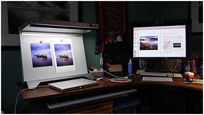
I'd like to run some practical hands on workshops in my office, in the centre of Edinburgh next year. At the moment, my idea is to limit each workshop to a group of four, each with a computer, Eizo display and screen calibrator - for over a weekend. We'd go through setting up our environment for colour management, editing in the digital dark room, and producing high quality prints in a repeatable - expected way on an Epson printer.
Please don't ask me any specifics about it just yet - as I'm in the middle of trying to work it all out, but I'll let you know when I do have a more concrete syllabus for a weekend workshop.


