Thoughts at Lake Kussharo, Hokkaido

I often see similarities between one place in the world, and another. 

Me photographing at the edge of beautiful lake Kussharo, Hokkaido Japan, December 2015.

Me photographing at the edge of beautiful lake Kussharo, Hokkaido Japan, December 2015.

I've been on the island of Hokkaido in northern Japan for the past week or so, and I have been surprised to find that the landscape here often reminds me of Patagonia. For example, on the shores of lake Kussharo, I found myself thinking I was somewhere in Torres del Paine national park. This is in part because of the weather but mostly it was because the shoreline was black volcanic sand and the vegetation scattered around the edges were also similar to what I've seen in Patagonia.

But the similarities didn't end there. In northern Hokkaido, in the town of Wakkanai, a small fishing town situated on the coast, I felt that I could have been in Punta Arenas on the edge of the Magellan straight. Both towns have an 'end of the world' feeling to them. Tinned roofed buildings, rusting industrialisation scattered in the fields, and the low flat coast line with a sea that could be a channel, or an ocean. Punta Arenas and Wakkanai were inseparable in my mind.

Laguna Armaga, Patagonia. Image © Stacey Williams (thanks stacey!)

Laguna Armaga, Patagonia. Image © Stacey Williams (thanks stacey!)

Perhaps though, the reason why I see so many similarities between different places in the world is much simpler than I may imagine: it might be a case that I'm drawn to those places because they are comfortably familiar to me: they resemble my own country of Scotland in ways that are not immediately apparent to me. I may be just be drawn to places because underneath - they offer the same things. Similar weather, similar terrain. Ultimately, they offer something deeply comforting because I 'understand' or 'know' them so well.

But I think it's really just that the more I travel, the more I will be prone to draw comparisons between places. It's unavoidable really. 

Either way, I enjoyed seeing the resemblances. It allowed me to look more closely than I would if I was just a normal tourist, and it's also very comforting to experience a sense of familiarity while I'm on my travels: everywhere feels like home.

Hokkaido is perhaps a place I will be returning to from now on.

Acknowledging your influences

I'm in Hokkaido, Japan right now. It's lovely to be here.

Acknowledging one's own influences is good for the creative-soul. It's good to give credit where credit is due, and it's also very humbling to recognise that there is no such thing as true originality: we derive our work from what inspires us.

I think that acknowledging your influences is first and foremost a respectful thing to do. But it is also a way of understanding and tapping in to what it is that drives you forward as a photographer. 

Homage to Michael Kenna, Hokkaido, Japan, December 2015

Homage to Michael Kenna, Hokkaido, Japan, December 2015

I have learned so much by following (literally) in the footsteps of some of my heroes. I first visited Patagonia in 2003 because of Gallen Rowell's images of Torres del Paine national park in Chile. And now I am in Hokkaido, guided there by the inspiring photographs of the island by Michael Kenna.

When we do follow in the footsteps of our heroes, a few things happen. Firstly, we learn why certain locations worked for them, but we also learn a lot about ourselves in the process. I've arrived at a location I know through someone else's work whom I admire, only to find out that the landscape is more urbanised than I had thought. Or maybe I find out that there is simply only one aspect to shooting the location. Either way - I learn. And if I am fortunate enough, I may see other possibilities in the landscape: a view, or a fresh aspect that was not explored by my hero.

Following in someone else's footsteps is a worthy thing to do. But hopefully at some point, we begin to forge our own path. Even if you are visiting the same place as your hero, hopefully you'll begin to find your own voice after a while. I certainly think this is how my time in Patagonia has panned out for me over the last decade: where I initially saw Galen Rowell everywhere, I have moved past this and have found my own aesthetic in the Patagonian landscape. Now that I am here in Hokkaido, I acknowledge that I am at the very beginning of finding my own voice here. At this very moment,  Hokkaido is Michael Kenna and Michael Kenna is Hokkaido.

One thing that I'm acutely aware of, is just how much work MK put into crafting his vision of this island. It is a very personalised one, because on the surface, Hokkaido looks nothing like his images suggest. For one, it is a very populous place. It has as many people living here as there are in my native Scotland (5.5 million), and the landscape is not as pure and empty of people as MK's images suggest: the main source of industry on Hokkaido is that of agriculture and the landscape is littered with farms.

In praise of shadows

I've been reading a beautiful book called 'In Praise of Shadows'.  It was written by the Japanese author and novelist Jun'ichirō Tanizaki and is considered a classic essay on Japanese aesthetics.

As a westerner, I find reading Tanizaki's book is opening up some thoughts for me about light, the way we use it in the west, and in particular, how varying levels can be employed to create a sense of quietness in our environment. Tanizaki talks at great length about the beauty of shadows.

Although his book may be more related to architecture design, I do feel that as a photographer, it's touched upon something that is close to my own heart: that of how I respond to my surroundings. In the days of old Japan, subdued lighting was used to give a sense of calm or 'quietness' to a space. Areas of shadow were an intentional and appreciated consideration to building design. My feelings are often influenced by the lighting of my environment, and I find that most modern, brightly lit places aren't relaxing places to be.

Shadows are the places where our imagination is given free reign. In Tanizaki's book, he delights in suggesting that the corner of ancient temples where very little light penetrates, allow the mind to find quietness and a space in which to dwell. While reading Tanizaki's thoughts, I couldn't help but feel I always knew this. I think that most of us do.  I just needed someone to spell it out for me. 

For instance, as a child, I remember being afraid of the dark and would ask for the hall light to remain on, because in the shadows I could see many possibilities. This is something most children do, and in my adult life as a photographer, I find I still see possibilities in areas of negative space or where shadows exist.

Maiko1.jpg

As I've progressed as a photographer, I've had to open my eyes to what is really before me. I have come to know that I am sensitive to light levels where initially I had no idea that I was. Shining a direct light into my eyes is tantamount to a pneumatic drill crowding my thoughts. I've despised overhead lighting for many years, for this very reason.  Likewise, on overly sunny days I may have the blinds lowered in my home to give the degree of visual comfort that I emotionally require.

This sensitivity to light, is something I try to imbue in my photographs. I think all visual artists should.

Tanizaki's book allows me to embrace this - I know now that shadows are beautiful and used carefully in one's work, they can add depth as well as mystery. They also give me space for my imagination to roam free.

As a visual artist, I understand that my surroundings are important to me, not just because they are the subjects of my photography, but because the qualities of light they possess influence it in ways that I was never truly aware of, until I read this book.

Many thanks to Jeff Bannon for recommending this book to me.

Art as Influence, as Inspiration

"art is often a symptom of the landscape"

Over the past few weeks, I've been enjoying and reading about the great Japanese artist Hokusai. Although Hokusai's name may not be universally known to many of us, his painting 'The Great Wave off Kanagawa', will be. It is perhaps the most famous Japanese print of all.

Hokkusai's 'The Great Wave of Kanagawa'.

Hokkusai's 'The Great Wave of Kanagawa'.

I'm due to visit Japan this December. It's a trip I've been looking forward to all year now and as it gets closer  I find I can't help myself but wish to know more about Japan, its art and its culture.

You see, I get great inspiration from enjoying and absorbing the art of the places I'm going to visit, because its art is often a symptom of its landscape. I think this is very true in Japan's case. Often the landscape has been cultivated to fit their aesthetic sensibilities, and other times the shape and form of the landscape has informed their art.

This is a beautifully illustrated book of Hokusai's work. I find that just looking and enjoying the work, that I am finding inspiration. 

This is a beautifully illustrated book of Hokusai's work. I find that just looking and enjoying the work, that I am finding inspiration. 

But as well as enjoying the art for its own sake, I find the actual process of investigating and learning about it helps me connect with the place I'm going to visit. Indeed, I often find that the art of a country can often mimic elements of the landscape, or the other way round.  In Japan's case, their landscape has been cultivated to a degree to match the culture's aesthetics. 

But there is more. The Japanese have very definite aesthetics to their art and architecture, and I feel that any understanding I gain before the trip may help me when I am piecing together a new portfolio of images. I guess I'm trying to say that since I felt inspired to come to Japan because of its art and their approach to shaping their landscape, I wish my photography to illustrate this as far as is possible. If I am not entirely ignorant about a place and the culture, then I think any knowledge I have is going to be absorbed hopefully in my picture making.

Inspiration can come from many sources, and I guess the most obvious one is to look at other photographer's work. But I think I stopped using others photography as the sole reason for my influences many years ago. These days I'm more likely to find inspiration through a book i've read, some music I've listened to (such as the wonderful 'Bino No Aozora by Ryuishi Sakamoto below)) and most likely - the art of the country, because the art is often a symptom of the landscape. 

Ryushi Sakamoto's 'Bibo No Aozora

Selection Process - The Birth of a Portfolio

A few years back, I discussed the editing and whittling down of a shoot to a select number of images. My post was about 'quality control'. You can read it here.

One aspect of quality control is how the work is presented. I was really trying to get across the message that in order for the final work to have a cohesive feel to it, certain images may need to be removed, despite them being great images on their own. The key point here is 'on their own'.

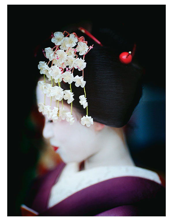
Maiko, Kyoto, February 2014, © Bruce Percy

Not all images work well together and it's up to us as photographers to see relationships between images and realise that they make a statement or message stronger if they are put together. Conversely, the message becomes diluted if you just place all your good shots together with no thought to how they relate (if at all)  to one another.

A portfolio (or collection of images) should tell a story. That story needn't be about a chronological sequence of events. It just needs to be a visual-story - one that has a pleasing way of unfolding on the viewer. That means thinking about the relationship of tones and colours more so perhaps than subject matter. It just shouldn't jar in any way. Or to turn it around - a portfolio should just 'flow'.

Just as the composition and tonal relationships within a solitary photograph should 'flow' (work together and lead your eye comfortably through the image), so too should a portfolio do the same thing (the images should work together and lead your eye comfortably through the collection).

Looking at portfolios on-line, it's often apparent that many have not taken the time to consider the ordering of the images. Nor has there been any thought about ordering images with similar aspect ratios which exist side by side.

Geisha-Contact-Sheet

If one were to put a book together, you would take the time to think more about the layout -  where to put the images, and although there may have to be certain decisions as to put related subjects together, you will find that the overriding decision will be to use ones where their visual properties are similar. For instance, I really don't like to put two images together that have very different tones or even aspect ratios. On a two page spread, if I have to have a portrait orientated image on the left page, I make sure the right page has an image with the same orientation. This is because each time you turn a page, you are now confronted with two images in one go. They need to be related in some way and this can be achieved through similar orientation or similar tonal properties, or maybe just similar subject matter.

Similarly, I would  put images of similar tonal ranges or 'feel' together, unless the intention was to convey a sense of contrast. An example of creating contrast may be to use two images of the same scene but each illustrating a different season. But just simply jumping around from one image to another with little consideration for 'the story' you're trying to convey will result in your portfolio appearing weaker than it really is. All just because there was no sense of flow to how the images were laid out.

So portfolios are really 'concepts'. Like a prog-rock concept album, they have a story to tell.

Lastly, a portfolio is not just simply created at the end of an editing session. You don't just work on all the images and then decide which ones to put together. A portfolio should surface as the editing of a collection of images is worked on. A protfolio should be one of the aspects you should be considering during the editing stages.

Consider the collection of images of Geisha I have in my contact-sheet above. These are here not just because they have a similar look and feel, but more because, as I worked on scanning and editing the images in this collection the tonal look and feel of the work became more apparent to me. I saw in maybe 4 images a similar look where the dress and white faces seemed to influence or 'guide' the editing. I kept looking at the overall collection of images that I was working on and if I noticed that there was a strong colour or tonal relationship with some of them, I went with them as the guidelines for where the editing should go. So thinking about a portfolio during the editing influenced the outcome of the images you see here.

Conversely, if I'd edited them on an individual basis and not looked at the collection of images I was amassing, I think the body of work would be much weaker. The tonal relationships or 'look and feel' of the final work would be more tenuous, and I'd be left with a body of work that felt 'wooly' and thoughtless.

Everything you do as a photographer should be about maintaining high standards. Only show your best work, and give a lot of care and attention to how it is presented. Badly presented beautiful work can be easily misunderstood and overlooked. Now you wouldn't want that would you?

Getting Acquainted with new work

Back in February, I made my first ever trip out to Japan. It was a very enjoyable trip, mostly because the people there are terrific. Politeness is something that seems to be at the core of the Japanese, and I will definitely be going back next year.

Maiko, Kyoto, Japan, © Bruce Percy

The past few weeks have been deeply satisfying for me on a creative level.

I had originally gone out to Japan for a special one day event in Kyoto. I had high hopes that I might make some beautiful images of Maiko and Geiko (Kyoto's Geisha). All I can say about that day is that by the end of it, I felt extremely happy, feeling that I'd maybe made a few nice portraits.

I'm a film shooter, which means I have to live with the memories of those moments where I felt I captured something good. I think that's one of the reasons why I love shooting film. There is no pressure to review immediately what I've shot, and I go with the philosophy that what's done is done. It allows me to live more in the present moment. No stopping to review, just making images. Which is great.

Once I click the shutter, the image is either imprinted on my mind or it's not. I have to listen to my gut a lot and the more memorable images tend to stay with me in my thoughts and feelings for days after the event. I find it highly enjoyable to let my mind settle and absorb what it was I experienced. I often feel it takes a lot of time, maybe weeks or moths to really be clear on what I experienced, and in this way, it's great to just leave the films until I get home and have space in my mind and schedule to work on the images.

So this posting is really about the experience of watching new work come to fruition. In my studio I have a light table where I place my transparencies, and I also have a daylight viewing booth where I can review the contact sheets for the negatives I've shot. The Geisha portraits I made were shot on Kodak Portra 160 colour negative film, so I always request a contact sheet to be made, so I can easily look over the entire collection of images on a roll in one easy go.

During the selection and editing, I've felt I've been getting re-acquainted with Kyoto and my the day I spent there making images of Maiko and Geiko. It's been such a really beautiful thing to get absorbed in the sights and memories of the trip and also to find that the certain images that really made a big impression on me at the time of shooting, have reliably met my expectations. But there is also the beautiful surprise in seeing other images I had not thought would make the grade come to life, and  to watch the final portfolio take shape.

Each portfolio should have it's own vibe. Sometimes that vibe is based on the subject matter, but more so for me now, the collection of images has to have a cohesive feel to them - usually brought about by the colours and tones present in the work. I often feel my own images tend to speak to me and dictate how they are going to turn out, and it's up to me to see relationships in colour ranges or subject matter to find a common theme or story while I'm editing them.

The past few weeks of sitting in my home studio absorbed in contact sheets and watching the portfolio's story appear before my eye's has been really wonderful.

One mustn't rush the editing. When you have just made a collection of images it's all so tempting to get back to your home and busily start work on them, but there's really something wonderful to be had in cherishing the moment because it is a way of recalling the experiences and feelings you had whilst making them.

My new collection of images can be viewed in the new work section of this website.