Imperceptible Horizons

When you take the horizon away from a landscape photograph, the viewer is inclined to invent one.

Hokkaido-2019.jpg

We tend to imagine what we need to complete (to make sense of) what we see. This is true of photography, but it is also true of how we use our visual cortex in our daily activities.

Everything we see is a ‘construction’, and it’s so innate to us that we’re not even aware of it.

Consider the Necker cube. You immediately know it’s a wire frame cube. But what is interesting to me is that our ‘construction’ can be influenced. You can choose which walls of the cube become the back wall and the front wall. After a while you can flip them so what was the back wall is now the front wall, and what was the front wall is now the back wall. The necker cube is great at illustrating that your vision is a ‘construction’.

Necker cube. Can you imagine this cube in different ways?

Necker cube. Can you imagine this cube in different ways?

When we look at photographs, we ‘imagine’ the scene in our mind’s eye. We essentially construct it. And most interestingly to me, we tend to create any missing supporting elements we need to help us make sense of an image. This means that we may imagine things that aren’t actually there.

In the three photographs in this post today there are no horizons in the shot. Yet I think most viewers of these three photographs will ‘imagine’ a horizon. They will essentially imagine what isn’t there to help them complete (or make sense of) the image.

There are many ways in which we tend to ‘imagine’ what isn’t there. For example:

  1. What is outside of the frame. We tend to ‘continue’ the photograph outside of the frame. In our mind’s eye we tend to imagine beyond the perimeters of the frame.

  2. Objects at the end of the frame tend to continue outside of the frame. If a mountain begins to slop up and out of the frame, we tend to imagine the rising angle continuing outside of the frame.

  3. If there is no real horizon, we either tend to invent one in our mind’s eye, or if there is something within the photograph that can act as a substitute, we will use that. This is what false horizons are.

Knowing about this ‘feature’ of the visual cortex to ‘fill in the gaps’ can be a great photographic tool.

Indeed, in the case of point 1. above, (we imagine what is outside of the frame). I tend to use this a lot to help viewers imagine that the landscape is very empty. If there is nothing around the perimeter of the frame then one tends to imagine that everything outside of the frame is a continuation of that ‘nothingness’.

So in today’s post, I’ve selected three of my images where there isn’t a clear horizon. You can ‘imagine’ where the horizon is, even though in some of the images there really isn’t a horizon. No really, there really is absolutely no horizon in one of the images in this set. Do you know which one?

Imperceptable horizon, Lençois Maranhenses. The horizon does exist. Except that I’ve chosen to edit it to make it ‘almost’ invisible.

Imperceptable horizon, Lençois Maranhenses. The horizon does exist. Except that I’ve chosen to edit it to make it ‘almost’ invisible.

In the above image, perhaps, depending on your monitor, the horizon is perceptible. It is there, but it’s so faint that it’s almost become invisible.

Deliberately making things imperceptible

Indeed, this was my intention during the edit of this photo.

My aim was to reduce or simplify the image down to one subject : the graphic nature / shape of the lagoon edge. Remove the horizon line and the lagoon edge starts to float. It becomes the sole reason for looking at the photo.

And yet I know that most viewers will ‘construct’ or ‘invent’ a horizon if one isn’t present.

I’ve had to think about why I love making the horizon disappear in some of my photographs. I think there are several answers to this:

  1. Pictures become more ‘mystical’, or ‘dreamy’ when things aren’t so obvious.

  2. The mind has to work harder at figuring out what’s going on.

  3. It reduces down and simplifies the image so it’s easy to ‘digest’.

  4. The mind tends to fill in the gaps where there is missing crucial information. The viewer is forced into their own ‘dream state’ by imagining what isn’t there.

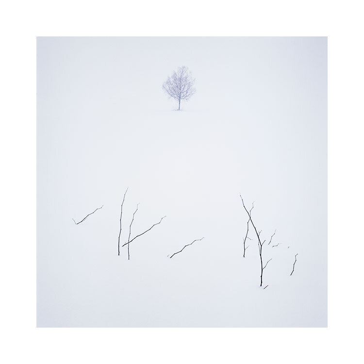
Hokkaido-(16).jpg

Which image really has no horizon?

As I promised you at the beginning of this post, here is the photograph that has no horizon. It was shot on a sloping field where the background behind the tree is actually the field rising up above the top of the frame. So I know from being there that the sky was never in the photograph.

Yet isn’t it interesting that we can’t help but imagine there’s a horizon in there!

I love playing with images where things are left open to interpretation. In my view, why should everything in an image be crystal clear? Why indeed do we need high-resolution all the time? And why do many of us strive to make everything so obvious to the viewer?

Well, my take on this is that for most of us, there’s an insecurity in worrying that the viewer may not see what we saw, feel what we felt. So we either tend to over-emphasise it (and almost everything else) in the edit to try to spell it out. And this can at best make the image too conventional, or at worst ruin it completely.

Final thoughts

I think it’s completely fine to leave things unanswered, to allow things to be inconclusive for the viewer. If it helps create an imaginary world of sorts for your viewer to disappear into, then it’s a feature rather than a problem.

This is why I love imperceptible horizons, because I know that often it’s best to leave as much of the interpretation to the viewer. It promotes engagement.

Re-interpretation

Before I begin my article today, I’d like to make a few points very clear:

  1. There is always a trade-off. When you gain something, you lose something.

  2. Sometimes we like something because we’re attached to how it is.

  3. The two images below, I don’t view one as better or worse. And hopefully you should get beyond this point also. ‘Like’ is a personal preference. It has nothing to do with the validity of an image.

I have just recently chosen to go back to some of my favourite landscapes in Scotland in 2021. Partly it is because I would like a change: It has been many years since I photographed my own home country, and I feel that there has been a big change in my style of photography over the past few years. I’m curious to see how I will approach / react / and photograph, since I am aware that I am looking for different things now.

This is the original image, shot circa 2009, in the Assynt region of Scotland. It is not of Stac Pollaidh, as many people assume.

This is a re-interpretation. I did it, just to see where I may end up based on my current tastes / aesthetics, etc. I realise I’ve learned so much in the past 10 years, so I was curious to see how I may re-interpret the same image.

Well I’m sure you’ve already studied the two images above : both from the same film-scan and reached your own view of which you like more than the other. This article today is not about this. I am not going to say ‘this image is better or worse because of…..’. Instead, I just wish to discuss some other aspects.

Point 1. Familiarisation makes it hard to see it any other way

I personally love the original image, but I’m really not sure how much of this has to do with familiarisation. We become set / stuck in our ways the more we live with how things have been. And this is just as applicable to our older work. Attempting the re-interpretation image has forced me to think about whether I’m attached to the original image because it’s good, or just because I’m overly familiar with it now.

Point 2. How radically different an image can be through editing

Editing / post-processing (I abhor this term personally), is a highly creative place to live. I have never believed that the work is to ‘get it right in camera’. And I’ve always enjoyed the editing / interpretive side of my photography. It’s interesting to know that an image can be edited in many different ways. Editing is an art, it is a skill. It is a life-long endeavour in learning to see what was in the image and bring out the main motifs. Editing isn’t done by learning Lightroom in a few weeks and that’s it. It can really take you places if you don’t mind departing from what was there at the time of the capture.

Point 3. How much I have changed

I don’t know if I have it in me many more to do deeply saturated colour work. I’m wondering if I may return to it in some years to come, but I’m certainly aware that the original image from 2009 isn’t something that I would do any more. There is always a trade off in your own development. I see things in the original image that I love, but I couldn’t do that now if I tried, because it’s not where my aesthetic leanings are. I’ve lost some aspects to my image making, but I’ve gained also. As I said, there is always a trade-off.

Which leads to my last point:

Point 4. The original capture was made by a different me. Edited by a new me. Perhaps this doesn’t work?

Yep, the guy who made the original shot was the ‘Bruce-Percy-2009’ edition ;-) We shed skin, we move on. I’m not too sure it’s a good thing to return to older work that was created by a different you. Because there is in some way a disconnect. I think I would shoot this scene differently now and I think it would be done differently with an aim to edit it a particular way. These days my editing and composition skills are intertwined. Where I once just went out to make images and then see what I could do with them later on. I think that when I compose shots in the field now, I already know what I’m going to do with them when I edit them.

I think if one wishes to return to older work to re-edit it. There has to be a reason. For example, if you ‘see’ something in the work that you can bring out, or enhance then I think it’s valid to return to it. But if you are trying to ‘update the work to match where you are now’, I’m not convinced it will work.

This is what I tried to do with this image. I attempted to edit it to ‘see what I would do with it now, based on who I am now’. And I’m not sure it’s a success. My reasons are, there are too many distractions in the foliage that I probably wouldn’t have shot it this way. So I’m trying to start on an image that isn’t at the right starting point for where I am now.

Conclusion

It’s fun to go back and revisit older work. You can really learn a lot about yourself in the process:

  • How far have you come?

  • Would you shoot the work this way now?

  • What distractions in the work do you see now that you didn’t see at the time of the original creation?

  • Do I want to return to the same places now, that I feel I am looking at things differently?

For me, the last point is the salient one. I am very curious to find out how I will approach photographing in Scotland now that my style has evolved. Will I find some common ground? Will I see new things?

Landscapes can teach us so much about our photography and about ourselves. Find the right landscape in your own development and it can move you forward in ways that other landscape won’t. Returning to a well known place many years later can be very interesting because you will most likely be looking for different things and you’ll therefore see it in a fresh and new way.

I’m aware that my work is always in a state of change. Nothing is ever finished. There should be no rules. Do as you please, return to older work if it’s what you feel you need to do. Re-interpretation can teach us so much. I just don’t think it will always yield better / improved results, but you’ll certainly grow from the experience.

Collating

Today I've been collating my images from Iceland and Japan, with the thoughts of putting together two future book projects. I've been struck by just how much work I've done over the past three years in each location, but also, how much is still incomplete in the sense of producing a book on each subject.

Playing around with sequencing of my central Iceland photographs.

Visualisation is key in propelling me forward with what I do.  

By collating the work and laying it out in a visual sequence i'm able to build an emotional connection to how I see the work panning out as it continues to be supplemented with new work. This can be very inspiring for me, and I often find myself dreaming up some additional images in my minds eye.

This aspect of visualisation is usually down to 'lost opportunities' - those 'photographs that never were', as you spied them while passing by some place, or because the weather changed and you failed to make them on time. They leave an indelible mark on your imagination that trigger strong feelings of 'I must return here, as I know I am not finished with this location yet'.

As a result of all this visualisation and dreaming of expanding the work, there have been for the past few years, ongoing discussions with my Icelandic and Japanese guides as to new places I wish to research and photograph. Everything is a work in progress. This is all good stuff as it gives me purpose: I can see that there are still unfinished ties to each of the locations I've already made photographs in.

What is most exciting for me, is that I am acutely aware that I often underestimate how much new work will come out of further explorations. New work often enriches existing work by allowing it to take on a new identity. Sometimes I feel the work is one thing only to find out that once I'm done adding new work to it, that it has become something different entirely. And I find that just very inspiring.

Collating one's own work is a great way of figuring out what you've achieved, and where there are missing gaps in the work, and which direction you need to take it.

Playing around with sequencing of my Hokkaido photographs.

The creative edit

Today's post is all about the creative edit. I'm been very kindly given permission to use one of the images that was discussed and edited during my Digital Darkroom workshop this past May. Many thanks to Orchid for allowing me to share this image with you.

Disko Bay, GreenlandImage © Orchid Fung, workshop participant, Digital Darkroom class May 2018

Disko Bay, Greenland
Image © Orchid Fung, workshop participant, Digital Darkroom class May 2018

There is often an image hiding within an image, and often a re-interpretation hiding within an interpretation. When we first compose a scene out in the field we often look at it from the point of what was there, often focussing, composing, setting up with the intention that we are going to record faithfully what we see. But when we come to edit or to review the image later, we often re-interpret the original composition and see other crops or other compositions within the original frame. This I believe is perfectly normal and should be encouraged.

I think if you are a photographer, you are always 'seeing', but also, you should always be interpreting, and that means even re-interpreting. To look at a photograph and see something else within it, is a similar process, if not identical to the one that allows us to look at the original world view and choose how to interpret it with our initial capture.

If you get good at choosing what to put into the frame and what to leave out , then I see no reason why this should not continue when you come round to reviewing your work and then deciding to re-crop or make another photo out of an existing one.

Which is what we did here with this photograph.

The original capture (RAW file with no processing applied) it shown below. My intentions are to illustrate that sometimes there are strong shapes and motifs in a photograph that will get stronger if we manage to remove the other things that are competing for our attention, and also, that it is perfectly ok to depart fully from what was captured.

The original raw file

The original raw file

During my workshop, we discussed how as visitors to a location, we are often caught up in the experience of being there. We live in a 3D world with real objects and we often tend to separate them in our mind because we know they are physically different things. I also believe that we look at tones in different ways when we look at scenery compared to how we look at tones when we look at a photograph. I am convinced that my dear friend Orchid thought the highlighted snow in the foreground was a pleasing part of the photograph because I too, have done the same. I have also taken many many photographs where I was inclined to put a foreground into the picture when non was required. This is, I believe, because as physical beings we wish to represent what was immediately in front of us. Foregrounds are a way of allowing us to step into the picture after all.


It is only when we review the image later that we find that perhaps the foreground is too distracting, or maybe it doesn't have enough aesthetic beauty to support the rest of the frame. Which is what we discussed with this photograph. I know the photograph was taken because of the mountain peak in the background and I believe the foreground was put in there because of such a need to have something to help us walk into the frame.

For me, I'm fascinated by the disconnect between a photograph and reality. I do believe that we see differently while on location than we do when we are reviewing photographs. For many of us the process is different, yet I have a very strong feeling that it shouldn't be. We need to be able to 'see photographs' while on location. Not scenery, and this is the hardest thing to do for most of us because we've had a lifetime of thinking and seeing the world as a living breathing 3D reality.

So what of the final edit? Are you shocked at all by how different it is from the initial capture? I'm curious because for me, I think of photography is the art of creating an illusion. Photographs aren't real, even when we don't alter them, they still do not convey what we saw or how things actually were. We could get quite philosophical if we chose to on this one.... but for me, photography is a creative-arts endeavour where our aim is to create a beautiful illusion. How we get there is a matter of personal ideals of what photography is and what it isn't. I have my own thoughts on what is photography (dodging, burning, cropping) and what isn't (blending, HDR, merging, superimposing things) but that is just for me. I realise that each and every one of us has our own boundaries of what is and what isn't photography and I respect that you may be happy to merge or superimpose things - there are after all no rules, and nor should there be. It's an arts endeavour we're discussing here.

I think my interpretation I made of Orchid's photo takes the viewer to the heart of the picture - that beautiful peak at the back of the original frame. By softening the tones down dramatically across the picture, we have removed a lot of textural details that would be vying for our attention. Doing so enables that beautiful graphic zig-zag shape to emerge in the photograph a perhaps the reason for the photograph. It was there all along, but it was competing with so many other elements that it was being drowned a little.

I think editing is an enormously creative process. It is a space that I can spend hours and days in, and it has taught me never to judge my work at the point of capture. I never really know just what the final images may end up being like, and I've certainly had images that have become personal favourites when I almost never worked on them because I wasn't convinced they had enough merit.

Photography is the art of looking again. And again. Of being open, and willing to re-interpret something another way. I hope today with this example I've shown you exactly that.

Many thanks to Orchid Fung for allowing me to reproduce and discuss her beautiful image.

You've gotta hand-craft it

Many years ago, before my current occupation as a photographer, I used to be a budding musician with lots of nice synths at home to play with. This was the 90's and an era where most synths turned up with lots of nice sexy factory presets to play with. Indeed one of the issues with 90's synths was that they only usually had one slider on the front of the panel and thus were a nightmare to edit the sounds, so most people would tend to use the factory presets with almost no changes to them at all.

This past month I have returned to music and I'm presently busy building a little home studio of some nice synths to own. I've deliberately chosen to look for machines that have lots of knobs and sliders on the front panel so that they will encourage me to shape the sound to my liking, rather than hope or rely on some preset to work in the music I'm making.

You may wonder what this has to do with photography. Well quite a lot.

I don't believe that plug-in's that offer presets to work with are a good way to start, or to continue with for the long-run. I can sympathise and appreciate that they may feel like a really great way of kick-starting your editing, or that they perhaps influence or inspire you, but the chances of them actually being exactly what your images need is pretty slim.

I've reached the conclusion that the best approach to image editing is to hand-craft it. Here's my reasons why I think it's good to go the slow manual way:

  1. You are given the opportunity (through having to figure out what you want to do to an image) to learn what components of tone, colour and form your image is made up from.
  2. You learn a lot about what works and what doesn't when you have to go in there and deconstruct  your image. Presets don't encourage this.
  3. Presets will rarely, if ever, give you exactly what you need and they will not encourage you to look or study deeply into what is going on in your work.
  4. Hand-crafting your work means that you build up skills to interpret what you've created, and also to think about what you might want to look for in future when you do return to shooting outside.
  5. It should go without saying, but each image you create does not conform to a preset. It has its own character and therefore needs to be treated on an individual basis.
  6. Photography is about being creative, and convenience should not be part of the creative vocabulary. Making good or great images isn't easy, and we have to put the work in to learn.
  7. Perhaps the most important point - you get to tune the image exactly the way you want.

Perhaps you think that presets are a great starting point, and that you still tune and edit manually anyway. My thoughts on this are that when we apply presets to our work, we only see or understand a little of what has been changed. if you wish to iron out some of the effect it's a little bit like going 10 steps forward to have to retreat 8 steps to get to where you want to be. I'd much rather walk each step at a time and build up a good understanding of what it is i'm doing with the edit at each stage.

I used to rely on presets for synth sounds in my music and often found it hard to get certain sounds to mix in well with others. Now that I have a collection of synths at home with tweak able parameters I can shape the sounds to fit in more. It brings me confidence when I hear certain sounds just shift into focus as they are tuned to fit into the music. Rather than flipping through thousands of presets hoping for the 'right sound' I am creating it myself.

By taking the reigns of your editing and pulling the decisions and control back into your own lap, you are giving yourself the opportunity to learn about your yourself, your work and to improve your own visual awareness. As tempting as certain presets may be, I'd suggest going the manual way for a while and see how it goes.

Portfolio Development Skills

This post originally offered a space on my September portfolio skills workshop.
It has now been filled.

You may have noticed that I'm offering more 'skills development' style workshops over the coming year. Going on location is great, and shooting is fun and that is mostly why I have tours. Workshops on the other hand should be just that - a space where you learn and develop your skills.

Portfolio Skills Development with Photoshop CS Masterclass
£448.00

Image Interpretation Techniques for building cohesive portfolios

September 3 - 8, 2018

Price: £1,495
Deposit: £448

5-Day Photographic Mentoring Workshop
Wester Ross, Scottish Highlands


Add To Cart

Shooting is just one part of our workflow. There is also the question of editing, which in my view, is as much of a skill and art as shooting is.

I personally feel I've learned more about my photography and my 'style' during the editing stage than the shooting stage, and would also suggest that the things you learn about your images whilst editing, often bleed back in to your visual skills whilst out in the field. Shooting and editing become symbiotic: one informs the other.

It's one of the reasons why I detest the phrase 'post-process'. Words can influence our attitudes and I believe this phrase just encourages us to think that editing is something we do as an afterthought. As if it is unrelated.

Further, I think the word 'process' encourages us to think of editing as some kind of activity that has no art to it. It's an incredibly creative part of the birth of one's images and I find it a hugely inspiring space to work in..

Well, further to this is the skill of developing one's own style. I believe that most of us don't know if we have one, and I think this is because we aren't really given tools with which to look for it.

One of the best ways to figure out who you are as a photographer, and how best to move forward with your art - is by looking at your work from a 'project' or 'portfolio' basis. Working towards building stronger portfolio's of your work can only lead you to be a stronger photographer.

That is why I've put together the workshop you see listed here. I'm really keen to show others how to recognise themes in their work and build cohesive portfolios, with the aim of helping them become clearer about where they are with their photography and how to make it stronger.

Vanishing Point II

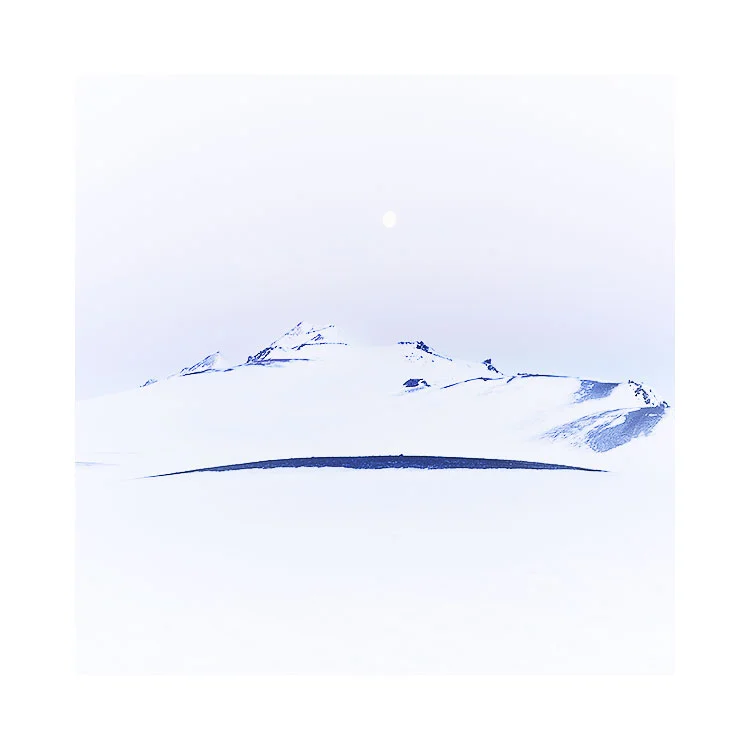
It's often been said that the eye is attracted to the brightest part of the frame. And I have added to this by saying that I think the eye is attracted to the tone that is less like the rest of the picture. So in a bright image, your eye is attracted to the darker tones, and in a dark image your eye is attracted to the brighter tones.

In my image below, I find my eye is pulled right towards the middle of the frame to the darker tones of the curve of the foreground slope and also the thin dark line of the hill.

Fjallabak-Winter-2018.jpg

I've deliberately brightened the edges of the picture: it is in effect an inverse vignette. Can you see it now that I've mentioned it?

As with all good edits, they should touch you in some way without you being consciously aware that anything has been done. You should instantly buy the illusion that is being cast upon you.

1.jpg

One final note today: I felt there was a danger that everyone would think that these images had no colour in them, that they are just black and white. I've found that some of us are very aware of colour casts and can spot when white snow is really blue-white, or magenta-white, or grey-white. I've chosen to show you the work here now with a white background, as I think it allows you to notice the colours in the pictures more. You should perhaps ask yourself what colour is the snow in each of these images, or in particular, what tint does the whites in each picture have?

2.jpg

Vanishing Point

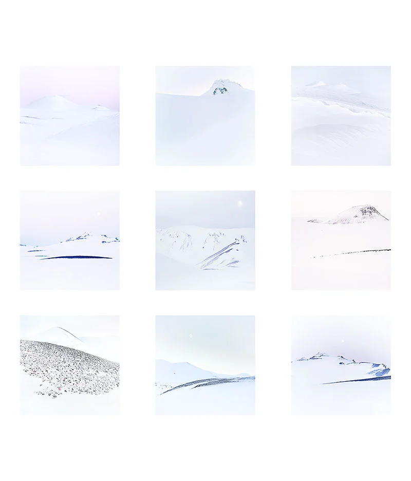
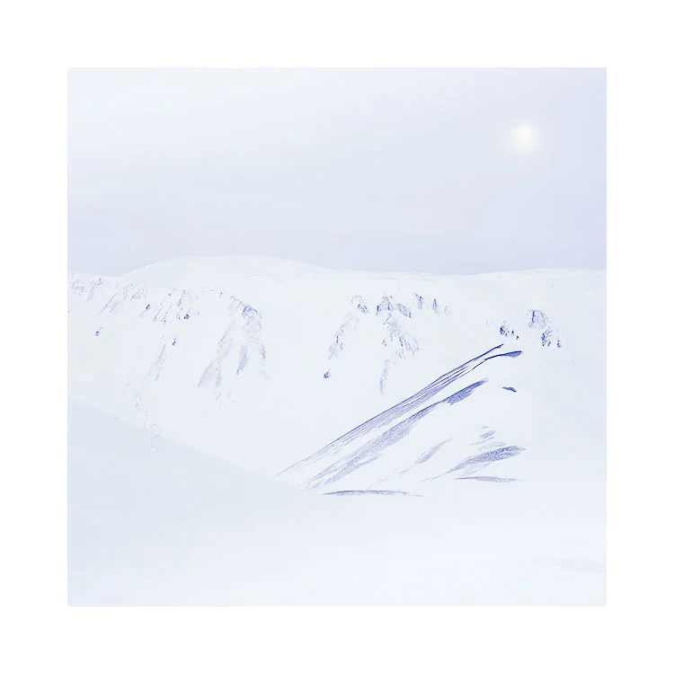
As I push and push the tonal registers in my edits, I begin to notice that there is a fine area where things are still just about visible, but almost at the point of disappearing. I like to play around with that vanishing point because in doing so, I can hopefully lead the viewer into having to look again, to wonder what is there.

After all, why does everything have to be spelled out for us? Where does the need come from, for this clarity in what we produce?

Fjallabak-Winter-2018-(22).jpg

Why can't things be implied, left open to interpretation? Isn't there beauty in what has been left unsaid? 

Not knowing can be thrilling, but above all, more interesting to me than an answer, because up until the answer is given, anything is possible. Because when the answer is revealed, any mystique that was present, instantly vanishes.

Fjallabak-Winter-2018-(7).jpg

The central highlands of Iceland is a space where boundaries become unclear. It's attraction for me is that often times, things aren't spelt out. Definition isn't always high on the agenda, and it's a place where gradual variances in tone can almost be lost in plain sight. What you think you're seeing isn't there because your mind wishes to fill in the empty spaces with 'something'.

Editing images so that the tones are almost at the very edge of becoming nothing (in this case absolute white) but still retaining a hint of colour is something I find fascinating to play with.

Where the dividing line becomes hard to find, your mind goes hunting for it, for your 'must' find a division point, an anchor, something to latch on to.

I ask myself 'why is that so?' Why do we need to have boundaries defined for us? Can't they remain unsolved for us? Where does our compulsion come from, to make sense, to answer all the unsaid aspects of a picture?

Fjallabak-Winter-2018-(5).jpg

So I deliberately edit with the intention of introducing snow-blindness to our view of the photographs. Not knowing where one hill begins and another ends, is the story of these photographs. The central highlands becomes a playground for messing with the viewers visual system and its need to construct, to make sense of what it is seeing.

Fjallabak-Winter-2018-(15).jpg

I'd much rather watch a movie where the story is left with no conclusion, than an film where everything is spelled out and explained to me. Because the film with no proper ending has room for interpretation, for it to become whatever my thoughts make of it.

Because in the agony of not knowing what really happens at the end, we endlessly work on the problem - always looking for meaning. It's certainly a much more interesting way to conclude a film than the tired approach of having to allocate 10 minutes at the end to explaining just what we saw. That kind of film invites us to think we need answers, when instead, there is often beauty in not knowing.

A forest wedding

Sometimes an image contains some kind of symbolism. Well, perhaps they always contain some kind of symbolism. Whether it's a privately held feeling or view, or perhaps something a bit more literal that an audience can interpret.

A forest wedding, Hokkaido.Image © Bruce Percy 2017

A forest wedding, Hokkaido.
Image © Bruce Percy 2017

Someone on my Twitter account wrote to me that this photograph is 'a forest wedding'. I like that idea very much.

I shouldn't have to explain it, and I feel that if I did, some kind of magic would be lost in the marriage between the literary title and visual interpretation.

Finding out who you really are by acknowledging and thanking your influences

"Let influences be your guide. But don't let them define you"


We all have to start somewhere. That place is usually in the footsteps (or tripod holes) of those that we admire. It has often been said that the biggest form of flattery is imitation.

The Cuernos & Lago Pehoe.Image © Galen Rowell

The Cuernos & Lago Pehoe.
Image © Galen Rowell

I would certainly agree with this. I know myself that I learned a lot during my initial years of photography by following in the footsteps of those that I admire. For example, I remember my whole reason for going to Patagonia back in 2003 was because I had been so inspired by the work of the late Galen Rowell. He had made one particular image of Lago Pehoe that just made me want to go there so badly and when I did, I sourced out the location where Galen made the image you see on the right.

I know my influences: Galen Rowell first gave me the motivation to use strong colour when I first started out. Through his writing and emotive images he taught me to embrace the adventure. Even today, his book 'Mountain Light' is perhaps my most favourite book on travel photography which I often return to when I feel I need to re-connect to my roots as to why I got into this whole thing in the first place.

Michael Kenna was and still is a great influence on me: I've learned so much from Michael's work over the decades that I have followed him (I've been a fan since the late 80's). He himself has said in many interviews that it is quite normal to follow in the footsteps of your heroes. By working in the places that they worked, you learn a lot about how they made the images they made.

The Cuernos & Lago PehoeImage © Bruce Percy

The Cuernos & Lago Pehoe
Image © Bruce Percy

But there must come a time when your work should diverge from your heroes - it is usually a signal that you are beginning to find your own voice. Some of us have a long journey ahead of us to get there, and indeed, some of us never do. It is my hope though that we should all, at some stage, get a glimmer of who we really are underneath all the hero worshiping that is, I believe, a normal stage of development.

In this age of high proliferation: it is hard to be an individual. Indeed, I often feel that many people go to the same locations because they wish to capture similar shots that someone else has captured. We are bombarded with many shots of the same view, endlessly repeated on image sites that I think it is hard to step away and find our own voice.

To find one's own voice inevitably requires us to understand ourselves: to know who we are.

As part of finding out who we are,  we need to acknowledge and thank our influences. I remember noticing that Kenna had gone to some of Bill Brandt's locations and he had name checked his influence with the title  'Bill Brandt's Snicket', as you can see below:

Image Left: © Bill BrandtImage Right © Michael Kenna (titled 'Bill Brandt's Snicket, Halifax, Yorkshire)

Image Left: © Bill Brandt
Image Right © Michael Kenna (titled 'Bill Brandt's Snicket, Halifax, Yorkshire)

I myself have openly thanked Kenna in turn for kindly providing me with his guide's details for Hokkaido and the work I created there - I made sure to namecheck him as I felt a need to be in-tune with which parts of my creativity are truly my own, and which parts I've borrowed from my heroes. It's vital that I know who I really am and to do that, I have to recognise and understand my influences, and to thank them for what they have given me.

Image Left: © Michael Kenna 2007Image Right: © Bruce Percy 2017Following in the footsteps of one of my heroes, even now.

Image Left: © Michael Kenna 2007
Image Right: © Bruce Percy 2017

Following in the footsteps of one of my heroes, even now.

Photography is a personal journey into finding out who we really are. That is what makes it so special; it is our own private universe, a place where we get the chance to express our individuality. If we wish to get a clearer insight to who we really are as artists, and to know where we are going with our creativity,  we first need to understand our influences. But before we can continue, we also need to acknowledge and thank them for showing us the way forward.

Postscript:

I received a few replies about this post where the reader assumed I was telling them to go and literally thank their influences:

"If the person who influenced you didn’t mention that they had already been “influenced” by another photographer. Or who do you mention when shooting something like St Paul’s? Could be 1000’s thinking they deserve a mention. Do you mention the influencer every time you post it?"

That's the problem with the written word: readers can often read into what you've said and come up with a different meaning than the one I intended.

If anyone is still in doubt about what I was suggesting, I am merely saying it's good to be aware of your influences. You can thank them any way you can, but the easiest way is to just be mindful and to recognise that they are part of the reason you do what you do.