Turner-esque

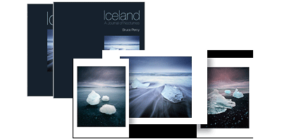
Triplekite publishing has released a very beautiful soft bound book by David Baker. ‘Sea Fever’ is a photographic monograph about the power of the sea.

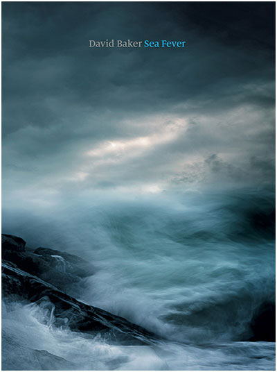
Like a Turner-esque painting, the cover image sets the stage well for what is to be found within its pages. I particularly like the cover image. With a break in the clouds situated right at the heart of the image, I felt drawn in - invited almost, to come and engage with this book.

Making a book is not an easy process. Having published two books myself, I fully appreciate that there are many design considerations, and plenty of discussions that happen along the way. And often the way a book ends up looking is the work of a very long and thoughtful  process.

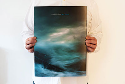
This book is tall, and large - a decision I think to enable the power of the sea to be conveyed to the reader when viewed as two-page spreads. It is also a soft back book, and very light to hold. I enjoyed going through it as it was never a cumbersome book to handle. It felt like a very large, luxurious magazine that encouraged me to engage with it. This was possibly due to its flexibility, which worked well with the content it conveys, because it enabled me to twist and re-shape the contours of the sea to my own pleasing. Rather than the images being fixed and my viewing being forced to settle on the work from one static aspect only, I felt I could engage, and play with the book more. I liked this aspect very much.

I’m no fan of images spanning two pages and I often dislike images bleeding over the very edge of the paper, for me, I like to be able to take in the entire compositional aspects of an image in one go. Often a break in the middle of the image (due to spanning two pages) can be irritating or unpleasing at best. Many of the sea images in this book do exactly that, but I was surprised to find that it actually enhanced my viewing experience, rather than detract from it. In this instance, spanning big images of turbulent sea across two pages works like an IMAX cinematic experience - these images fill your entire field of view and the result is that we are told that the sea is powerful, the sea is overwhelming. The same can be said about the images bleeding to the very edge of the page. I think it was a very effective design choice to do this because it conveys the message that there is no end to the power of a raging sea.

page-spread

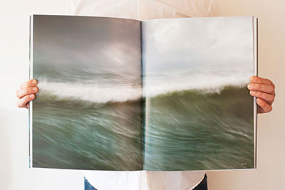
Also, because of the very abstract nature of many of the images contained within this book, there is less of a need to avoid page splitting. The images are less about order, and more about conveying power. We are not here to study graphic forms, but more to enjoy nature when things get dramatic - as the title of the book conveys. So I have to give a lot of praise to Dav Thomas whom I think was responsible for many of the design  considerations of this very beautiful and engaging book.

With regards to what this book has to offer, it is a monograph. It tells a story in visual form only. There is very little text, and that is fine by me. I often feel that many photographers wish to learn from the photographer, and they think that learning will come from reading text. I think you can learn a great deal about the photography and the photographer by simply studying their work - the answers are in the imagery. All we have to do, is be open and let the photographer take us on their journey. Submit rather than dictate. The photographer has a lot to tell us, so sit back and let him do that. And a good book will do exactly just that, and in this respect, this is a very good book.

I am looking forward to seeing what other subjects Triplekite will handle in future.

Sea Fever is available from Beyond Words book store for £25.

Probably the best filter bag in the world

Last year, I wrote a review about the Kinesis filter bag.

Before I continue, I would like to make it very clear that I love this bag very much and it has become my favourite filter bag of all time. I can't recommend this bag highly enough.

Just shortly after publishing my review, I was alerted that there is a problem with the bag ‘outgassing’. The concern seemed to be about the material within the bag releasing a gas that seems to leave a residue on the filters.

kinesis Large Grad Pouch, goes around your tripod collar, for easy access to the 'indexed' card system of filters inside.

At the time, I did some testing of my bag and found that this did seem to be the case. I was very disappointed because I love the design of the bag and it is extremely functional. But I decided to change to the Lowe Pro filter bag.

To try to cut what is already a long story short, I found the Lowe Pro bag had the same problems. In fact, I would say that probably any newly manufactured filter bag would probably releases gas or chemicals, simply because it is new.

With both filter bags, I found that after a few months, the issue was no longer there. I can only surmise that this is something to do with newly manufactured materials, and in no way does it affect the life of your filters.

I've been using the Kinesis now for the past 9 months or so and have really grown to love it. It is my favourite filter bag of all time, mainly because of how functional it is: It has a lovely little strap that allows me to hang it around my tripod collar where I have instant access to all my filters like a little indexing system. I can heep my head at camera level and if I need to change filters, there's no moving over to the bag to find them and there's no wondering where to put the filter bag either. It works 'with me'.

Also, because the filters are stored sideways and are all accessible like a filing system, I can easily drop a filter back in its slot, and pull another out.

I keep all my filters in this bag now, and I have them ordered in the following way, so I know where everything is, without any fidgeting whilst on location:

1 stop ND 2 stop ND 3 stop ND 3 stop ND (yes, I have two, as sometimes I use 6 stops ND) 1 stop soft grad 2 stop soft grad 3 stop soft grad 1 stop hard grad 2 stop hard grad 3 stop hard grad

As many of you may know, I really believe in 'process'. I keep everything in the same place all the time, because it cuts down on any delay in working in the field. When everything is in the same place, your hand just reaches for the right object based on muscle memory.

This ‘order’ works for me very well, and the bag also has enough space to leave some lens cleaning cloths inside it, or even store the entire lee filter holder (With filters already mounted) when I need to take the holder off the camera.

In short, the bag has become a spare pair of hands for me now, and I will often put in the dark slide for my Hasselblad camera, or anything that needs to be taken off the camera for a few moments. I've never known where to put things when I need to take them off the camera for a few moments, and often lie filters on rocks or on the top of my camera bag. That little strap around the filter bag keeps the filters where they need to be - within easy reach.

I should warn you that this bag is a bit bigger than most filter bags, but it's ergonomics makes me want to take it with me at all times.

If you would like to read the original review about the Kinesis filter bag, then it is here.

Beautiful Lo-Fi

I've been listening to a lot of Icelandic bands this past year and one thing that has struck me is how open many of them are to messing around with the sound quality of certain instruments in the production of their songs.

Some parts of the music are deliberately distorted, or are messed around with so much, that they have become almost shadow facsimile's of themselves. Instead of hearing the actual instrument, I feel I hear an imprint, some kind of aural residue. It's a really effective way to take the listener on a journey, one where you engage more with the music.

Here's one example, by an Icelandic duo (twin sisters), called Pascal Pinon. The song is very beautiful, but also, so too is the lo-fi quality of the piece.

https://www.youtube.com/watch?v=ds6miVqD9ZE&width=400

The song was produced and mixed by Alex Sommers (he is the partner of Jónsi (pronounced Yonsi for those who are not familiar with Icelandic) of incredibly famous band - Sigur Rós fame). Alex is a genius at production.

So this has got me thinking about image quality, and how we often strive for the best resolution we can. And I believe many of us think that by having utmost image quality, the image will be more enjoyable to view. That is certainly true some of the time. I think there is a valid place for utmost resolution in imaging, but so too, is there validity in all forms of image quality, be it soft, blurry, fuzzy, noisy, underexposed or overexposed.

Seeking perfection in image quality is not a symptom of the digital imaging age. It has always been a preoccupation for photographers through the ages, regardless of whatever medium they were using. In the instance of film users, there has always been a portion of the photographic community who strive for finer grained films, or larger negatives in the pursuit of high-fidelity imaging. This is of course a nobel quest and one I would not disparage. It's just that I think that going the other way - reducing  image quality, intentionally, is just as valid and nobel a pursuit as any.

With music, we can create depth to a piece by using different frequencies - we can also add a sense of 3D by mixing high-fidelity sounds with low fidelity ones, as well as bright and dull sounds. Complex interplays of varying audio quality lends a sense of space to the music.

Similarly, messing around with the tonal range of an image is just as valid. Not everything has to be 'punchy', or have high contrast. Mixing in low-contrast areas with high-contrast areas opens up an additional dimension to an image. But this does not stop with tonal range.

We can add additional ways to interpret an image. Most of us think about tones and contrast, but varying the level of detail within an image can bring an extra dimension to the work. It is just as valid to have areas of the frame where there is lack of detail as it is to have areas where there is a lot. Softness tends to make the eye pass over an area of the picture, whereas sharpness attracts the eye. So in my view, I believe that images where there is a deliberate degradation in resolution is welcome, and can be beautiful if the treatment is appropriate.

I think there's beauty in softness. Softness lends ambiguity to an image or a part of an image. There's something fascinating about the unknown, about wondering what something meant, when we only have a fragment, a clue to work with. When areas of the frame are soft, we have to fill in the gaps.

Similarly, any flaws can be beautiful. Flaws introduce a sense of randomness, which often lend a certain uniqueness or 'character' to the images we create.

Low-fi images have a way of engaging our emotions and dreams, in a different way than hi-fidelity images do, simply because there are things left unsaid, or half-revealed.

We should embrace low-fi quality as an additional tool to our imagery, and not attempt to banish it. After all - all images are wonderful if they capture the spirit of a mood or emotion or feeling, since seldom do we throw something out if it possesses such beauty, even if it is flawed in some way.

Diminishing Solar Activity

On the BBC news website today, there is an article stating that, although the sun is at the height of its 11 year solar activity cycle, the solar activity is actually very low. Scientists are comparing the low activity to a time way back in the 17th century when winters got so cold, the Thames froze over for many months. I've often wondered about this period of time and why the temperatures dropped as a result. It appears that the path of the jet stream alters when the sun's activity drops.

I personally felt we were enjoying a heightened awareness of the Aurora Borealis here in the northern hemisphere, but maybe this is perhaps the first cycle we've had, where digital cameras have become commonplace, and there are more photographers around than there has ever been.

I do hope the solar activity remains high for the next few years, but if not, well, it seems we have some very cold winters to look forward to - always a bonus for the landscape photographer :-)

Really Right Stuff, in Europe?

If, like me, you like Really Right Stuff camera plates, ball heads, and tripods, and live in Europe, then I have some good news for you. 13

Although Really Right Stuff do not have any official distributors here in Europe, there are two camera shops that buy RRS components in bulk. I know this, because I asked RRS about this. Here is what Carla at RRS said:

"There are a couple of web shops in Europe who purchase from us in bulk (we give them a very small discount to do so), and then sell our goods on their own sites. It’s not a formal distributorship relationship – we don’t offer them any payment terms (they pay in advance, just like regular customers). But we will honor the warranty if you’re able to provide proof that you purchased from them. The two that I work with regularly are:

Augenblicke-Eingefangen (Germany) www.augenblicke-eingefangen.de

CameraNU (Netherlands) http://www.cameranu.nl/

So if you love RRS products, wish to avoid being hit for import duty, and live in Europe, these two shops may have what you're looking for.


Aspect Ratio Solutions

Those of you who have been following this blog for a while, or have attended one of my Scottish workshops, will know that I have a few theories about aspect ratios. Specifically, that I believe that some aspect ratios are easier to compose in than others, and that for most beginners or amateurs, the aspect ratio of 3:2 is not an easy aspect ratio to master the art of composition with. For beginners, 3:2 is like giving yourself a handicap before you’ve even started.

https://www.youtube.com/watch?v=rbbeZ9anQPA&width=400

I wrote an e-book about my theories as to how certain aspect ratios can aid or hinder your development. I finish my e-Book with an open letter to camera manufacturers to provide selectable aspect ratios in all of their cameras, not just the pro-level models.

If you've never thought about aspect ratios before, and don't know if your camera offers different ones, then it's something worth investigating. Many models do offer such options, but they are often hidden, or at best, poorly described. For instance, Nikon calls it 'picture style' I think. Canon hides their aspect ratio options under their custom function menu. And some models offer more than others. The Canon 7D for instance, has a collection of aspect ratios available, whereas the 5DMk 1, Mk2 have none, while the Mk3 I believe, only has 4:5 and 2:3.

My e-book has not been able to offer a solution for those of you who own cameras where the aspect ratio cannot be modified in some way. The good news is that I have seen a (slow) change in camera production over the past 4 years and note that more and more models are offering different aspect ratios for the live-view preview screen (which as you will know if you have attended one of my workshops - is a tremendous aid to composition). But the truth is that still many cameras do not offer a choice of aspect ratios.

Choice of aspect ratio may seem gimmicky to some, and pointless to others. I’d go the other way and say that by using a camera with an ill-fitting aspect ratio (i.e, one that does not suit your eye), is a seriously debilitating place to be with your photography.

I’m always amazed that most do not even consider the aspect ratio of a camera upon purchase. It doesn’t even come into the equation, and yet for me, it can be a deal breaker. I’ve found that ever since I moved from 35mm film up to medium format, my compositions seemed to be much easier to arrive at.

3:2 is difficult to compose with because it is heading towards panoramic - it is a letterbox format. Too wide, and not too tall when used in landscape mode, too tall and too narrow when used in portrait mode. Going 4:5 or 6:7 yields a much easier aspect to work in, because all the objects within the frame are never too far away from each other (and therefore their relationships to one another are easier to see and associate). If you don’t know my thoughts on this already, then I would recommend getting my aspect ratios e-Book.

So, I’ve been meaning to write for a while about two solutions I’ve been informed about regarding altering your camera to a different aspect ratio. One of them is a software solution while the other is a hardware solution. I have tried neither and offer them to you for your own investigation. Please do let me know how you get on if you try some of these:

Software Option (Canon users only)

http://www.magiclantern.fm/

Magic Lantern provide a software upgrade to your camera to offer additional features. One of these is to offer crop marks on the live view of the camera. It requires that you upgrade the firmware of your camera. It sounds risky, but there is plenty of information as to how to recover in their FAQ. The instructions on the website are pretty simple for setting up. First you have to make sure you have the most up to date Canon firmware installed, then you simply update the firmware again using the magic lantern files on the root of a CF card.

You can find more about the crop mark functionality from Magic Lantern here:

http://magiclantern.wikia.com/wiki/Cropmark

Hardware Option

Probably the best way to go, is to have the ground glass of your camera laser etched, or buy a replacement that has been pre-etched for you:

http://viewfindermasks.com

and

http://www.katzeyeoptics.com

Again, I have not tried any of these, and merely offer them to you for further investigation :-) Good luck, and let me know how you get on :-)

A life of its own?

It's just over a year now, since my Iceland book came out. Which I can't believe. In some ways, it feels as though it has been a lot longer, but a year isn't much time at all, so I'm finding it interesting to feel as if the book has been around for a long time. Perhaps it was already a thought in my mind long before I even began working on it?

Iceland-45

It was really interesting to decide on the special edition print runs for the book. It was also a lot of fun too.

I spent a bit of time deciding which group of three images would go together to form the triptych. The idea being that if they are put together, they are complimentary and can be framed as such. The final touch for me, was to create a dedicated envelope for them. The envelope has the same layout and font-set as used for the slipcase. The idea being that the prints will be stored alongside the book in this special edition envelope, as a collectors edition. Well I've just done a stock count, and it seems I only have 8 copies of this edition left.

When creating special edition sizes, it's a difficult task to decide upon the quantities. Make the edition size too small, and the edition will sell out too quickly. Make it too large, and the stock will sit around for some time.

But selling books should not be entered upon, if you are going for a quick-win result. Books take a long time to sell, and even small print runs of 1000 copies need a few years at least to sell out, if they are going to sell at all. Creating books and selling them, is ultimately a risky endeavour, and one that is embarked upon, if you feel you really need to do it, and can accept the possibility that you might not get your money back. Books are not cheap to print, and even more difficult to store somewhere dry.

The idea when I decided to put together my two books, was to create products that I could offer to workshop participants, and visitors to my website, for several years to come. If I sold all the books out in a year, then I would have nothing left to offer.

Like my prints, I feel a well printed book is a 'calling card'. It is a statement of who the photographer is, and the aesthetics / design of the book, right down to the layout and font-set used, should give you a sense of who the photographer is. The entire thing, not just the photos contained inside, should be carefully chosen, and should fit the aesthetic tastes of the photographer. In fact, I can't imagine any photographer who wouldn't want to be involved in the design of their book as much as possible. It is such a personal thing to do. So many photog's get that part wrong, and I've come across books that have wonderful photos in them, but the overall design or layout is at odds with the work contained within.

I'm still hoping to do a 3rd book sometime. My initial plans were to come out with a book about the Altiplano of Chile and Bolivia sometime next year, but I feel this is too soon. The work I have begun to create in Bolivia, seems to be getting stronger each year I return. So I think I need to wait a while and see what transpires there when I go back this June.

Well, just some thoughts and observations. It's good to check in on where things are, and I find christmas and new year a time to reflect, to look back and think about how far I have come as a photographer, as in life, as in everything.

It seems that making the photos, and designing the layout and appearance of this book with my friend Darren Ciolli-Leach, was just the start. It seems that even a year after publication, the book is still finding its place in my heart and mind. It's a grower, and it's heartening to note that sometimes, when I think I've finished a project, it's only really just begun. I think my iceland book has taken on a life of its own. So I will be watching it with interest over the years to come.

Abandoned Window

Music  inspires me. I have SONOS all around my home and I have music on most of my time while there. The TV is seldom on. Where do you get your inspiration from? https://www.youtube.com/watch?v=t365KdoiHTM&width=400

Here is Jon Hopkins playing 'abandoned window'. The album version has a lot more electronica added to the piano. He writes music for films (Monsters), and has worked with people like King Creosote on the wonderful Diamond Mine album.

What I love about Jon's work, is that he can move from classical to electronica, to ambient, to folk, and always retains his signature sound.

Acid Free Tape

You can probably tell by now, that printing is on my mind of late. I've been matting a lot of my work for overseas clients - I guess Christmas must be calling. I thought it would be good to discuss the use of linen hinged tape - in particular - why you should use acid free tape.

Ineco linen hinged tape

As my framer says. Putting normal tape over your prints to hang them behind mats will eat through the photograph in a matter of months. I haven't seen that for myself, but the best thing to do when matting your own work is to use acid-free materials where possible.

What I particularly like about linen tape though, is that it's all water based. If you're not happy with the placement - just add some water to remove the tape and reposition.

If you're interested in getting some, one of the best places here in the UK for presentation material is Silverprint.