Light Table

Over the past five or six years, I've noticed a resurgence in analog photography. There is usually one or two participants on my workshops who now have a traditional black and white darkroom at home, or are a colour film shooter. Some are pin-hole shooters but most of them are hybrid photographers. They have digital and film and like to experiment with all the mediums now.

An A2 in size LED 'light pad' used as a photography light table.

An A2 in size LED 'light pad' used as a photography light table.

This I feel, is greatly refreshing to note. For a long while, I was always being asked 'have you gone digital yet?' and this question seems to have abated over the past while because we've gotten over that uncomfortable period when everyone feels they need to throw out the old for the new. It is no longer an either / or situation and we are now living in a period where photographers are embracing multiple formats, multiple systems and along with that, different mediums such as palladium printing, traditional black and white as well as C41 and E6 processing.

For a while, it was becoming harder to find things like a good light table. I have a beautiful one at home by Gepe. It has the same colour temperature as my monitor and daylight viewing booth, but I wanted a larger area - something around A2 to help me do an 'overall' review of images I've shot. I like to be able to see the bigger picture, to understand what kinds of images I've made on a shoot and how I think they may be edited together into some cohesive final portfolio.

I bought this A2 light pad, as it's called. It was pretty inexpensive for what it is (£70). It's great for helping me spread out several sheets of transparency roll films for review! I just love looking at transparencies on a light table - the scene comes alive for me but most importantly, it allows me to reconnect. I find my imagination is awakened and I can step back into the scenes I was photographing.

The downside about using an LED light table though, is that its colour temperature is far too 'cool'. Images can appear more blue or cold than they really are. The other issue, which is the most important one for me is that when I return back to my monitor the colour temperature shift is noticeable. My monitor appears to look rather yellow in comparison. It's not really. It's just that the LED is far too cold. 

So I bought a Cinegel #3409: Roscosun 1/4 CTO A2 sized colour correction gel filter to help reduce the coldness of the LED light table. It's exactly what I needed to bring my 'lighted' into line with the colour temperature of my monitor and daylight viewing booths.


Lyme Disease in the UK

Today I found an article about Lyme disease on the BBC news website. It's a timely one as Lyme disease is on the increase throughout the British Isles and is still not widely known about.

If you are an outdoor photographer living in the UK, you should be made aware of Lyme disease. It is a disease that is transferred by deer ticks and if it goes untreated, can be a debilitating and dangerous illness.

  • Ticks are active March to October, but they can be active on mild winter days
  • You will not feel the tick attach to you, so check your skin

In this BBC news article, the writer goes to great pains to explain that Lyme disease is on the increase and can be picked up in many places throughout the UK. The disease is transferred via deer ticks - if you get bitten by one and start to feel really poorly, then it is vital that you seek medical attention.

Here is an exerpt from Stopthetick.co.uk:

Initial symptoms differ from person to person, this makes Lyme disease very difficult to diagnose. Some people with Lyme disease may have no symptoms at all.

  1. There are three phases to Lyme disease: In the first phase, a red ring-shaped rash (called Erythema migrans) appears (in 35-50% of cases) within three weeks at the site of the bite. This rash slowly expands, then fades in the middle and finally disappears.
  2. During the second phase, flu-like symptoms appear: headache, exhaustion, pain in the arms and legs. These symptoms are self-limiting and will disappear on their own.
  3. During the last phase, often months after the bite, more serious and chronic symptoms will occur: joint pain, cardiac arrhythmia and nervous system disorders.

This disease isn't taken seriously enough by the medical profession, mostly I feel, due to a lack of understanding and a belief that it is not possible to get it in areas where you actually can. I've had direct experience of this myself because I was dismissed by a GP when I went to see him about a suspect bite that had now covered my entire leg. He couldn't believe that it may be possible to pick up Lyme disease in the countryside outside of Edinburgh. In the BBC news article, the writer describes a similar circumstance where his GP was doubtful that he could have picked up Lyme disease near London.

I think it is good practice to always check yourself over each time you have been outside during the tick season. Take note whether you get bitten and if you start to feel like you're coming down with the flu. The important thing to know about Lyme disease is to know what it is and what the typical symptoms are.

Further Reading:

www.stopthetick.co.uk/

http://www.lymediseaseaction.org.uk/about-ticks/

BBC new article - I was floored by a Tick

New Atacama images

I have a backlog of so many images from my travels over the past few years and I've become aware that there really has to be the right time to work on them.

Rather than fret and put pressure on myself to work through that backlog,  I should just work on what I feel inspired by and leave those other images for another time. But the backlog 'does' need to be cleared, otherwise a 'creative blockage' - builds up in one's mind, which isn't a good thing.

One of the difficulties for me, is that I need space and time away from what I do, so I can approach the work with a sense of enthusiasm and objectivity. If you travel a lot like I do, and there isn't a lot of space in your schedule, then it can be hard to find your mojo.

Balance is key to everything we do in life. Too much of one thing and it starts to suffer. These days my photography is no longer my hobby. I have had to choose other activities so I have time away from what I do. So this summer I've spent a bit of time cycle touring and long-distance racing around the north of Scotland.

I mention all of this, because I simply cannot come home and delve right into editing work straight away. Apart from requiring some distance to maintain a sense of objectivity from the shoot, by the time I've spent over a month somewhere, I'm a bit saturated. The enthusiasm is starting to wane simply because I need some balance in my life.

Regarding the editing of this new Atacama work, I had a few false starts trying to begin work on them. When I've not given myself enough time to recharge - I can view things rather negatively. If i'm not in the right frame of mind, it's easy for me assume the images I've shot are no good.

It's hard to gain inspiration in something if you're needing some time away from it.

So this is one of the reasons why I have a backlog of images from the past few years. I just haven't found the right time and place to edit them. To ease the burden of feeling there is so much of a backlog, I've given myself complete permission to have that backlog. I've also made it clear to myself that it's ok not to work on stuff when I don't want to.

This self-acknowledgement has helped tremendously in dealing with the work. I've found as a result, that the work doesn't get left behind. The fear of neglect has gone, and a new way of working has surfaced. It is not unusual for me to delay working on images for up to a year or more now. I like to think the gestation period gives me time to consider and approach the work the right way.

This collection of Altiplano images had a few false starts. I was letting self pressure get in the way. So I backed off from it all and chose to do other things.

Then one morning, with no intention to begin work on them, I found that things just started to click. There was positive flow. As a result I never made it out of the house for the next 24 hours. I immersed myself in the flow of creativity I found myself in and above all enjoyed the process.

Patagonia 2016

This week I published some new images from Patagonia on this very website. 

My previous visits to Patagonia yielded monochromatic, often dark toned, images. I felt at the time, this really summed up my view of this landscape. Seems I may have been too quick to judge as this year I found myself confronted with a softer, lighter view of the place.

Serrano Forest,Torres del Paine National Park, Chilean PatagoniaImage © Bruce Percy 2016

Serrano Forest,
Torres del Paine National Park, Chilean Patagonia
Image © Bruce Percy 2016

I think the appreciation of what I saw and how I interpreted Torres del Paine this year was influenced heavily by my visit to Hokkaido last December.

Since that visit, I feel my images have been moving towards the higher registers of tonality. Rather than focussing on the dark tones and 'drama', I now feel I've found a few more octaves of light to play with.

Like a singer who stays in the middle range of their voice for safety, I'm curious if this is what most of us photographers do with the tonal subjects we shoot. Most of what we do resides in the safer tones. Yet, by pushing the exposures to the extreme outer edges of our comfort tones, we may find some new things to say in our work.

Ice & salt in Laguna Armaga,Torres del Paine National Park, Chilean PatagoniaImage © Bruce Percy 2016

Ice & salt in Laguna Armaga,
Torres del Paine National Park, Chilean Patagonia
Image © Bruce Percy 2016

In this new work, there is a mixture of dark images and as well as lighter ones. The skill I feel, is to marry them so they feel part of the same set. 

Tones and tonality has become something I'm very obsessed with over the past few years. I think it's easy enough to make nice images these days, but to really make your images stand out, or to go that extra mile, I feel an understanding or tones and relationships between them is vital.

Returning to the same places time and again is a tortuous thing for me to go through. Not only am I so fortunate to return to Patagonia on a yearly basis, but each year it feels as if the place sets me new challenges, new homework.  The benefits are enormous. Through this process, I get to grown as a photographer in some way.

Rio Serrano Forest, Torres del Paine National Park, Chilean PatagoniaImage © Bruce Percy 2016

Rio Serrano Forest, Torres del Paine National Park, Chilean Patagonia
Image © Bruce Percy 2016

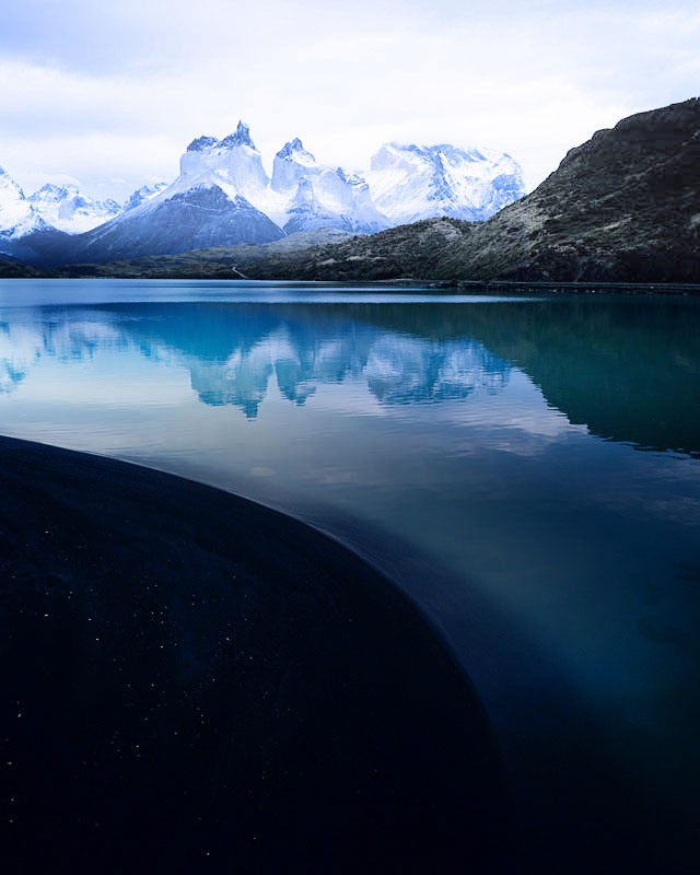
What I like most about this years work, is that I made photographs of lesser, iconic views. I've never shot Lago Pehoe before without the Cuernos mountain range in the background. The mountain range always seems to dominate my view of the place. It's therefore unusual for me to make more abstract or intimate compositions.

Lago Pehoe, Torres del Paine National Park, Chilean PatagoniaImage © Bruce Percy 2016

Lago Pehoe, Torres del Paine National Park, Chilean Patagonia
Image © Bruce Percy 2016

At Lago Sarmiento we had no view of the Paine massif, and this was very freeing. I felt I could concentrate more on the shore and the rock formations there. Sometimes the Paine massive is just too magnetic. It can over dominate the scene.

Rio Serrano Forest, Torres del Paine National Park, Chilean PatagoniaImage © Bruce Percy 2016

Rio Serrano Forest, Torres del Paine National Park, Chilean Patagonia
Image © Bruce Percy 2016

Colour Proofing.......

Today I'm colour proofing...... But I have to calibrate my monitor first, to ensure that what I see on it, is a close representation of what's actually in the files.....

Most people choose 'native white point', but that may result in the monitor being too cool in tone. The only way to confirm your monitor is calibrated, is to compare it against an icc profile verification print - essentially a  file that has been accurately measured and is guaranteed to be close to the file it was created from. I put this file under a daylight viewing booth (as shown below) and compare it with the source file it was printed from, with proofing switched on in Photoshop. If the 'perception' is that they are similar, then I've got the monitor calibrated & profiled well.

For essential colour accuracy, one must use a daylight viewing booth to confirm the profiling of your monitor. If the print target does not match the monitor - then the calibration / profiling is off. You also need to have a torch and an Icelandic P…

For essential colour accuracy, one must use a daylight viewing booth to confirm the profiling of your monitor. If the print target does not match the monitor - then the calibration / profiling is off. You also need to have a torch and an Icelandic Puffin in your studio too :-)

On a side note - daylight viewing booths such as the one I use from GTI have a colour temperature of 5000k. But there's more to it than just assuming that if the viewing booth is 5000K, then my monitor should be set to the same colour temperature. This won't work. GIT have an article that explains what 5000K actually means if you really need to know this stuff, but for most purposes, you'll find a 5000K viewing booth will be comparable to a monitor running at a temperature much higher than 5000k. (If you put your monitor down to 5000K - it will go seriously yellow and it definitely won't match your viewing booth at all).

For me, the most critical aspect is the neutrality of the black and white tones. In the  icc profile verification print you see above, there is a monochrome section in the top left of the file. If I have the monitor white point set too high, the monochrome picture may appear too cold (it should theoretically go blue but some monitors don't - see below for more on this). Conversely,  If you have the white point set too low, then the monochrome area will look too warm on the monitor. By fine tuning the white point of my monitor (through the calibration software I use) I can get my monitor closer to what I see on the print. This is an iterative step that I do until I find the right white point.

Lastly, as mentioned above, it's easy to assume that computer monitors should become bluer (cooler) as their white point is increased. This isn't always the case. Some monitors may go either green or magenta when their colour temperature is turned up too high, I find that my Eizo goes a little green.  Apparently setting the white point only alters the blue to yellow colour axis and not the green to magenta tint.

So If you do find your monitor is going a little green or magenta, then you may have to compromise and stick to the native white point. I would suggest however that you experiment.  For me, I found moving my monitor down to just below 6000K seemed to work nicely but your findings may differ.

My musical past

I've had two creative lives. The first one was a musical one which started when I was twelve years old. I lived and breathed music - writing it, playing it, recording and producing it until I got to around 29 years old.

Back in the mid-90's, I was in a Scottish band called 'The Indian Givers' with my friend Nigel Sleaford (whom you can hear singing on the song that I've embedded into this post). Nigel had just been dropped by Virgin Records whom he had been signed to for a few years. He had released one album as The Indian Givers and had thought he was set up for doing a second album when Virgin were bought by EMI and they dropped most of the non-major artists on their rosta. 

For those of you who know a bit about some of the lesser known Scottish bands at the time, I was a friend of Gordon Kerr's - he was in a band called Botany 5 whom had some success in the early 90's. Gordon put me in touch with Nigel when I was looking to work with a singer. Nigel at this point, had been dropped by Virgin. Up until we worked on this track, I had just been putting together instrumentals and was keen to find a vocalist to work with.

The song you can listen to above, is from an album of twelve tracks we recorded over 4 years in my living room. It's very 90's now :-) 

All the sound production and mixing  was done by myself on a really horrible cheap / nasty mixer. So it's really a 'demo' and I'd hoped that if we got to record it properly sometime, we might have used a real string section for it, rather than samples. Everything on the track was either sampler or synth.

For the music nerds reading this post: I did have some very nice Synth's at my disposal (Prophet 5, Studio Electronics ATC-1, Wavestation, TX816, Roland S-750 Sampler, Waldorf Microwave, Waldorf Wave, SCI Pro-One) and a Mac computer with an Audiomedia card running on it (for the vocals). Plus a lot of outboard effects units. I was still learning about audio production at the time.

I find that looking back at this period in my life a bitter sweet one. We had been offered a publishing deal at the time but it never really got off the ground. I almost got offered a job working for a film studio doing sound design, but that never really happened either. After working on music for so long and feeling that nothing was coming of it, I hit burn out. 

I had a hiatus of around 4 years where I couldn't face writing music any longer and where I had no other creative outlet. I think I needed the break, but looking back - it was an empty time for me. I really need to be creative.

My second creative life - that of Photography - really started around the year 2000 when I was around 33 years old. I've never had any real direction in what I've been doing with the photography side - it just seems to have blossomed over the years into something that I could actually do full time. I'm extremely grateful for this, because I always felt I should be a 'creative person' in some form or other.

But one thing I've learned over the years is this: you need to look after your creativity. Nurture it. Don't abuse it, don't be overly critical of yourself, and above all else: remember to enjoy it. I beat myself up so much about my music that I stopped enjoying it. I also took it far too seriously. I wish I hadn't.  

At the moment, I'm just grateful to have found a second creative outlet and that this one has been much kinder to me.  I hope I can continue to be creative for many years to come :-)

I feel very philosophical about my musical past: it's mine, I own it. I also feel that everything we do is a stepping stone. I know for sure, that I needed to go through the process of working on music for so long, in order for me to be doing what I do now. We are after all, products of our accumulated experiences. 


Shedding Old-Skin

"We need space in our creative endeavours,
just as much as we need space in our photographs"

Often, I feel too much emphasis is placed upon the creation of work. But I think as artists, our non-creative time is just as important. We need to understand and most importantly, respect that periods of inactivity are just as healthy as periods of activity are. They give us a much needed pause in our creative lives to reflect and grow.

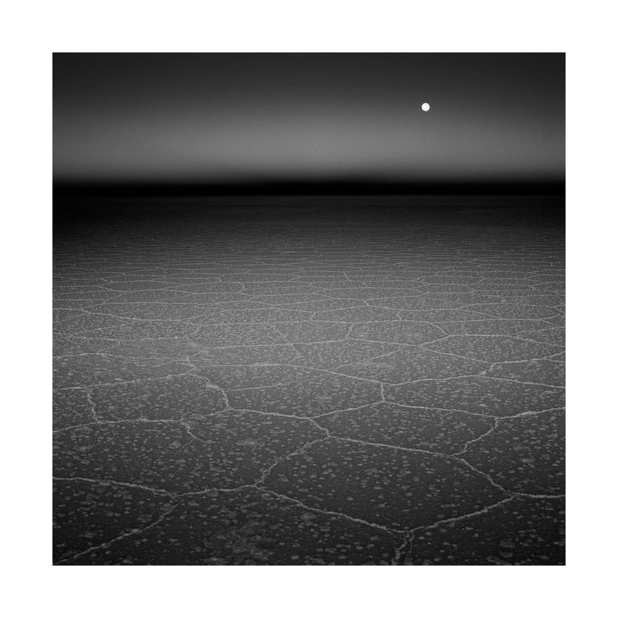
Moonfall, Salar de Uyuni, Bolivia. Image © Bruce Percy

Moonfall, Salar de Uyuni, Bolivia. Image © Bruce Percy

Creative drought is often viewed upon negatively. There is a fear that since we cannot find any inspiration to create, or cannot create at will, that perhaps the creative well is dry for good. Our thoughts go along the lines os 'I shall never be able to create anything ever again!'

I think we should look more positively at these periods of inactivity and recognise that as with any creative endeavour, there is always going to be an ebb and flow to what we do. A yin and yang. To create, we must have periods where we do not.

I see these moments of inactivity as a rest, a pause in the music of our creativity. But there is more than just this, I've often found these periods to be the precursor to some new growth in my artistry.  What I had thought may be the dwindling of my creative force, turned out to be the beginning of a new direction, or the reinforcement of a style in my work. The shedding of old skin.

If you are currently experiencing some creative drought - a bare patch in your creativity, I would suggest you accept it and let it ride itself out. Take your foot of the gas and wait.

Just as when we have a pressing issue that we do not have the answer to, I've often found that given some time away from it, the answer will come. As my dad has often said to me when I was trying too hard to get something to work: "best give it a rest for a while and when you do come back to it, you'll see it in a new light".

Human eye response

I find it very interesting that it's completely impossible for us as a species, to see true dynamic range. We don't actually see the world the way it really is - our eyes compress luminosity so that everything in the upper regions all looks the same:

The human eye compresses luminosity. In other words, we are unable to see true dynamic range. It is a physical impossibility. Digital cameras can however see the true dynamic range. Even so, just because they can, does not mean they render images th…

The human eye compresses luminosity. In other words, we are unable to see true dynamic range. It is a physical impossibility. Digital cameras can however see the true dynamic range. Even so, just because they can, does not mean they render images the way we see them. We need to use grads to do that.

We are in fact, all blind to true luminosity in the real world. Whereas digital cameras aren't: they are able to see that the sky is 4 stops brighter than the ground. But just because they can see it - it doesn’t mean digital cameras are giving us what we want. It just means that digital cameras don’t see the way we see. And that’s the important bit.

We tend to view everything we look at, as a mid-exposure. When I look at the sky, in my mind I see a mid-exposure of it. And when I look at the ground, I see a mid-exposure of it also. As my eye scans around, I build up an internal representation of the world - a collage or collection of mid-exposures.

This is why I don't agree with the concept that 'if a scene can fit inside the entire histogram, then we don't need grads'. This belief, lacks understanding of what it is we are trying to do with grads in the first place and also what a histogram represents.

Image shot without a grad. Sky is overexposed while ground is underexposed. Although it is contained within the histogram, and is a true representation of what is there, it does not match how the eye perceives the scene (the human eye compresse…

Image shot without a grad. Sky is overexposed while ground is underexposed. Although it is contained within the histogram, and is a true representation of what is there, it does not match how the eye perceives the scene (the human eye compresses dynamic range whereas digital cameras do not),

With a grad in place, the dynamic range of the scene is reduced - but not only that - the ground values move towards the mid-tone area (right) of the histogram, while the sky tones move towards the left (mid-tone) area of the histogram. Giving an im…

With a grad in place, the dynamic range of the scene is reduced - but not only that - the ground values move towards the mid-tone area (right) of the histogram, while the sky tones move towards the left (mid-tone) area of the histogram. Giving an image that is closer to how our eye sees.

In the images above, the left-hand one is an example of what happens when I don't use grads. The image may well 'fit into the histogram', but the ground is underexposed and the sky is overexposed:

The left-hand side of the histogram represents dark tones while the right-hand side represents bright tones. I now have a muddy underexposed ground (left-hand side of the histogram) and overexposed sky (right-hand side of the histogram).

So everything fits, but the image sucks.

And the thing about histograms is: Just because you have the space - it doesn't mean you have to fill it. 

The problem is, my eye doesn't see the ground as a dark area, nor the sky as a bright area. My eye tends to perceive them both as similar to each other and as a mid-tone. So if I wanted my histogram to represent what I saw, I would expect to see a 'single humper' histogram like this one:

One where the ground is a mid-tone and the sky is a mid-tone too. In effect, the ground and sky would share the same area of the histogram. 

And that's where grads come in, because they do this for us. They not only push the sky from the right side of the histogram to the middle tone, they also move the ground from the left side of the histogram towards the middle tone. Yep, grads not only darken the sky - they also brighten the ground because they reduce the dynamic range or width of the histogram. Since your camera is always aiming for an 18% mid-tone, everything moves towards the middle: sky goes left and ground goes right.

Again: just because you have the space - it doesn't mean you have to fill it :-)

If you do choose to use grads, there are a couple of benefits to using them:

1) You will have more space in the left-hand side for more shadow tonal information. When you don't use grads and squeeze everything into the histogram you push the ground to the left - and underexpose it. And when underexposing - you tend to compress (or quantise) different lower tones into fewer tones. Twenty discreet tones are summed into one or two tones. However, If you use grads, you open up the shadows by moving the ground towards the middle area of the histogram and this compression becomes less of an issue.

2) Conversely, the same is true for the sky. You have more space on the right for more tonal gradations and you record more tonal graduations. If you didn't use grads - many of the brighter tones are squeezed together or quantised - several tones become one in an attempt to fit it all into the dynamic range of the camera.

3) If you use grads the RAW image doesn't suck so much to look at.

Point 3 is perhaps the most important one for me. If we put all the science to one side, I'd much rather come home with something that already looks inspiring to work with.  A more balanced exposure through the use of grads will do that for me.  I wish to be engaged when I review the RAW files,   I don't wish to have to think about jumping through some additional hoops before I can figure out if there is anything of value there. If I don't use grads, I may let a few images fall between the cracks if I have to do additional processing before I can visualise if the image holds promise.

So for me, coming home with a more pleasing balanced image that requires less work to see if there is potential, is the most important aspect for using grads.

But that's just me. Which of the two images above would you choose to come home with?

The restless come down

"When I'm at home, I long to be away on my travels with my camera
and when I'm away, I sometimes long to be at home"

I'm just home from a month traveling in South America. It is something I do annually and I dearly love returning to Patagonia and Bolivia. Like most of the landscapes I have become acquainted with over the years, they have become a home from home for me. I dearly love them and would be very sad indeed if I could not return as frequently as I do. I fully appreciate that as part of my job, it is a real luxury to go to Patagonia and Bolivia each year, when these destinations are perhaps at most a once in a life-time experience for many.

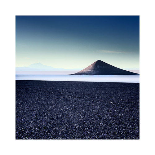
Cono de Arita, Argentina Altiplano, Image © Bruce Percy 2015

Cono de Arita, Argentina Altiplano, Image © Bruce Percy 2015

I've been back home for a week, and I've found it very hard re-adjusting. Years ago, the adjustment was just as hard, but in a different way. Traveling abroad would be a real luxury for me - a once a year endeavour and escape from my (at the time) IT job. I fully see and understand the parallels for my dear clients - many of whom have become good friends. I understand their excitement on coming with me to Patagonia or Bolivia.

But for me now, the re-adjustment is different. I do so much traveling, and spend so much time with groups of enthusiastic photographers, where the chat and banter are so much fun, that it's often very hard to come back to my home town and settle back in to a routine. I noticed last year for instance, that after being home for two weeks, I was hatching plans to buy a plane ticket and head off..... I'm glad to say that I resisted the temptation and went 'cold-turkey' for a month.

It was only then that I really started to enjoy being home. The same bed each nice (bliss!), the same kettle, I didn't have to pay a fortune each time I wanted a cup of tea or coffee. I had full privacy, and the surprising thing of all - I delighted in the familiar.

It took me a while to realise, that due to the amount of traveling I was doing, I was becoming 'institutionalised'. The travel, the landscapes, the places I love to go to, were becoming more of a home for me, than my real home was.

So this year, I opted to go 'cold-turkey' for three months. To stay at home and just enjoy the familiarity of my surroundings. Well, I'm one week in so far, and I'm already feeling that sense of restlessness that seems to pervade my thoughts. But I know I'll get through it, and before I know it, I will be psychologically ramping up for going away on my travels during the autumn and winter.

It's a schizophrenic life I lead, and I think it's not dissimilar to many others who have a love of landscape photography.

The thing is, I recognise that I'm not alone. Most of us who have a passion for the landscape, have a desire to break free from the 9-5 job, or to be more connected with the world in some way.

Watching the clouds roll over a landscape, or watching the tide wash against a coastline is as primeval an instinct as staring at a fire is. It seems to be something deep within some of us, that we simply just want to be as connected with the world and our environment as we can be.

It's a restlessness of some kind, and I think it's just the way it is: we can't control the urge or the impulse, and because we can't, we never really know exactly where we want to be.

Perhaps it's just a yearning for a sense of balance that we're really searching for? 

We are inquisitive by nature: I would put it to you that all landscape photographers are seeking to know more, to feel more connected, to feel more alive, and one way to do that, is to go searching, traveling, seeking.

With that inquisitiveness has to come a sense of restlessness. And with that restlessness comes a need for some kind of balance between routine and adventure.

Grad Filters - soft graduations or hard graduations?

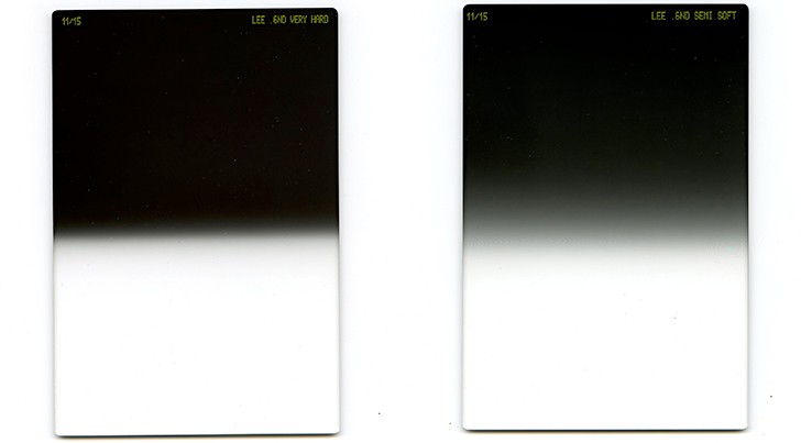
Lee filters introduce two new graduations of ND filter

In April,  Lee-Filters announced two new graduation sets to their ND product range. Up until now, you had the choice of either soft-graduation or hard-graduation ND filters. Now you have two further choices - very-hard-graduation and also medium-graduation filters.

Lee filters have just introduced a new 'very-hard' and also a new 'medium' graduation filter set to their existing line of soft and hard ND-grad sets.

Lee filters have just introduced a new 'very-hard' and also a new 'medium' graduation filter set to their existing line of soft and hard ND-grad sets.

I currently own the 1, 2 & 3 stop versions of both soft and hard-grad filters. They are useful in many different ways. But with the news of the newer graduation types, I think my filter set is going to change.

Soft or Hard, which should you choose?

Each year when I send out my trip notes for the workshops I'm running, I ask everyone to buy the hard-graduation filters. Despite some participants reluctance to get the hard-grads because they think the graduation may be too obvious (it's not) in the picture, I find the existing Lee hard-grads just about right for most applications.

The reason is that Hard grads are actually quite diffused once they are put up so close to the front of the lens. They give enough bite to change the picture, and do so without being too obvious where their placement is. They are perfect for when you just want to grad the sky only.

Soft grads on the other hand are too soft for just grading the sky - their bite doesn't cut in as much as I'd like. But I do find that Soft-grads have other uses: they are ideal for instances when there is a gradual change from the bottom of the frame to the top. Instances like lakes where the water is extremely dark at the bottom of the frame and it gets brighter towards the horizon. Using soft grads across the middle of the water help control that.

So in general: hard grads are for controlling the sky when there is a sudden shift between ground and sky. Soft grads are useful for scenes where the entire scene changes gradually as you move up the frame.

Grad Placement may not be so critical, and here's why

It really depends on the focal length. Smaller focal-lengths provide a sharper rendering of the graduation whereas larger focal-lengths diffuse the graduation, making hard-grads softer.

If you zoom out - the graduation becomes more defined. And as you zoom in, the graduation becomes more diffused. With a hard-grad it means it's a hard-grad at 24mm but it starts to act more like a soft-grad when used at 75mm. Soft grads are soft at 24m but they become far too soft once you get up to and beyond 75mm.

I illustrate this below. Using the same hard-grad, I zoom in from 24mm to 150mm. As I do so, the graduation becomes softer. I am essentially zooming into the graduation:

Using the same hard-grad, as I go up the focal lengths from 24mm to 150mm, the graduation becomes more diffused. My hard-grad essentially becomes a soft-grad at 150mm.

Using the same hard-grad, as I go up the focal lengths from 24mm to 150mm, the graduation becomes more diffused. My hard-grad essentially becomes a soft-grad at 150mm.

I have a medium-format rangefinder system. I can't see through the lens, but I've never had a problem with placing the hard-grads, and it's all because of a combination of them being so diffused so close to the lens, and the higher focal lengths. My wide angle is a 50mm for example.

Which Graduations should I choose, and why?

Your choice of camera format will also determine how your grads will behave.  Smaller-formats user smaller focal lengths, while larger formats use larger focal lengths for the same angle of view. For example, a 24mm lens in 35mm format has the same angle of view as a 50mm does in medium-format. But the same grad used on a 24mm will be more defined than if it were used on a 50mm, even though both lenses give the same angle of view.

In the graph below, I show the equivalent focal lengths for the 'same angle of view' as you go up the formats from MFT (Micro-Four-Thirds) to Large format. You can see that the focal lengths get longer and longer. This means that your soft-grad filter will become softer and softer as you move up the formats.

As you go up the formats, the focal lengths get longer for the same angle of view. This also means that any hard-grads you buy become softer as you move up for camera formats. Or harder as you go down the formats.

As you go up the formats, the focal lengths get longer for the same angle of view. This also means that any hard-grads you buy become softer as you move up for camera formats. Or harder as you go down the formats.

So it's not just a simple case of choosing soft grads over hard ones, because you think they will be less noticeable in the final image. You also have to take into account the focal lengths you're using.

In my own case, I use Medium Format cameras, and I mostly use hard-grads because they give me the right amount of graduation across the frame for the focal lengths I mostly use (50 and 80). When I use the hard-grads with the 50mm, the placement isn't so critical as there's a degree of diffusion there already, but the filter still bites into the image enough to make hard-grads a viable choice. When I use soft-grads though, they tend to be too diffused for the focal lengths I use. 

Which of the new range will I be tempted to get?

Since I'm a medium format shooter, I'm tempted to replace most of my soft-grads with the new medium grads. The medium-grads will give me what I am looking for (but not getting) from my soft-grads.

I will remain using the standard hard-grads, as they are perfect for my wide and standard lenses, but I am interested in buying some very-hard-grads for use with my telephoto lenses. As explained, when you get up to such high focal-lengths, hard-grads become less and less effective.

Using different types of graduation is a key component to good exposures. I've found for many years that I could do with some graduation filters that are somewhere between the old hard-grad and soft-grad sets, and there is also cause to have very-hard grads for use when using higher focal lengths. So for me, I will be buying some of the medium-grads and very-hard grads to compliment my ever-growing set of ND filters.