No sitting on the fence

I've made some headway with my new e-book and I hope to have it published in a month or two from now.

This is really part 2 of of my tonal adjustment series.

Part one ' Tonal Relationships' was 'software agnostic'; I deliberately left out any 'how to' in the text and focussed more on the 'why' because image editing is an interpretive process where understanding tones and relationships is more important than figuring out which slider to adjust. Indeed the technical is something anyone can master, but the artistic interpretive side is a life-long artistic endeavour tied in with improving one's own visual awareness. Being able to 'see' what is in the image is paramount in achieving the most from your edits.

But there does need to be some kind of technical instruction if one wants to push things as far as they can. In my forthcoming new e-Book 'Photoshop Curves', I now take a look at the technical: in particular, I take you through the most powerful tonal editing tool available: Photoshop Curves.

Forthcoming e-book about Photoshop's Curves tool. The Curves tool is, in my view, the most powerful tool for tonal adjustment available.

Forthcoming e-book about Photoshop's Curves tool. The Curves tool is, in my view, the most powerful tool for tonal adjustment available.

I know this will be highly contentious to many: but it is my view that Lightroom does not offer the fine degree of tonal adjustment / control required (at the time of writing) that Photoshop's Curve tool offers.

Lightroom is a good editing tool. It is intuitive and offers most of what we need. At present though, the tonal adjustment side of it isn't as powerful as it could be. I know many love Lightroom and feel it is all they need for photo editing, but to me, it's a bit like saying 'I'm happy with what I know, even though there may something out there that can offer a whole lot more'. If you're serious about improving your photographic editing, and thus upping your photographic style, you need to get to grips with Photoshop and in particular its curves tool. That is where all your future growth as an editor lies. Believe me.

But I realise that Photoshop isn't an easy program to learn. It isn't intuitive and this may be a reason why you will choose not to learn Photoshop. However, this point shouldn't stop you if you are faced with the knowledge of what it can provide you with in terms of tonal adjustment. There is nothing better out there.

Over the past few years that I've been running my Digital Darkroom workshop, many participants who start the course as Lightroom users often end the course wishing to defect from Lightroom to Photoshop once they have seen what I can do with the curves tool. Even with seasoned Photoshop users I still find room for improvement in their knowledge of curves and how to utilise it to really tune individual tones.

So with this in mind, I have decided to write specifically about curves. It really is the most powerful tool available to image editors.

I appreciate and anticipate that my point of view will be highly contentious to many, but since my blog is all about my point of view, that's what I'm giving you, after all, you didn't come here to hear me sit on the fence, now did you?   ;-)

Progress Isn't linear

I have to confess I've been having difficulty writing something on this blog for the past few months. After almost a decade of writing a frequent blog, things become harder to cover as the risk of repeating oneself becomes higher. I don't like to write on my blog unless I really have something to say. 

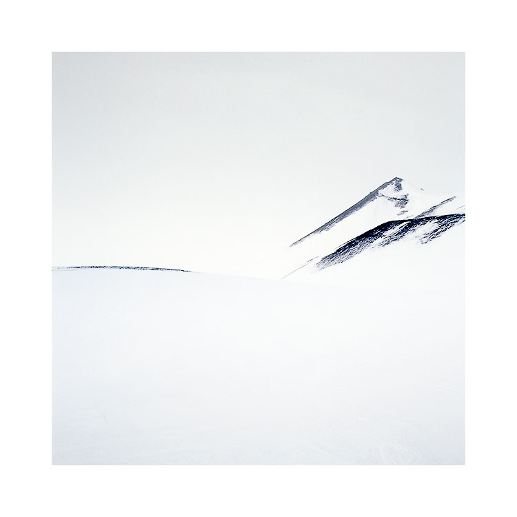
Each year I have been very lucky to surprise myself. I never envisaged this shot before the trip to the central highlands: it just landed in my lap.

Each year I have been very lucky to surprise myself. I never envisaged this shot before the trip to the central highlands: it just landed in my lap.

Right now, I feel I am at a cross roads with my photography. There has been so much progress and development for me over the past decade. I've been fortunate to find certain landscapes that resonated for me and have been instrumental in helping me grow (or perhaps grow up) as a photographer: the Bolivian altiplano was the beginning of my style development, and has over the years taught me so much about simplification. I know know that when I thought there was nothing there but just negative space, gradual shifts in tone were still present. I learned to look again and to work with the less obvious, subtle shifts in light.

Over the years that I've been continuing to develop as a photographer, my choice of colour palette has become more muted (when appropriate). This too, was an instructive lesson, given to me by the stark landscapes of Iceland and Patagonia. I've learned that not everything works in soft warm colours and that I can also celebrate the more stark aspects of the landscape.

In essence:  the landscapes that  I have been drawn to have had another purpose beyond just being an aesthetic choice: they have been my teachers and I am now a very different person from the one who started this blog almost 10 years ago.

But progress isn't linear.

I have had to learn to work-through lean times. I've had periods of stagnation, where I felt I had perhaps reached the end of the tracks in how far I could go with my own development, only to find a few years later that my photography was taking a turn for the better. Either it was progress - a strengthening of already learned ideas and techniques, or it was a shift - a change in direction, or a change in tastes. Perhaps I found I had grown tired of the old ways and was now interested in a new way of seeing.

I have learned that I can't force progress. Forcing anything never works for anyone. All I know is that I just have to be open and wait for the cues for taking that further step forward.

We are the products of our experiences and memories. We are all defined by what we've learned and what we've seen and our experiences become part of us.

This is no different from our photography: our photographs are the culmination of our experiences that we amass over time, so in that way, our own progress is bound to slow: we start to haul around a lot of history with us.

My journey has taken me to this point. Last year I created perhaps one of my most minimalist images to date.

My journey has taken me to this point. Last year I created perhaps one of my most minimalist images to date.

A photographic life should be full of wonder. We need to keep surprising ourselves, of shedding old skin and evolving. I know so far that I've been lucky for this to happen for me at different times over the years.

I'm aware also, that in recent years my photographs have become less focussed on the iconic landscape, less saturated, and to me at least, there is more of a thematic side to them brought about by tonal responses. I know I still have a long way to go, but just sometimes I'm not sure what the path up ahead is taking me, and I need to be patient and let it come when it's ready.

Have soul & be authentic

It's a new year, and I feel it's a new beginning. We are always beginning though, aren't we?

If I were to give advice to those who are just beginning in photography, or perhaps those who have been doing it for a while but feel they need some guidance, I would say the following:

Kitami, Tanno 2.jpg

"If you want to be a good photographer, then just focus on being as authentic as you can be. Connect with who you are, and let things flow naturally.

You can read all the photo-magazines in the world, read all the websites about technique, download all the photo-plug-in's and buy the latest gear. But all of it will be meaningless if you don't have soul for what you do.

Focus on yourself, not the gear. Focus on your aspirations and what you feel inside when you make photos that matter to you. Everything else is irrelevant.

Don't give a damn what others think, and don't seek compliments from others. Trust yourself and your gut, you know when something is right or wrong. Listen to how you feel inside and trust your intuition.

Above all else, have soul, and be authentic. Authenticity is your calling card to the rest of the world. It is your way of telling others who you are and what you stand for. If you can be authentic, then you can't go wrong".

Happy new year!

Inspiration through animation

One of the things I really enjoy, and get a lot of inspiration from is beautiful cinematography. I think I have become a bit of a film-fanatic of recent years.

I like to seek out films that are beautiful to look at (and have a good story of course) and The Red Turtle by Studio GHIBLI is one such movie.

As a photographer, I'm attracted to the tones in the scenery I shoot, and the movements of the sky and sea. This movie has a very beautiful look to the skies in particular: they seem to have lots of moving grain, as if it was captured on film, or perhaps the look is to simulate the use of pencil?Whatever the reason for the aesthetic, I found it such an engagingly beautiful looking movie.  The story was also excellent.

I've been thinking lately, that I very seldom get inspired by looking on the web at photographs now. We are living in an age of photography-overload. I don't like to treat photography as something to be consumed, or flicked through, instead I wish to be immersed, engaged. This is so hard to do when there is so much work out there.

But watching a beautifully animated movie for a few hours forces me to slow down, to get immersed. It is a medium that can't be consumed lightly.

The Red Turtle reminds me why I take pictures. I wish to be captivated, drawn into another world and engaged. I've often thought that if I can feel that way about my own work, then hopefully I can make others feel that way about what I do also.

Norilsk - deadly beautiful

The most northerly town within the arctic circle, Norilsk is home to the world's largest heavy metal smelting complex, where more than 4 million tons of cadmium, copper, lead, nickel, arsenic, selenium and zinc are released into the air every year.

The British newspaper The Guardian ran a piece about this town where a river was found to run red due to a leak from the Nickel plant.

I just watched this short movie about this city and I had two conflicting feelings about it. On the one hand I thought the city to be quite atmospheric and so I would be interested in going there to make photos, but on the other hand the level of pollution there made me think better of it.

It's an insightful documentary about the life of the people there. What I like about this documentary is it feels as if there is no agenda to the story telling. They are not trying to tell you how bad it is here, or what we can do about it: instead it gives us an insight into the lives of some of the people here. You are left to form your own opinion and I didn't feel as if the director was trying to sway me either way.

Still, from a photographer's point of view, there is beauty or at least a photogenic aspect to a polluted place and Norilsk has a visual story to share with us.

Being a curator of one's own work

"Twelve significant photographs in any one year is a good crop."
- Ansel Adams

Nothing is more convincing about the quality of a piece of work, than the test of time.

It's something I always think about when I finish working on a set of new images. 'Wouldn't it be great if I'm still happy with these images in many years to come', is something I always wonder. And each year as I move forward through life I find that I change, and my impressions of what I have created also change.

Isle of Harris.Image was shot in 2014. I'm still very pleased with this image, yet it is now three years old. I wonder, will I still feel this image is relevant for me in a decade's time? Does it have staying power for me?

Isle of Harris.
Image was shot in 2014. I'm still very pleased with this image, yet it is now three years old. I wonder, will I still feel this image is relevant for me in a decade's time? Does it have staying power for me?

Ansel Adams is quoted as saying "Twelve significant photographs in any one year is a good crop.". But even with those 12 images, there may have one or two that would become part of your canon: work that you would still be proud of in years to come.

It should be something we all aspire to.

Going out there to make images is only really one tiny part of being a photographer. We also have to curate our work. Curation is all about raising you family of images to be the best they can be. It is an on-going process of returning to your older work to review and select, to help those older images live with your newer work. Our older work isn't static, unchanging. We change towards it and as we do, we must also reflect and review and understand its place in our present. I've found that it is hard to gauge my work until a few years has passed, because it is only then that I see one or two images that seem to stand the test of time, and stand out over everything else I have shot.

I think as time goes on for me, as I am getting older, I am now starting to think of what I do as a record of who I was at a certain time. I now understand that some of them have more staying power than others and some have become really important to me as time has passed.

We should all be curators of our own work. We are responsible for collating, documenting, and organising our past so that it can sit alongside our most recent work. We have to tend our garden well and look after not just the new buds, but also the established ones as well.

Mediocrity awaits on Social Media

I read this interesting article about Spotify this week. It was not news for me: if I were to sum up the article it more or less says that creativity is being stifled by the need to create playlists that garner the most listens. It seems that Spotify are looking for playlists that are easy to consume, and will attract the most listens.

If you are a musician that has something unique to offer, you're more than likely going to get burried because only the popular, the music that appeals to the wider demographic will survive.

Fjallabak-(8)-b.jpg

It reminded me why I left Facebook and have not signed up for Instagram. The basic fault of these social media sites as I see it, is that diversity does not survive on them well. The conventional, expected kind of work that a majority will appreciate (and therefore probably isn't pushing any boundaries) is what does well on these sites. That is not to say it's awful work. My point is that diversity does not survive on these platforms when everything is judged by the same mechanism: popularity of like counts.

I left Facebook because I didn't want my art to be measured. Art shouldn't be measured. Like-counts just boil things down to value. Art is subjective, it is there to be interpreted by anyone and enjoyed in whichever way the viewer chooses to do so. To be told that one image got more likes than another is meaningless.

As far as I can see it, many social media platforms encourage conformity. Because in order to get the highest like count or highest viewings, you need to appeal to the middle-road. Do anything that's a little unconventional and you'll be buried.

So over two years ago I chose to leave Facebook. Twitter is another matter right now, as I feel that Twitter is there to encourage the dissemination of information. Short tweets encourage you to look at linked articles out in the web, whereas Facebook does not. It encourages you to stay in the realm of the Facebook bosom, and to consume what they want you to see.

So I left for these reasons: I'd much rather be an independent source. I like having all my eggs in my own basket, rather than give them to some faceless platform that doesn't care about what I'm doing, and will spit me out sooner than I can say 'boo'. I'd much rather foster my own content, build upon it, and own it. Which is what I do on my own website and blog. I wish to cultivate a place where people who 'get me' come to visit, where I don't feel I need to have to try to shout louder than others by offering what I think I they wan't in order to get others to listen. 

I don't see most social-media sites offering a way to be authentic in what you do. The ultimate result is always going to be to compete against others for views and traffic, and if you start thinking about what you can do to get others to like you : then you are lost.

It's such a soul-destroying experience to be on a platform where you are at the mercy of who they choose to let see your work. If you don't already know this, Facebook does not let your audience see what you do unless you pay them. It's social-media-discrimination. It's not social. It's the complete opposite. Yep, I had 4,000 people following me and each time I posted something I was lucky if 30% of them saw it. It's because I had to pay to reach the people who had asked to be notified about what I do. And when I did try an experiment to see what happened when I did pay, I started to reach people who's profiles showed little or zero interest in photography. In other words Facebook's algorithms are screwed. So badly screwed that almost nothing is true. In order to make me feel that I had to keep paying for reach, they offered me what I am convinced were fake likes. I doubt I was really reaching any of my original audience because they always wanted to keep them just out of reach.... just so that I would feel I need to keep paying. I never did it. I left instead.

Since I left over two years ago, I have not seen any decline in my business. I never saw any drop in web-traffic (because any posts I did put up on Facebook with a link back to my website or the original article were penalised and therefore not seen by my audience). Instead, I trusted in those who are genuinely interested in what I do. The really interested come directly to this blog or to my newsletter.

Facebook is not social media - in my view, it's blackmail. They are exploiting your hopes of reaching others and instead have set up a medium where you will have to continue to pay in the hope that you might reach those that expressed interest in what you do. It is also a place where the things that will reach bigger audiences are things that most people will already like or accept. Being different or having some kind of unique quality about what you do won't get picked up by large traffics of people. It encourages mediocrity because the easy to digest is what will survive the best on there. That's why I left Facebook. And I won't be back.

Photoshop's Curve tool Primer

Input-output-graph.jpg

Photoshop's Curve tool is no mystery to me, and if you are a frequent user of Photoshop then it shouldn't be to you either. That being said, I have found over the time I have been running my Digital-Darkroom workshop that many participants have a very basic understanding of the tool. Indeed, due to the non-intuitive nature of Photoshop I find that most think that the Curve tool is a mysterious thing.

The Curve tool is really a tone re-plotting tool. You can transpose a range of tones to being another range of tones by way of an input/output graph. The X axis (highlighted in green) conveys what the tone is before the transposition while the Y axis (highlighted in red) conveys what the tone will become.

In the curve example here, you can see that the anchor point in the middle of the graph is transposing mid-tones to upper-mid tones. In fact, any tone that is of value 128 (black = 0, white = 256) will be transposed to an upper tone of 192.

The curve (as the name suggests) is non-linear: meaning that although I have transposed tones in the middle region, I have altered tones elsewhere but to a lesser degree. More specifically, tones near the anchor point in the middle of the graph are transposed the most, while tones towards the black and white points (far left, far right) are transposed the least. This is illustrated by the blue area underneath the curve: the diagonal line in the graph is the 'no-change' waterline and the further away the curve moves from it, the larger the tonal-transposition. Where the wedge is thickest we get the most alteration in tone, and where the wedge is the thinnest we get the least change in tone. But ultimately tones throughout the entire image are being altered.

The Curve tool is really quite simple. It's just that we expect it to be quite difficult because it looks complicated.

Music for Image Editing

I can't edit in silence. The silence is too deafening and distracting.

It is simply too quiet for me to work as there is some part of my brain that needs to be kept occupied while the image-editing part works.

Steve Reich's 'Music for Mallets, Instruments, Voices and Organ' is a cyclical piece that I often use when editing my work.

I have found over time that certain kinds of music, but not all, can be used to occupy the part of my mind that needs to be kept busy while the rest of me works on my images.

In general, for me I've found that the best editing music is either cynical - full of repeating patterns, or has a wash like structure to it of long notes held over long periods. I believe it is the structure of the music that is the most important element for it to work as a background. Somehow the structure of repeating patterns and long washes of notes lend a hypnotic effect which allows my mind to zone out of the present moment and into the world that my images reside in.

It's also vital that the music does not demand too much of my attention - so highly dynamic music (going from quiet to loud) doesn't work. Any music I use has to have some form of trance ability to it, or for it to act as a form of 'audio-wallpaper'.

Steve Reich's 'Music for Mallets, Instruments, Voices and Organ', lends a certain quality of 'wallpaper' about it. It is a cyclical piece that is consistent in dynamics, with enough gradual variations over time to keep my background mind occupied. It provides enough of a 'trance' like effect to help bring my mind under a spell as I am brought out of my current existence and transported into a place where I can allow my mind to focus on the process of editing my work.

Environment, I think, is greatly overlooked when it comes to image editing, or being creative in general, not only do I have to have the right kinds of sounds around me, but I also need to be surrounded by the right levels of lighting. Perhaps I am more tuned-in, or too sensitive to what is around me? I don't think so: I think we all need a space that is conducive to creativity, and it is something that is personal for each of us.

Long washes of sound, such as this piece of music by Stars of the Lid provide the right setting for me to work on my images.

Are you the same? Do you find that you need to create the right setting in which to work? And do you sometimes feel that you can't find the right space in which to edit? Perhaps you can't find the piece of music you need, or perhaps it's more to do with the ambient light around you or the simple fact that you need some time to yourself to work on your images?

Our environment plays a big role in how we feel while we are editing our work and music can be a big part of that space. By choosing music that is non-distracting, or has some hypnotic aspect to it, we can create a suitable space that is conducive to good editing. 

Happy music choosing.

Digital Projection

Canon XEED WUX500
Canon XEED WUX6010

I think I'm a pretty passionate guy when it comes to wanting to display my work as best as I can.  Any good photographer should care very much about obtaining the best environment and materials to show their work. It is why some of us have personal preferences for the papers we print on.

For a long while I had been looking for a digital projector that would give me the equivalent image quality as what I see on a well calibrated computer monitor. I also needed a good digital projector for my workshops as we tend to sit in a room during the afternoons for around three hours doing image reviews / critiques and also some editing approach work. I needed a good digital projector for this also.

Canon WUX500 digital projector.

Canon WUX500 digital projector.

Way back in 2007 when I started to look into digital projection I found that the Canon LCOS series of projectors were the closest one could get to the quality I was seeking. Indeed I owned a Canon Xeed XS-50 and then a Canon Xeed SX-800 in my pursuit for the best image quality I could obtain. They were pretty good but they suffered in lack of dynamic range and in particular, they couldn't really display the detail in the shadows that an LCD screen conveys.

Canon WUX6010 digital projector.

Canon WUX6010 digital projector.

Over the past month I have bought two new projectors. The Canon Xeed WUX500 and Canon Xeed WUX6010. Both have an improved contrast ratio of 2000:1 as apposed to my previous projectors which had a ratio of just 900:1. They are also much brighter sitting at 5000 and 6000 lumens respectively. They are also full HD projectors with resolutions at 1920 x 1200. The resolution is so good that I can't see the pixels at comfortable viewing distances, and indeed, I am now able to see the film grain on my images now :-) 

The WUX500 is much quieter than the 6010 and also smaller. It is my preferred choice of projector for classroom work, while the 6010 is ideal for a larger venue as it allows for custom lenses to be fitted. Whereas the WUX500 has a fixed zoom lens (ideal for small rooms to medium / large scale rooms), the 6010's standard lens is designed for longer throw distances and therefore larger spaces. The 6010 has many lenses that can be fitted from wide angle (short throw) to telephoto (very long throw and therefore very large room).

The colour reproduction of both projectors out of the box is accurate. I do not need to calibrate them. They are also capable of showing image detail in the shadows - the biggest complaint I had about Canon's older projectors. Also, I notice that highlight detail is spot on also. Years ago I would find I had to play with the gamma setting on my old projectors to try to squeeze out the subtle highlight information present in some images. Not now - the WUX500 and WUX6010 both are capable of showing every detail that I see on a good quality LCD monitor straight out of the box.

If you are on the look out for a projector that is going to give you the closest reproduction to a high quality LCD screen, with full HD capability, then I can't recommend the Canon WUX500 enough. I think this is the projector to get out of the two I've mentioned: it is quieter, smaller, and just as bright as the larger 6010. Use it on 'Photo/RGB' mode, and turn the lamp to 'Power saving'. The lamp at full-power is too bright for most classroom work, and moving it to 'Power Saving' makes it more comfortable for the eye, and has the added bonus of making the projector so quiet you don't notice it.

I love digital projection. To me, it is similar to the beauty of looking at a transparency on a light-table. There is something wonderful about using light to illuminate photographs. It makes them more alive.

I would imagine this post today will be of interest to photographic clubs or professionals that are looking for the best reproduction they can get for their images. The price point of both projectors does not allow for these to be bought for amateur use (unless you are just as nutty as I am about projected light). I hope this review will be of good use to those that are looking. 

In a nutshell: digital projection has come of age. For a long while it was always the case that a projected image never looked as good as one displayed on a good quality LCD screen. This is now not the case any more. Digital projection can offer the same quality. You just have to choose the right projector and pay more for it than you would for an LCD screen.

The Canon XEED LCOS projectors - specifically the WUXGA models (1920 x 1200 pixels) are in my opinion strongly recommended.