Working your aspect ratio muscle (re-published)

preamble - this post was published in January 2019. I am digging through my earlier posts looking for relevant articles. I have written so much in the past 15 years, and I hope / feel that these are still relevant.


I’ve been saying for many years now, that certain aspect ratios are easier to work in than others. Choosing the right aspect ratio for your own aesthetic temperament will aid you in finding compositions, whereas working with a difficult aspect ratio will hamper you. The thing is, you need to find out which aspect ratios work for you.

I’m still surprised that so many buy a digital camera and don’t consider the aspect ratio it shoots in. I have always thought that 3:2 is a particularly difficult aspect ratio to work in and choosing a less panoramic format such as 4:3, 4:5 or 6:7 would be easier to help you compose in.

Anyway, the reason why I am writing this post today is to say that by choosing different aspect ratios to work in, you force your eye to move into regions of the frame that you don’t normally visit with your eye.

If we consider the 3:2 format below, I’ve marked the region where most of us tend to spend time with our eye in black. The white areas of the frame are where we spend less or no time looking in.

area-of-most-use.3-2.portrait.jpg

I like to think of the black areas of the frame as ‘concentrated areas of experience’ with the white areas being ‘areas of little or no experience’.

If you choose to shoot in another format for a while, the different shape of the chosen aspect ratio will force your eye into areas of the frame that you wouldn’t ordinarily visit.

I found with square, my eye was visiting more of the frame, as is illustrated below

area-of-most-use.jpg
P1010941.jpg

Interestingly, I found my eye had less to travel to reach the far corners of the frame than in a 3:2 format. My ‘area of experience’ isn’t too far away from the corners of the frame.

As a result, I started to put objects at the far corners of the frame.

This isn’t something I was ever comfortable doing with 3:2 or 4:5.

After shooting square for a few years, I found that when I did return to 4:5 or 4:3, I found that all those exercises of putting things in the far corners of my square aspect ratio helped me use those corner and edge areas of the rectangle aspect ratio. As in this picture below:

4x5.jpg

Working with different aspect ratios is a good exercise to do. Move around between them too much and perhaps you won’t learn anything as I do believe you need to settled into one or two ratios for a few months if not years. But certainly it is true for me, that by moving to a different aspect ratio for a while, has changed my photography and how I compose when I have returned to an aspect ratio I used many years ago.

Your visualisation skill is like a muscle. If you don’t use it, you lose it. If you never force your eye into the corners of your frame then I think you lose the skill to visualise compositions that can produce very dynamic work.

Camera height

Preamble: this post was originally posted in January 2020. I am going through some of my older posts, as I think many, several years after writing them, are still relevant. I hope you think so too :-)


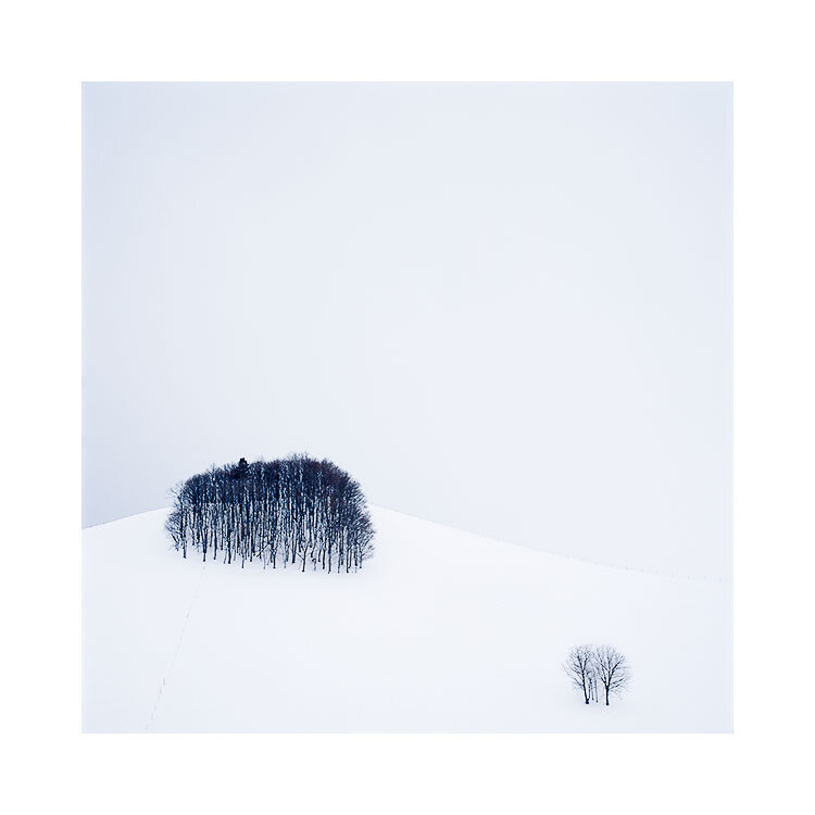
I am in Hokkaido this month and I’ve been reminiscing about some of the images I have made over the past few years here, and one in particular required me to be high above the ground to accomplish what I saw in my mind’s eye.

Hokkaido-(14).jpg

This photo was made by being perched up high. While at ground level, I could see that the collection of trees in the bottom of the frame were clashing / hitting the row of trees at the top of the frame. To get the separation between them in my photograph, I had to go this height:

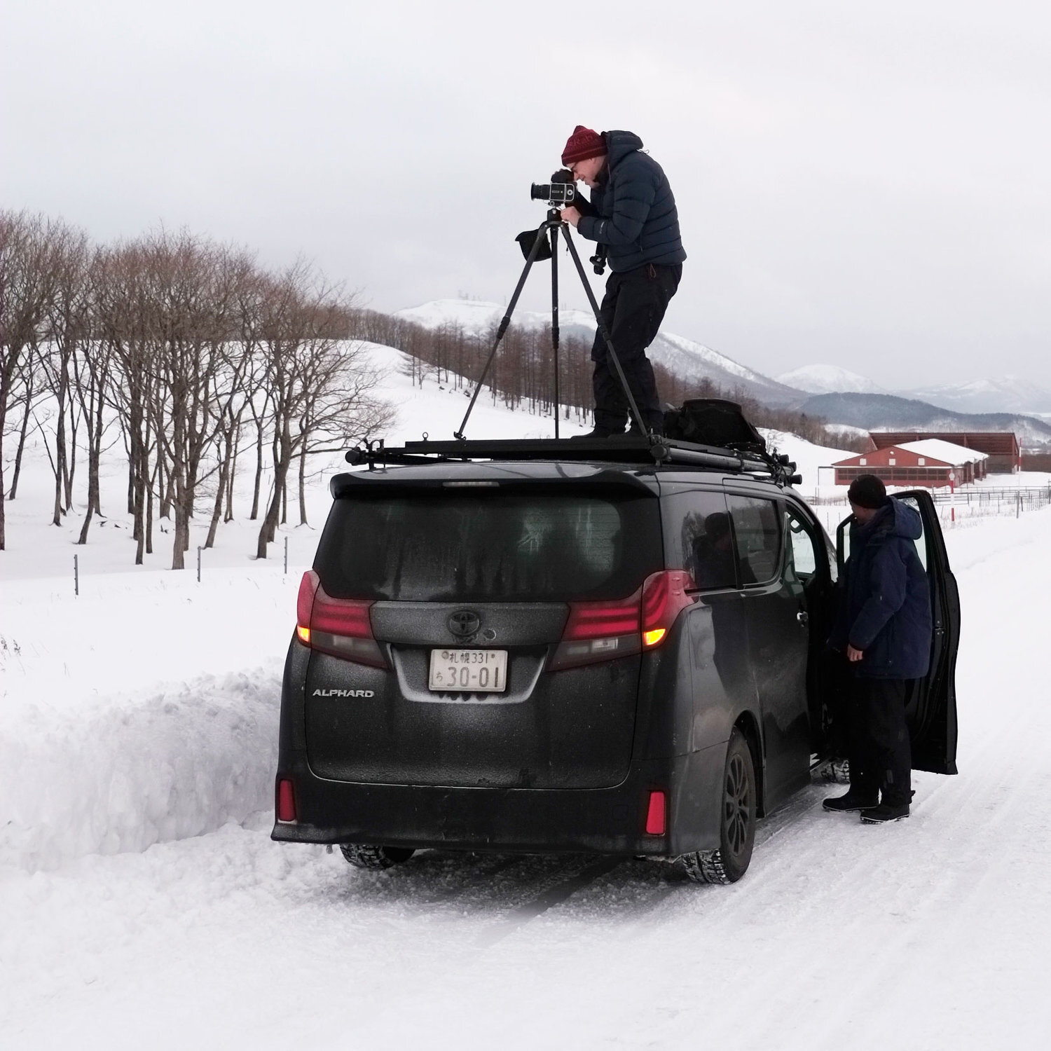
image-asset-2.jpeg

This is the actual photograph of me making the image you see in this post.

Camera height is often a critical part of composition. OK, my example to illustrate that is perhaps extreme, but I have had many times when I have wished to take photos from much higher than my tripod can reach to.

I have also had times when I have wished to take photos that are much lower than my tripod can compress down to. Going low allows me to compress the mid-ground, and it is also a useful device in removing any clutter or debris that is lying around on the ground. Going low also allows me to move objects that are on the ground closer to those objects higher in the frame. By bringing them together / closer, we can strengthen relationships between them.

Tripods don’t find compositions. They fine-tune them

I think camera height is an important consideration for composition. But I am always surprised to see many photographers doing this:

  1. Get out of the car

  2. Extend the tripod to eye-level

  3. Put the camera on the tripod

All of this, without really considering if the height of the tripod is correct for any possible composition they see.

For me, this is what should happen:

  1. Get out of the car

  2. Take the camera out of the bag

  3. Walk around with the camera looking for good compositions

  4. When you find a possible candidate for a good composition, try the composition from different heights: down low, mid-height, eye-level, and of course, from above my own eye-level.

  5. Once a nice composition has been found, set up the tripod to assist in keeping the camera in that ‘magic space’ that has just been found. You know - that ‘middle of the air’ place where the composition works.

So for me, having a very tall tripod is really invaluable. I have two tripods. One is over 7 feet tall, while the other is over 9 feet tall. I have used both fully extended many times, and I’ve been grateful to have the extended reach they have.

A word about centre columns

My tripods also have no centre column. For me, these get in the way and prevent me from putting the tripod so low that the camera is almost at ground level. So when I buy a tripod, I always buy one that is very tall, and also has no centre column.

There will also be occasions when you need the camera to be literally sitting on the ground. In these circumstances I take my camera off the tripod and actually sit it on the ground. I sometimes have to make a hollow in the earth to help support the camera to place it where I need to. But I also need to use a viewfinder that allows me to compose comfortably. For me, I have a 45º angle viewfinder on my camera. For you, you can either use your live-view, or buy a 90º angle finder for your camera (Nikon and Canon).

Tip: when working with cameras lower than you are : get low. That means having to lie on your tummy. You need your eye to be level with the view you’re seeing so you can balance it properly. Peering into a camera with your head sideways isn’t going to help.

Camera height is a critical part of composition. I have found many times that the same composition taken at different heights will have a ‘sweet spot’ where the height is just right for the composition to really gel.

When what is outside frame influences what is inside the frame

Preamble - this is a post that was originally published back in October 2020. I am finding much value in digging back through this blog.


This little area of Hokkaido is rather special to me. There are many rolling hills with bunches of copse together. When I am here, I am always striving to isolate groups of the copse with maybe a few single trees around them, but it’s so hard because there are often more complex, less attractive aspects of the landscape trying to creep into the shot.

‘To me, what you leave out of the frame is often just as important
or more important than what you choose to leave inside the frame’

As simple as this shot may appear, it took quite some effort to do, because I was constrained by a large forest just outside the bottom area of the frame. I found I had to go higher and higher up a hill to get enough clearance, and even then, in order to completely remove the unwanted forest, I had to settle on this composition:

Hokkaido-2018-(5).jpg

Due to the large forest (just outside the bottom part of the frame) being so close to the little trees, I couldn’t give the trees enough space below them. This forced me to push the two little trees towards the edge of the frame.

At the time of capture, I remember thinking ‘this is a little unusual’, as everything in the frame of interest is really bunched down at the bottom of the frame. Can I live with it?

‘I think all you can do is make the shot,
and leave the pondering for another time’
(we are best being editors when at home)

I think all you can do is make the shot, and leave the pondering for another time. And indeed, as I’ve lived with this image over the past two years I’ve grown to really enjoy it. To me, those little trees are so keen to be part of the copse. But they’re almost being pushed out of the scene.

So sometimes it’s ok to put subjects at the very edge of the frame. Sometimes it’s ok to create tension. I just think that it has to look like it was intentional. Otherwise most viewers will assume it’s a bad composition.

I would also like to add that by being restricted to composing this view because I was trying to avoid what is outside of the frame, I was forced to create a composition that is / was outside my normal habits or comfort zone.

Sometimes (if not all the time) restrictions and limitations are a good thing, and encourage an attitude towards innovation.

Steel Dunes, Scrabster, Scottish Highlands, 2024

There is power in ambiguity. The picture below could be of sand dunes, or perhaps a wave caught before it folds over. But the subject is neither. The title above is impressionistic in nature, non literal for sure. And I quite like that you are left to see in it what you see.

All Quiet

Dear reader,

I know I’ve been very quiet.

It may appear as though I have dissapeared. Well, that is usually a sign that I’m busy doing something else. A few things in the pipe line, one of which will be announced this late August / September.

Sorry for the silence. But I am busy.

Over the coming days, I intend to republish some old (but still very relevant) blog posts.

Thank you for visiting.

Make the landscape your own

“I want to get to a point with my photography,
that even if I tried to get as far away from myself as possible,
I would still be there in my own work.”

Everyone starts somewhere. And for the most part, we start by emulating what we like in others work. No matter what discipline, emulation is often the starting point.

As a photographer, turning up to the location of a photograph you love, can teach you a lot of things. Perhaps, the first thing you’ll learn is that the original composition that you admire, isn’t so obvious. The next thing you’ll possibly learn is that the scale of what you imagined the original scene to be is different from the reality. You’ll possibly also learn that you must use the right combination of focal length and distance from the subject to get everything to fit into the frame just like the original.

But perhaps the most important thing you might learn is, even if you do manage to make a shot very similar to the one you are trying to emulate, it won’t be the same.

Some things are a product of timing, and I would wager that the original image you so admire, is special because it was made under exceptional lighting conditions. The originator made the original capture because they were so motivated at the time, or at the very least, you are drawn to the image, not just because of the subject, but because everything else - weather, lighting, atmosphere, all came together to make something larger than the sum of its parts.

Although you may learn a great deal through emulation, it won’t teach you about making the landscape your own. That requires something else entirely, and it’s probably something that can’t be taught.

If you can reach a stage where you are no longer emulating your heroes, but instead, have found your own coal seam to mine, then congratulations. You have just reached a point in your art that few reach. Because finding a unique voice is a rare thing indeed. Many spend a lifetime looking for it.

I’ve given this a lot of thought. A unique voice does not come to everyone. It is an elusive thing, and if you do manage to find a unique look to your work, I am a firm believer that it will only surface over some time.

But that does not mean we should not try.

And I do believe that we should always endeavour to find our own point of view in the landscape. For me, the goal is to be able to find myself in the images I make.

So I think it better to make the landscape your own, and I know that is what drives me forward. A desire to find myself in the landscape. I want to get to a point with my photography, that even if I tried to get as far away from myself as possible, I would still be there in my own work.

The limiting factor lies within me, and not the landscape

It's a classic view these days. But I am always amazed at how beautiful lago Pehoe is.

I’ve been coming to Torres now for 21 years. It's gone by in a blink. It’s an old friend and in a way, I feel i’ve grown up with it.

Sometimes I’ve found I have been in sync with it, other times I’ve felt that Torres del Paine’s difficult weather, and stubborn wilderness has left me realising it will never be tamed. That I will never be able to capture it when the full force of its dramatic weather systems takes a hold on the landscape.

Other times, like in this picture, it’s peaceful and easy to work with. Still, there’s always the hint that if you’re not quick enough, you just might lose the mountains as the cloud line lowers and they disappear for the rest of the day.

When the weather can be so unpredictable, it’s forgivable to make a shot that you have made countless times before. In a way, you’re just grateful to get to see the mountain range on a good day, when it’s in a good mood.

But one has to wonder: am I producing anything new here? And perhaps the deeper question is: and do I always have to?

In a way, if one wishes to push the boundaries of their own art, then I think there has to be an understanding that not all the work will be equal, and some of it might be more about being in the moment than actually bringing anything new to the table. One cannot always invent. Sometimes we have to take joy in whatever we are given, and to just accept and go with the flow.

Torres del Paine is, after all, an old friend. And like all old friends, I think we tend to go into a familiar patterns with them. Our dialog is the same. Same old thoughts, same old themes.

But in repeating our old ways, we may get a glimpse of how we have altered our views, if just a little. Of how, ever so slightly, we may have changed over the course of our relationship.

If I am to look back at my time in Torres del Paine, I can see there are aspects to the landscape I am still attracted to, pretty much like I was during my first visit back in 2003. Some things have not changed. But in other ways, I find myself looking for a more minimalistic view of the landscape.

And it’s not so obvious. It takes work, and while I am working, I am accompanied by the thought that any limiting factor I encounter, really lies with me, and not with the landscape.

Anticipation at Laguna Armaga

On the recent tour to Torres del Paine, we spent three mornings attempting a sunrise shot of Laguna Armaga. The first two mornings we came here, we could not see the famous Torres (towers) which we of course, had all been anticipating.

Instead, I got this shot;

We had a bit of rain, and low lying cloud. It was ‘socked in’, quite heavily, and I’ve been in so many similar situations, that I now know to embrace it. Even though, it has taken me quite a few years to come to this understanding.

Anticipation cannot be avoided. We are, by nature beings that when we are not living in the past, we are thinking about the future. Seldom are we in the present moment.

As a workshop or tour guide / leader / whatever it is that I actually am, I’m aware of seeing the same emotions, the same highs and lows in groups when the weather is not cooperating. It is a funny thing to realise that all of us cannot escape anticipation.

I think that anticipation of a location is similar to pre-visualisation. It can be a hindrance. Expecting a landscape to give you what you want, let alone even be aware of your needs is something we all have to, at some point, understand is a futile preoccupation. We have to learn that it is us whom must submit to the landscape, as it will not submit to us.

But anticipation does have its benefits. I am 100% sure it is not entirely a destructive mental process. If we do not anticipate anything then this may suggest boredom, or a lack of engagement. I think when we are excited and looking forward, we cannot help but anticipate. It is a form of photographic-hope.

What I think anticipation’s most destructive aspect is on all of us, is its way of stopping us from seeing outside of what we hoped to get. Much like comparison is the thief of joy, anticipation the thief of working with the unexpected. When we don’t see what we want, we will often say ‘there was nothing there today’. Fact is, what we’re really often saying is ‘I couldn’t get past my expectations’.

We have to learn to let go of what we wanted to get, and recognise that there may be something else staring us in the face, which may be just as valuable as the thing we didn’t see.

I often think that the creative process is the art of working on one’s own personal hang-ups. The landscape tends to mirror back what we are feeling. If we feel excited, then the landscape is exciting. If we feel uninspired, then we think the landscape is uninspired. But the landscape just is. It is neither boring or interesting. It just exists and what we are dealing with is our own personal way of working though how we feel about what we are seeing.

Anticipation cannot be avoided. We are all hard-wired to anticipate. It is what drives us forward. But it can steer us into a cul-de-sac of seeing nothing, when there is something there to photograph.

Learning to understand when anticipation has taken us over may be the first step. Learning to deal with the dissapointment of not getting what you wanted may be the second step. Thinking there may be something else to find, and deciding to let go of previous wants, is ultimately where we want to get to.

If we can reach this stage in our own development, then we will be more open to discovering compositions that may be even better than what we had first anticipated.

Lençóis Maranhenses Participant images

I thought it might be nice to ask everyone on my last Lençóis Maranhenses tour if I could publish some of their images. I had intended them for my newsletter, but after some thinking, I felt it would be more suitable for this blog.

Everyone sent me a three to ten images or so. I appreciate that many did not send me them as an intended portfolio, but because it is something I am passionate about, I would like to discuss their edits in the context of portfolios.

In my view, even when images aren’t intended to be part of the same set, by grouping unrelated images together, we can learn a lot. Sometimes we find that certain images show less luminance than intended when grouped with others. Or it could be the other way round. Ultimately, the aim is to find a way to ‘see again’, or to learn something about the images we did not know. I use many techniques to ‘shake up my vision’ to notice things in the work that I may have become blind to from staring at the work for too long.

I thought everyone’s work was beautiful and nice to see. So none of this is meant as any negative criticism, and more about ‘food for thought’. Feedback or opinions, are to be taken with a pinch of salt, unless you find value in them, in which case take them as priceless when they help you gain more insight into what you do. An opinion that is valuable is gold. An opinion that does not resonate, is just noise, and not for you.


Vera Conley

I really like Vera’s accomplished level of editing. She wrote to me that she felt the work had gone in quite a radical direction for her, and I think this is a case of someone going beyond their own comfort zone and into some new territory. Which is always a delight to see.

I think Vera has pushed herself into a new place in her work. When we do that, the terrain is new, unfamiliar and also, it means that we haven’t learned quite how it works just yet, so the first while here we’re going to experiment, and play around to see what works and what doesn’t. Often the first foray into a new space in our work has the power to hit upon some new ideas that we will keep, and some that won’t stick.

Vera has appeared to use some kind of solarisation effect with these images. If this working with solarisation continues, I think that there will be further refinement. Not because it is unrefined right now, but simply because once we start working with some new approach, refinement of technique or development of is inevitable.

Years ago, most photographer’s aspirations were to simply come home with some nice images where they were technically correct, had a nice composition and good light. But I think the bar has been set much higher these days. Nice images isn’t going to get you noticed. Individuality in your work will. To have a recognisable unique style to your work is, in my view, where good photography is at these days.

I enjoyed very much seeing Vera take a lateral approach to the edits. I love that her edits are far removed from what we saw and photographed. It is a skill that is so sadly under appreciated: I believe that most folks think that good photography is all about improving their field work, but the editing stage can, and is, a highly creative space to work in, that requires a lot of learning and talent. It is also the space where it is more possible to impart your own individuality through careful editing.

I thought it would be great to show the entire set that Vera sent me. I think the level of editing ability in judging luminosities is very high in Vera’s work. It depends of course on what one is aiming to achieve, but I think by converting these to black and white, we can see there may be further room for luminosity fine tuning, should Vera think the work needs it.

I often convert to black and white, because when I remove colour, I’m able to see how the luminosities within each image hang together, and also, how they hang together as a set.

Once colour is removed, we can see the luminosities more clearly. If I pay attention to the highlights in the images then images 1, 2, 6, 7 and 9 have similar high key tones in them. Images 3, 4, and 8 and 10 are of a lower register highlights, more like upper mid-tones. The last image (10) is my personal favourite: it just seems to glow whether in black and white or in colour.

Similar with the darker tones in the work, I can see that images 5 and 6 have the darkest tones in the work.

These are merely observations, and not in any way a criticism of the work. I find that occasionally converting my portfolio sets to black and white extremely useful in gaining an ‘understanding’ how the luminosities work across the set. With this improved understanding it is up to the owner of the work if they wish to make further adjustments based on what the conversion has shown them.

I find Vera’s level of editing to be highly accomplished. She understands luminosity and hue very well, in and above her composition style where she is comfortable utilising sections of a subject, and placing them towards the edge of the frame as and when required.


Christian Surber

I think it is always interesting not just to see what participants choose to photograph, but more so for me, how they choose to edit the work. One of the more notable things for me is that a photographer’s own aesthetic taste tends to come through in their edits. That translates to their choice of strong / weak colour, and also contrasts. Christian’s landscape edits have more vibrancy in the colours and his choice of luminances go into the higher registers, very close, if not towards the right hand wall. It is his personality you see on display here with these edits in terms of how he prefers to work with more primary blues as well as highlights almost bleeding off the page.

If we look at the entire set he sent me, we can see that he is also no stranger to working with harder contrasts when he feels like it (images 4, and 8). I like the final image (8) and how the high key luminosities of the image bleed into the upper top left corner of the image from very stark textured water. He’s not afraid to go from one extreme to the other.

I’d also comment that his crops are very tight. This isn’t a criticism, but again an observation that he seems to be much happier using telephotos and getting right into the heart of the composition.

Because the crops are tight, I feel that some of the images may benefit from some ‘quietening’ towards the edges of the frame. Image 1’s wall of texture for instance, may benefit from some softening towards the upper region of the frame:

It’s a different style, and Chris may disagree with me on this. I have found for myself, that edges of the frame have a lot of power. They tend to catch your periphery vision, which I like to think of as my subconscious vision. Usually when the contrast levels at the edge of the frame are the same as the contrasts in the centre, they tend to be more noticeable. I have found that by reducing contrasts towards the outer edges of the frame, can stop the eye slamming into the sides of the frame, and bring it back towards the centre of the image, where we should (normally) return to.


Bruno Vais

Each of the three images Bruno sent me were not intended to be a portfolio. But somehow I still feel there is something that makes me know that they are from the same photographer.

Compared to some of the other images, there is less of the elipses, curves, or standard graphic ‘pleasing’ nature to this work. Images 1 and 2 are less about simple elegant curves, and more about things being angular. Slightly difficult. His contrast work on the first two is very high, and I think that is something that is where I feel I see ‘Bruno’ in the work. Image 3 is perhaps less relatable to the other two, but is still recognisable as being one of his images.

If I were to suggest something, it would be to use the first two images as a set, and since the contrasts on image 2 are high, then it feels natural to think of doing the same thing with image 1. If we turn the two images to black and white we will see that image 1 is much softer in tone compared to image 2;

Now if I balance the tones of image 1, to be more stark, to match image 2, I get this;

Which I feel makes image 1 more in sync with image 2.

Let’s reinstate the colour and now review:

As much as these images were not intended to be a set, or portfolio. One can notice possible discrepancies if laid out next to other images.

Reference points are important. If you are wondering if your work is punchy enough, or soft enough, or high-key enough, then by laying them out together we can often see where we may wish to tune the images.

I should stress that this is always a highly personal decision. If you ‘see’ discrepancies in your work when you lay unrelated work out together, then that is what you see. If another is telling you there are discrepancies and you yourself do not see them, then they aren’t there. You can only work with what you notice yourself.

So again, laying out unrelated work together, may show you things about your work you did not even know. It is a technique I use regularly, and it is to help me gain a better understanding. As to whether I feel there are discrepancies or I need to act upon any new information on my work, is entirely up to me, and it should be for you also.


John Motzi

John’s images showed delicacy with the tones when required, but also he is not afraid to go high key when he felt like it, such as in the central image below.

I appreciate that John didn’t send these to me as an intended portfolio, but let’s just assume that a portfolio was in mind with the set below:

If we convert this set to black and white, as we did with a few of the other participants, we can see that there are three groupings of luminance. Images 1, 6 & 7 have the same upper mid-tone luminances. Image 4 stands out on its own, and images 2, 3, 5and perhaps 8 have the same mid-tone luminances.

Temporarily converting a set to monochrome really does help in learning how the luminosities of the set hang together, and also, allow us to remove the distraction of colour.

With regards to composition, what we may have thought as tonally different or more isolated, such as the sand dunes against the water may appear less so when colour is removed. No judgement intended, merely to illustrate that when colour is removed, we often get a true sense of the tonal separation in the work, and I often find that using this technique tells me I need to push the separation further in the work.

In my opinion, John’s set of images show that there is room to separate the tones more, if he so chooses to do so.

I would suggest though that the top right picture has been pushed as far as it can go, in terms of blacks and whites, this image may ‘lead the way’ for the others to follow? Or does it require to be calmed down, to fit more in-line with the others? Perhaps if any further adjustments are made, it may be a case of doing both.

Thank you to everyone who chose to submit their images. It was a very enjoyable tour.


Post amble

The human eye is highly adaptable, and tends to distort reality. The more you stare at your work, the more acclimatised you become to it, and the less objective you’re able to be. This is not a theory, this is fact.

Although many of the images submitted above were not intended as a portfolio, by grouping related, or even more so, unrelated work together, the differences between work can be observed. We are not looking for problems, we are looking for an improved level of understanding. We are looking to heighten our awareness.

What you do with that new level of awareness is up to you.

By periodically putting on a black and white layer whilst editing single images can be extremely useful in assessing the tonal separation in your edit. I tend to find I am more inclined to increase separation in tones between objects in the frame when I edit with a black & white layer enabled. I then revert back to colour, and review.

Additionally, grouping sets of images together, whether they are intended to be in a portfolio or not, can aid insights into what you do. It can even show you if there is a style to your work. Sure, it can show discrepancies and errors in your work also, but that is not really the main point. The main point is that we are looking for heightened awareness. We are looking for understanding of what we do.

And by improving our understanding, we are able to make better decisions about what we do.

The first key is: self reflection. If you’re someone who tends to reflect a lot, then apply it to your work. It’s a skill that not everyone has. I am of the opinion that most do not reflect, do not review or think about their past work much. It is a failing not to do so.

Looking for more lessons?

If you’re interested in this, then this portfolio masterclass covers it in more detail:

The second key is: inquisitiveness. If you’re someone who is always asking questions, specifically about what you do, then that is another skill. Being able to reconsider your work, is a hugely beneficial skill to have.

For most of us, we need tools to help us ‘see’ who we are, and to understand better what we are creating.

I think most photographers edit on a single image basis only. And few review their work over the past year or so. If you’re not putting collections together, then you’re not going to be able to assess who you are as a photographer.

Portfolio Development video class 2021 (Bolivia)
£175.00
One time

I’d bet that if you put unrelated work together into a folder, you would still see some relation, on some level, between the images. And in the process of doing so, you would gain a further glimpse into who you really are, as a photographer.