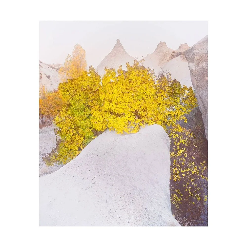
When incidental becomes something more

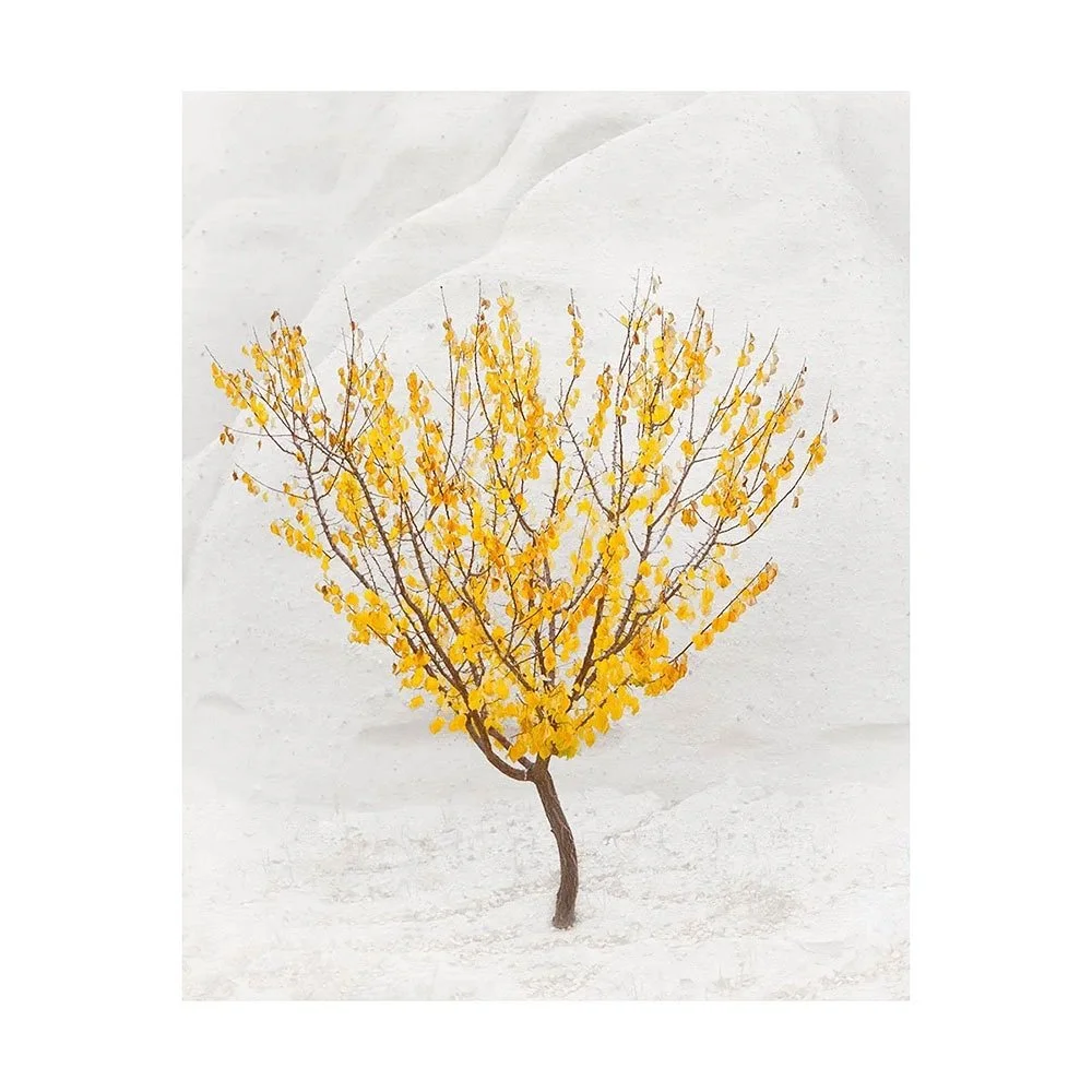
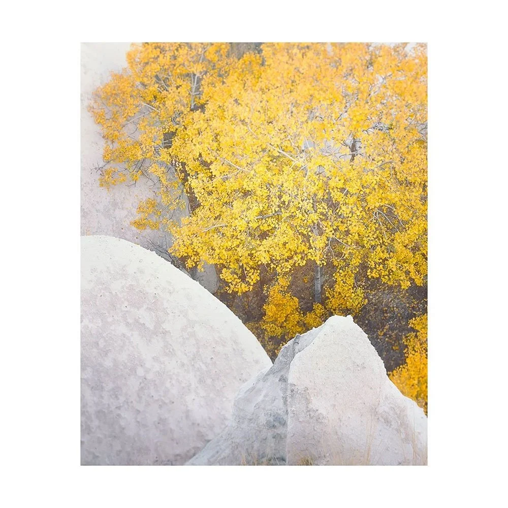
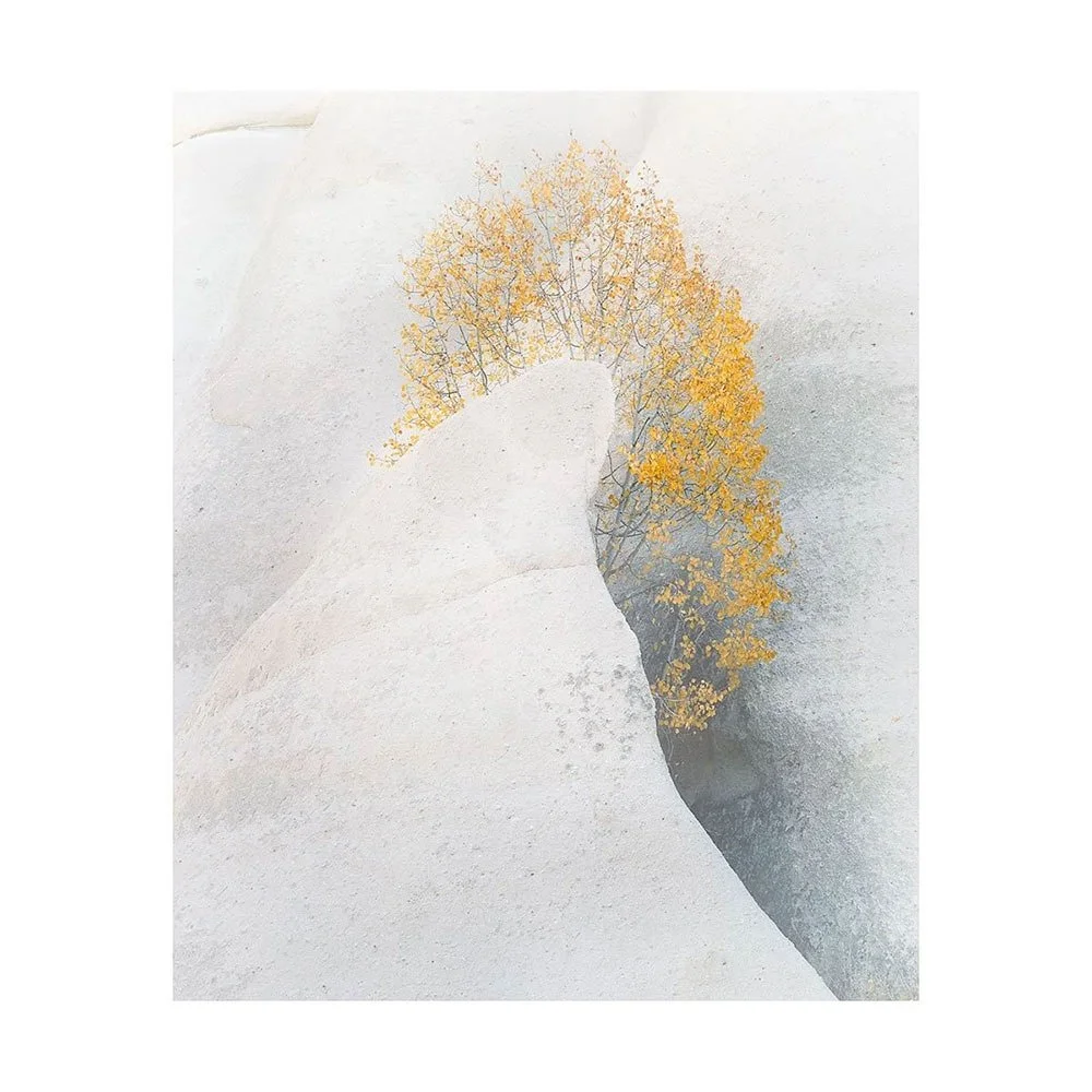
When all the images from a shoot are unedited, they can appear as if there’s not much of anything there at all. That is how I felt about a set of images I made whilst in the northern region of Japan in January 2024.  

At the time of shooting, and also reviewing the work on my light table, I had felt there was no apparent theme. They felt as though they were half-ideas, things that had not worked.  

I had decided to shelve them and perhaps I would never return to them.

The skill required in turning what may appear to be nothing more than random visual thoughts into something that has continuity and hopefully a consistent stylistic message cannot be overstated.

I find the hardest part of working on a new set of images is the getting started phase. I’m aware that I could start on the wrong foot, take the wrong approach. It’s much easier when there is something in the collection of raw images that I am drawn to. That can offer a way in.

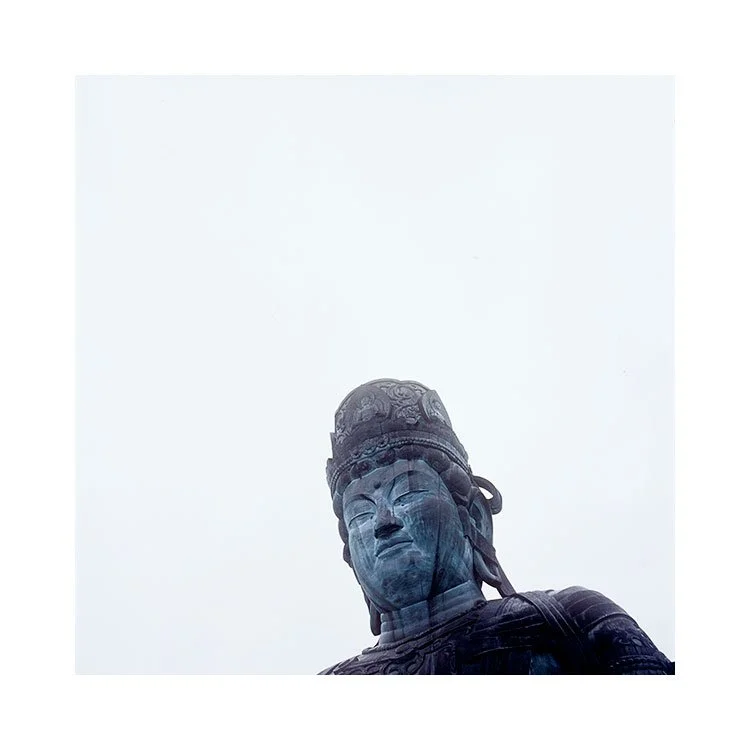
What grabbed me about the images I shot in Aomori, were the murals. Three images shot very quickly inside a monastery, turned out to be my way in. They were what I found appealing to work on  and were a joy to play with and notice where they went.

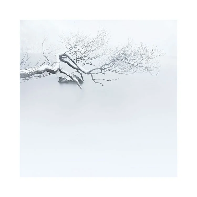
I had also visited a snowy lake. I found that by adding in these more regular winter lake shots provided an extra dimension to the collection that I had not expected to work. I often feel that portfolios tend to grow in terms of personality as we add more images to the set.

About six images in, I was now looking for a further three to make the set up to nine. I prefer small portfolios of uneven number. They lay out well in columns of three while also being more concise by their small number. They suit my minimalistic approach and I think they help make the message much cleaner.

The six edited were now instructing me as to which sort of images to choose to add to the set. It makes it a lot easier to find complimentary images if the set is already feeling cohesive.

I have often thought that when an idea is good, things tend to flow. When things are ‘right’, things come together quickly. Songwriters of very famous songs have often said ‘the song seemed to write itself’, and I think that when we are working with good ideas and good material, then things tend to come together more easily.

But if it were as simple as that, then we’d all be creating great work. The magic is in the mystery of the creative process, and I think part of the ingredient for my set of nine images was timing.

The images had been sitting on my table for more than six months. I had no intention of working on them any time soon. But somehow, today seemed to be their day.

They were waiting for me, and somehow, I was ready.

Available Light

This past May I spent a few days making some portraits of gauchos in Chilean Patagonia.

I prefer to work in available light, and indoors if possible. The light in Southern Patagonia has a cool colour temperature, so skin tones etc don’t tend to be as warm outside as I’d like.

While visiting José’s cabin at the estancia he works at, we had a lot of soft warm light stray into his kitchen area. It really helps if you can get light that allows the subject to glow if possible.

I must confess that I am no expert at lighting. I have often thought of bringing reflectors with me (I invested in a set when I got home from this trip).

Most of the time, whilst shooting the gauchos, I found the light levels too low to hand-hold the camera. This is the downside of shooting film - although the technology has improved a lot - Kodak’s Portra 800 ISO film is no more grainy than the 160 and 400 equivalents (they look identical to my eye last time I did a test), I still struggled to keep the images sharp. I am so rusty that it had not occurred for me to bring my monopod along.

I love shooting the Contax 645 with the 80mm lens. It can go as wide as f2, which results in quite dramatic bokeh, but it can often be too much - sometimes the plane of focus is so thin that I end up with one eye of a subject in focus and the other soft. So I am forced to use f4, which guarantees the eyes will be in focus, but it does mean I lose a stop.

So next year (as I plan to return), I am bringing my monopod, and reflectors. My friends Sabine and Alberto will be put to good use as assistants to hold the reflectors.

Daniel

It’s been a long while, since I made any serious effort at portraiture. Almost a decade in fact as the last time was in Bhutan in 2016. Quite a shock really, but that is partly due to two lost years during covid stretching out the gap. The rest of the time is entirely my own doing - I sometimes have no space in my yearly calendar from running workshops and tours to do anything else, except come home for a much needed break.

This past May, I spent three days with my friends Sabine and Alberto driving from one estancia to another with an appointment to photograph a gaucho at each location. Sabine had organised that we would visit two gauchos per day, and this worked out very well for me.

I normally prefer to roam and pick the people I find photogenic, but this was not possible on this occasion because Sabine didn’t know what sort of subjects I was looking for, and also, she contacted all the gauchos she knows from her time as a guide in Torres del Paine national park.

The setup was very nice. Each gaucho invited us in, we would sit for a few hours chatting about life and things, and it always felt very relaxed and comfortable. Alberto is a driver for the national parks but also worked as a gaucho for a spell, so he knew most of the gauchos that we visited or at least had some common ground / colleagues with them. Alberto is very good at talking, and that made up for me not being able to speak Spanish.

Sabine and Alberto would tell the gauchos what I was looking for, or explain that I would just make some photos, and to kind of ignore me.

I must say that I have had the belief that most of my portraiture work is non-verbal. You can convey so much with your own expressions and how you approach someone, but I was rusty and very much feeling a bit of out my depth on this occasion. Lots of pauses where the subjects didn’t know what I was doing, and I didn’t know either. I tend to know what I like when I see it, but I’m often waiting for folks to do something that I like, rather than me orchestrate them.

Daniel was the last gaucho we visited. He was expecting his first son to be born the day after our visit, and seemed pretty relaxed about it all.

Anyway, I really love making pictures of people. I wish I could do it more often. It is a welcome reprieve from doing landscape work all the time.

You’d think that doing what you love couldn’t become tiring, but the truth is that everyone needs a break away from what they love. It allows you to recharge, get perspective, and to return to it (landscape photography in my case) with a renewed sense of wonder.

I can’t encourage anyone more to ‘take a break, and do something else’ away from their passion. It really does help.

Gaucho, May 2024

I enjoy making people photos just as much as I do making landscapes. It’s a different thing, and requires a different approach.

Shot with a Contax 645 film camera and 45mm lens, this was made inside the small hut this gaucho worked from. Every gaucho I met had a similar stove and all of them were crazy about mate (south American tea). They drink it from a gourd that you can see in his hand.

The shot isn’t posed. My friend Sabine and our driver spent easily two to three hours with each of the guides just chatting and shooting the breeze. It was a good way of me being able to make photos as at some point, they would just ignore me and get on with what they were doing.

I do love to make people photos and I really haven’t done anything in a very, very long time. Taking a break away from landscape work can be very beneficial in terms of recharging one’s own batteries.

It was just a lot of fun.

Scars on Land III

How we view the landscape, can be shaped by the choice of words we use to describe it.

The word scar for instance has negative connotations. It is often used to convey damage, fault, or something that is permanent which cannot be repaired. We use it to describe emotional damage as well as physical.

I’m often conscious that my choice of words can influence how I feel about a place. Often the feelings come first, and I hunt for a word to describe them. Other times, the words come first, and an emotional reaction is derived from them.

Much like long exposures record the passage of time, scars are a recording of the landscape’s formation. There is something in this for me. I am drawn to knowing that there is history. I am intrigued even, because I realise, I will never know the full story of what happened here.

But I’ve come to see scars in the landscapes as something more than just a mark, a trace of the landscape’s formation. They can be wonderful composition motifs, pleasing or perhaps providing tension to the scene I am recording.

I have re-imagined what I think the word scar means.

They are natures drawings, often loaded with aesthetic beauty as well as many other things.

Some scars are more photogenic than others. Some more meaningful than others. I find myself drawn to them, and I can’t really get to the bottom of why. All I know is they satisfy my visual curiosity for building compositions that are meaningful to me in some way.

I think this is why I am drawn to the interior of Iceland. It is a young landscape. The traces of its formation are apparent, if not in understanding, for I am no geologist, but certainly in terms of graphic artistry. I often feel as though I am looking at the underlying structure of our world. Stripped back to the essentials. It suits my aesthetic for the minimal and graphic. But it also suits my need for connection. For understanding the landscape.

Landscape photography is not just about looking for the graphic aesthetic. We are looking for connection. Often, I think I am hunting for a visual home. A place of familiarity. I am a Scot, and the weather, quality of light and muted colour palate present in the Icelandic interior makes me feel as though I am home in the Scottish Highlands. There is a lot of similarity, even though there is a vast difference in age by several hundred million years between the two landscapes. Iceland’s landscape is young. The oldest parts being roughly 20 million years old. Scotland’s landscape is approximately 480 million years old.

And yet I feel at home. So much so, that when I return to my homeland of Scotland, I find it much easier now to imagine where the glaciers one stood. How each glen was formed by vast tonnes of ice scraping and sculpting the land. I see traces of all this in the scars left behind. Which brings me back full circle to realising that scars on land are somehow more important to me than I had once realised.

Grads still have a place in digital photography

Preamble: This is a re-post of an entry from February 2020. Occasionally like to repost entries from my 15 years of writing my blog because I think the entry is still relevant.

Over the past few years I’ve noticed less and less folks using grads, and I think it’s a shame they aren’t using them. There is a general opinion now that grads are not required for digital photography but I beg to differ on this. Ultimately: the choice is yours, but it’s also my prerogative to try to change your mind :-)


Today I’d like to discuss the validity in still using Grads in an age where digital cameras have so much dynamic range that many believe that grads are no longer required. To do this, I need to go over what happens to the exposure when we apply grads.

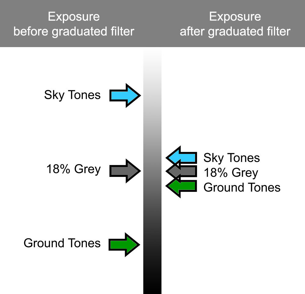
When using Aperture Priority, the camera automatically re-balances the exposure when a grad is applied (this does not happen in manual, which is why I mostly use Aperture Priority for most of my daylight work):

exposure-grads.jpg

As you can see, the grad reduces the difference in contrast between sky and ground. And since the camera wants to take an average between the two values, we find the sky and ground moving towards mid-grey (18%).

In the above illustration you can see that the ground values are now lighter once the grad has been applied. This is key to my post today. When you apply grads, what you are essentially doing is opening up the shadow detail in the histogram / exposure of the photo.

sky-ground.jpg

Consider the histogram on the left. No grad was applied, so we end up with a classic ‘double humper’. The ground has been squeezed into the lower tones of the histogram while the sky has been squeezed into the upper registers of the histogram.

Note where 18% grey is.

The ground is essentially underexposed, while the sky is overexposed.

Also consider that the ground is residing in the shadow ‘darker’ area of the histogram. This results in loss of tonal information in the shadows as many dark tones are being quantised. Many tones become one.

Now let’s consider the same image shot with a graduated filter:

sky-ground.jpeg

The ground values have been moved towards the middle area of the histogram. Same for the sky values. The important points to consider are:

The shadow information has been opened up (marked in red). We now have more tonal information stretching over a longer tonal scale way down into the shadows.

The highlight information has also been opened up (marked in red). We now have more tonal information stretching over a longer tonal scale way up into the highlights.

For me, the main reasons why I use grads are:

  1. I wish to avoid underexposed ground and overexposed sky

  2. I want to go home with a pleasing negative to work with.

  3. I don’t want to have to jump through additional hoops in the processing to figure out if the image is any good. Working with an image where the sky is overexposed and the ground is underexposed isn’t very inspiring at all !

  4. if I didn’t grad, I’d have to process every file I shot to see if they were any good before I began work.

  5. Working with a nicely balanced exposure straight out of the camera can be, and often is, a very inspiring way of working. You can see straight away whether the composition and image works or not, and I remain engaged.

Engagement is the key for me.

I don’t want to struggle with bad exposures to make them nicer. I want to work with images that inspire me, and that means pleasing, balanced exposures.

If I go home with a nicely balanced exposures, I am more likely to work with them. Conversely, having to trawl through hundreds of images with dark foregrounds and bleached out skies wondering if they might be good once I’ve put them through my editor of choice isn’t going to fuel my creativity. And it’s certainly not going to inspire me.


Post amble: I’d also like to point out that most folks assume that grads are used to darken the sky, or to stop the sky from being over-exposed. That’s not really the whole story. Grads reduce the dynamic range between ground and sky: which is why I focussed in the post above about the ground becoming lighter.

If you use aperture priority the camera will re-adjust the exposure as it tries to balance out ground and sky. As you push the grad down into the frame, the contrast between ground / sky is reduced and when that happens, the camera has to re-compute where mid-grey is.

So grads don’t just control the sky, they also control ground exposure. When you use them, the difference in exposure between ground and sky is reduced, and this is why my diagram at the start of the post illustrates ground becoming lighter (moving towards mid-grey) while the sky is also becoming darker (moving towards mid-grey).

Bear in mind that the human eye perceives everything as a mid-grey exposure, so this is why, even if you have loads of dynamic range, you are aiming for the ground, as well as the sky moving towards mid-grey.


Lone Balloon

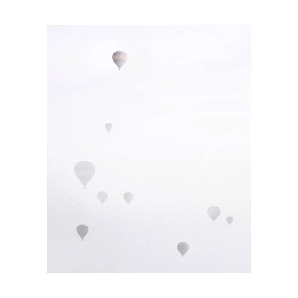
A slightly misty day allowed me to get these silhouettes of balloons.

More a case of 'spray and pray' for the right composition, it was not easy as I was using an Ebony field camera. But this shot I liked very much, and enjoy very much noticing that one balloon has more emphasis than the others.

Realm of Nature

I have a backlog of images to work on from the past five years. I don’t mind this at all, as I like to know there is something in the chest, for that rainy day when I wish to work on something and have some free time.

Many years ago, I always felt that if I had not worked on images as soon as I’d shot them, then I would lose momentum or would never get around to them. I’ve found that not to be the case for me now, and I currently have a beautiful set of images from Senja Norway from 2020 to work on at some point, as well as recent images from Argentina and Bolivia from this year to work on as well.

Occasionally a set of images get away from me though.

I published the images above in my newsletter in 2019, but never got round to putting them on this website as a gallery. I just stumbled upon them today and it was such a delight to find them.

I must admit that I never thought I would get to a point in my photography where I would overlook a set of nice images such as these, but that is just the way it is I suppose.

There is something important about remaining fluid in what you do, and always keeping moving forward. I am mostly methodical in my approach. Not so chaotic. I prefer to complete work, and if it’s not finished, will strive to complete it. But I’ve been thinking lately that I now have learned that some things have to hover in the ‘incomplete’ stage for some time, and that them being in an incomplete stage is perfectly ok to do so.

I had plans for this set of images, but Covid got in the way, and kind of derailed me. Them surfacing today reminded me of the hopes and focus I had at building a more comprehensive set, and has spurred me on to thinking how I can get round to completing the work in the next year or two, schedule permitting.

Suspended Reality

My original motivation for picking up a camera was to record my travels. Then, as time passed, my priorities changed and the pursuit of images became the reason why I travelled. From that point onwards, I think I was on a trajectory towards creating (hopefully) some kind of art with what I do, and I suspect it is the same for you. I would hope as a reader of this blog, you have similar aspirations with your work.

Suspended Lagoons, Lençóis Maranhenses, April 2024

Creating beautiful or ‘art’ pictures isn’t really how I would define what motivates me. I think what I’m really attracted to, is creating a sense of suspended reality in my images. I am not a verbatim shooter, and although I respect and understand that for some, photography is only truthful when the work is not edited (manipulated is such a loaded word), but I have always thought that photography cannot convey reality because how can one translate a 3D moment in time to a 2D interpretation and give a true account of it? It’s just not possible as even the choice of angle of view when made, can greatly influence what the viewer believes.

So for me, I’ve always considered that photography is an interpretation. It is a point of view, and we should all embrace the idea that with our camera, we have the potential to show others ‘our personal interpretation’, or convey through omission and inclusion what we want the viewer to focus on.

I particularly love images where upon initial viewing, one can appreciate their beauty but also, not fully comprehend what is going on. This is why I think I am attracted to abstract shapes and patterns in vistas. Nature does not tend to be orderly, or to show design as if man made, and if I find it in the landscape by careful composition, then I will use it.

If one can frame abstract shapes carefully, or perhaps exclude points of reference that will allow the viewer to understand what is going on (like a horizon, or a clear sense of scale), then the viewer cannot help but hunt for an understanding. The eye will keep searching.

In this shot made in Lençóis Maranhenses this past April, I deliberately shot two lagoons intersecting with the slope of a dune. I was attracted to this composition more so because the intersecting dune slope bled into the surrounding landscape. One does not see the slope, instead one sees two ellipses with a diagonal line intersecting them.

I don’t for one minute assume the picture is a deep puzzle. I am merely trying to convey / explain why I make the images I make. I think it does not take too long to figure out the scene, but by removing a bit of detail here and there (the dune slope in this case), or by having nothing around the edges of the frame to give context, then the lagoons appear to be almost suspended in air, and the viewer’s eye has to ‘look again’ to find a foundation of understanding on which to build a complete picture.

Working your aspect ratio muscle (re-published)

preamble - this post was published in January 2019. I am digging through my earlier posts looking for relevant articles. I have written so much in the past 15 years, and I hope / feel that these are still relevant.


I’ve been saying for many years now, that certain aspect ratios are easier to work in than others. Choosing the right aspect ratio for your own aesthetic temperament will aid you in finding compositions, whereas working with a difficult aspect ratio will hamper you. The thing is, you need to find out which aspect ratios work for you.

I’m still surprised that so many buy a digital camera and don’t consider the aspect ratio it shoots in. I have always thought that 3:2 is a particularly difficult aspect ratio to work in and choosing a less panoramic format such as 4:3, 4:5 or 6:7 would be easier to help you compose in.

Anyway, the reason why I am writing this post today is to say that by choosing different aspect ratios to work in, you force your eye to move into regions of the frame that you don’t normally visit with your eye.

If we consider the 3:2 format below, I’ve marked the region where most of us tend to spend time with our eye in black. The white areas of the frame are where we spend less or no time looking in.

area-of-most-use.3-2.portrait.jpg

I like to think of the black areas of the frame as ‘concentrated areas of experience’ with the white areas being ‘areas of little or no experience’.

If you choose to shoot in another format for a while, the different shape of the chosen aspect ratio will force your eye into areas of the frame that you wouldn’t ordinarily visit.

I found with square, my eye was visiting more of the frame, as is illustrated below

area-of-most-use.jpg
P1010941.jpg

Interestingly, I found my eye had less to travel to reach the far corners of the frame than in a 3:2 format. My ‘area of experience’ isn’t too far away from the corners of the frame.

As a result, I started to put objects at the far corners of the frame.

This isn’t something I was ever comfortable doing with 3:2 or 4:5.

After shooting square for a few years, I found that when I did return to 4:5 or 4:3, I found that all those exercises of putting things in the far corners of my square aspect ratio helped me use those corner and edge areas of the rectangle aspect ratio. As in this picture below:

4x5.jpg

Working with different aspect ratios is a good exercise to do. Move around between them too much and perhaps you won’t learn anything as I do believe you need to settled into one or two ratios for a few months if not years. But certainly it is true for me, that by moving to a different aspect ratio for a while, has changed my photography and how I compose when I have returned to an aspect ratio I used many years ago.

Your visualisation skill is like a muscle. If you don’t use it, you lose it. If you never force your eye into the corners of your frame then I think you lose the skill to visualise compositions that can produce very dynamic work.