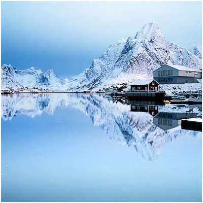
Last year, on my Bolivia trip, Jezz said to me 'it's not that you like snow Bruce, it's just that you like white'.

I think Jezz hit on something with his humorous comment.
I do like white.
Over the past few years, as my photographic style has simplified, it's as if that 'white' that Jezz speaks off, has become something I seek, because it has a few properties about it that I find are an aid to my compositions and inspiration.
Like a blank canvas, these white spaces allow me to reduce the content of the frame down to the most elemental building blocks. Less objects in the frame can often suggest a much simplified view.
But these white spaces also allow the objects that I do include in the frame to be more separated out; for them to have breathing space around them. This breathing space implies a sense of calm to the photograph.
Snow is the epitome of space and 'nothingness'. Which is why I think I'm often attracted to the colder regions. There is something unblemished about Snow and Ice. It rarely has the mark of man on it, and through it, we are allowed to place upon it our own visions of what is or isn't there. And that's what space in photographs does for us - it allows us to have more freedom to conjure up our own thoughts and dreams.
So although Jezz thinks I like white, I really like space. Space in a photograph allows for things to be more calm. Space also allows for the image to be more simplified. Space is good.
But it's not just Snow that gives us this. We can reach similar levels of space and simplification by using other surfaces. Large areas of sand on beaches is another example, and so too is anything that has a simple texture and area to it with almost no break to its own continuity. This continuity I speak off, allows the eye to pass over, to float by and head towards the subjects we do wish the viewer to rest their eyes upon.
By isolating out regions of the landscape where it seems as though nothing is going on, we can create images where it feels as though there is more going on than meets the eye. Less is more. And by removing distracting tones, or overly complex structures in our images, we reduce our message down to one that is concise. Our message becomes much easier to digest, and more coherent as a result. Good images have often simple, but strong messages.
Yes, space in the landscape is good.


