Over the years, as my own photographic 'style' has been changing, I've had the good fortune to be in a position where I spend a lot of time 'noticing' the changes. This is perhaps one of the benefits of being a photographic workshop leader. In order to convey a message, and illustrate things, I've had to look at my own work and get to know myself a bit better as a result.
I wrote a nice little e-book about 'self-awareness' a while back, because I think that in order to grow as an artist, we need to become more aware of how we react to our environment. we need to get to know our moods and responses, as this will allow us to understand ourselves better.
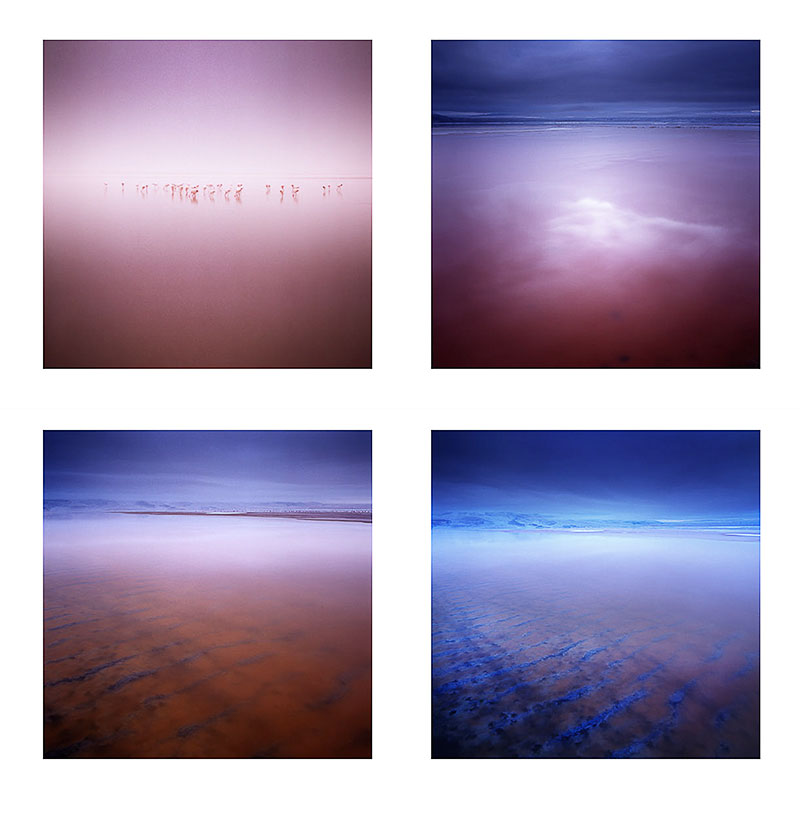
One aspect of making good photographs, that I think is seldom discussed, is that of using colour as a theme. We are often very absorbed by the idea of composition in terms of form only, that I believe we spend very little time considering how colour may affect our style. Or more importantly, how colour can be utilised as a theme to bring a body of work together - and make it stronger than the sum of its parts.
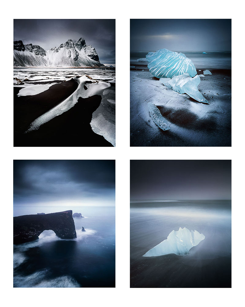
I've noticed in my own work, over the past couple of years, that the colour palette of a location figures largely in influencing what I choose to shoot. I think this all began in 2011 when I first visited the black volcanic beaches of Iceland. In venturing here, I discovered that I could shoot monochromatic scenes with colour film, but also, that the final work had more unity because the colours and tones present in the work were similar.
Certainly, being presented with the reduced monochromatic colour palette of black sand and white ice, should have spelled out for me the direction where the work might go. But I'm not so convinced that most of us observe colour in this way, during the making of images on location (back to my point about developing a sense of self-awareness).
My impressions of the trip just after getting home, was that it had been a complete failure. My head had been so full of the cold that I came home thinking I'd gotten nothing out of the trip. The epiphany happened once I got my films back from the lab. It was only upon viewing the processed transparencies that I saw unity in the reduced colour palette. I saw a way forward and I consciously decided to run with it.
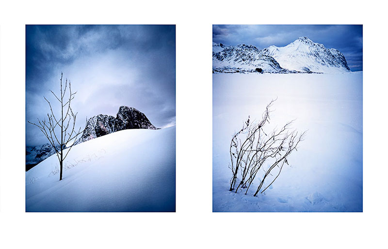
I think there's an opportunity in every place we go to make photographs, to notice colour as a potential theme to the work. This is also true whilst editing the work afterwards. it should be possible to notice that perhaps a handful of the images go together more strongly than others - all because they have a similar colour 'feel' to them.
Utilising colour in this way, is now pretty much at the heart of my photography.
I tend to hone right in on those particular images that have a strong colour aesthetic. I will look through the entire shoot to see if I have others that fall in-line with this mood, or usually, it comes about naturally as I build up a body of work. Some of the images relate to each other more, because there is a strong colour relationship between them.
I will even, after collecting many completed images, distill them down to those that have a strong colour relationship, because it has become a 'signature' - a unifying theme to the whole portfolio.
I don't expect others to be as literal with colour as I am. But I do feel that being more aware of colour relationships as a unifying theme that goes right through a body of work is beneficial.
Composition of an image does not just end at where we place objects within the frame, object placement is only really one dimension. Colour adds an additional dimension.
Just like black and white photographers will often tone a collection of images so that they have a similar feel, colour photographers should consider utilising the same approach in their work. If it brings forward a direction in which one wishes to explore further, then that's a good thing.


