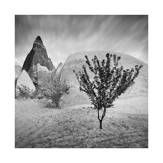
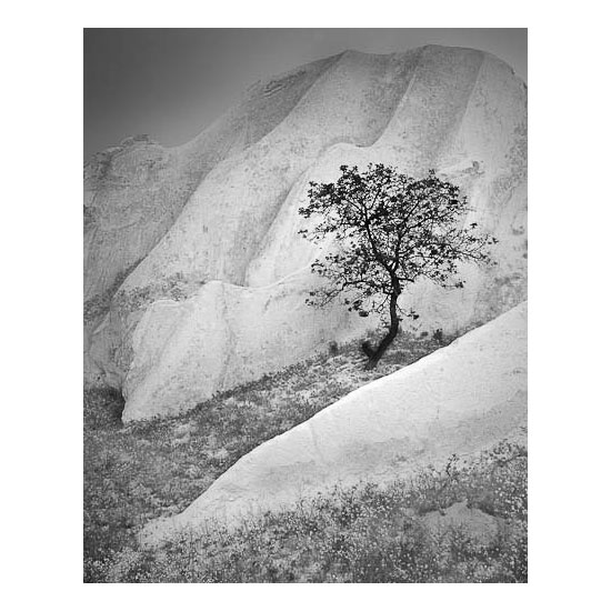
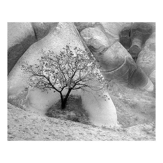
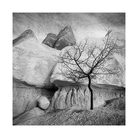
About a month ago, I was in the fascinating landscape of Cappadocia, Turkey. It's a beautiful landscape for sure, but I find it seems to want to be interpreted in black and white mostly.

Black & White is not a medium i'm particularly comfortable with. It's really very, very difficult to make good images, because it is even more about form and tone than Colour is.

I think Black & White is something where I have to be much more careful when isolating objects from others with similar tones. Any overlap and the eye compresses the two objects into one.

Black & White also demands a sense of everything having its own tone. The trees in these two images deliberately have the darkest tones in the image - because I really wish to bring the viewers eye to them. I do use these kinds of techniques all the time in my Colour work, but I have the liberty of being allowed a little more lee-way because of the extra dimension (read that as distraction) of Colour going on, as well as just form and tone.

I'm not done editing at the moment. I've only really just started work on these, so I think things will change and morph over the next few weeks while I scan and edit. It's a very enjoyable experience to work in Black & White and to notice that sometimes I think the edit is good only to realise a few hours later, that I'm only half-way there.
