Something in-between Sunlight & Shadow

For a long while now, I've been fascinated by the power of suggestion over a more literal interpretation. I was initially attracted to this aspect of photography through the work of Michael Kenna in the late 80's. His use of shadows and night often convey a sense of mystery or at the very least mood to his imagery.

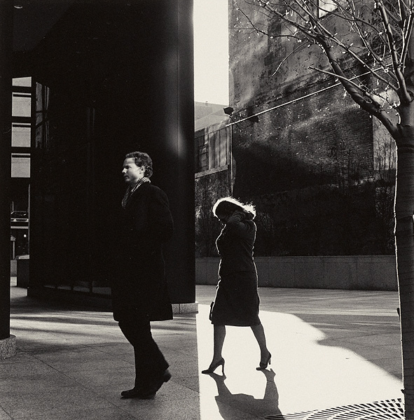
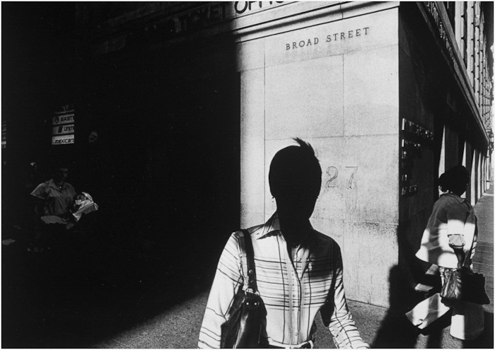
Just recently, I found out about Ray Metzker, who passed away last year. His work conveys similar concepts to Kenna's. He was interested in suggestion rather than a literal translation. His use of sunlight and shadow to conceal his subjects often lent his work a sense of mystery.

 Solitary pedestrians and urban spaces transformed by sunlight and shadow. Image © Ray Metzker

 Solitary pedestrians and urban spaces transformed by sunlight and shadow. Image © Ray Metzker

Suggestion is a powerful tool to possess as a photographer - because being able to get your audience to stop and listen to what you are doing often happens through the art of suggestion.

 In Ray Metzker's images, he shows tremendous skill in using sunlight and shadow to convey mystery. What may have otherwise been an ordinary scene becomes more interesting and thought provoking when shade is used to conceal or reveal.

Ray would produce portfolios based on these tonal suggestions rather than by subject matter. This resonates with me because I feel I have been doing something similar; for a while now, I have been choosing images where they are related either by tonal response or by colour palette.

Ray Metzker's use of sunlight and shadow was masterful. Image © Ray Metzker

Ray Metzker's use of sunlight and shadow was masterful. Image © Ray Metzker

To explain further, I find Iceland to be a monochromatic place: black sand and white ice. Bolivia is about blues and reds: the lagoons of red sediments and the salt flats at twilight intertwine to offer up a particular colour palette. So I tend to go looking for subjects that fit together tonally or by colour - as a collection. These two places are responsible alone for me branching out into monochrome work. They have taught me that the portfolio - the whole is greater than the sum of its parts.

I see a similarity in Ray Meskier's work where he chooses subjects that are collected together by tonal similarities. People in the city often photographed as silhouettes, or with their identities concealed by use of shadow strengthen his portfolio as well as lend a very decisive look.

Images don't always have to utilise the full tonal range. Here Ray Metzker uses mostly shadow to mid-tones only. I find the deliberate concealment of the people's faces adds further mystery to the image. Image © Ray Metzker

Images don't always have to utilise the full tonal range. Here Ray Metzker uses mostly shadow to mid-tones only. I find the deliberate concealment of the people's faces adds further mystery to the image. Image © Ray Metzker

His work has a style - something that we are all trying to develop or bring forward in our own work. And this is perhaps the most important lesson from looking at this work: it's clear that Mezkier has thought about the aesthetic qualities of his final selection of images and also the subject matter in such a way that we are clear each photograph is by the same author.

I learn a lot by looking at work that I find inspiring. It doesn't have to be landscape related for me to 'get it'. I just have to find a connection in the work - to see something that I find intriguing, or that makes sense to me in some way that I hadn't thought of. With Ray Metzker's work, I do exactly that. I learn about image selection based on using tonal responses but I also learn that his choice to make people very anonymous or to conceal their identities through his use of shadow and sunlight can lend the work a thematic quality which goes a long way in conveying a photographic style.

And sometimes it's the sudden split between shadow and sunlight that throws a contrast; like two images spliced together, providing a sense of tension between the two subjects in the frame. Image © Ray Metzker

And sometimes it's the sudden split between shadow and sunlight that throws a contrast; like two images spliced together, providing a sense of tension between the two subjects in the frame. Image © Ray Metzker

And then there are his choices in composition. I've always thought that street photography has less to do with aesthetics and more to do with narrative. But in Ray's work the story is missing. He has deliberately chosen to conceal most of his subjects so we know very little about them. Instead we are presented with compositions constructed through form and tone only. They are like landscape studies about the people in a city.

A study of graphic qualities. Image © Ray Metzker

A study of graphic qualities. Image © Ray Metzker
Bracing Myself

In just a few days time, I will be thrown back into Winter. Each February I spend two weeks above the arctic circle in Norway's Lofoten islands, and each year it's just like a winter reset.

Made after several days of looking at this scene. Sometimes I like to let a view sit in my mind's eye for a while before I know how I think I want to capture it.

Made after several days of looking at this scene. Sometimes I like to let a view sit in my mind's eye for a while before I know how I think I want to capture it.

It can be a bit of a jolt to the system, to have to go to Norway at the end of January. While winter is starting to show signs of loosening it's grip here in Scotland ( the days are gradually getting longer), it's not the case in the Lofoten islands up above the arctic circle.

One of the ways I cope with this, is to review my images from Lofoten. It helps me get my 'head into gear' for the trip ahead. My mind is filled with mountains and that beautiful northern light for days before I arrive.

I think there always has to be a 'settling in' period when we venture out with the camera. Go somewhere so different from where we've come from, and it can me physiologically challenging.

But today I've been thinking about the image at the top of this post. It is the view from my friend Camilla's spare bedroom. Camilla lives in the beautiful town of Reine, and her home is situated on the very edge of Reinefjorden. It's one of the most amazing views in the world as far as I am concerned, and it's a place where you can constantly study the shifts in light and season.

Making the photo you see here was hard. Simply because each time I looked out my bedroom window, the view seemed to suggest that although there was something beautiful happening every second, trying to capture the essence of it, would be a challenge.

I think some locations can be quite intimidating on that front. They're just so enigmatic, that the act of trying to start, to begin to make photographs of it, can be quite daunting. Start on the wrong foot and you might just screw up. Take the wrong approach and you might find you feel dissatisfied with what you create: often I feel there has to be a right time and it's best to just leave things until it feels right. So I left my camera in the bag for a few days.

The pressure was gone.

I just enjoyed what I was seeing and this in turn allowed my mind to become immersed in Lofoten. I found my mind and my dreams of what I was seeing began to sink into my emotions over the coming days until it eventually became second-nature. 

I started to understand, to anticipate what the winter storms were going to do to the view I had in front of me. I knew by now where the snow showers were going to go and what parts of the mountain scenery would be obscured and it was at that moment that I took up my camera and started to make photographs.

Your own voice

 This week I was interviewed by the UK photographic magazine 'Black & White Photography'. It was interesting to find out that they were particularly interested in my isle of Harris photos below. 

During my chat with Mark Bentley, we got on to the subject of style and that of finding your own voice.

Isle of Harris images as requested by the Uk magazine 'Black & White Photography'. I'm always surprised by the choices others make when choosing which images of mine to use for publication.I've learned that I can't guess how some of my images wi…

Isle of Harris images as requested by the Uk magazine 'Black & White Photography'. I'm always surprised by the choices others make when choosing which images of mine to use for publication.

I've learned that I can't guess how some of my images will be received, and I never hear the same things about them. This has taught me that I just need to listen and trust my own intuition first and foremost. I can't anticipate what others will like or dislike about my work, and the only person I need to satisfy is myself.

I've worked with many participants through the years on my workshops here in Scotland. The subject of finding a style is never far away from our daily critique sessions, so it's only natural that I should have formed some views on this.

To my mind, a voice is a unique thing. to be recognised, you need to stand out from everyone else in some way. So I think the main characteristic of those who create very personal work is that they have a deep trust in themselves to be independent and do their own thing.

Anyone who does something unique does so,  because they do not to pander to trends or others opinions. Take it from me: I hear opinions about my work from others all the time and there is so much variety in what others tell me, that I've come to the conclusion that if I tried to follow it - I'd get lost pretty quickly. Instead, what I choose to do (note that I'm the one choosing what to do here) - is listen to the stuff that makes sense or enlightens me in some way.  The rest - the stuff that I feel doesn't make sense or can't see any value in, I just take as someone else's opinion. Interestingly, I find that most of the time, others opinions usually tell me more about them, than me.

No one else can live my life or make my creative decisions for me. The only person who knows where I want to go with my photography is ultimately me. I can glean some advice from others but in general, the impetus to do anything in my work has to come from within. 

So here are my thoughts on finding your own voice.

  • Your own voice, is something you find when you go it alone.
  • Your own voice, is something that only you can find.
  • Your own voice, is something that comes through a process of self enquiry.
  • Your own voice, is something that becomes apparent over time.
  • Your own voice, is something that comes to you when you listen and observe the changes within you.
  • Your own voice, can't be found by being part of the derivative. Follow others and you quickly get lost in a sea of ubiquity.
  • Your own voice, is something that happens when you are free of current trends.
  • Your own voice, is something that comes when you don't try to please others.
  • Your own voice, is something that comes when you are free of expectations.
  • Your own voice, is something that comes when you are free of ego.
  • Your own voice, is something that comes when you know yourself (i.e your capabilities and limitations).
  • Your own voice, comes when you stop copying your influences. Embrace your influences and use them as the basis for where you start, but don't get tied to them.
  • Your own voice, comes when you do your art for you and you alone.

In a nutshell, you need to have the courage to follow your own path, and above all, believe in yourself.

My First Black & White Print

I've spent a bit of time over the past few months researching black & white printing. Until this year, I had deliberately stayed away from monochrome work as I feel that it is a very different space in which to work. It is also an extremely difficult medium to master because any tonal errors or tonal distractions are more evident in the work. With colour, tonal errors are less critical because we have the added distraction of colour.

Printed on Museo Silver Rag paper, using Colourburst's RIP Print driver and Pixelgenius capture and output sharpeners

Printed on Museo Silver Rag paper, using Colourburst's RIP Print driver and Pixelgenius capture and output sharpeners

So I'd looked into using the John Cone system of loading up a dedicated Epson printer with monochrome ink sets. I really liked the sample prints I got from John, but I went ahead and used my own standard colour printer inks to do the monochrome print you see above. My feeling is that if you have a really well calibrated / profiled system, I think monochrome inks via the colour ink cartridges is really nice. I'm certainly happy with it and I would suggest if you are thinking of doing monochrome work with a colour printer, to use really good profiles, or as in my case - a dedicated RIP print driver.

When I looked into printing a few years back, I was amazed to discover that it is almost a religion for some and many people have different ways of tackling it. My system is very simple - I use BasICColour's Display 5 software to calibrate my monitor, and by using a RIP driver with good paper profiles installed, and suitable sharpening algorithms for the final print (I use Pixelgenuis' Sharpener toolkit), you can't go wrong. Oh, and of course you need a really good day-light viewing booth with which to evaluate the final prints.

The print you see above is my first monochrome print, and it's for my client and friend Stacey Williams, who is from Trinidad. Stacey will be on my Torridon workshop next weekend so I'll be delighted to hand her the print in person.

Printing is a very personal thing. The paper choices, how the work is presented are all personal decisions. But what sets a print apart from a computer screen is the fact that it's tangible, physical thing.

And with all tangible physical things, t's an extremely rewarding feeling to be able to actually give the work to whoever it was intended for :-)

The path to black & white

Today I was chatting to the editor of a major photography magazine and he was asking me why I had decided to start working in black and white. The correspondence was on e-mail, so I wrote down very quickly for him my thoughts on this, and when I read it back, I felt it would be a really good thing to post here on my blog. So below is my reply, which I hope may give you some food for thought about colour, monochrome and more importantly the relationships between all the objects present within the frame of your viewfinder.

"Over the past 5 years, I’ve spent a lot of time teaching people about landscape photography. Through the teaching, I’ve had to look at what I do and figure out just what’s going on for me when I choose a certain composition. 

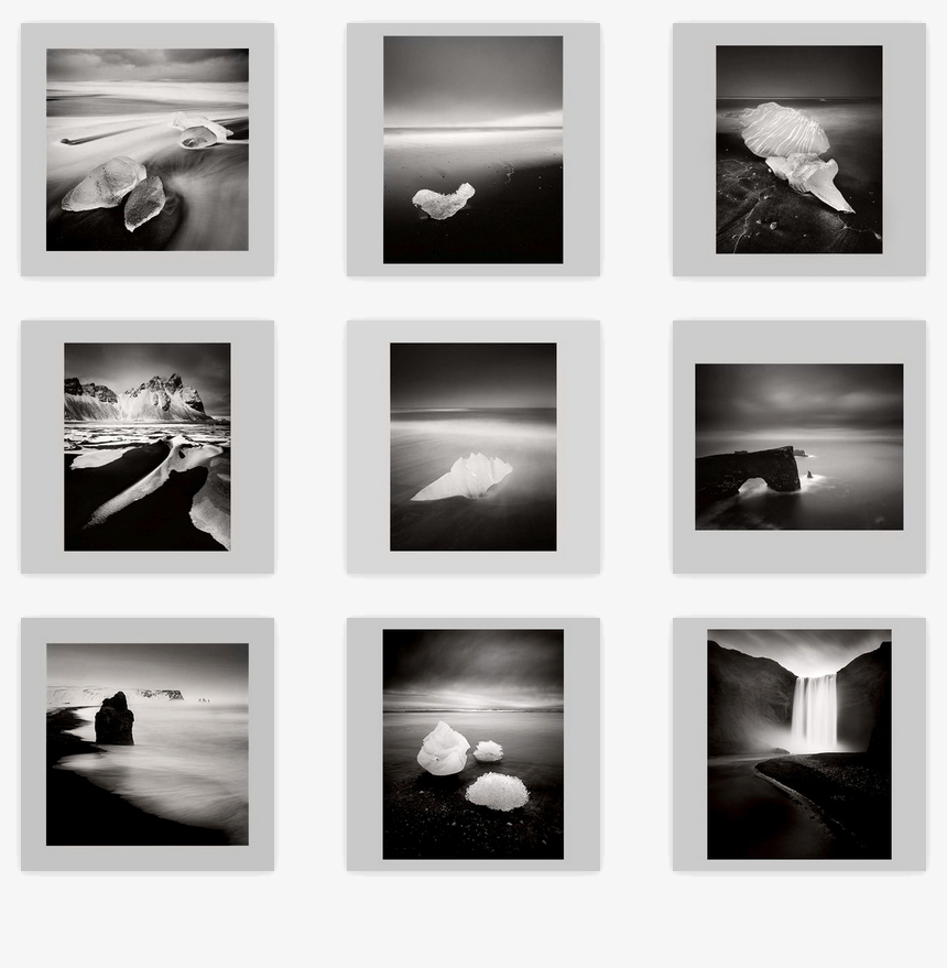
These images all started out life as colour images. Through working in a monochrome landscape such as the black beaches of Iceland, I learned a great deal about tonal relationships. This has, over the years trained my eye and I think when I compose …

These images all started out life as colour images. Through working in a monochrome landscape such as the black beaches of Iceland, I learned a great deal about tonal relationships. This has, over the years trained my eye and I think when I compose in colour, I'm very aware of tones and their relationships, which is why I think these converted straight into monochrome with little or no further editing.

"In the past few years, I’ve found I have started to talk more about tones and their relationships in the frame. As a way of helping others think more about composition and what they’re putting into the frame of their viewfinder, I’ve asked them to consider if certain tones merge when put side by side, and also if some tones compete for attention with other tones in the same frame.

"My feeling is that black and white is harder to do ‘well’ than colour is. Many may disagree, but I feel that with colour, you can have lots of tonal ‘errors’ in the frame and you still get away with it because you’re distracted by the colour elements. With black and white you’re only dealing with one thing and although that may seem much simpler, it actually means that any errors you get in tonal relationships really stands out.

"What I found was, that many of my existing colour images worked really well when converted straight into black and white with little or no editing involved. I think that’s because for a long while, I’ve been composing my images with tonal relationships in mind. My style of photography is of a more ‘simplified landscape’ and when you reduce your compositions down to more basic elements, you’re forced to look at tonal relationships more than if you were simply trying to cram a lot of subjects into the same frame.

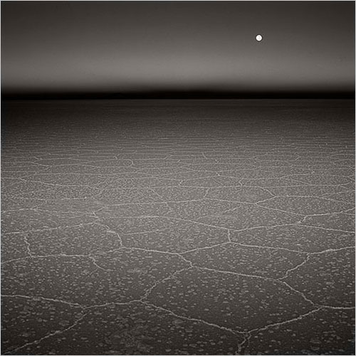
Bolivia was where i felt I started to work with more simplified compositions, simply because the landscape has so much space to it, you can't escape it if you work with what's given to you.

Bolivia was where i felt I started to work with more simplified compositions, simply because the landscape has so much space to it, you can't escape it if you work with what's given to you.

"So for me, the path to black and white started when I began to shoot more simplified colour landscapes. I found that understanding the different tones and their relationships between the objects present in the frame has been a great primer or foundation for beginning to work in black and white.

I’m often surprised that when someone has an images that doesn’t work in colour, they feel that a simple way to fix it is to turn it into black and white. As you and I both know, good black and white work is extremely difficult to pull of well. The key word here is ‘well’. I think a lot of people are happy when they turn something black and white, but it takes a lot more to make it special, and a good understanding of form and tonal relationships is behind that".

New website - monochrome

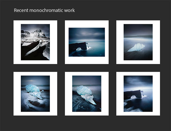
For the past while I've been noticing that many of my more recent efforts have been leaning towards a muted colour palette or towards a monochromatic look.

I've often said on this blog, that it's possible to see where you're going by looking back at where you've been. There are often clues and signs in your previous work which suggest the direction you are headed.  For the past while I've noticed signs that monochrome might be an avenue for me to explore. I've encountered some locations that have dictated a more muted or monochromatic feel in my colour work. The black volcanic beaches of Iceland is one obvious example of this, as the following images may demonstrate.

The black volcanic sand beaches of Iceland is one area where I think I was given permission to accept that pink skies don't  always suit the subject matter. Rather than looking at a landscape and wishing for sunset tones, it's best to find beauty in what is actually there. Work with what there is and if the tones are muted, and the sky is overcast - then embrace it. It has its own kind of beauty.

This is something I find many workshop participants have to overcome. What appears to be boring light or disappointing as it does not match a pre-visualised ideal of a certain location can, and often is great light to work with, providing you can see that this kind of light and muted tones are actually quite beautiful.

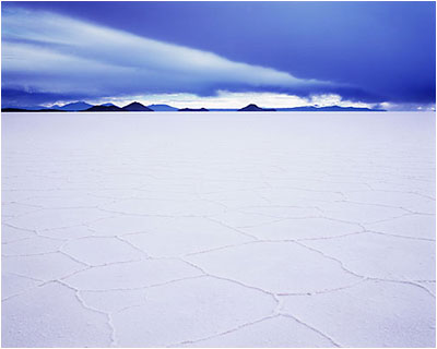
I think I've been working in a monochromatic way even before I visited the black sand beaches of Iceland. If I look at this shot of the Salar de Uyuni in Bolivia taken in 2009, it's really monochrome-in-blue.

But black and white isn't easy. I think that's one of the reasons why I've steered clear of it for so long. The medium is unforgiving when it comes to noticing any errors in tonal relationships. I feel it's a medium that is actually harder to work in despite common sense telling me that it should be simpler. It's often the case that what looks simple is actually very difficult to pull off well.

I've always felt I needed to gain a good grounding in darkroom interpretation skills - knowing where to dodging and burn rather than how, has taught me a lot about how the tones in an image interact. So for me, working in colour, and reducing the components of the scene down to a much simpler set of tones and colours has been a good primer for working in monochrome.

With this in mind, I've decided that it would be great to start exploring the world of monochrome a little bit more, in addition to my colour work. I'm sure both will influence each other over the coming years. But at the moment it's just a hunch and I'm really keen to see where things may go.

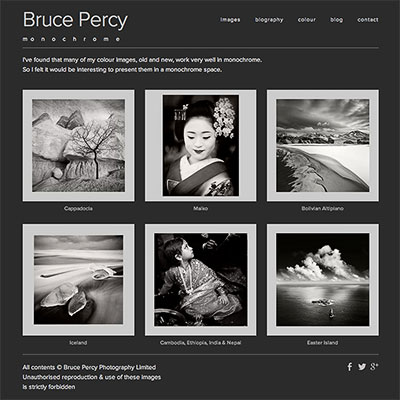
I've set up a new website for my monochrome work here: www.monochrome.brucepercy.com

The site currently contains some re-interpretations of some of my better known colour images along side some new images.

Lastly, my reasons for setting up a dedicated website for my monochrome work was purely aesthetic. I feel mixing colour and monochrome work together under the same space is trying to do too many things in one go, and that kind of approach never works. One will dilute or weaken the message of the other. Plus, I feel that the viewer should be led into a body of work and whilst there, enjoy a sense of continuity rather than being flung from monochrome work to colour and back again. It's unsettling for the viewer and it breaks any spell they may be under (hopefully) from immersing themselves in the work.

For me, the importance of how ones work is presented, should never be underestimated.

Thoughts on Black & White

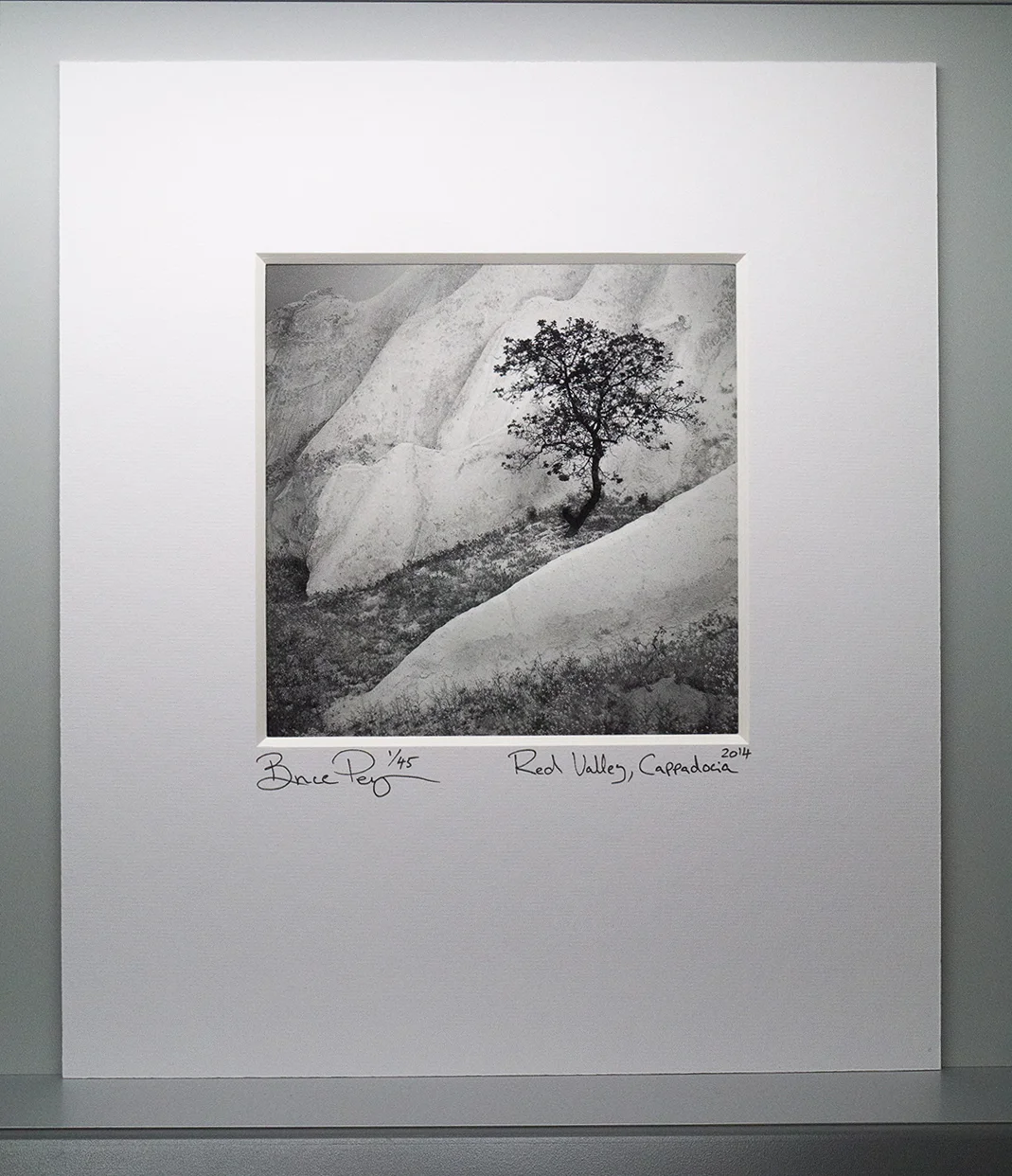
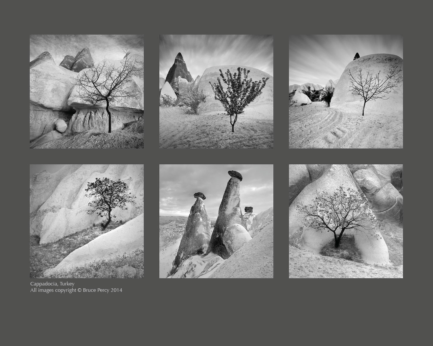
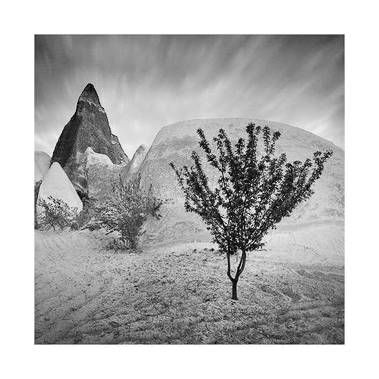
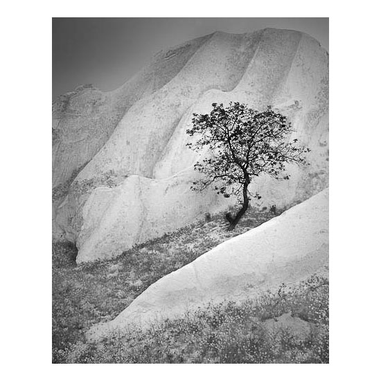
Over the past few days I've been editing work from a recent trip to Cappadocia, Turkey. The process has been a great learning one for me because I've found that working in Black & White has allowed me to focus solely on the tonal elements at play in the images. Click for full screen 24" version.

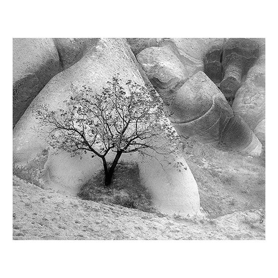
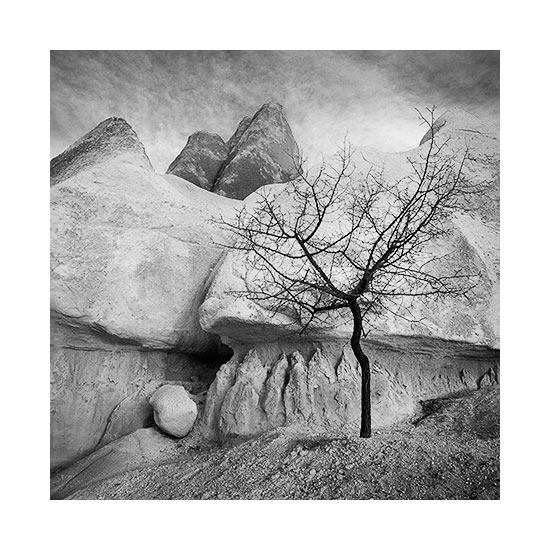
Specifically, I've had to spend a lot of time ensuring there is good tonal separation between foreground and background elements. For instance, the trees have been deliberately toned as dark as I could make them while the background tones have been lightened as far as I could, to ensure as much tonal separation as I can get away with.

Tones are one thing, but contrast is another. It's possible to convey a sense of depth to a scene by giving some objects less contrast than others. I chose to make the lighter rock formations as soft as I could - often reducing contrast in these areas. I increased contrast in select areas where I felt perhaps that a line or a curve or some other feature needed to be emphasised.

So often I feel that as beginners, most of us tend to add contrast globally but I feel that just pulls the eye in all-directions and leads to too many elements vying for the viewers attention. The image becomes fatiguing to look at for too long, because our eye is constantly being pulled everywhere.

Yes, Black & White is not just about adding lots of contrast, but also about smoothness of tone. Low contrast equals calmness while high contrast equals tension. Used sparingly, and in the right places, the eye is led around the frame in a pleasing manner.

On the subject of selection process, I shot a lot of images but I'm only left with the six you see here. I think when it came down to it, despite Cappadocia being a place of amazing rock formations, I fell in love with the solitary trees which I often found hidden away in the crevasse of a rock.

It's important for a collection of work to sit well together and this can either be achieved by collating images that have a similar colour palette, or by collecting images that have similar subject matter. I feel these Black & White images work well because they are similar in subject matter - the trees being the unifying theme here. But the compositions are similar in some ways too. But mostly I feel it's the use of tones across the collection that ties them together for me most strongly.

Editing is always a continuous case of reviewing where I'm at, how I feel about the work and it's that feeling that keeps me tuned into what needs to stay and what needs to be weeded out. Focussing on the tones in the images I shot, has led me to choose some images over others, simply because the tones were in keeping with the work I had amassed during my editing sessions.

Lastly, I've decided to present them here with a dark-grey background. Ansel Adams said that there was only one time in his career when he felt satisfied with an exhibition space, and that was because the walls had been painted olive-grey. I fully appreciate this - placing Black & White images on a white wall neutralises the white highlights of the print - which leads the viewer to perceive the print as much darker than it really is. Olive is akin to a mid-grey tone, thus allowing the brighter tones (in addition to the darker tones) a chance to stand out and sing.


The Rose, Red & Honey Valleys, Cappadocia

About a month ago, I was in the fascinating landscape of Cappadocia, Turkey. It's a beautiful landscape for sure, but I find it seems to want to be interpreted in black and white mostly.  

The Rose Valley


Black & White is not a medium i'm particularly comfortable with. It's really very, very difficult to make good images, because it is even more about form and tone than Colour is.


The Red Valley


I think Black & White is something where I have to be much more careful when isolating objects from others with similar tones. Any overlap and the eye compresses the two objects into one.


The Red Valley


Black & White also demands a sense of everything having its own tone. The trees in these two images deliberately have the darkest tones in the image - because I really wish to bring the viewers eye to them. I do use these kinds of techniques all the time in my Colour work, but I have the liberty of being allowed a little more lee-way because of the extra dimension (read that as distraction) of Colour going on, as well as just form and tone.


I'm not done editing at the moment. I've only really just started work on these, so I think things will change and morph over the next few weeks while I scan and edit. It's a very enjoyable experience to work in Black & White and to notice that sometimes I think the edit is good only to realise a few hours later, that I'm only half-way there.