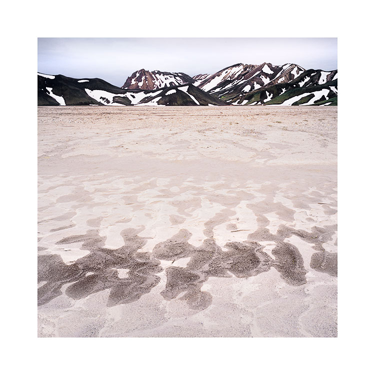
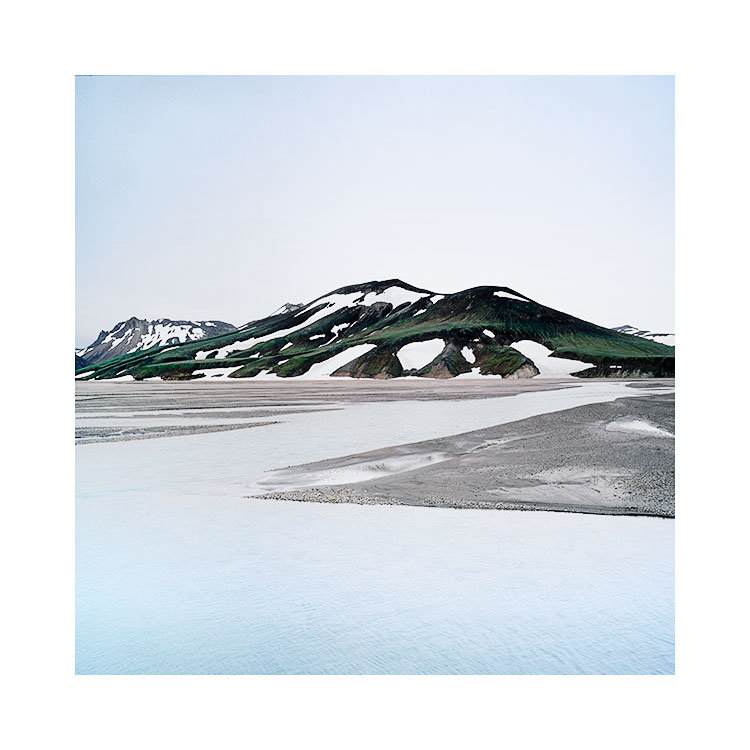
Euclidean geometry, Lençóis Maranhenses, Brazil

I’ve been reviewing my images from Lençóis Maranhenses tonight, as I will be visiting this fabulous place in a few weeks time for my second visit.

Lencois-Maranhenses-2018-(7).jpg

Why is it, that most photographers try to shoot the entirety of a lake or lagoon? Rather than using a section of it, which I think provides a more focussed composition, most are tempted to get the wide angle out and shoot its entire circumference. It just smacks of trying too hard to spell a message out that most viewers already understand.

All I’ve learned is that less is often more.

Try to fit an entire lake into the frame and all that happens is the picture become weak as a lack of presence ensues. All because one is trying too hard to convey too much.

Rather than trying to squeeze a whole lake into the frame of your camera, I would suggest you focus on a small region of the lake. Preferably an area that offers some kind of elegant shape to keep the viewer interested.

The viewer will fill in the missing gaps. As is the case with my photograph. For most viewers the lagoon doesn't stop at the edge of the frame: it continues beyond, and the viewer delights in filling in the missing gaps.

two parts of a whole

Over the past month I've been returning to Ray Metzker's 'City Still's' book, sadly out of print because Ray is no longer with us, having passed away in 2014.  The book is a fascinating study of form and tone.

Ray was a master printer, who could use his darkroom techniques to help bring forward the graphical elements in everyday street scenes. 

Image © Ray Metzker. This is really a study of vertical lines and two or three discreet tones.

Image © Ray Metzker. This is really a study of vertical lines and two or three discreet tones.

Metzker also had the talent to spot graphical elements in the everyday at the point of capture, and to work with them later in the darkroom. He was no 'post' processor - I doubt very much that anything he did in the editing stage was an afterthought.

I really abhor the term 'post-processing' because it encourages us to think that our editing may be something we do 'afterwards'. It encourages us to think of the two tasks of capture and edit as unrelated. They shouldn't be.

With Metzker's finely printed work, it's clear to me that he saw his edits at the point of capture. He knew how far he could pull and push certain tones in his darkroom, and this propelled him to go looking for tones and forms that would work within the parameters of his darkroom skills.

Image © Ray Metzker. I've never been so captivated by a car door before.

Image © Ray Metzker. I've never been so captivated by a car door before.

Photography is sometimes about making the viewer reconsider, to think again, to look at something in a way they may have never done before. Who would have known that the curve of a car door could be the focal point of a photograph as we see above?

Nor would one expect to be so enthralled by the coat tail and side lighting of clothing of anonymous passers by, as in the photo below?

Image © Ray Metzker. When has the coat tails of a jacket appeared to be so beautiful to the eye?

Image © Ray Metzker. When has the coat tails of a jacket appeared to be so beautiful to the eye?

The people in the image above are not important. We cannot see their faces and we do not need to know who they are, because the photograph is not about them. It is instead a study of form and tone, and Metzker uses the interplay of frozen people's clothing to bring us to certain forms. His printing approach is to subdue almost everything in the photo, and to give high relief to the highlights on the clothing. It is as if Metzker saw this kind of form and tone as an ongoing symphony in his everyday encounters, and I'm sure his darkroom work informed his choices when he was out shooting.

So I would ask of you, what do you see when you walk around your town? Are you seeing beyond the obvious? And if you are, how much of what you see is graphical?

To my mind, Metzker saw the graphical in the everyday. I sympathise with his ability to abstract the normal into a beautiful photograph because this is what I aim to do with my landscape work. I'm not interested in the verbatim. I'm much more interested in finding graphical forms and tones in nature and bringing them out in the printing / editing stage. So much so, that I go looking for them in the first instance.

I'd hate to think I am still doing things as an afterthought, as this is really the approach of a beginner. Instead, I would like to think that my capture and editing have become two pieces of a whole,  an interrelated activity where one informs the other, as they should.

Paper & Pencil - Grasleysufjöll

I know I had to go elsewhere before I came here.

If I had reached this landscape years ago, I doubt I would have known how to approach it and I would have struggled with it. Everything I have done with my photography has been a stepping stone onto other other things. For me, when I look at my recent work, I always see hints of the past and of other experiences and places that have contributed to take me to where I am now.

Grasleysufjöll, central highlands of IcelandImage © Bruce Percy, March 2017.

Grasleysufjöll, central highlands of Iceland
Image © Bruce Percy, March 2017.

Things happen through connections, be it emotional ones or physical. I've been following my 'art' with my feelings for many years simply going with what feels right. Every once in a while an exterior influence comes in and leads me somewhere new. Had I not been looking for a professional guide to help me get access to some of the less accessible, more remote areas of Iceland, I doubt I would have come to the central highlands in winter time. It was after all his suggestion. I had no idea just how photogenic this place could be. The conversation went something like this:

'Bruce, there is a landscape here that I think you would like,
but it is costly and difficult to get to.
It is a white canvas of black brush strokes, very minimal, I think you would like it
'.

And he was right. But I couldn't have done it without him and to this day I would still have no knowledge of this place if he hadn't mentioned it.

The central highlands of Iceland in the depths of winter time, is somewhere few go. Those that do are in convoy and are most probably only locals heading into the mountain cabins for some winter get togethers. There are no roads as everything is under several feet (or metres) of snow. Driving here requires skill, even as an experienced 4W driver, the skill required is above most 4WD skills.

I have some lasting memories of this trip into the central highlands and perhaps the most impressionable one is of how I took the photo you see at the top of this post today. I was literally standing on the top ridge of a mountain that my guide drove up on to. One minute we were in the valley below and I said that I liked the outline of the faint mountains and a few minutes later his car was driving up the slope to get me there.

When we arrived, the entire landscape was a white-out, with only a few impressions of black volcanic rock poking through the snow where they had been weathered by some recent rain and wind. Indeed, when I made this shot, the snow was blowing over the dark ridge you see in the foreground and the background mountains were coming and going with varying degrees of visibility.

The scene was etched into my mind not just because of how graphically strong it was, but mostly because my guide had taken a perverse pleasure in being able to take me anywhere. You see, for most of the year you are not allowed to go off-road. If you depart the main roads, even in the highlands, there are heavy fines involved because you will be eroding the land. But if you come here in winter and there is deep snow everywhere - then you can go anywhere that you car can take you (and can't take you, as you may find out!).

I don't think I've ever stopped a car and gotten out on a mountain ridge before. Nor have I encountered a scene like the one you see above anywhere else on my travels. Sure, I've been to many winter places with lots of snow, but I have never seen such an abstract and minimal landscape such as this - ever.

Our vehicles on a mountain ridge, suspended in space.Image © Bruce Percy, March 2017

Our vehicles on a mountain ridge, suspended in space.
Image © Bruce Percy, March 2017

Ellipses in the landscape

Those of you who have read my 'Simplifying Composition' eBook that was published a few years ago will know that I'm a big proponent of utilising shapes and patterns in the landscape. I think that curves and diagonals work well because they follow the way the human eye likes to walk around a frame.

Volcanic crater, Veiðivötn, Central Highlands of IcelandImage © Bruce Percy 2016

Volcanic crater, Veiðivötn, Central Highlands of Iceland
Image © Bruce Percy 2016

The eye tends to prefer to scan around images diagonally, and it's not too comfortable if it has to scan horizontally or vertically, unless of course the composition is all about strong horizontals (for instance, the trunks of trees can emphasise the vertical aspect of a composition) or with a panoramic image, strong horizontals aid the composition rather than deter.

Below is an excerpt from my e-Book 'Simplifying Composition':

In general, we tend to enjoy scanning images in diagonal movements. If we are forced to do otherwise, it causes discomfort and the image becomes tiresome or frustrating to look at.For example, if our eye is forced to walk horizontally between two su…

In general, we tend to enjoy scanning images in diagonal movements. If we are forced to do otherwise, it causes discomfort and the image becomes tiresome or frustrating to look at.

For example, if our eye is forced to walk horizontally between two subjects, then flow through the image is interrupted and the eye begins to boomerang back and forth between the two.

The same is true with verticals. When my eye is forced into jumping erratically backwards and forwards between the top and bottom of a frame, I find it very displeasing.

However, If my eye is forced to walk through an image diagonally, I find I can comfortably traverse it without any desperate feeling to jump from one end to the other.

See how your eye feels as you follow the arrows in the diagrams above.

But what of circles in the composition? Do they work? Well I'm not really too sure that they often do. Each time I've shot rock pools, they never look pleasing to the eye is they are entirely round, and I find that shooting them from an incident angle, thus turning them into an eclipse more pleasing.

Consider my image in todays post. In the background of the shot the volcano has taken on a very strong graphical elliptical shape. It's not by any stretch the main focal point of the image, but I feel that the eclipse is there anyway. 

If we think about s-curves, they are really compound curves, and curves when we break them down to what they really are - they are really curved diagonals. Ellipses are really compound curves!

Back to the shot: I was initially attracted to the little stream in the foreground. I felt it would make a suitable interest focal point for the composition. But it was really the sweeping curves of the horizon and the ellipse of the volcanic cone that chose the final composition for me.

I enjoy also working with very definite tonal ranges in my landscapes. I can find not only interesting graphical shapes to work with in this landscape, but so too do I find dramatic tonal ranges also.

As I continue with my own photographic development, I just think that everything is ultimately broken down to shapes and tones. There seems no better place for me to do that, than in the vast abstract wilderness of the central highlands of Iceland.

Graphical elements, or landscape?

The Landmannalaugar region of the central highlands of Iceland offers up a lot of graphical elements when the conditions are right. The following images were made during the summer of 2015 when there may still be snow in the region. Winter always has a much firmer grip on the centre of Iceland for longer than the coastal regions, and it's no uncommon to find that some areas of the highlands are still inaccessible in the early summer months.

Arcs & Triangles, Landmannalaugar, Central Highlands of IcelandImage © Bruce Percy 2015

Arcs & Triangles, Landmannalaugar, Central Highlands of Iceland
Image © Bruce Percy 2015

If you're a regular here, then you'll know that I'm particularly drawn to a more minimalist style of photography. I love to play with graphical elements that occur naturally  in the landscape and use these to impart (hopefully) a more powerful composition.

Curves and diagonals as well as tonal balance or proportions in the frame balancing in some way or other are the things that I love about what I do, and some landscapes are better for working with these themes than others. The central highlands of Iceland is one of those places, but I should warn you - it's not an easy place to photograph!

Camouflage, Landmannalaugar, Central Highlands of IcelandImage © Bruce Percy 2015

Camouflage, Landmannalaugar, Central Highlands of Iceland
Image © Bruce Percy 2015

I've just been going through a lot of my images from my recent trip here  this September past, and as part of completing work on this small chapter in my photography, I felt I had the enthusiasm and time to pull out the transparencies that were shot over a year and a half ago.

I'm a big believer in doing things when they 'feel' right. I never got round to editing the work from the summer of 2015 because I just wasn't in the mood. For years, I would have never let work sit unfinished for so long, but I've become comfortable with this approach now. Dare I say that I've gained some confidence in feeling that there is no rush, no need to edit right away, and that if I leave the work until I feel inclined to work on it, then that will produce better results.

A much younger me would have felt an internal pressure to work on the images soon after, and would have worried that if I left them for more than a year, that I would never get round to working on them. Well, that ain't so. I've got a massive backlog of work from the past three years or so, and I'm aware that although some of it I may never get round to, it now seems to be a common theme for me to only get round to editing the work maybe a few months or much later on.

What I loved about working on these three images, was that I hadn't seen them for more than 18 months. I could connect with what they are, rather than what I had intended at the time. I also think my eye is looking for things in a more attuned way than I would have been a year and a half ago.

These three images are really all about shapes. Graphical elements. The landscape is often full of them, they are signs, indications of what needs to be photographed, composed a certain way and also edited a certain way. Look for them, forget that you are photographing mountains river and sky, but think instead about patterns, shapes, curves, diagonals and the occasional triangle, and I think you can't go wrong. Well, you can go wrong if this isn't something that appeals to you. So only go this way if you think it makes sense. I offer it as a suggestion if you think it does :-)

Curves & Zigzag, Landmannalaugar, Central Highlands of IcelandImage © Bruce Percy 2015

Curves & Zigzag, Landmannalaugar, Central Highlands of Iceland
Image © Bruce Percy 2015

Minimalism in the central highlands of Iceland

I'm just back home from Iceland where I've spent the past nine days in the central highlands. It's a fascinating place that I became acquainted with several years ago. This however, has been my first tour here with a group and I, and the group loved it.

Fjallabak Nature reserve, IcelandImage © Steve Semper 2016

Fjallabak Nature reserve, Iceland
Image © Steve Semper 2016

I thought it would be nice to show an image that Steve Semper and myself worked on while on the tour together. I think the attraction for me about this landscape is on three levels:

1. The possibilities of abstraction and graphic elements that can be found here if one really works hard at it.

2. The range of tones from monochromatic landscapes to places where there are extreme colours. This is a landscape that asks to be what it is: it is a highly beautifully stark place, where sometimes there feels as if there is no colour, just different shades of grey.

3. It is a landscape full of compositions and possibilities at every turn in the road, yet most are not 'honey pot' or 'iconic' places. It is a landscape that encourages you to step away from the obvious.

Back to Steve's image. We spent quite some time at this location - a purely arbitrary point for me which I loved simply because of the tonal separation between black sand desert and waters edge. What you see in this photo is actually a black sand bar - a small island of sand poking out from the surface of a lake.

What I love about finding arbitrary places to stop at, is that you never quite know what is there until you get out of the car and start to explore. I feel that choosing one part of this lakeside over another is a process of reduction. We started out with some edges of the lake that felt promising only to find towards the end of the shoot that a particular sand bar held the most promise in terms of graphical shapes to make a pleasing composition from.

Even when we did find this sand bar, we spent quite some time fine-tuning the composition so the edge of the sand bar touched the far left-hand side of the frame. There was further additional parts of the sandbar that if left inside the frame, would have prevented the elegant shape that you see here to stand out. Often I feel that making good images is more about what to leave out rather than what to leave in.

I shot around 40 rolls of film whilst on this trip. It was a real adventure - a real process of discovery and surprise each day and I'm now looking forward to going back next year. In the meantime, it was a pleasure to see other's work come up on their digital camera's live-view features, as it reminded me of how much potential may be lurking inside my films once I get home and have them processed.

Many thanks to Steve Semper for letting me show his image on this blog.

Association versus the anonymous

I often feel there's too much emphasis made of association.

Landscape photography requires us to be able to abstract: to reduce meaningful objects down to their graphical forms. Rather than thinking about trees, rivers and mountains, we should be able to see them for how beautiful their forms are. Rather than seeing 'mountain', we may see  'pleasing conical shape', rather than seeing 'tree', we may see 'pleasing wavy flow through the image', and rather than seeing 'river', we may see 'beautiful s-curve through the frame'.

Scarista, Isle of Harris, Scotland November 2014, © Bruce Percy. But you didn't really need to know where it was did you? ;-)

Scarista, Isle of Harris, Scotland November 2014, © Bruce Percy. But you didn't really need to know where it was did you? ;-)

But I think this only happens for some of us, and for the majority of us, we photograph things because we know them. If I show you a chair, you associate with it, because you know what a chair is. If I show you a tree, then most people see a tree, because it's what they already know.

To find a beautiful composition, we need to be able to see the relationships between objects, not in terms of what they are (association) but how they graphically fit together. Perhaps the tree and the mountain have similar shapes and there is empathy? Perhaps the tones in the river compliment the tones in the tree? If we do this, we make our imagery stronger, because it has more foundation in the arts than it does in real life.

But there is more to this problem than simply being able to abstract objects down to their basic elements of form and tone. Our problem goes much deeper than this. I'm guilty of finding myself on many occasions making pictures of a place, not because the light is beautiful, but because the place itself is iconic. In fact, sometimes the light at the iconic place is not so special and there is better light elsewhere, yet I still choose to photograph the iconic place.

I've had to ask myself why is it that I do this? Well, I think the reason is simple: we are attracted to what we know and the power of association is a very strong force to deal with. We seek what we know, because we find safety and comfort in it.

So my question to you is: what would you rather do? Would you prefer to photograph an iconic place in boring light, or photograph an anonymous place where the light is beautiful? I think you may say the later, but the truth is, I think many of us often do the former. I'm certainly guilty of it.

When it comes down to it, a photograph of an anonymous place in beautiful light is more powerful than a photograph of an iconic place shot in boring light. But despite believing this, I seem to always gravitate to what I know over what is photographically better.

Being a landscape photographer is sometimes about overcoming our human instincts to go with the familiar and this is certainly one example where our being human gets in the way of better photography.