More cover mock-ups

I'm heading down to Nottingham on Monday to work on my 2nd book layout. Darren has been sending me some ideas on the cover and slipcase, and these have been feeding back into my own mind and resulting in more changes.

The choice of a font, can really make a huge difference to how a books is received. We conjure up expectations based on how the cover of a product looks, and in these mock-ups, the font is more 'modern' than the one's in the previous mock-ups.

I find this all very exciting, and full of surprises. I've been living with the previous mock-up in my mind for some time, and was imagining the book sitting on my bookshelf, and now, what was becoming 'real' is now becoming fiction for me again... something fluid, changeable. It makes me wonder just how different the book will actually look once we've got the design complete, which I would imaging, should take a few more weeks of fine tuning once Darren and myself have gone through setting up the initial look.

The other good news is that the preface has been written by my very special guest photographer. More news about this at the end of the month in my monthly newsletter.

Variations on a theme (read location)

This image was taken at one of the many times I've been down at the waters edge of Reinefjorden.

I can't seem to stay away from the place, and I've shot it under vastly different lighting. The above shot was taken in February as part of a Safari I was running. We did come back in March too, and we got the light you see in the image below:

Quite a marked difference in light. Partly to do with the sun being more directional, hitting the edges of the Lofoten 'wall', this shot was very much a 'throw-away' effort at the time. But I'm glad I decided to stay put and just shoot. Literally a minutes walk from where we were staying, it was from a slightly different vantage point. But it was the same fjord, and the same mountains, just from a slightly different angle, and with much different light.

But I also shot this image in March too, of the same fjord:

But I think the last image is more a 'standard' landscape image. It shouts 'vista-shot', which is no bad thing, but just perhaps a little too 'expected' for my own liking. I much prefer the first two efforts as in each of them, there is a very strong message that I feel is less evident in this shot.

I think that what I'm striving for in every image I make, is some form of presence, or individuality. Certainly the first two are very unique. The first is mostly a play on lighter tones and calm reflections, with a dominant mountain in the frame, while the second image is mostly about directional, moody light.

Returning to the same location time and again, always yields something new, because each time the location is new. We are reactionary beasts and in photography, I feel that means we react very much to the differences in the quality of light - if we choose to observe, and notice those differences.

When impressions don't match results

When I'm out making images, I have to trust my intuition - it's part of being a film shooter - I can't see what it is I've captured until the films are processed much later. I would say though, that after shooting film for over 20 years now, that I feel I've got a fairly good grasp on how well things are going at the time of capture.

But there have been a number of occasions of late, where I feel that what I created, once home, and reviewing the transparencies, did not equal what I thought I was achieving at the time. In some instances, the final images have surpassed what I felt I captured. This was evident last summer when I visited Iceland. I had a terrible head cold and felt that the entire shoot was a disaster. So much so, that I came home early, feeling very despondent and assured that the whole shoot had been a disaster.

When they returned, and I finished work on them, I discovered I had this collection of imagery:

I was a little overwhelmed at just how well the final images turned out, and in particular, how the images are perhaps some of my personal best work, despite my belief at the time that things weren't working for me whilst on location.

I'm curious as to just what it was, that helped me make such a strong collection of images, despite my belief at the time that the images were no good?

I feel, that we should always be willing to review not just our work, but also ourselves. I little bit of introspection - or self-awareness is no bad thing, and in fact, I think it's perhaps the most important thing in photography. We often overlook the most important ingredient in image making - ourselves. I've written about this on several occasions now, and I've even gone to the trouble of writing an ebook about it too.

So I'm no stranger to being surprised by my own efforts - a creative person should find himself surprised every now and then, and if he isn't - it's maybe because he never re-evaluates himself, or the work he's created.

Above is a contact sheet for my first escapade to the Lofoten Islands last March. I feel this too, is a very strong body of work. The only difference between this and my Iceland shoot, was that I knew I was capturing something of merit at the time.

So this year, I've been to Lofoten twice. I'm in the middle of editing the final images from two shoots - one in February where we had the most spectacular light and plenty of snow, and a second trip in March where the snow was fast disappearing and I didn't feel that enthused about what I was capturing.

Again though, I'm surprised. The latest (and most disappointing shoot) seems to be providing the most thought-provoking images out of the two shoots. Which is not what I anticipated.

I think there are perhaps numerous reasons why we should have such a disconnect between what we anticipated and what we actually get. I'll try to cover some of them (as I see them) here for you. Maybe you'd like to suggest some others that I've missed?

1. Lack of experience is the obvious one. But as I've said, I feel I've become pretty proficient at what I do, but there are still those moments where my vision seems out of sync with my ability.

2. Being overwhelmed by the experience of simply being there. Some places are more pleasant to shoot than others. But this has little impact on the final image. A rainy day can make the whole experience feel worthless, yet we can still come home with some surprising images. Part of this is because we have to learn that the quality of light that we find pleasing and enjoyable to be in, is not the same as the quality of light that a camera prefers to record. Camera's like low contrast light.

3. Energy levels. If you feel like crap, you can't really be that objective about what it is that you're doing. If you're unexperienced, you  will most probably let it influence your shoot as well. More proficient photographers (although not immune to this), can often still come home with good images because of the amount of experience and technique they've built up.

But i'm wondering, if you're not entirely there - if you're feeling sick, or your mind is distracted, and you still come home with good images, then what is going on? Is perhaps the illness taking your mind off things a little? Is it acting as a distraction? A distraction that allows the mind to think more laterally, and come up with things it ordinarily wouldn't?

Your comments are welcome.

3.

What we don't see, we can't learn from

While I was staying at Lilians guest house in Lofoten last week, we had a discussion about music which I felt had a lot to bear on the process of photography. Lilian was explaining to me, that when composers wrote their musical manuscripts, they always wrote down the exceptions, the things that should be played differently. They never ever wrote down what was normal practice. It seems that in the classical world of music, we have very little knowledge of what was assumed as standard practice back then. So when we come to interpret manuscripts from the past, we only know about the exceptions and have no idea how the piece would have been played based on fashions of the time.

Our little conversation got me thinking about just how much we learn from looking at other photographers work. I know I've learned a lot from viewing the work of photographers that I admire. But based on my conversation with Lilian, I'm now thinking that I've only learned a small amount of information by looking at a completed set of photographs.

Put it this way, good photographers only show their best work. They do not show you all the mistakes, or near-misses that they encountered on the way to creating the final image. We have no understanding of what compositions came before the final one, or whether the composition was tuned until they got it 'right'. If Ansel Adams had been a medium format shooter, I would have loved to see a contact sheet of the not-so-perfect versions that came before many of his iconic images. It would teach us a great deal.

In my own case, I'm aware that I often start off with a nice composition, but as the shoot progresses, so too, does the composition become more refined, until I feel I've got as far as I can with it. Distracting elements are slowly removed, and over the course of half an hour, I might find the composition becomes simpler. But you'd never know this, because you never get to see the set of images in the sequence that lead up to the final image.

I think this brings me to a problem that a lot of amateurs have. They feel that everything they do should be good. They give themselves a hard time if they are not. Someone who is proficient at their photography knows there is an evolution stage to most of their best images.

I don't often start off with a good composition. I have to work at it. I am, essentially starting from square one each time I go out to make new images. But the important thing is, that I allow myself the freedom to make mistakes, to experiment. It is by only allowing myself that freedom, that I can hit upon something worth exploring and then moving onto further tuning.

Everything starts as chaos. all artists give themselves up to starting from scratch every time they begin a new work. What is 'work in progress' may look bad, but good artists know that things are fluid, in an incomplete state. Amateurs who set high standards for themselves, aren't prepared to live in this 'no-man's-land' of incompleteness - it's a frightening place to be, because it requires confidence to know that they are on the right track with what they're creating. I think this is overcome with experience, and experience comes from being patient and giving yourself the time to develop.

I think this is why we often hear people say things like 'oh, that's so good - i could never do that'. Because they can't visualise all the blind alleys, wrong choices and evolutionary stages that an artist had to go through to create the final work. All they see is the final work and assume that whoever created it, knew what they were doing from the onset.

It simply isn't true.

I wish each landmark photograph out there came along with a set of documentation to show its evolution stage. We would sometimes discover that the photographer happened on the final image, almost by chance. We would learn that the photographer was confident enough to allow themselves to run free and not be too worried if the image didn't amount to much. We would also learn how the final image was a vast improvement, because of all of the objects that were removed out of the frame over repeated fine tuning. We may also learn that the photographer took a step further into the scene, and this changed the potential image  from something that was mediocre to something that was spectacular. We would learn so much.

I find it intriguing that every published image we look at, is an incomplete story. They only tell us about the final destination, but nothing of the journey. For this reason alone, they are illusions. I think that's why I love photography so much, because great images cast a spell, and part of that spell is that we were never privy to what the magician (read photographer) had to go through, to give us his final vision.

I'm coming out to San Fran / San Jose this December

I'm in the middle of planning a trip to come visit a school friend of mine this December who lives in San Jose. I thought that since I'll be out that way - if you have a photographic club, and would be interested in me coming to do a talk about my photography (I'd just need a nice digital projector and screen - and some decent audio speakers to hook up to a laptop), then please do get in touch. I've decided that on my future travels, I'll advertise that I'll be in town, and see if I can slot in a talk for a local club if I can.

I love doing talks for clubs when I can. It's very enjoyable for me to discuss my photography and relive some of the experiences I've had whilst making my images.

It's great to meet some folks, and I thought it would be a great way to get an introduction to some of 'the locals' while I'm out visiting!

Cleaning your Gitzo

Every workshop I do, means my tripod often gets dumped into salty water. Salt water is highly corrosive, and if you're doing a lot of beach shooting, you should be stripping down and cleaning that tripod of yours after each outing. One of my clients from the USA, Mihir, sent me this link today -

http://reallyrightstuff.com/WebsiteInfo.aspx?fc=150

Really Right Stuff have a short tutorial on how to dismantle, clean and re assemble a modern gitzo tripod. I've just run through it and it's pretty good advice. You may find sometimes, that you do need to use some grease on the threaded collars though - if you do - a word of advice - get the Gitzo grease. I've found others are not suitable and once mixed with salty water, can lend your tripod frozen up for good.

Book Review

Every now and then, I'm informed about a review of my first book. Noeleen Hargan has written perhaps the most objective review of my book that I've read so far. I say this, because in her review, Noeleen considers what I had to say in my text and she gives the reader an idea of what to expect, if they were to purchase the book.

This would seem to be an amazingly simple objective that a reviewer should have - to give the reader an idea of the content of the book. But as I said a few months back - I don't tend to read the reviews now, because most of them lack research - it's clear to me from the content of the review that they haven't read the text (I'm sure this is very common - and one of the many reasons why authors don't read reviews!).

Anyway, I felt that Noeleen's review of my book was very considerate. She's clearly read the contents, thought about it, and makes some points based on what she's read. Noeleen has kindly allowed me to reproduce it here for you all to read.

The lure of endless possibilities

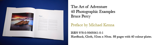
Book review: Bruce Percy, The Art of Adventure – 40 Photographic Examples. Half Light Press, Edinburgh, 2011.

No, a photograph is not a simple visual report of “what was there”. In Bruce Percy’s words, photography is “an emotional response to what we see and feel”. His first book, The Art of Adventure – 40 Photographic Examples, its format and title paying homage to Ansel Adam and Galen Rowell, lends substance to this view.

The book’s 40 images are each accompanied by a one-page commentary providing insights into the image-making process. While the locations vary from the photographer’s Scottish homeland to further afield – Argentina, Bolivia, Cambodia, Chile, Ethiopia, Iceland, India and Nepal – before long, the book’s underlying question becomes clear: Why this photograph?

The backstage insights shared with readers include descriptions of the setting in which each photograph was created. Percy talks about his fears and worries, mishaps and coincidences, makes technical and compositional observations, and interprets the sense of his work while reflecting upon the role of emotions and the unconscious in image-making. Above all, he tries to convey to readers what drew him into an image, why that particular image was made, how he feels when he has made a good image.

Percy loves the fact that photography in general “gives us a reason to get out there and experience new locations and new people”. The “endless possibilities” offered by photography are themselves a source of inspiration, he feels. At the same time, he knows that “one of the biggest mistakes a new photographer can make is to keep moving and not spend enough time in one location”. Slow down, he seems to be saying, and think about what you are doing, why you are doing this. Or at least, this is what he seems to have said to himself at some point along his own photographic journey.

Percy knows the joys of making landscape images “at an unearthly hour, in the silence, just you and your camera.” Perhaps this is one reason why his photography often has a mystical, meditative quality about it. These days, he tells us, he is striving for an “otherwordly” mood in his photography, along with simple shapes and tones.

One unexpected component of the book is the portraiture. Until now, I had associated Bruce Percy exclusively with evocative landscapes, but now am intrigued by his assertion that “portraits should be landscapes in their own right”. He sees portraiture as “very similar” to landscape photography. As he puts it: “I’m looking for an aesthetic that is pleasing in terms of composition, light and tonal balance. But I’m also looking for a spirit, and that is not too different from landscape photography after all”.

Knowing what you’re looking for may well be half the battle or more, but photographers keen to make the most of photography’s “endless possibilities”, should perhaps take their cue from Percy’s account of finally succeeding, on his 4th attempt, in making the sunrise image he wanted at the Laguna Torre in Argentina’s Los Glaciares National Park. As in the legend involving his namesake Robert the Bruce and a spider, Bruce Percy simply tried and tried again.

But perhaps some of the book’s assertions shouldn’t be taken too literally, such as “there appears to be no such thing as bad weather”. Try telling that to a sodden, bedraggled group of photographers from Italy, on a week-long trip to the Highlands, while they are sheltering from the Scottish wind and rain under a low stone wall near Rua Reidh lighthouse;-)

The Art of Adventure – 40 Photographic Examples is an absorbing read for anyone interested in photography, and a compilation of beautifully-reproduced photographs that you will want to look at over and over again.

Review © Noeleen Hargan, 2012

The original review can be found at Noeleen Hargan's blog here: http://www.respirolestelle.it/html/index.php?option=com_content&view=article&id=240:recensione-the-art-of-adventure-bruce-percy&catid=34:recensioni-letterarie&Itemid=55

And of course, if you want to buy a copy of the book, you can find it at the Half-Light Press website.

Red Morning, Reine, Lofoten, Norway

Just a quick post tonight. This image is of my favourite mountain in the Lofoten islands - Oldstind. We had some spectacular light in February (there's no guarantee what you'll get, any month).

I love simplified compositions and anything that is distracting should be thrown out. You'd think that having loads of stones in the foreground would be distracting, but for me, I'm always looking for uniformity. They all are very much alike, that my eye quickly absorbs them. That, I feel, is the key to good images - nothing should really jar with your eye's movement through the frame. It also helps that the snow is of similar tonal ranges to the mountains in the mid-ground. And of course, the light was spectacular this particular morning. Really something.

Enjoy your weekend. Many more 'wintry' images to come over the next few weeks as I work through my backlog.

Lofoten Islands, Norway

I'm just starting to work through my backlog of images from my last two (recent) safaris to the Lofoten Islands this February and March.

I loved the simplicity of these little ferns in the bay of Ytterpollen. It's normally full of reflections of the background mountains, but when we got here in February, the entire bay was frozen over. While the group were eating their packed lunch out of the boot of the car, I made this shot at the roadside on my Hasselblad.

I love shooting shallow depth of field at the moment. Being able to see through the lens is a luxury for me, after spending so many years working with a rangefinder (which i still love very much).

Anyway, I'm looking forward to going back to Lofoten in 2013. I published dates for two consecutive safaris in February this morning, and all the spaces were sold out within four hours.

I'll be back with more images from my trips, as the days progress. But right now, I'm off to watch some telly and enjoy some time at home. Enjoy your weekend!

The art of expensive toys?

For those of you who’ve been reading my blog for a while now, you’ll know I spent a bit of time last year getting a good colour managed system in my studio. Last year I bought an Epson 4880 printer and Colourbursts RIP driver. I also bought a viewing booth, which is vital in allowing me to assess and review my prints under daylight balanced light.

So my colour management was going really nicely, until my screen calibration tool broke. My trusty old Gretag Macbeth Eye One (now Xrite) started to produce wildly varying profiles, and after evaluating it on a friends system, I quickly came to the conclusion that it was broken, which probably explains why it went into the bin last year.

It’s an admission I’m not comfortable making, but I feel I must. Since last October, I’ve not been able to calibrate my screen. This might sound like terrible news.... how can Bruce work on his images if his screen is way out? Well, the simple answer is that I was able to confirm that my screen wasn’t ‘way out’. In fact, it turns out that my screen, when set to default settings was pretty much ‘way in’. Let me explain.

I’ve got an Eizo CG241W display at home. It comes from the factory calibrated. I hadn’t realised just how well calibrated it is in 'factory-mode' until I evaluated it whilst using a calibration test target. The test target comes in two parts - the first part is a TIFF file you open up in Photoshop, while the other part is a printed file, that when put under the viewing booth I own. If the TIFF file is opened up and the correct proofing setting enabled, both the printed file and the electronic one *should* look very similar. Well, it turns out that my test target looks pretty damn close when my Eizo is set to default settings. So this is how I was able to work for the past six months without a display calibrator.

To be fair, evaluating a printed target against one loaded up in Photoshop with proofing enabled is really the only way to ensure your calibration is true or 'close'.

But I have to confess that good is never good enough. I’m a perfectionist, and if there’s any chance of error in what I’m seeing on my display, it does make me feel a little uneasy. So I’d had my eyes on a new screen calibration tool for some time.

Enter the BasICColour Discus. I’d read so many review of it, seen it calibrate screens much tighter than anything else on the market - I knew I had to have one. But it’s not cheap, coming in at around £850. Yep, that’s around four times the price of an Xrite i1 Pro, which has similar features.

I felt that since I was getting ready to prepare my Iceland images for my 2nd book, I should really invest in a decent screen calibrator, and well, I must confess - I was sold on the Discus. Sometimes, I’m attracted to something because there’s an element of gear-lust involved (as much as I hate to admit that I'm susceptible, just like anyone else is to being attracted to some piece of gear), and in the case of the Discus, it’s a beautifully crafted piece of engineering. It reeks quality. But is it any good?

Well, I’m not really going to give you any deep technical reviews of the Discus, but suffice to say that although the calibrations are very accurate, they’re not as tight as the reviews I read before purchase. Do I feel deflated? A little, yes. But I think overall I’m happy, because the Discus is a quality piece of solid engineering. I'm just curious as to whether it was worth the 4 times the price tag of an Xrite i1 pro though.

So is there a message in this post for you all? Perhaps. I guess it's very easy to be swayed over by 'expensive = better', when in fact, we all know, as I have always done, that so long as the tools do the job, the rest is really up to us.

Ultimately, I can now get on with the main task at hand, that being preparing my Iceland images for print in my second book.

Tools are jumping boards to help us convey what our vision is, they are a means to an end. Do I wish I'd bought an Xrite i1 pro? Maybe.... but I think when it comes to making sure that colour is accurate, I would have preferred the option to test both items to see how far different the profiles are, before sinking the money. That said, now that I've done the deed, the profiles out of the Discus are very good indeed, so I'm not that interested in wasting my valuable time by splitting hairs between calibration devices.  That is a job for someone with some free time on their hands.