Cono de Arita, Puna de Atacama

Today I just published some new work. This time round, from a place I've never photographed before - the Puna de Atacama.

I visited this high plateau early on this summer. Perhaps the most startling location here is the cono de Arita - a small volcano that is only 122 meters high.

I was really taken with its conical shape and the tonal contrasts - the white salt flat is at polar opposites to the dark tones of the cone. The place has a surreal, alien quality to it and I really wanted to convey that in the final edit you see here.

But it's a tough place to visit: at a high altitude of around 4,000 metres, and very basic amenities (more basic than in Bolivia), plus very very long traveling distances between locations - I found my time here a challenge.

I missed a lot of places because we were passing through at the wrong time of day, or because we simply ran out of time. In my minds-eye I can still see so many key locations that I failed to capture, that I know I really do have to come back. So I've already begun planning some time there again in 2016.

I love how photography has the ability to steer you in new directions and take you on new journeys :-)

Sometimes it's about the sky, or ground, but seldom both

Disclaimer: Please note, that I write these articles to stimulate some thought. I will sometimes generalise a point or simplify an argument  in an attempt to convey a message. Ultimately,  it is just my point of view and of course is not the definitive word on the matter (as much as I'd love to think so!) ;-)

As much as I would love to fit both sky and ground into my compositions, I only have so much area within my frame to work with. So I have to figure out what is central to the story I'm telling in the image I'm composing. If I add a lot of sky in, then it should either compliment the foreground in some way (if both sky and ground have a relationship - by mirroring shapes or mirroring textures / patterns), or it should dominate the scene.

Picture 1Despite many thinking this image is about the desert and the mountains, it's really about the sky. So much so, that the sky covers 3/4 the area of the frame, while the ground only covers 1/4 the area. My eye moves mostly around the sky with…

Picture 1
Despite many thinking this image is about the desert and the mountains, it's really about the sky. So much so, that the sky covers 3/4 the area of the frame, while the ground only covers 1/4 the area. My eye moves mostly around the sky with occasional visits to the two mountains - often in a triangular motion around the frame.

For me, it has to be either / or. You either have a lot of foreground and little sky in the frame, or you have a lot of sky and little ground in the frame. 

We have to figure out what is it that we're trying to say, when we choose the proportions of sky and ground. Is the photo really about the desert and mountains? Or is the image really about the sky, and the mountains are in the frame to give some kind of context?

Settling for something in the middle often results in a confused message. The end result is that the viewer is pulled between both sky and ground and a competition race between sky and ground ensues for the viewers attention (see Picture 2).

But it's hard to choose the sky over the ground as a dominant subject. We tend to give foreground or ground subjects more prominence than they deserve because they are usually what draws us to a location in the first place. In the first image above (see Picture 1), I had that very circumstance. I was first drawn to this place by the strange rocks and mountains to be found there. We can be so wrapped up in what grabbed our attention, that we may fail to see other motifs or interesting patterns elsewhere (such as in the sky). Picture 1 is all the cloud shapes and the light scattering upon them. It is a 'sky photo' with some contextual mountains in the foreground. Not the other way around. 

I've re-cropped the image so we can look at it from another point of view. In Picture 2, it would have been so easy for me to compose the shot in a more traditional format - with the sky only taking up 2/3rd's of the frame and the ground taking up 1/3rd. The net effect is that the horizon is more central and my eye is being pulled between two competing subjects: sky & ground. 

Picture 2In my original shot, the ground covered 1/4 area of the picture. In this crop where I've reduced the sky, the ground has now 'gained' and covers 1/3 the area of the picture. The result is that the sky has less dominance while the ground has…

Picture 2
In my original shot, the ground covered 1/4 area of the picture. In this crop where I've reduced the sky, the ground has now 'gained' and covers 1/3 the area of the picture. The result is that the sky has less dominance while the ground has gained in dominance and I find my eye is being pulled between sky and ground in a competition between the two for my attention.

My advice would be to do the following:

1. Set up your shot the way you want it and make an image for comparison.
2. Adjust the camera so that you get a lot more ground in the frame than sky, and make an image.
3. Adjust the camera so that you get a lot more sky than ground in the frame, and make an image.
4. Compare.

I guess I try to avoid central horizons where I can, because mostly they just make a composition feel less focussed. But there are times when going central does work. If the sky and the ground have a tight relationship (such as similar tones, or textures, or perhaps a pattern in the landscape that is also encountered in the sky). I also find I will go central when I feel that sky and ground have little to add to a photo - the main point of attention is to be found in the middle of the frame, By doing this, I can use the sky and ground equally to give a lot of space around a subject, as in Picture 3:

Picture 3.The horizon is just slightly above centre. I can get away with this composition due to the requirement to have a lot of space around the island. Note however, that I still didn't go central, because that would introduce the feeling of the …

Picture 3.
The horizon is just slightly above centre. I can get away with this composition due to the requirement to have a lot of space around the island. Note however, that I still didn't go central, because that would introduce the feeling of the island sinking (see Fish Tank article from a few days ago).

Ultimately, often trying to have both sky and ground with equal attention leads to competition between the two, unless they are contextual (such as in Picture 3 above - where they just contribute a sense of space to the composition). I prefer to make things as clear as I can - either the image is about the ground (and therefore there is a whole lot more ground in the frame than sky) or it's about the sky (and therefore there is a whole lot more sky in the frame than ground).

Most often, you can't have both without it seriously compromising the strength of your composition.

Suffering from Fish Tank Effect?

Disclaimer: Please note, that I write these articles to stimulate some thought. I will sometimes generalise a point or simplify an argument  in an attempt to convey a message. Ultimately,  it is just my point of view and of course is not the definitive word on the matter (as much as I'd love to think so!) ;-)

Over the years I've been running workshops, I've noticed that many photographers tend to put a lot of sky in their photos, pushing fore & mid-ground interesting subjects towards the bottom of the frame (see Picture 1).

If I were to look at Picture 1 from the point of view of balance, I would be tempted to suggest that everything is sinking towards the bottom of the frame. My eye spends most of the time hovering in the lower area of the photo. If I had to use an analogy, it would be that of a fish tank, where everything that is placed inside the tank sinks to the very bottom.  In the case of Picture 1, I would go further and suggest that everything is not only sinking to the bottom of the fish tank, but it is also falling through the floor and beyond!

Picture 1.
Classic bad composition (Sinking)

Picture 2.
What many photographers would consider balanced, but in my view, is still sinking towards the bottom of the frame

Picture 3.
In my view, this is balanced (not sinking). The composition appears central, even though everything is higher up in the frame

Overall, Picture 1 has a very 'low' feeling to it, caused by my eye being pulled downwards. 

I've seen this kind of composition repeatedly on my workshops over the years and I've often wondered why many photographers employ this approach? I think the reason may be that the photographer is simply trying to 'put everything in the same shot'. Or perhaps it's because they find composition difficult. But I suspect it's because, like most of us, they interpret the world as being made up of half landscape and half sky. So why would you put less or more sky in a photograph would be their reasoning.

A good framer will always add a little extra space to the bottom border of a matt, so the picture feels more central.

Photographs are fixed perpendicular frames. They only have so much area in which to lay out a scene. We can't get all of what we see into the same frame (although I feel many of us try!), Photographs are not real. They are interpretations of reality. A photograph is a 2D representation of something, framed within a rectangle or square. Rectangles don't exist in nature - the world is not a rectangular thing, so we should understand that when framing the world through a frame, we have to use some kind of notion of balance in our compositions.

Simply composing your images like Picture 1 because you like a lot of sky, does not help the composition, and as explained, creates an imbalanced bottom-heavy composition that suggests everything is sinking to the bottom of the frame and beyond.

In Picture 2, I have corrected the imbalance by pushing the camera south (towards the ground), and therefore moving the mountain and tree towards the middle of the image. But although this is a huge improvement on Picture 1, it still feels imbalanced to my eye. And here's why. a good framer will never place images right in the centre of the frame, they will leave a little extra room at the bottom of the frame so the picture sits higher up in the frame. They know that when you do this, the eye perceives it as being central. They also know that when you put something in the middle of a frame, it is perceived as being lower than central. So even in Picture 2, the overall balance still has the suggestion of sinking.

In Picture 3, I've moved the horizon further up the frame and as a result, I've also heightened the distance between the branches and the mountain to give them more 'breathing space'. By placing the horizon a little further up the frame, I feel I've given the image a more 'uplifting' feeling and it also feels more centred. As discussed in the framing example above, images tend to feel more centred when they are placed higher in the frame. So too is the same thing evident in photographic composition: by placing the key elements of a composition higher in the rectangle, the image is given a more centred feel.

Before I close on this post today, I would like to show how I feel the viewer interprets the above three images by the diagrams below. The black circles indicate where the eye tends to be drawn to, and consequently, illustrates the 'weight' of the image. 

Picture 1. The mind interprets the balance of picture as sinking

Picture 2. The mind interprets the balance of picture as more central but still sinking towards the bottom

Picture 3. The mind interprets the balance of picture as central, even though the main elements of the composition are higher in the frame than the mid point

This subject is covered in my Simplifying Composition e-Book which is available in the store section of this website. I also cover this subject and many other aspects of composition on my Scottish based workshops.

Discovery Series - Conceptual at heart

I think that photography can be a lot stronger if it is created with a concept in mind, or if it exists as part of a concept. 

Individual images, like individual sentences can be quite nice, but there’s often more depth to the work if the sentences are strung together to create a story. So too, with the photographic image.

Images on their own only go so far to tell us something but I often find I’m left feeling part of the story is missing. That’s why I find collections of images, arranged within a theme or as part of a narrative so much more engaging.

Hans Strand - Intimate 1

Hans Strand - Intimate 1

Chris Friel - Framed

Chris Friel - Framed

Greg Whitton - Mountainscape

Greg Whitton - Mountainscape

This month, Triplekite have just announced a series of books which fit into this category. Rather than producing individual books, they are focussing on producing a series that all fit together to create a unified body, which I think is a great idea.

David from Triplekite explained to me that: “It’s the ‘wholeness’ of the project that interested us when we began to work on it. Rather than looking at individual titles, I think there’s a strength to a body of work if it belongs as part of a larger theme”.

He struck a chord with me, because this is something that is at the heart of my own photography. I believe that when we prepare our work, we should consider how it fits into the bigger picture. I’m not a piecemeal photographer, and I believe that my ‘message’ is stronger when my images are presented in theme based portfolios.

With the three books I’m going to review here, they are presented with the same aesthetic values: all titles here have the same dimensions, the same page count, and although each book is a flexible vehicle for illustrating a wide range of photographer’s and also a wide range of projects, they ask to be considered as part of a whole.

David also explains that “for Triplekite, we are looking at this as an ongoing project - one in which we can, over time, add new titles, showcase lesser known photographers as well as some really well known ones - which we already have in the pipeline, but ultimately, make the collection a cohesive effort".

So clearly the the Discovery Series has been put together with the hope that owners of the collection will be attracted by the diversity and on-going exploration into different photographers work along with varying project remits.


Abisko Canyon, Sweden, September 2013, Image © Hans Strand. Used by kind permission.

Abisko Canyon, Sweden, September 2013, Image © Hans Strand. Used by kind permission.

Hans Strand - Intimate I

The first book in the Discovery series i'd like to review is Hans Strand's 'Intimate 1'. Clearly the title suggests that there are more intimate series to come, and I'm looking forward to them very much since Strand's work is of particular interest to me.

Until now, I was only aware of Strand's ariel 'abstractions'. In 'Intimate 1' he takes us in, closer - to a smaller intimate landscape. Seldom will you see the sky in any of the images contained in this collection which is something I admire, because quite frankly - I suck at it. It's very hard indeed to make such beautiful yet anonymous images and Strand excels at this. He is a meticulous photographer. His compositions are extremely well thought out and very fine indeed. He takes time to simplify them right down and show you only what you need to see, and nothing more. I can fully understand why this may be series 1 in an on-going collection for him. 

I should note that this is by far my favourite book out of the Discovery series (at present).

Before I leave this book, I should take time now to say that I was particularly taken with Strand's Iceland book - also published by Triplekite - if you don't own it - then I strongly suggest you read my review of it here.

Reed, Lake Teen, November 2011, Image © Hans Strand. Used by kind permission.

Reed, Lake Teen, November 2011, Image © Hans Strand. Used by kind permission.

Nianån River, February 1992, Image © Hans Strand. Used by kind permission.

Nianån River, February 1992, Image © Hans Strand. Used by kind permission.


Greg Whitton - Mountainscape

Loch Coire Mhic Fhearchair, Torridon, Scotland. Image © Greg Whitton. Used by kind permission.

Loch Coire Mhic Fhearchair, Torridon, Scotland. Image © Greg Whitton. Used by kind permission.

"A love for all high places" - is perhaps the sentence that resonated with me upon reading Whitton's introduction to his book 'Mountainscape'.

Like Whitton, I had to endure endless hill walks as a youngster with my mountain-mad father. I'd often yearned for the time when I could choose for myself to avoid them. But just like Whitton has found in later life, the passion for the hills had already been ingrained from an early age. It seems we both could not escape the beauty of the mountains in our later years.

This book then, is a homage to his acknowledgement that he loves the high places, and perhaps without knowing it - it is also a tribute to his father's love of high places also.

Liathach, Torridon, Scotland. Image © Greg Whitton. Used by kind permission.

Liathach, Torridon, Scotland. Image © Greg Whitton. Used by kind permission.

'Mountainscape' contains images shot up high, around many parts of the UK: Snowdonia in Wales, the Lake District in England, and many places in the Scottish highlands such as Torridon and Wester Ross to name a few.

Whitton's images are more intent on capturing the atmospherics of a place, rather than showing you some literal translation. I can almost feel the 'liquid-air' of the misty days I spent up in the mountains with my 'mountain-mad' dad.


Image © Chris Friel. Used by kind permission

Image © Chris Friel. Used by kind permission

Chris Friel - Framed

I've left this book till last, because it is perhaps the most adventurous of the three. The first two books could be easily classified as belonging to what many of us consider landscape photography.

But landscape photography should be, and can be, a whole lot more than the idea of recording verbatim scenery. As a creative person, I believe that photography is an art-form. I'm not particularly interested in recording a verbatim scene, but instead, I'm more intrigued by how we can interpret what we see and feel. This book falls distinctly into that realm for me.

Image © Chris Friel. Used by kind permission

Image © Chris Friel. Used by kind permission

Friel's images are like wild brush strokes. As Doug Chinnery notes in his fine introduction "they mimic the tantalising half glimpses we get of light and beauty through windows". So often I've been mesmerised by these 'half glimpses', and I would go so far as to suggest that many of us, if not all who love photography, are often caught by moments when the light shifts and a scene is altered for a fleeting moment.

Perhaps it is the short lived sense of something only being for a moment that I find most arresting when I'm drawn to something I wish to photograph.

Image © Chris Friel. Used by kind permission

Image © Chris Friel. Used by kind permission

Friel also uses frames found in the real world to frame his landscapes. Again, Chinnery notes "His frames are not regular, perfect, geometric shapes. Rather, they are the wild, free brush strokes of an artist at work". I think this is an accurate description of Friel's interesting use of the landscape to frame itself.

It's an interesting book and one which I think suggests that this discovery series may allow us to explore the wide gamut of what photography really is about. 


These three titles on an individual basis, offer excellent value for money at £18.50 each. They are inexpensive, yet beautifully reproduced. They encourage me to think of collecting the set that Triplekite intend to release over the coming years, and I feel it's worth noting that keeping an eye on this series will reap rewards: you'll get to find out about photographers you hadn't heard of before, but you'll also be open to looking at a wide variety of projects. If you're a book collector like I am, then I would imagine that some of the titles may be very popular indeed, and knowing which ones to collect just makes it more enticing to collect the entire set.

I think Triplekite have offered a concept in photography book publication, which they should be admired for.

For more information, please see: Triplekite Publishing Website

Do your images have good design?

As someone who makes photographs that are often cited as having some form of simplification about them, I've often found it hard to explain how I come about my compositions.

In this TED talk, I think that Roman goes a long way to helping me explain how I simplify my compositions. By discussing the design of Flags and why some flags are better designed than others, Roman explains what 'good design' is.

Once we understand what 'good design' is, it doesn't take much to realise that it can be applied to almost everything we see around us, which Includes photographs.

For example: a good flag will look effective when viewed as a tiny thumbnail image. Most flags are viewed from far away, so if the design doesn't work at such a small size, it's probably too complicated. I find parallels in this idea with my own imagery. Often the images I choose to edit or work on look good when viewed as thumbnails. I can often see the underlying structure or simplistic forms that make up the core of the image when viewed really small. Complex imagery doesn't tend to work when it's reduced to a very small thumbnail.

On a related note, I find that making well designed photos is not enough if you want to be a good photographer. How we choose to present out work - the design presentation - can influence how others perceive the work and ourselves as photographers. If the presentation is smart, clean and simple, then the work has a chance to live up to its full potential, but if the work is presented with little thought or care, it can be received less well.

Design goes right through everything we do as photographers - from our business cards, to website layout, to how we present our work in book form.

So often I've seen beautiful images badly conveyed because there was little or no thought in how to present the work. Good design is important.

It seems that flag design is more important than I realised. Watch the film - it's a fascinating insight into how design is everywhere and how it really matters.

Fine Art Posters

I've just published a limited edition set (100 copies) of fine art posters. Printed in my studio on my Epson 4880 Ultrachrome ink printer on Museo Silver Rag paper, they are archival prints made as 'poster' format. Each one comes numbered and signed.

They can be bought individually, or together (see very bottom of post) with one shipping ost applied if you buy both as a set.

A landscape full of light

This week I've just completed working on new images from the Altiplano of Bolivia.

The Salar de Uyuni - the largest salt flat in the world, contains a world full of light at sunrise and sunset. These images were shot this June on Hasselblad 500 series cameras with Fujifilm Velvia 50 RVP film.Images © Bruce Percy, 2015

The Salar de Uyuni - the largest salt flat in the world, contains a world full of light at sunrise and sunset. These images were shot this June on Hasselblad 500 series cameras with Fujifilm Velvia 50 RVP film.

Images © Bruce Percy, 2015

Over the past few months, I've had some time away from my busy schedule each year. I've been at home for most of the time, sleeping in the same bed and finding a routine in the day to day experiences of city life. It's been a real luxury for me to do this.

Having this time and space at home, away from workshops and tours, has allowed me to entertain working on some of my own images that I've been stock piling up for some time. It's been hugely rewarding (and of great relief) to be able to unburden my conscience by completing work from the Isle of Harris, Patagonia and now the Bolivian Altiplano. Having a backlog of work that is incomplete feels unhealthy: it creates a blockage of sorts in my mind, and stops me from moving forward with what I do. I like to leave work for a while before I edit it, to allow objectivity into the picture, but leaving work for far too long starts to invite a sense of procrastination and other complex feelings about your work. It's not advised. Trust me :-)

I love my work: I'm so extremely lucky to be able to go to so many wonderfully exotic landscapes each year. Many of these places have become friends - as my favourite landscape photographer - Michael Kenna has often said in his interviews - the more you return to a place, the more you get to know it, to open up a deeper conversation with it. I couldn't agree more.

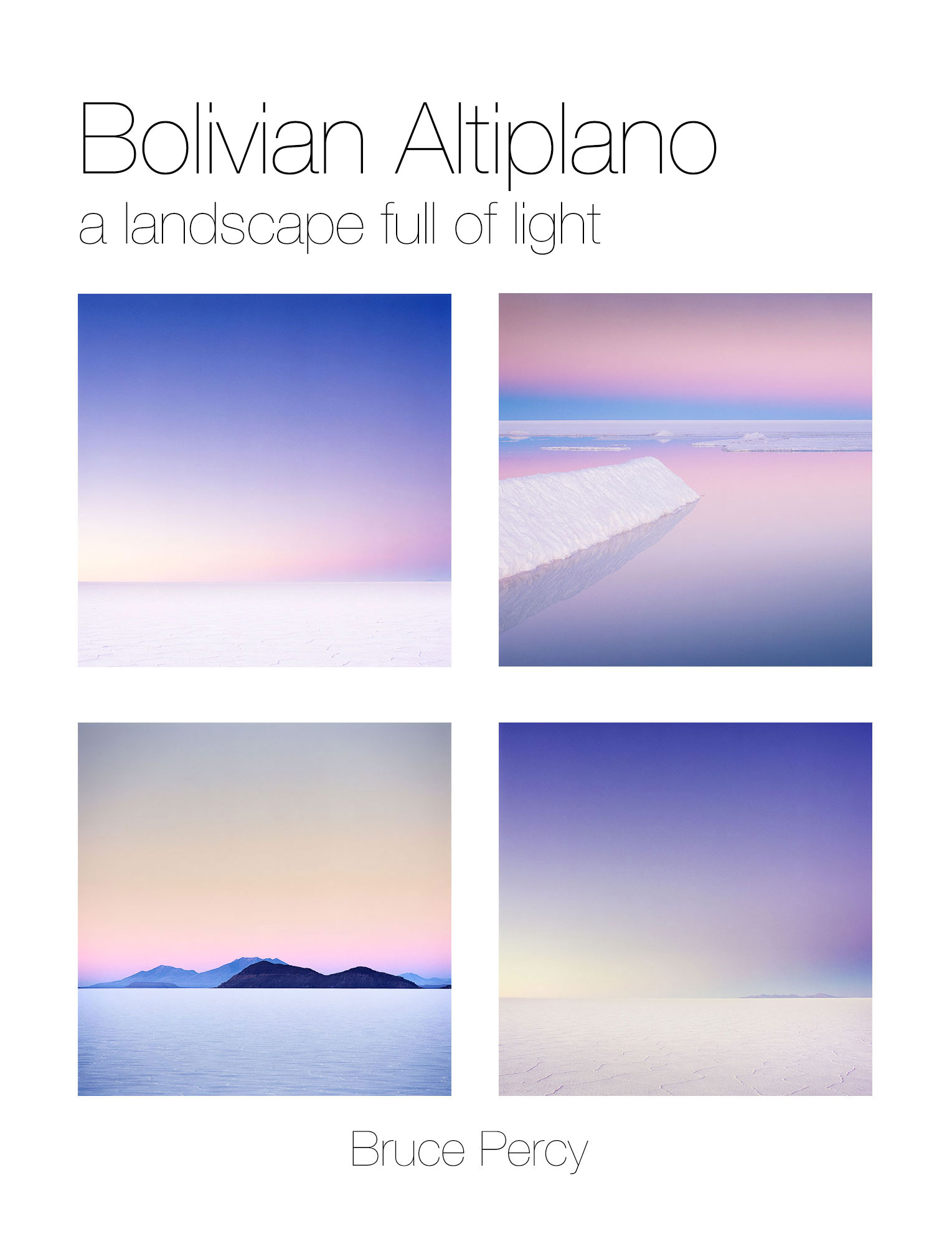
With this in mind, I present to you my most recent images from the Bolivian Altiplano.

About the Altiplano

At high altitudes between 3,600m and 4,800m, the air is thin here. There is no humidity so temperatures drop below freezing at night. There are no roads to speak of - just vast desert interspersed with Land Cruiser tracks spreading out in all directions. Professional help is needed and indeed, sensible. The guides and drivers I use here know their way around the landscape, and can also be found to navigate the largest salt flat - the Salar de Uyuni by fixing onto the far off distant silhouettes of volcanos. It is a challenging place, and coming here requires a lot of planning and discussions since many of the tour operators do not venture out for the special hours.

About the new Work

I should stress that there were some preconceived notions about what I hoped to achieve on my visit this June. When I say preconceived - I mean that I can't help having visual ideas or dreams about what I hope to accomplish. They are really motivators to get my inspiration working and I'm quite happy to depart from them once on location. They are dreams, and as such, they are often quite broad and not too specific.

It had been two years since I was last here, and I knew I'd missed certain key locations if I were hoping to complete a rounded representation of what is here. Now that I've completed the new work, I realise that although I did indeed visit some of these key locations and realise some of the images I'd hoped to make, the new body of work is different yet again from anything I had envisaged.

Things never quite turn out the way you want them to. In the process of aiming for what I was looking for, I've been fortunate to discover beautiful locations and imagery that I couldn't have dreamed of before setting off on this journey.

This, I feel, is the best thing about photography: you always aim for something, and more often than not, the final results and experiences are more surprising than you could have ever imagined.

Special thanks

I'd like to express my deepest of thanks to the following guides and drivers who assisted me over the three week period I was at high altitude:

Drivers

Abel Valdivia Lopez
Armando Mamani Flores
Demetrio Chavez Vergara

Guides

Alvaro Oropeza Carbera
Marisol Maydana

Film processing

AG Photographic, who should be commended for giving consistent and reliable results. In an age where I've had to switch lab because of poor or contaminated processing, AG can be trusted to give me the standard of film developing I need.

What is your message?

I was watching something recently, and there was a quote from Gandhi - 

When asked what his message was, Gandhi replied 'my life is my message'.

And it resonated with me. I felt that everything I do; how I conduct myself and the way I interact with the world, as well as  the art that I produce - is my message.

It's the same for all of us.

If you are a photographer, then I'd like to ask you -  have you figured out what your message is?

Tightrope walking, Jaisamler, India. Image © Bruce Percy 2009.

Tightrope walking, Jaisamler, India. Image © Bruce Percy 2009.

New Patagonia Images

I've just published a new collection of images from my Patagonia trip this May. They can be found under the recent work section of this website.

Lago Pehoe & Cuernos del Paine, Torres del Paine National Park.This was shot a few years ago that I never knew how it fitted in with anything that I'd done, up until now. So it is part of my new portfolio as it fits so well with the work from th…

Lago Pehoe & Cuernos del Paine, Torres del Paine National Park.This was shot a few years ago that I never knew how it fitted in with anything that I'd done, up until now. So it is part of my new portfolio as it fits so well with the work from this year. Image © Bruce Percy 2013

About the new images

I often get a feel for the work while I'm out there shooting. I remember saying to a friend once I was home, that I could see in my mind's eye a portfolio of black beaches contrasting against almost white skies. I could almost 'see' a two-tone collection.

If you like to focus on a theme in your work as I do, it's much easier to marry images together when you're dealing with a few tones or colours. Which I think is exactly what this portfolio does.

For me, I know that good images come about due to three things;

1) Good light
2) Right time
3) My ability to work with what i'm being given

The last point is the most important one. I've been saying for a while now, that I've been lucky to meet certain landscapes at the right time in my own photographic development. If I meet them too soon, then I run the risk of finding them hard to interpret because I haven't developed the sufficient skills in which to work with what I'm being given.

Lago Grey, Torres del Paine national ParkImage © Bruce Percy 2013

Lago Grey, Torres del Paine national Park
Image © Bruce Percy 2013

I've been coming to Patagonia since 2003, and despite loving the place, I've always found it hard to photograph and I believe it's because I haven't been ready until recently. I didn't have the skills with which to interpret a stark, monochromatic landscape. Looking back, I have often been going against the flow by trying to get Patagonia to give me what I wanted (saturated colours), rather than me being able to see the beauty and relationships in a landscape that excels at contrasts between light and dark. The black volcanic beaches are so far apart from the bright tones of overcast skies and snow covered mountains, that I see now, this was the key to me understanding this landscape.

I feel I'm always learning, always realising that each landscape has its own way that it wants to be conveyed. It's just a case of being receptive to it, and working with it, rather than against it.

Ice floes in Laguna Armaga, Torres del Paine national parkImage © Bruce Percy 2015

Ice floes in Laguna Armaga, Torres del Paine national park
Image © Bruce Percy 2015