seeing is a creative act of intelligence, we create the visual world we live in

As part of my workshops and teaching photography, I often find that many of my participants have difficulty resolving what they thought they saw, with what their camera saw.

I've felt for a long while, that seeing should not be believing. There are evolutionary aspects to how we construct our reality, and this can be a problem for us photographers, because we are often 'tricked' by our own nature. 

In this TED talk, Donald Hoffman puts forward that we 're-construct' our reality in our minds. In other words, we create the visual world we live in - inside our heads. Hoffman's talk goes a long way to making the point that all visual experiences are interpretive ones.

It might be useful in helping those of you who have difficulty resolving the differences between what you thought you saw and what your camera saw. Just simply knowing that there's a lot of psychology to it, might be enough to help you understand that you shouldn't trust what you see, but instead, try to look more closely.

Please do watch the video, but stay with it. It does get a little scientific for a few minutes and then ties up nicely at the end.

Epiphanies in the study of light

When I look back over the past twenty years of my photography, I can remember many moments when I had an epiphany - a sudden insight, to what kind of light really worked well in a photograph.

Lago Nordenskjöld, from a secret location Torres del Paine, Chilean Patagonia.Shot in mid-afternoon light on an overcast day.Image © Bruce Percy 2015

Lago Nordenskjöld, from a secret location Torres del Paine, Chilean Patagonia.
Shot in mid-afternoon light on an overcast day.
Image © Bruce Percy 2015

If I summarise it, it would be down to this; 

I started out shooting in bright blue sky sunny days because my eye liked it. But I found my camera didn't as the pictures wouldn't come out the way 'I saw them'. The first epiphany was that camera's don't see the way we see, and what is exciting to the human eye, is too high contrast and hard for a camera to record.

Then there came the second epiphany: If I shot at sunrise or sunset, the colour was often beautiful and it gave my images a sense of magic (or glow) that I couldn't quite get during the sunny days I had been shooting in until that point. I learned that the light is warm at sunrise and that often the atmosphere of a place is often calm too. Midday light is a rather cool light in comparison to the warm tones of sunrise.

For a long while, I would do nothing but shoot at sunrise and sunset. It's a great learning experience to continuously work in soft light at these times of the day, and although we all seek those golden colours, they don't always suit the environments we're photographing.

Shooting the isle of Rum from the Isle of Eigg one overcast, rainy miserable day, in 2007 taught me so much about overcast light, and how beautiful it can be in a photograph.

Shooting the isle of Rum from the Isle of Eigg one overcast, rainy miserable day, in 2007 taught me so much about overcast light, and how beautiful it can be in a photograph.

After many years of working in this light, I found myself on a very wet beach one afternoon in winter and had another epiphany. Midday light worked too, so long as the light was very overcast. I hadn't up until this point, imagined I could get any kind of 'mood' to my work except by working during the golden hours, and since this moment back in 2007, I started to employ working at other times of day, providing that the light is soft.

Over the course of 10 years, I'd gone from shooting only in sunny light, to only shooting during the golden hours, and then finally, coming back to shooting in midday light, so long as the light was soft. My understanding of the kinds of light I could shoot in had altered and I knew that soft light works best.

And then another epiphany happened. Although I would shoot any location if the light was soft, at sunrise, sunset and in the middle of the day, I found that some of the images didn't work because the light had to suit the subject. For instance, the stark black volcanic beaches of Iceland work well if the light is very cold / monochromatic. Composing a monochromatic black beach with warm light seemed at times to be at odds with each other. The landscape didn't really need the warm tones of sunrise, and if anything it was a distraction.

Small ice floes in Laguna Armaga, Torres del Paine, Chilean Patagonian winterImage © Bruce Percy 2015

Small ice floes in Laguna Armaga, Torres del Paine, Chilean Patagonian winter
Image © Bruce Percy 2015

These days I still prefer to work with soft light, but I try to work with landscapes based on their tones and colours. Some places are monochromatic in nature and therefore I feel they work best in a neutral colour temperature (midday). For example, Torres del Paine national park can be a monochromatic subject. The mountains are granite grey with dark sediment rock layered upon them and Its beaches are made up of black volcanic rock. The mountains have a very stark look to them, so rather than seeking to shoot them in the warm glow of sunrise and sunset only, I find that the cooler colour temperature of midday light can often work better.

I've come to realise over the years, that beauty is everywhere and it can be rendered under different colour temperatures - not just the golden rays of sunrise and sunset.

Live Interview Thursday 6th August, 8pm BST

I just thought I should let you know that I am being interviewed by Paul Griffiths for his 'Live and Uncut' Google+ Hangout tonight at 8pm BST (British Summer Time).

The interview is about 1 hour long and seems to be a general chat about how I got started, what cameras I use, etc, etc.

I believe you may need a google+ account to view this, as I'm not too up on g+, but here is the link to the hangout: https://plus.google.com/u/0/events/cu2uhd0t3b3frk0vh53dn1jfkl4.

Maybe see you there :-)

Editing is an art, not a process

I think there is power in the written word. In fact, the decision to use one word or term over another can have profound implications for the way we think. I mention this, because for a long while now, I've really grown to dislike the term 'post-processing'. I'll explain why, but before I do, let's consider what the editing stage of a photograph actually involves.

From left to right: Left: Original Image © Dave BowmanMiddle: Dave Bowman's interpretationRight: Bruce Percy's interpretation

From left to right: 
Left: Original Image © Dave Bowman
Middle: Dave Bowman's interpretation
Right: Bruce Percy's interpretation

Firstly, I consider the editing stage as interpretive. Just as you chose which composition to shoot and therefore give the viewer a particular angle or story, so to does editing your image give you another level of conveying your story. Often I find that by darkening and brightening areas of the frame, I choose how the reader's eye should be led through the frame.

Secondly, I think of the editing stage very much as an art. I've been editing work now for more than 15 years and I still learn new ways to approach editing my work every week I work at it. So to me, not only is it an art, but as art forms go, it is a life long journey of discovery in visual awareness skills, interpretation skills and above all, developing one's own style.

So let's get down to why I dislike the phrase 'post-process'.

Dave Bowman's edit (higher resolution). Image © Dave Bowman

Dave Bowman's edit (higher resolution). Image © Dave Bowman

Firstly, it does not encourage one to think of this stage of creativity as anything but a process, rather than an art. As an extreme example of this, I've met one or two photographers who apply the same template or 'processing' to every image they have.

Secondly and perhaps most important to me, the word 'post' encourages us to separate the editing stage of our work from the image capture, and I have a real problem with that. You see, I often think that it's easy to consider image capture and editing as two very different things, when in fact they are highly related and often use the same skills: for example, when you crop in your editing application, you are re-composing, and when you compose out in the field you are in effect cropping the landscape. Similarly, when we edit our work, we consider how the tones and shapes in the frame interact with each other (if you’re not doing this, then you should be). The same should apply to when we are out in the field. I now find myself thinking more about shapes and tones while out in the field than I did years ago and I know this is because of what I've learned during my image editing time.

So although the first stage is done behind a camera and the second is done behind a computer screen, they both utilise the same awareness skills. Only problem is, I think many of us don’t see it that way and tend to approach each stage as if they are completely separate. They’re not.

Fieldwork to Digital Darkroom Workshop

This year I conducted my first Digital Darkroom workshop here in the north west of Scotland. I had specifically set this up to work on awareness skills while out in the field and while behind the computer. I made a point of saying that the course' purpose was not to teach the participants software programs such as Photoshop or Lightroom (although some techniques and tools are learned as a matter of getting to a result during the week), but more to help participants consider what is actually in the frame of the image and how to interpret it during image capture and editing stages and hopefully see the relationships between the two.

It was a very informative week for me, as this was a new area to teach in my workshop schedule. I feel I learned a lot, specifically when it came down to ‘how far does one go with the edit’. I feel there is no answer to this, other than ‘it’s a matter of taste’. Some participants I felt were far too light on their approach while others may have suffered from overworking the work. I often feel this is a balancing act that can only be corrected by leaving the work for a few days and looking at it again later. Distance gives objectivity, but with a lack of experience, we can still end up with images that either haven't gone far enough, or have gone too far.

One of my participants during the week is a very proficient photographer in his own right. Dave Bowman has been making images for over 30 years and is represented by galleries in the US, Canada and the UK. I found his skills as a photographer to be already highly developed. So much so, that I found it particularly hard to contribute anything to Dave’s work because he has such a developed sense of awareness and skill. But during an e-mail after the workshop, Dave said he might have learned a lot more about my approach if had edited one of his images from scratch, rather than contribute to what he had edited. I thought this was a great idea.

At the top of this post are three images. The first is the original image straight out of Dave’s camera. You can see that his sense of composition is well developed. The second image is Dave’s edit and the third and last image is my edit - done this week without any consultation or referencing Dave’s own edit.

Bruce's edit (higher resolution). Image © Dave Bowman

Bruce's edit (higher resolution). Image © Dave Bowman

There is never a definitive edit

Firstly, and even though I will say this, I’m sure it will be overlooked: this is not a test of which is better. That I feel, will always be highly subjective. But I include both edits here to show that ultimately, two photographers editing the same image can convey a different aesthetic / mood and style. Both images are successful in different ways and ultimately, both are highly personal interpretations.

When I spoke to Dave about my edit, he felt i'd move it along further than he would be comfortable with. Likewise, I felt his edit was far too subtle and that he hadn’t gone far enough. All this proves really, is that both Dave and I have different tastes and we are looking for different things.

I find that I always learn new things in looking at a different interpretation of the same work. And I also feel that being a good editor of one’s work is mostly about objectivity. If I am too close to it, then I find my ideas about the image are often out of sync with what is really there.

I’ve also found that if I try to edit the same picture from scratch on a different day, I always go somewhere new with it. Like a band that plays the same song, each rendition is different in some way and presents a different flavour. Which is why I think image interpretation is an art form. It's a life long journey into personal interpretation and self expression.


Certain Landscapes have the power to Shape You

I’m sure all of us have had a positive encounter with someone, at some crucial moment, which has changed the course of our lives in some way.

Well, similar to this, I believe that some landscapes, when I've met them at a certain point in my own creative life, have changed the course of my own photographic development.

Seilebost beach, Isle of Harris, Scotland. Image © Bruce Percy 2014.  Seilebost becomes a massive sand flat at low tide. It's this vastness and space that allowed me to see parallels with the empty landscapes of the Bolivian Altiplano - a lands…

Seilebost beach, Isle of Harris, Scotland. Image © Bruce Percy 2014.  

Seilebost becomes a massive sand flat at low tide. It's this vastness and space that allowed me to see parallels with the empty landscapes of the Bolivian Altiplano - a landscape that has taught me so much.

I remember many years ago first visiting the Isle of Harris in the far north west of Scotland. I was struck by the beauty of the beaches there, but I had difficulty in translating the scenery into photographs that conveyed what I was feeling. I've had many encounters such as this in my photographic life where I've visited a place, and although I love it and find it extremely beautiful, I'm still at a loss as to how to photograph it (well). Making good photographs is not simply a case of finding good compositions and good light, but it's more than this for me: it's about finding an underlying theme - something which gives the body of work a sense of cohesion.

I tend to look at these encounters with the view that perhaps I'm not approaching the place the right way, or that perhaps I'm simply not ready as a photographer to get out of the experience what I feel is there. That doesn't mean I shouldn't try - it just means that perhaps I haven't the skills yet to convey what I'm seeing.

Take this case in point. It had been four years since I had last visited Harris. In the intervening years, I had photographed many ‘empty places’ that had taught me so much. I felt that if I returned to Harris now, I might have a better handle on how to approach its minimalistic landscape.

It was just a hunch, but I feel I've worked on my self-awareness enough to understand that what I am looking for has changed over the years. When I first started out making pictures, I was always looking for the iconic - for places that were easily recognisable, and also objects that are easily understood (trees, rivers, mountains). See 'association versus the anonymous' for more on this. More recently I've found I'm much more interested in the mood and atmosphere of a place rather than photographing known or easy to understand objects asI believe photographs can be extremely powerful if tones and colours are used to spark an emotional response. Well, that's how I see it anyway.

Laguna Colorada, Bolivian Altiplano. Image © Bruce Percy 2013Laguna Colorada is a red lake at high altitude. There are no structures such as mountains or trees in this landscape to grab onto for security. You have no alternative, but to work with wh…

Laguna Colorada, Bolivian Altiplano. Image © Bruce Percy 2013

Laguna Colorada is a red lake at high altitude. There are no structures such as mountains or trees in this landscape to grab onto for security. You have no alternative, but to work with what it gives you - tones and colours only.

I show both these photos for one purpose: to illustrate that the Bolivian shot made in 2013 helped me 'see' how I could approach the Isle of Harris here in Scotland. Ok, you might want to discuss how both images are quite similar, and maybe you’re thinking I've just borrowed from a template of what worked previously. But I feel the similarity is due to much more than that.

Firstly, when I went to Bolivia, I was forced to work with tones and colours because sometimes there's not a whole lot else in the landscape to work with. 

(On a side note I fully appreciate that it can be quite daunting for many of us and I would not criticise anyone for feeling there was 'nothing there to photograph'. I feel so often I rely on easy to understand objects such as trees, rocks and mountains to give my photographs focus. But i've realised that the act of looking for recognisable objects in the landscape is sometimes just me looking for a emotional crutch, and what I'm really doing, is avoiding working with what i’ve been given).

Since visiting Bolivia and learning to work with empty places, the experience has had far reaching repercussions for my photography. I now find it much easier to approach empty places with confidence and to work with different climatic conditions. I often see parallels between one landscape and another and I utilise these relationships when I'm aware of them. For example, the black beaches of Iceland have taught me how to approach the black volcanic lagoons of Patagonia. I see parallels all the time now and I know this is because one landscape teaches me how to photograph another.

As for the Isle of Harris: I remember when I made the image you see at the top of this post. I was on the beach with my group of workshop participants, and one of them, Carlos said to me 'this reminds me of your Bolivian Altiplano shots', to which I replied 'Yes!'. Most of the time however, the connection isn't so obvious. It can often be an unconscious process where I realise many months or years later that there is a connection between one place and another. That's why it's taken me about six years to figure out how I think Harris is best conveyed. I needed to go to Bolivia first to be taught how to work with empty places before I could approach a part of my own country.

Some landscapes have the power to shape us. They can be road-signs to show us where we are going with our photography. It's just up to us to have the awareness skills to see the connection, or let the connection come to us many years down the line, and run with it.

Busy Landscapes

It's very difficult to make good images of busy landscapes, and yet we are often drawn to places with too much going on.

The Cuernos (Horns) of Paine & destroyed forest, Chilean Patagonia, 2015

The Cuernos (Horns) of Paine & destroyed forest, Chilean Patagonia, 2015

I know of no other craft where one starts with complexity.

In just about any other pursuit, we start with the basics and move up from there. If you take up juggling, you don't start with three balls, you start with one. So it is with photography: each object that is added inside the frame of your camera is like adding another juggling ball to the mix. And if you're juggling balls, you need to know where they all are at the same time.

Yet when we look around our surroundings, we have an amazing ability to filter out most of it. Our vision has evolved to allow us to focus on the things that we're interested in, and exclude those that we're not. This may be really useful in everyday encounters, but it's a disability when it comes to interpreting scenes for photographic possibilities.

So often have I come home and found that the image did not convey what I saw. As a beginner, I would be surprised to discover additional objects in the final photograph that I had not seen at the time of capture. I've gone through over 20 years of trying to improve my awareness to see what is really there - to overcome my instinct to filter out things in the scene.

As I've developed my compositional skills, I've come to realise that beautiful scenery does not automatically equal great imagery. I've also had to accept that there are some things that can't be photographed well. Some places are too big, or have too many things going on in them to capture in their entirety, and what often works better is to take a subset of a location because it makes for a more powerful image than the entire scene does. An example of this is that I've often found that to reduce an entire waterfall down to just a few segments of it - may be more powerful than a photograph of the entire waterfall.

When we put too much in, everything becomes diminished or at best, confused. Consider it another way: if you were writing a proposal for your work, you would never try to discuss several points at the same time, as things would become confused or the points you are trying to covey would become lost. Instead, you would cover each point in its own paragraph. Well if we use this analogy, a set of images is akin to a proposal, and each image is akin to a paragraph in that proposal.

The skill of a landscape photographer, is to be able to take a location and distill it down to a few elements that convey a clear message. The final photograph may not be an accurate impression of the place, because there's been a degree of interpretation applied. Which is fine by me, because that's what photography is all about, in my view.

I knew when I made the image in this post that it was a busy scene. I had already reduced it down to two basic elements as I saw it: the background mountain range and the foreground branches. But I still felt there were unresolved issues with the composition: there's just too much textural information everywhere in the scrub and this detracts from letting my eye move freely between the foreground branches and the background mountain range. In addition, I also felt that the branches might get 'lost' in this textural complexity because tonally, they're not too dissimilar.

My point is this: I knew there was too much complexity. But I also knew that as much as it wasn't perfect, I could live with it. And this in itself, is a whole different ball game from when I used to come home and wonder why my images hadn't come out the way I had seen them.


Colour Neutrality Guatanteed: Hitech Firecrest Full-ND Filters

For the past few months, I've been using the new Hitech Firecrest range of Full-ND filters and I thought I would share some of my insights into using them with you in this post today.

Rio Serrano & Paine Massif, Torres del Paine National Park, Chilean Patagonia, 2015

Rio Serrano & Paine Massif, Torres del Paine National Park, Chilean Patagonia, 2015

I use many kinds of colour neutral filters in my work:  ND-grads are used to control the contrasts between sky and ground, and I also use Full-ND (neutral density - i.e no colour filtration - just darker) filters in my work to control the shutter speeds so I can get the effects I'm looking for, regardless of what the light levels are at.

For a long while I've used the Lee filter system. I've found the system to be one of the best out there, and for most things I've been very happy. The filter holder is well designed (unlike some of the other brands I could mention) and the filters - especially the grads are all hand made. I've also found that compared to other brands, they are less prone to introducing colour casts when compounded together. With most other filters I've tried, I find that combining a 3-stop full-ND filter along with a 3-stop ND-grad filter can introduce a very obvious magenta colour cast in the final images. With the Lee filter system, the colour cast isn't completely gone, but it's certainly the least pronounced and most of the time I am happy with being able to tune it out later on.

One of the filters I don't use by Lee, is the Big Stopper. The main reason being that I seldom require 10-stops of ND for what I do. This is because I am a film shooter who finds that during low light photography the reciprocity effects on my film mean I'm into long shutter speeds without needing to add anything more than a 3-stop Full-ND filter. For example, Fuji Velvia becomes less sensitive after 4s. An exposure of 4s with a 3-stop Full-ND filter applied becomes 32s. Once I apply reciprocity to this (the film loses it's sensitivity the longer its exposed, so I need to compensate for this by adding more exposure time) the exposure is already down to 1m 6 s.

So a Big Stopper has never been needed, or wanted for what I do. But I do however use 6 stops of Full-ND from time to time, and that means compounding 2 x 3 stop Full-ND filters along with a 3 stop ND-grad. Which often means I'm introducing a real magenta cast into the image - which is uneven - it's very pronounced in the sky and less so in the ground, but it's still there. I've avoided using the Lee Little Stopper, because it has the same very pronounced blue cast that is evident in the Lee Big Stopper.

So I was interested when I heard this year about the Firecrest Full-ND filters from HiTech (thanks Jeff for making me aware of them). I decided to buy two filters from them: one 3-stop NFull-ND filter and one 6-stop Full-ND filter. Now that I have images back from the shoots I used them on, I'd like to discuss their neutrality and also their physical attributes in today's post.

Colour Neutrality

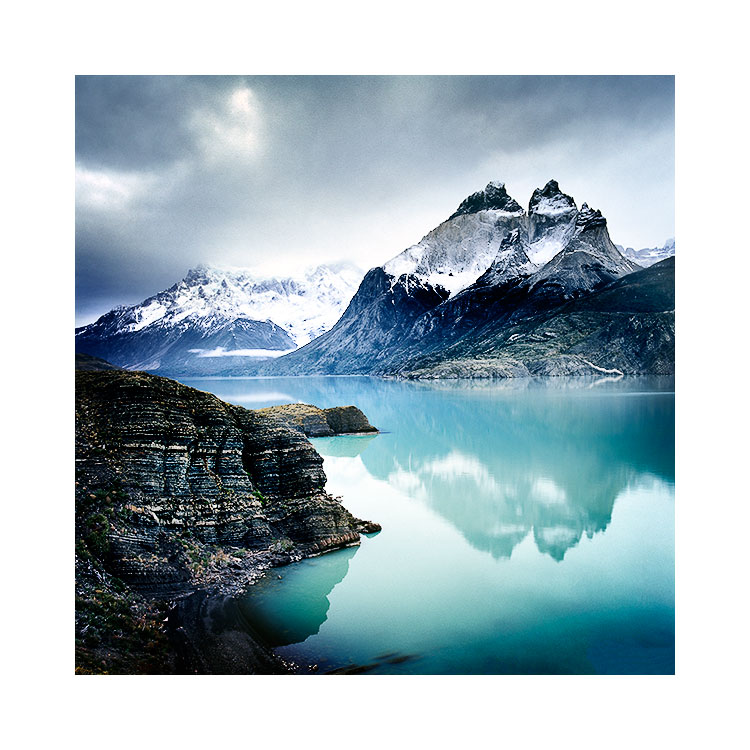
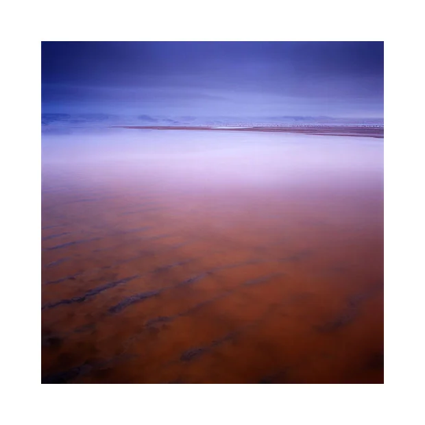
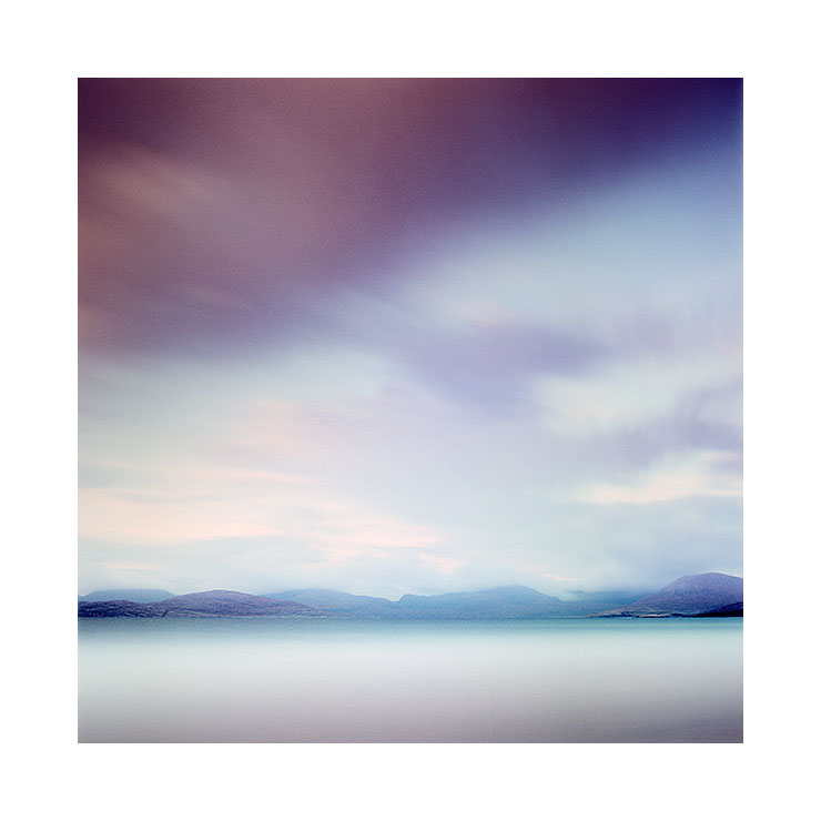
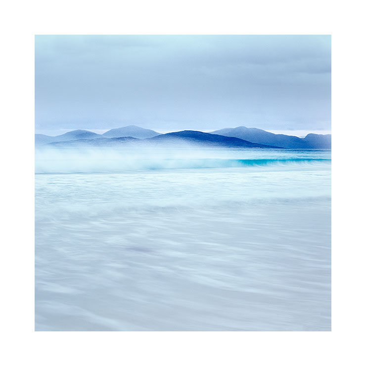
They are completely colour neutral. Phew, it took me a while to get to this point, but there you are. Worth every penny and a remarkable technological step forward.

Filter physical build and thickness

This is a description from the Hitech website:

"Rather than dyed resin, Firecrest is a carbon metallic coating used to create hyper neutral NDs. The filters are made from 2mm thick Schott Superwite glass, and the multicoating is bonded in the middle to increase scratch resistance. Firecrest Filters are neutral across all spectrums, including UV, visible, and infrared."

The Firecrest filters a slightly slimmer than the Lee's, so there's been some discussion that they may fall through the Lee filter holder. I've found that the filters are indeed a little bit slimmer, but I've not had any worry about them falling through. I would say however, that it's dependent on the age of your Lee filter holder. I find over time that the little rubber parts that hold the filters in place tend to get loose or soft. So it might be worth checking this out before using the Firecrest filters in your Lee holder. I think the fix for a loose filter holder is simply to buy some new spacers for it, or a new holder (I've always got a spare one anyway).

Glass Filters and Fragility

The last concern for me about using any glass filter is its fragility. It's well documented that the Lee Big and Little stoppers may break just being stowed away in a normal camera filter bag. So for the past several years they've been released with little metal cases to avoid the chance of this.

With the Firecrest filters, they come in rather large plastic cases. Too big in my opinion for storing in most camera bags, so if I had some recommendation to Hitech - it would be to produce a smaller set of cases please. But maybe this is a moot point, because I chose to see if the filters would break if I put them in my normal filter case. After six weeks of traveling on really rough unsealed roads in Patagonia and the Altiplano of Bolivia, the filters are still intact and I feel confident that they're not too fragile at all (they won't bounce if dropped, but at least they aren't going to break too easily if placed in a normal filter bag).

Summary

If you tend to compound ND-grad filters with Full-ND's  a lot, then using the Firecrest Full-ND filters in your mix of filters is definitely the way to go. They will cut down the possibilities of colour casts and allow you to be more free with the combination of grads with Full-ND's you use. 

If you use the Lee Big or Little stopper, then I would recommend you replace these filters now with the Hitech Firecrest equivalents. The Big and Little stopper filters have a very pronounced blue cast whereas the Hitech ones are completely neutral. (On a side note - you may feel that you can 'tune out' the blue cast from the Lee's during raw conversion, but please bear in mind that the blue cast may not be uniform across the entire visible spectrum. So I'm not convinced that tuning the colour temperature fixes the issue entirely, and may introduce cross-over casts in other tonal ranges of the image).

For me, since I tend to compound filters (an ND-grad + several Full-ND filters)  I've replaced my 3-stop Full-ND filter for one 3-stop ND firecrest filter and I've bought an additional 6-stop Full-ND firecrest filter (to get round those times when I previously used 2 x 3-stop Full-ND's).

I see that Hitech have also released some soft grads in the Firecrest range, which means we now have the possibility to use completely neutral ND-grads as well, but I haven't tested them yet, but have now placed an order for them. So I hope to tell you in a few months time once I've used them a fair bit. Until then I will continue to use the Lee ND-grads as I still maintain that they are the most colour neutral resin filters on the market.

For any full-ND requirements, I will now be using the Hitech Firecrest range with no reservation from now on. I'm delighted with the results :-)

Transposing Tones

I've been working on a new e-Book for some time now - 'Tonal Relationships'. 

Each time I begin work on a new project, it can really take a while to move off the landing pad. I found this to be particularly true when I wrote my Fast-Track to Photoshop e-Book, which actually took me about two years. Most of it was a sense of procrastination because each time I approached it, I felt I was tackling it from the wrong perspective.

A work in progress. It's better to release something when it's right. It may be some time yet :-)

A work in progress. It's better to release something when it's right. It may be some time yet :-)

I'm a great believer in sleeping on things if I don't know the answer. Backing off from something and giving my mind the time to collate and make sense of something works really well for me. I've found that adopting this approach to my photography, as well as writing e-books and also in life experiences, has been invaluable.

I found that just by leaving my 'Fast Track to Photoshop' e-book idea on the shelf for a long long while, I seemed to get clarity on how it should be formed, and when I did get round to writing it, it all came out very easily and I felt I wrote one of my most clear and concise efforts to date.

Well, I'm not there yet with my Tonal Relationships e-book, as I've been having difficulty trying to figure out how to proceed, but I've noticed that over the past few weeks I've started to formulate a structure for how the e-book should be laid out and things are getting clearer in my head.

One aspect that has become clear to me over the past few years, is that tonal relationships do not just have to work within each single image, but in order to help with defining your own style, I think the tones should remain consistent through any body of work you produce. For instance, I've noticed that when I convert my colour work to monochrome, I'm able to see how consistent my work is - strip away the colours, and the images still appear to be very balanced.

It was only when I converted some of my existing colour work to mono, that I discovered how consistent I was with my tonal ranges in my work.

It was only when I converted some of my existing colour work to mono, that I discovered how consistent I was with my tonal ranges in my work.

Anyway, I digress a little. Here right now, is a rough idea of how I feel the e-Book may be laid out. I'm always open to things changing, and trying to not be too fixed on things, because creativity needs the space to go where it wants to go.

Main ideas of book:

  • Relationships throughout the frame - by strengthening one area of the frame, other tones are affected
  • If you make two areas of the frame the same tone - they become related.
  • If you make two areas of the frame different, they become unrelated.
  • The odd tone out is the dominant one. If you keep one area of the picture different from the rest, it becomes the dominant tone. White stone on black background, or black stone on white background

Fieldwork Awareness Section

  • learn to think about tones while out making pictures: abstraction versus association
  • being aware of colour constancy / chromatic adaption while you work under different lighting conditions, and applying this to your choice of subject
  • Avoiding overly complex tonal compositions

Darkroom Workbook Section

  • Transposing Tones - take one tone in the image, and shift it (harris hills in harris photos)
  • Look for images in your collection that have very few tones. Edit them so all the tones become more similar
  • Simple compositions aren’t necessarily of one or two objects. Sometimes they are simple because they contain one or two dominant tones. Busy images can have too much tonal information in them. 
  • Image selection: choose those with simple tonal relationships, because it will make the task of editing them easier.
  • image selection: when toning one image, refer to others in the collection for guidance. Often one image will dictate how the others should be edited, so they 'sit together' better.
  • Is your eye being pulled all over the place by too many tonal distractions? Apply localised contrasts, or reduce contrast in other areas to bring emphasis to other areas.

The editing stage

I never like to work on images piece meal. I'm much more interested in a collection of images that work together as a whole. For me, that means that when I edit images, I'm focus my attention on images shot during one shoot. For example, last week I edited work from the isle of Harris only, even though I have plenty of images from other places I could have worked on or switched between.

I think these four images work well together, and the truth is; maybe the originals didn't. But with a bit of editing work, I was able to bring them in-line with each other.

I think these four images work well together, and the truth is; maybe the originals didn't. But with a bit of editing work, I was able to bring them in-line with each other.

I prefer to stick to this approach because I find that I can immerse myself in the colours and tonal responses of one place and get to know and understand them, which I feel is vital if I'm going to get the best out of the work I've shot.

You see, I think the editing stage is really important, as I think it's possible to screw up good work simply by not understanding it. It's possible to murder a collection of good images by tackling it the wrong way.

So I prefer to work on images from the same shoot. It allows me to get into the atmospheres and embedded feelings that were there when I made the work and it also allows me to see and feel the emotional messages in the resulting film transparencies. After all, if you spend a week or two in the outer hebrides shooting beaches, you will get into a certain theme or frame of mind while there. So too, the editing stage should have the same approach.

But I also like to focus on the same collection of images for a few other reasons:

1. it often takes me a while to find the theme in the work. I can sometimes have some false starts by taking up the wrong approach to the work, and I've been known to stop and retreat back to square one because I feel where I'm going with the work isn't right. I may find the first few images I work on don't seem to gel. I find it takes a while to get the right 'groove' for the work i'm looking at, and that can only happen if I let myself relive the experiences - the sights, the smells, the atmospheres of the place. I also find that after a few days of working, I start to find a theme in the work that kind of dictates how the rest of the work should be edited, and more specifically, which images out of all the ones I've shot - I should select to be worked on.

2. Different places have different qualities of light. If I move from editing images shot in a place where the light is soft and the tones are bright, to working on images from a high contrast location where the tones are dark, I loose my rhythm. I can't context switch between the two and I lose focus. It's best to remain with one theme and one body of work until the edits are complete.

I think these four images work well together. It was only after a few days that I realised there were some darker images in the collection that worked well together and as often is the case: one successful edit seems to lead the way forward for how …

I think these four images work well together. It was only after a few days that I realised there were some darker images in the collection that worked well together and as often is the case: one successful edit seems to lead the way forward for how the remaining should be edited.

3. Tonal responses are important. I'm always thinking about how the tones between images relate, not just within the image, but within the collection. It's important to see parallels and work with those hints. Just slapping on some grad in the sky and cranking up the contrast for all your work will reduce the possibilities of what your work could be, or the new heights it could reach by a sloppy approach. By working on images from a location, you remember the qualities of the light, and how you thought it should be conveyed, but more importantly, you should be tapping into your understanding of the tones that are present in the final images and be leveraging it. 
There should be a lot of care and consideration taken during the editing stage, just as much as the care and consideration that was made at the time of capture. Both the shoot and the edit are interrelated and rely on the same skill sets.

I tend to take many days, if not weeks working on a new collection of images. The editing times per image are quite short (a few minutes) because I like to go with how I feel and respond to the edits I put in, and I'm aware that working on them for longer than that means I'll lose objectivity in the work. But as I go on and edit other work, I find I often return to the earlier work to 'tune it' in so that all the work sits well together. Some days I find some edits look good only to find the next day that I hadn't gone far enough, or had gone too far, so there's a reiterative process there where I return and keep tuning images until the entire collection sit well as a whole.

My final edit of my Harris shoot from last November.

My final edit of my Harris shoot from last November.

Association versus the anonymous

I often feel there's too much emphasis made of association.

Landscape photography requires us to be able to abstract: to reduce meaningful objects down to their graphical forms. Rather than thinking about trees, rivers and mountains, we should be able to see them for how beautiful their forms are. Rather than seeing 'mountain', we may see  'pleasing conical shape', rather than seeing 'tree', we may see 'pleasing wavy flow through the image', and rather than seeing 'river', we may see 'beautiful s-curve through the frame'.

Scarista, Isle of Harris, Scotland November 2014, © Bruce Percy. But you didn't really need to know where it was did you? ;-)

Scarista, Isle of Harris, Scotland November 2014, © Bruce Percy. But you didn't really need to know where it was did you? ;-)

But I think this only happens for some of us, and for the majority of us, we photograph things because we know them. If I show you a chair, you associate with it, because you know what a chair is. If I show you a tree, then most people see a tree, because it's what they already know.

To find a beautiful composition, we need to be able to see the relationships between objects, not in terms of what they are (association) but how they graphically fit together. Perhaps the tree and the mountain have similar shapes and there is empathy? Perhaps the tones in the river compliment the tones in the tree? If we do this, we make our imagery stronger, because it has more foundation in the arts than it does in real life.

But there is more to this problem than simply being able to abstract objects down to their basic elements of form and tone. Our problem goes much deeper than this. I'm guilty of finding myself on many occasions making pictures of a place, not because the light is beautiful, but because the place itself is iconic. In fact, sometimes the light at the iconic place is not so special and there is better light elsewhere, yet I still choose to photograph the iconic place.

I've had to ask myself why is it that I do this? Well, I think the reason is simple: we are attracted to what we know and the power of association is a very strong force to deal with. We seek what we know, because we find safety and comfort in it.

So my question to you is: what would you rather do? Would you prefer to photograph an iconic place in boring light, or photograph an anonymous place where the light is beautiful? I think you may say the later, but the truth is, I think many of us often do the former. I'm certainly guilty of it.

When it comes down to it, a photograph of an anonymous place in beautiful light is more powerful than a photograph of an iconic place shot in boring light. But despite believing this, I seem to always gravitate to what I know over what is photographically better.

Being a landscape photographer is sometimes about overcoming our human instincts to go with the familiar and this is certainly one example where our being human gets in the way of better photography.