In Patagonia

I’ve just finished a tour of Torres del Paine national park in Chilean Patagonia. Thanks so much to everyone who came and shared some time with me :-)

Image courtesy of Mark McClure, tour participant 2019.

Image courtesy of Mark McClure, tour participant 2019.

I’ve been coming here since 2003. It is my favourite national park by far, simply because I feel I have history with it. Some places get under your skin and become part of who you are, and I think shape you as a person through the experiences you have with them.

So many wonderful encounters ranging from Sabine, my guide who is such a lovely person, to seeing Puma’s on just about every tour I’ve done here in the past 5 years.

The park is changing quite a lot now. As is the case with everywhere else : things are busy. Too busy.

So many photographers now, and tourists. We are living in a smaller world.

I’ve been running tours now for 10 years and I’ve seen so much change in that time. Airports have expanded, tourist numbers have gotten larger, and there are more photographers. It is becoming harder to have a solitary experience in the world’s famous places.

Scotland is overrun with tourists. Lofoten is overrun with photographers in the winter. Iceland is the same. Everywhere that has a magnetic pull, is now no longer the idea of the sole traveller but the idea of the many. Having that solitary experience is becoming less and less a possibility.

Image courtesy of Mark McClure, tour participant 2019.

Image courtesy of Mark McClure, tour participant 2019.

Much like the hiking community, a set of principles, a code of conduct would be very welcome. I feel that things are changing and park guidelines are becoming more and more restrictive.

I’d love the national parks to consider the dreams and wishes of all landscape photographers, but at present many of the rules and regulations are going in the opposite direction: things are becoming more restrictive. This is of course to save these places from the increasing footfall they’re experiencing.

If we want to get the photos we want, we have to cooperate as best as we can: we all have to be the best ambassador we can for the photographic community. I don’t know what that might entail and far be it for me to suggest, or put some thoughts forward on this.

In the meantime, all I can do is go out into the world and care for it: realise that it is a precious thing and that I represent the photography community at large with my actions. Act responsibly and try not to put the pursuit of my photography above everything else.

I wish for all of us to consider that regulations are becoming much tighter, and if we want to continue to photograph these special places without too much restrictions, we need to go lightly, and with much care into the world.

Discovery Series - Conceptual at heart

I think that photography can be a lot stronger if it is created with a concept in mind, or if it exists as part of a concept. 

Individual images, like individual sentences can be quite nice, but there’s often more depth to the work if the sentences are strung together to create a story. So too, with the photographic image.

Images on their own only go so far to tell us something but I often find I’m left feeling part of the story is missing. That’s why I find collections of images, arranged within a theme or as part of a narrative so much more engaging.

Hans Strand - Intimate 1

Hans Strand - Intimate 1

Chris Friel - Framed

Chris Friel - Framed

Greg Whitton - Mountainscape

Greg Whitton - Mountainscape

This month, Triplekite have just announced a series of books which fit into this category. Rather than producing individual books, they are focussing on producing a series that all fit together to create a unified body, which I think is a great idea.

David from Triplekite explained to me that: “It’s the ‘wholeness’ of the project that interested us when we began to work on it. Rather than looking at individual titles, I think there’s a strength to a body of work if it belongs as part of a larger theme”.

He struck a chord with me, because this is something that is at the heart of my own photography. I believe that when we prepare our work, we should consider how it fits into the bigger picture. I’m not a piecemeal photographer, and I believe that my ‘message’ is stronger when my images are presented in theme based portfolios.

With the three books I’m going to review here, they are presented with the same aesthetic values: all titles here have the same dimensions, the same page count, and although each book is a flexible vehicle for illustrating a wide range of photographer’s and also a wide range of projects, they ask to be considered as part of a whole.

David also explains that “for Triplekite, we are looking at this as an ongoing project - one in which we can, over time, add new titles, showcase lesser known photographers as well as some really well known ones - which we already have in the pipeline, but ultimately, make the collection a cohesive effort".

So clearly the the Discovery Series has been put together with the hope that owners of the collection will be attracted by the diversity and on-going exploration into different photographers work along with varying project remits.


Abisko Canyon, Sweden, September 2013, Image © Hans Strand. Used by kind permission.

Abisko Canyon, Sweden, September 2013, Image © Hans Strand. Used by kind permission.

Hans Strand - Intimate I

The first book in the Discovery series i'd like to review is Hans Strand's 'Intimate 1'. Clearly the title suggests that there are more intimate series to come, and I'm looking forward to them very much since Strand's work is of particular interest to me.

Until now, I was only aware of Strand's ariel 'abstractions'. In 'Intimate 1' he takes us in, closer - to a smaller intimate landscape. Seldom will you see the sky in any of the images contained in this collection which is something I admire, because quite frankly - I suck at it. It's very hard indeed to make such beautiful yet anonymous images and Strand excels at this. He is a meticulous photographer. His compositions are extremely well thought out and very fine indeed. He takes time to simplify them right down and show you only what you need to see, and nothing more. I can fully understand why this may be series 1 in an on-going collection for him. 

I should note that this is by far my favourite book out of the Discovery series (at present).

Before I leave this book, I should take time now to say that I was particularly taken with Strand's Iceland book - also published by Triplekite - if you don't own it - then I strongly suggest you read my review of it here.

Reed, Lake Teen, November 2011, Image © Hans Strand. Used by kind permission.

Reed, Lake Teen, November 2011, Image © Hans Strand. Used by kind permission.

Nianån River, February 1992, Image © Hans Strand. Used by kind permission.

Nianån River, February 1992, Image © Hans Strand. Used by kind permission.


Greg Whitton - Mountainscape

Loch Coire Mhic Fhearchair, Torridon, Scotland. Image © Greg Whitton. Used by kind permission.

Loch Coire Mhic Fhearchair, Torridon, Scotland. Image © Greg Whitton. Used by kind permission.

"A love for all high places" - is perhaps the sentence that resonated with me upon reading Whitton's introduction to his book 'Mountainscape'.

Like Whitton, I had to endure endless hill walks as a youngster with my mountain-mad father. I'd often yearned for the time when I could choose for myself to avoid them. But just like Whitton has found in later life, the passion for the hills had already been ingrained from an early age. It seems we both could not escape the beauty of the mountains in our later years.

This book then, is a homage to his acknowledgement that he loves the high places, and perhaps without knowing it - it is also a tribute to his father's love of high places also.

Liathach, Torridon, Scotland. Image © Greg Whitton. Used by kind permission.

Liathach, Torridon, Scotland. Image © Greg Whitton. Used by kind permission.

'Mountainscape' contains images shot up high, around many parts of the UK: Snowdonia in Wales, the Lake District in England, and many places in the Scottish highlands such as Torridon and Wester Ross to name a few.

Whitton's images are more intent on capturing the atmospherics of a place, rather than showing you some literal translation. I can almost feel the 'liquid-air' of the misty days I spent up in the mountains with my 'mountain-mad' dad.


Image © Chris Friel. Used by kind permission

Image © Chris Friel. Used by kind permission

Chris Friel - Framed

I've left this book till last, because it is perhaps the most adventurous of the three. The first two books could be easily classified as belonging to what many of us consider landscape photography.

But landscape photography should be, and can be, a whole lot more than the idea of recording verbatim scenery. As a creative person, I believe that photography is an art-form. I'm not particularly interested in recording a verbatim scene, but instead, I'm more intrigued by how we can interpret what we see and feel. This book falls distinctly into that realm for me.

Image © Chris Friel. Used by kind permission

Image © Chris Friel. Used by kind permission

Friel's images are like wild brush strokes. As Doug Chinnery notes in his fine introduction "they mimic the tantalising half glimpses we get of light and beauty through windows". So often I've been mesmerised by these 'half glimpses', and I would go so far as to suggest that many of us, if not all who love photography, are often caught by moments when the light shifts and a scene is altered for a fleeting moment.

Perhaps it is the short lived sense of something only being for a moment that I find most arresting when I'm drawn to something I wish to photograph.

Image © Chris Friel. Used by kind permission

Image © Chris Friel. Used by kind permission

Friel also uses frames found in the real world to frame his landscapes. Again, Chinnery notes "His frames are not regular, perfect, geometric shapes. Rather, they are the wild, free brush strokes of an artist at work". I think this is an accurate description of Friel's interesting use of the landscape to frame itself.

It's an interesting book and one which I think suggests that this discovery series may allow us to explore the wide gamut of what photography really is about. 


These three titles on an individual basis, offer excellent value for money at £18.50 each. They are inexpensive, yet beautifully reproduced. They encourage me to think of collecting the set that Triplekite intend to release over the coming years, and I feel it's worth noting that keeping an eye on this series will reap rewards: you'll get to find out about photographers you hadn't heard of before, but you'll also be open to looking at a wide variety of projects. If you're a book collector like I am, then I would imagine that some of the titles may be very popular indeed, and knowing which ones to collect just makes it more enticing to collect the entire set.

I think Triplekite have offered a concept in photography book publication, which they should be admired for.

For more information, please see: Triplekite Publishing Website

Something in-between Sunlight & Shadow

For a long while now, I've been fascinated by the power of suggestion over a more literal interpretation. I was initially attracted to this aspect of photography through the work of Michael Kenna in the late 80's. His use of shadows and night often convey a sense of mystery or at the very least mood to his imagery.

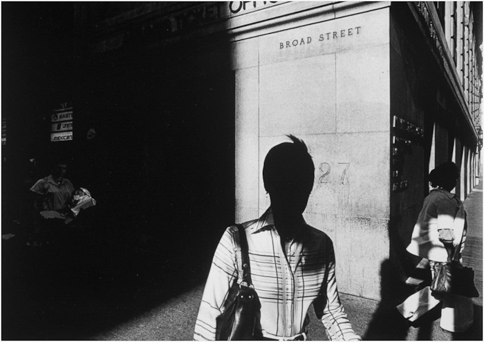
Just recently, I found out about Ray Metzker, who passed away last year. His work conveys similar concepts to Kenna's. He was interested in suggestion rather than a literal translation. His use of sunlight and shadow to conceal his subjects often lent his work a sense of mystery.

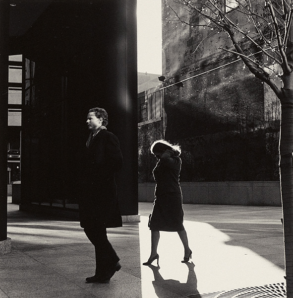
 Solitary pedestrians and urban spaces transformed by sunlight and shadow. Image © Ray Metzker

 Solitary pedestrians and urban spaces transformed by sunlight and shadow. Image © Ray Metzker

Suggestion is a powerful tool to possess as a photographer - because being able to get your audience to stop and listen to what you are doing often happens through the art of suggestion.

 In Ray Metzker's images, he shows tremendous skill in using sunlight and shadow to convey mystery. What may have otherwise been an ordinary scene becomes more interesting and thought provoking when shade is used to conceal or reveal.

Ray would produce portfolios based on these tonal suggestions rather than by subject matter. This resonates with me because I feel I have been doing something similar; for a while now, I have been choosing images where they are related either by tonal response or by colour palette.

Ray Metzker's use of sunlight and shadow was masterful. Image © Ray Metzker

Ray Metzker's use of sunlight and shadow was masterful. Image © Ray Metzker

To explain further, I find Iceland to be a monochromatic place: black sand and white ice. Bolivia is about blues and reds: the lagoons of red sediments and the salt flats at twilight intertwine to offer up a particular colour palette. So I tend to go looking for subjects that fit together tonally or by colour - as a collection. These two places are responsible alone for me branching out into monochrome work. They have taught me that the portfolio - the whole is greater than the sum of its parts.

I see a similarity in Ray Meskier's work where he chooses subjects that are collected together by tonal similarities. People in the city often photographed as silhouettes, or with their identities concealed by use of shadow strengthen his portfolio as well as lend a very decisive look.

Images don't always have to utilise the full tonal range. Here Ray Metzker uses mostly shadow to mid-tones only. I find the deliberate concealment of the people's faces adds further mystery to the image. Image © Ray Metzker

Images don't always have to utilise the full tonal range. Here Ray Metzker uses mostly shadow to mid-tones only. I find the deliberate concealment of the people's faces adds further mystery to the image. Image © Ray Metzker

His work has a style - something that we are all trying to develop or bring forward in our own work. And this is perhaps the most important lesson from looking at this work: it's clear that Mezkier has thought about the aesthetic qualities of his final selection of images and also the subject matter in such a way that we are clear each photograph is by the same author.

I learn a lot by looking at work that I find inspiring. It doesn't have to be landscape related for me to 'get it'. I just have to find a connection in the work - to see something that I find intriguing, or that makes sense to me in some way that I hadn't thought of. With Ray Metzker's work, I do exactly that. I learn about image selection based on using tonal responses but I also learn that his choice to make people very anonymous or to conceal their identities through his use of shadow and sunlight can lend the work a thematic quality which goes a long way in conveying a photographic style.

And sometimes it's the sudden split between shadow and sunlight that throws a contrast; like two images spliced together, providing a sense of tension between the two subjects in the frame. Image © Ray Metzker

And sometimes it's the sudden split between shadow and sunlight that throws a contrast; like two images spliced together, providing a sense of tension between the two subjects in the frame. Image © Ray Metzker

And then there are his choices in composition. I've always thought that street photography has less to do with aesthetics and more to do with narrative. But in Ray's work the story is missing. He has deliberately chosen to conceal most of his subjects so we know very little about them. Instead we are presented with compositions constructed through form and tone only. They are like landscape studies about the people in a city.

A study of graphic qualities. Image © Ray Metzker

A study of graphic qualities. Image © Ray Metzker

Into the polar night

When I started out making pictures and putting them up on this website, I found over the years, that I’d get correspondence from all over the world. When I look back at the early days , I can still remember the first emailers. I had maintained a long standing dialog with them while I was an amateur myself. Over the years while my own hobby turned gradually into my current profession, I had one or two stalwarts who maintained a beautiful correspondence with me. They never seemed to lose sight of me, nor I them.

One of those stalwarts was Vladimir Donkov.

A young Bulgarian photographer, Vlad was busy carving a career for himself, and doing things in the photography world before he was 20 years old, that most of us in our 40’s are still dreaming about.

Vlad would email me perhaps once, maybe twice a year, just to check in, tell me about his own photographic journey. I’d never met him in person, but over those initial years of working on my own hobby and website, I felt I’d kind of got to know him well. To me, Vlad was and is still, someone I relate to because we share the same passion.

Then, in 2009, Vlad emailed me to tell me of his plans to go and shoot images in the Norwegian winter. Oooh, I’d always wanted to go and make images in the snow, and so I thought I would accompany Vlad on his journey there. For some reason, I was under the impression that he had invited me, but we have many jokes these days about how I actually invited myself along on his trip!

So in March 2010, I went to the Lofoten Islands, at the time, a still relatively unknown location for winter shooting and met up with Vlad. He was perhaps 24 years old at this time, and I was 42 years old. I kind of like to think it’s funny how the numbers are reversed. I was wary that he might think me an old bore, or that I find him too young or immature. I’m glad to say that I found a great friend in him (despite him probably finding me immature ;-)

Vlad was solely responsible for me coming to Norway's Lofoten islands in winter, and I think he needs the recognition for being the one who started off what is now turning out to be a photographer's winter paradise. Each month, I see images of Lofoten appear on my facebook page from amateurs and professionals that have been drawn to the place for the same reasons Vlad and myself love it. It is a stunningly beautiful and wild place.

Vlad emailed me today to let me know about a new project - a video - that he has been working on. He’s made a really nice video of his work in the Moskenes region of the Lofoten Islands and the video has been done in conjunction with the support of Hasselblad. The video is excellent, and I just want to share it with you, as I feel it's inspiring to see him out there, in the Lofoten landscape, working his magic.

I think it's fantastic when people realise their dreams, or have a 'go-do' attitude. Vlad clearly has this and is very much following his own path.

If you'd like to know more about Vlad, and see some of his work, his site is called VerticalShot.com.

The life of a photographer

For a bit of fun, I thought I'd post this icongraphic today, which I found in a nice article on www.ispwp.com.

I think this is fairly accurate for wedding photographers, and not too dissimilar from what I do. I remember a wedding photographer friend of mine holding a talk at a local photographic club. In the talk, she asked 'what do I spend most of my time doing', to which most people thought was taking pictures. She informed everyone that most of her time was taken looking for clients.

I had someone recently ask me why I have an office. I thought that was an illuminating question, because it answered more for me what he thought of my job.

Anyway, if you click on the image, you can see the split a bit more clearly.

History's Shadow

A few month's back, Neil from Beyond Words book shop sold me a copy of David Maisel's 'History's Shadow book. Let me just start by saying it's perhaps one of the most beautiful books I've seen in a while, not only due to it being a large book, but mostly because of the content contained within.

I'm a lover of photogaphic books for a few reasons. Mainly it's to do with the interaction. By holding up a book and studying it, I get more out of the process than I would by browsing web sites. The other reason is that most photo books are printed well, so the tactile experience is often very pleasing and the detail in the reproductions is something you don't get from looking at websites either.

Speaking to Neil about his knowledge of photographic books, we had an interesting discussion which led to the idea that we would attempt to do a joint review of books that I've chosen and bought for my own collection. I'm not entirely sure how frequent this would be, as we've slipped on this one already, but we're hoping to cover future books together. So I hope you will look forward to finding out about other photographic artists, or works that I particularly love (and have added to my book collection).

Anyway, back to this book.

What follows is a review by Neil @ Beyond Words book shop, and the review concludes with my own feelings about this book.

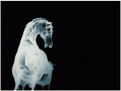
David Maisel is responsible for some of the most beautiful, yet disquieting works in contemporary photography.  His latest project, History’s Shadow, is typical of the meticulous, systematic, indeed forensic, approach that he brings to all his work.  In this series, Maisel re-photographs x-rays from museum archives that depict art works from antiquity, scanning and digitally manipulating the selected source material.  See here for sample images.

History’s Shadow is published by Nazraeli Press, a specialist publisher of photography books.  The dependably high quality of Nazraeli’s design and reproduction is the perfect complement to Maisel’s photographs.  Time magazine and American Photo have both selected it as one of the best photobooks of 2011
Maisel’s previous work, Library of Dust, is equally concerned with the survival of traces from the past.  It consists of a series of sombre and beautiful photographs depicting canisters containing the cremated remains of the unclaimed dead from an Oregon psychiatric hospital.  Dating back as far as the nineteenth century, these canisters have undergone chemical reactions, causing extravagant blooms of colour, revealing unexpected beauty in the most unlikely of places.

For those becoming familiar with Maisel’s photography only through these more recent projects, it may comes as something of a surprise that, for the bulk of his career, he has been a landscape photographer – of a particular sort.

Using aerial photography, Maisel has photographed civilization's aggressive advance across the American landscape.  From the vantage point of a low-flying aircraft, Maisel has constructed skewed landscapes that seem at times to have no horizons, no up or down, no near or far.  The Lake Project documents Maisel's work around Owens Lake. This arid expanse, located just east of the Sierra Nevadas, is for the most part a desiccated bed of mineral deposits. Drained for the water needs of Southern California, it now contributes carcinogenic particles to the atmosphere during ‘dust events.’  In other projects, the devastation wrought by deforestation and open pit mining has been clearly demonstrated.

On reflection, there is considerable continuity between Maisel’s earlier and later work.  Both use photography to examine the interaction of humanity and environment on a chemical level.  In pre-digital photography, of course, this capturing itself requires the mastery of complex chemical processes.  Also, like Ed Burtynsky, Maisel explores the uncomfortable relationship between images that will appear to many as aesthetically beautiful while depicting processes of pollution and destruction.
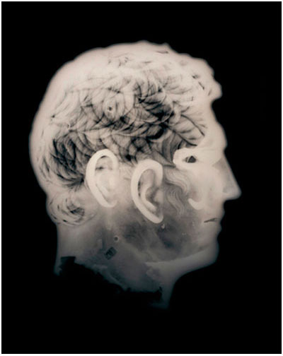
As Leah Ollman states, “Maisel’s work over the past two decades has argued for an expanded definition of beauty, one that bypasses glamour to encompass the damaged, the transmuted, the decomposed.”

Bruce's review, and conclusion

I think Leah Ollman has something of great value to state about David's work, and in particular the definition of beauty.

David's book is a large affair approximately - it's very substantial and the plates reproduced within are really beautiful. It is a book to inspire you to consider and think again about what photography really is.

His images in this book are photographs of photographs (x-rays), of objects archived in museums. I think there's something interesting in his approach to re-translating what is already done. I've personally never thought of taking images of my own images, and re-translating them.....

The toning of the images is beautiful, and the compositions, flattening down a 3D object into a 2D space sometimes leads to interesting results. Being able to view the skeletal stucture of the horse statue, makes for more interesting dissection of the image. I spent a lot of time pondering these images.

I'm very proud to have this book in my collection. If you have an interest in exploring other photographic styles, and considering how these may affect your own photography, History's shadow would be a welcome addition to any budding photographic book collection.

History’s Shadow is published by Nazraeli at £60 and Library of Dust by Chronicle at £50.  Both are available at 10% off from Beyond Words, here in the UK.

Ruth Orkin

I love street photography - capturing the moment, a glance, a split second in the life of someone - frozen in time. As much as it's not what I choose to do myself, I have my own tastes in photography that maybe don't quite match what I shoot myself. But I believe that they all share the same purpose: to inspire and guide me in doing what I do.

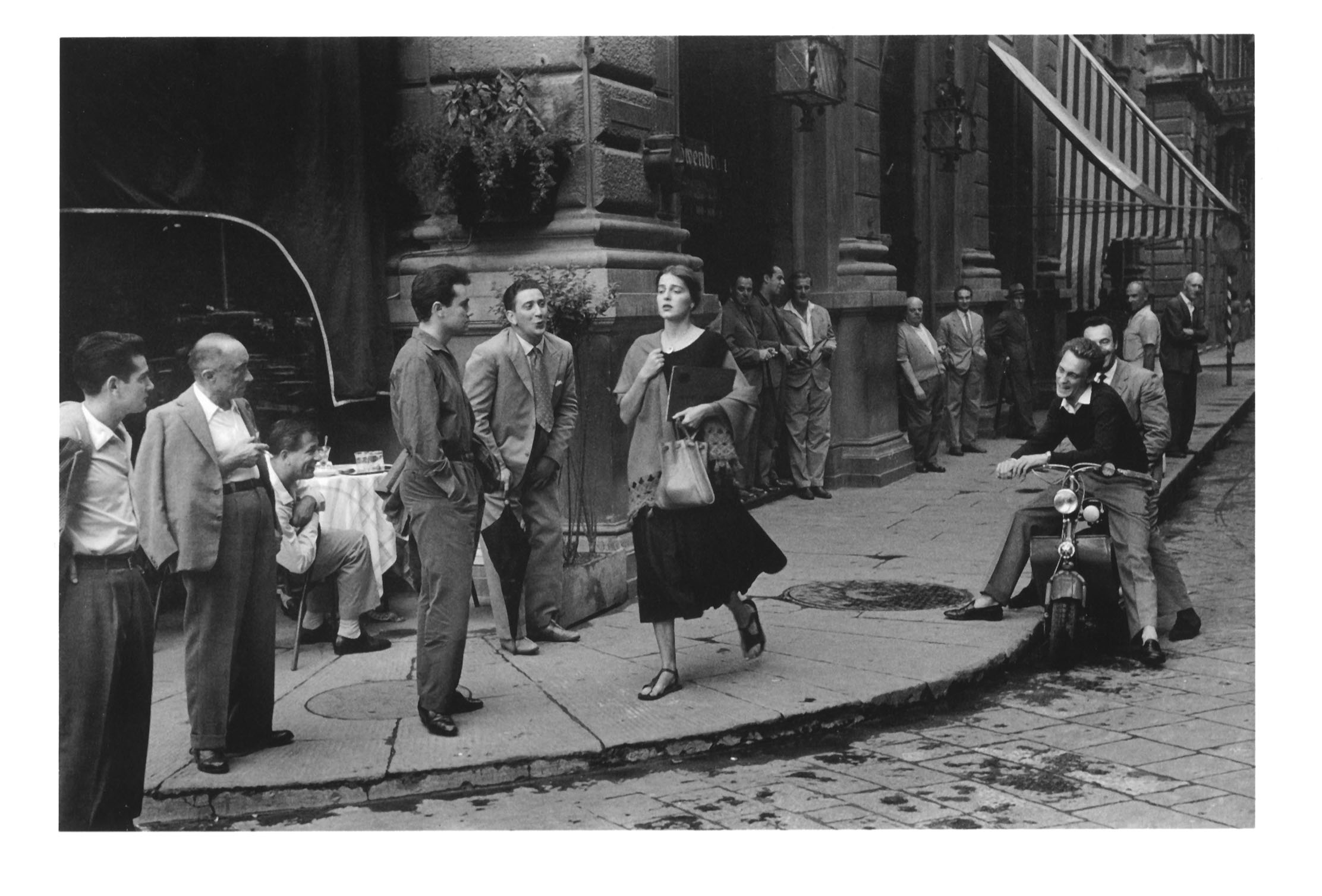
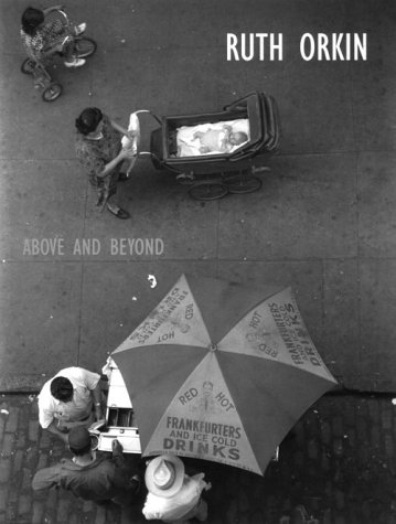
So it is, that I'd like to introduce you to Ruth Orkin's work. Ruth was a member of New York's Photo League. Perhaps her most famous image is that of the 'American Girl in Italy'. Whilst there on a holiday with one of her friends, they decided to make photographs of what it was like for a single woman traveling around.

I do love street photography. It's a very different form of photography from Landscape work. I find that although there is perhaps less of an aesthetic in the work, there is often more of a story involved, and I find that I look at street photographs in a much more different way than I do landscapes. I think I often feel transported back in time and find it really interesting to see the interaction between subjects. I often marvel at the timing in making the right shot (although for me, Henri Cartier Bresson's work is less engaging).

I often wonder, who were these people? What were their lives like? I love how photography can document something, freeze it in time.

Anyway, Ruth's work is really worth checking out and I see there is an excellent web site about her work which will give you plenty to enjoy.

Currently, there are no publications available about her work and I've had to rely on buying used copies. In particular, I bought 'Above And Beyond' by Ruth. It's a small, slim paper back, but the images in it are really excellent. It was unfortunately, a bit expensive, but when I get 'into something', I usually seem to find that money just doesn't matter that much...  (ahem). I'm just very curious as to why there has been nothing published about her in book form for some time?

Edward Burtynsky photographs the landscape of oil

I came across a really interesting site today (petapixel.com) which has some great TED video's on it. When I was in Patagonia several years ago, a couple (hi Mary & Chris) on my workshop kindly sent me a coffee table book of the works of Edward Burtynsky.

I'd never heard of him before, but his work I feel, is very compelling.

Photography should know no bounds. It's easy to classify things into 'landscape', 'portraiture', etc, etc, but as one moves on through photography, we hear and learn about photographers who are doing astonishing things.

A few posts ago, I was discussing 'voice', that part of you which governs your style and how you move forward with your photography. Watching this vide of Burtynsky, it's clear he has a very strong motivation for why he makes his images. He's very defined. He's not out there shooting coastal sea scapes (sorry, but this is perhaps a dig of mine at the countless web sites I see which just seem to feature water in every shot). He's got direction and focus.

His images are pretty inspiring and they remind me that so long as you have a strong sense of what it is you want to do, the photography will flourish.

Ansel Adams

What I love about this clip of Ansel, apart from how modest he is, and seems like a really easy going chap, is how open he is about his art. He explains how he manipulated his images in his dark room, and how he liked to 'visualise' the scene before he took it. Essentially, the negative for Ansel was the starting point in creating his 'visions', and to look at the negative printed verbatim would have been an uninspiring experience. He coined the phrase 'the negative is the score, and the print is the performance'.

Now what gets me is that there are a load of folk out there who think manipulation of the image is lying. And that it's a relatively new thing since the digital revolution came along, but If you listen to Ansel, you'll realise that manipulation of the image has always been there, and it's part of the creative process of photography. Sure I love it when an image comes together that requires no alterations, but I do like to put my own 'art' into my work, as do many photographers.

Ansel was very forward thinking and he embraced the (at the time) forthcoming digital revolution. He thought it was exciting and it would lead to new possibilities. He was a purist in the artistic sense and was no dictator of what should and should not be acceptible as art.