Looking for Tonal Separation

I’ve been coming to Iceland for over a decade and often visit it several times a year. It has become a home from home, somewhere that I feel I have built up a deep visual relationship with.

One aspect of returning many times to the same location, is that its appearance can be quite different during different seasons. In the winter months, Iceland can be shrouded in a blanket of snow, and this I feel can add a dynamic contrast to the black beaches found on the south coast.

View of Reynisdrangar sea stacks from Dyrhólaey, South Iceland, 2012. Image © Bruce Percy

View of Reynisdrangar sea stacks from Dyrhólaey, South Iceland, 2012. Image © Bruce Percy

I think my image of the distant sea stacks at Reynisdrangar, shot from Dyrhólaey illustrate just that. I was particularly drawn to the tonal separation between the foreground sea stack of Dyrhólaey against the background snow covered cliffs of Reynisdrangar. When I have visited this location during the summer months, the background cliffs are often too similar in tone to the foreground stack. So much so, that they often merge to become one confused mess in my viewfinder.
 

Some thoughts on to working on tonal separation

Perhaps the biggest lesson I’ve reached by visiting the same places during different seasons is in reading the tonal separation between objects in my view. I feel I am now at a level in my art where I make ‘black and white’ images ‘in colour’ (I often find that when I convert my colour images to monochrome, very little change is required because I am reading the tones of the scene at the time of capture). Well, I'd certainly like to think this is the case ;-)

I believe the biggest pit-fall for many of us is our inability to abstract a scene into an image. To do this, we need to understand that the skills used to compose our camera on location are no different from the skills we use to interpret and edit a scene during the ‘post-process’ phase. In fact, I abhor the term ‘post-process’ because it encourages us to think differently about two tasks that should use the same skills. The pit-fall is that many of us don't.

While out in the field, rather than thinking ‘tree’, ‘river’ or ‘bridge’, I try to think about the tones present within the scene. Because this is what I do when I am ‘post-processing’ my images.  If you are a film photographer, I would suggest using a spot meter, as it helps me build up a mental picture of the tones contained within the frame. If you are a digital shooter, then I would suggest using live-view. Live-view is fantastic because it transforms a scene into 2D for you. It further helps you abstract the real world into a tiny postcard image on the back of your camera. If you make the distinction in your mind by thinking of the back of your screen as a photo, rather than a view of live scenery, then you're on the right track.

To aid in helping you think more about tonal separation, try turning the jpeg settings to monochrome as this will give you a black and white rendition on your live-view screen. The Raw file will still be in colour but you will have a tonal rendition on your camera that should aid you in noticing tonal errors much more easily. You should be able to see more clearly tonal errors such as foreground objects merging into background objects or two objects of similar tone colliding with each other. Beware though that often green and red have the same tonal rendition in monochrome.

In praise of shadows

I've been reading a beautiful book called 'In Praise of Shadows'.  It was written by the Japanese author and novelist Jun'ichirō Tanizaki and is considered a classic essay on Japanese aesthetics.

As a westerner, I find reading Tanizaki's book is opening up some thoughts for me about light, the way we use it in the west, and in particular, how varying levels can be employed to create a sense of quietness in our environment. Tanizaki talks at great length about the beauty of shadows.

Although his book may be more related to architecture design, I do feel that as a photographer, it's touched upon something that is close to my own heart: that of how I respond to my surroundings. In the days of old Japan, subdued lighting was used to give a sense of calm or 'quietness' to a space. Areas of shadow were an intentional and appreciated consideration to building design. My feelings are often influenced by the lighting of my environment, and I find that most modern, brightly lit places aren't relaxing places to be.

Shadows are the places where our imagination is given free reign. In Tanizaki's book, he delights in suggesting that the corner of ancient temples where very little light penetrates, allow the mind to find quietness and a space in which to dwell. While reading Tanizaki's thoughts, I couldn't help but feel I always knew this. I think that most of us do.  I just needed someone to spell it out for me. 

For instance, as a child, I remember being afraid of the dark and would ask for the hall light to remain on, because in the shadows I could see many possibilities. This is something most children do, and in my adult life as a photographer, I find I still see possibilities in areas of negative space or where shadows exist.

Maiko1.jpg

As I've progressed as a photographer, I've had to open my eyes to what is really before me. I have come to know that I am sensitive to light levels where initially I had no idea that I was. Shining a direct light into my eyes is tantamount to a pneumatic drill crowding my thoughts. I've despised overhead lighting for many years, for this very reason.  Likewise, on overly sunny days I may have the blinds lowered in my home to give the degree of visual comfort that I emotionally require.

This sensitivity to light, is something I try to imbue in my photographs. I think all visual artists should.

Tanizaki's book allows me to embrace this - I know now that shadows are beautiful and used carefully in one's work, they can add depth as well as mystery. They also give me space for my imagination to roam free.

As a visual artist, I understand that my surroundings are important to me, not just because they are the subjects of my photography, but because the qualities of light they possess influence it in ways that I was never truly aware of, until I read this book.

Many thanks to Jeff Bannon for recommending this book to me.

Art as Influence, as Inspiration

"art is often a symptom of the landscape"

Over the past few weeks, I've been enjoying and reading about the great Japanese artist Hokusai. Although Hokusai's name may not be universally known to many of us, his painting 'The Great Wave off Kanagawa', will be. It is perhaps the most famous Japanese print of all.

Hokkusai's 'The Great Wave of Kanagawa'.

Hokkusai's 'The Great Wave of Kanagawa'.

I'm due to visit Japan this December. It's a trip I've been looking forward to all year now and as it gets closer  I find I can't help myself but wish to know more about Japan, its art and its culture.

You see, I get great inspiration from enjoying and absorbing the art of the places I'm going to visit, because its art is often a symptom of its landscape. I think this is very true in Japan's case. Often the landscape has been cultivated to fit their aesthetic sensibilities, and other times the shape and form of the landscape has informed their art.

This is a beautifully illustrated book of Hokusai's work. I find that just looking and enjoying the work, that I am finding inspiration. 

This is a beautifully illustrated book of Hokusai's work. I find that just looking and enjoying the work, that I am finding inspiration. 

But as well as enjoying the art for its own sake, I find the actual process of investigating and learning about it helps me connect with the place I'm going to visit. Indeed, I often find that the art of a country can often mimic elements of the landscape, or the other way round.  In Japan's case, their landscape has been cultivated to a degree to match the culture's aesthetics. 

But there is more. The Japanese have very definite aesthetics to their art and architecture, and I feel that any understanding I gain before the trip may help me when I am piecing together a new portfolio of images. I guess I'm trying to say that since I felt inspired to come to Japan because of its art and their approach to shaping their landscape, I wish my photography to illustrate this as far as is possible. If I am not entirely ignorant about a place and the culture, then I think any knowledge I have is going to be absorbed hopefully in my picture making.

Inspiration can come from many sources, and I guess the most obvious one is to look at other photographer's work. But I think I stopped using others photography as the sole reason for my influences many years ago. These days I'm more likely to find inspiration through a book i've read, some music I've listened to (such as the wonderful 'Bino No Aozora by Ryuishi Sakamoto below)) and most likely - the art of the country, because the art is often a symptom of the landscape. 

Ryushi Sakamoto's 'Bibo No Aozora

We construct what we see

I’ve been reading ‘Visual Intelligence’ a book by cognitive scientist Donald D. Hoffman. It is a fascinating book about the cognitive processes that are at the core of our visual system. 

The premise of Hoffman’s book, is that we ‘construct’ in our minds what we see. In essence, light comes in through the pupil of our eye and hits the retina, but from that point on, there is a lot of ‘visual processing’ that happens immediately, and in such an innate manner, that we aren’t even aware of doing it.

Let's consider these two statements from Hoffman’s book:

"The image at the eye has countless possible interpretations"

and

“The image at the eye is always two dimensional. You construct the third dimension”

In the famous Necker cube we see here, we are given a rare opportunity to observe our visual-intelligence working. Let's look at the cube:

The Necker cube is an optical illusion first published as a rhomboid in 1832 by Swiss crystallographer Louis Albert Necker. If you look at it for a while, you may see the cube in two different ways. Keep looking!

The Necker cube is an optical illusion first published as a rhomboid in 1832 by Swiss crystallographer Louis Albert Necker. If you look at it for a while, you may see the cube in two different ways. Keep looking!

There are actually two ways in which we 'see' the cube. Sometimes we visualise the square marked here with letter A as being in front of the square marked here with letter B. Other times we see them the opposite way around. If you don’t, just keep looking. 

Donald Hoffman's book about visual intelligence. If you're interested in why we 'see' the way we do, and why our brains are fooled by certain optical illusions, then this is the best book I've read to date on the subject of our visual system.

Donald Hoffman's book about visual intelligence. If you're interested in why we 'see' the way we do, and why our brains are fooled by certain optical illusions, then this is the best book I've read to date on the subject of our visual system.

I’ve been thinking for a long time, that the problem for us photographers is that our visual intelligence is so innate, so immediate, that we sometimes don’t actually ‘see’. 

I believe that our ‘visual-intelligence’ helps us only so far with our photography. And from a certain point it starts to hinder us. The adage that looking is not the same as seeing rings true here. We really have to work at being more visually aware because our visual-intelligence has its own agenda and often hi-jack's us into seeing things in a way that does not help us when creating images. 

For instance, our camera sees in 2D while we do not. So in order to be able to visualise our images we have to be able to look at a scene in 2D. This is very hard because our visual intelligence is so innate that we can't help ourselves but see everything in 3D. It takes effort to see something in 2D. (Interestingly each of our eyes receives a 2D visual image and it is our visual intelligence that is responsible for automatically constructing a 3D interpretation).

To be a good photographer, we almost need to un-see the 3D construction that our visual-intelligence innately makes for us, so we can notice if one object that is in front of another will merge when flattened down in to a 2D image.

If you’re interested in this subject (as I feel all photographers really should be), then I’d recommend Hoffman’s book. It’s very well written.

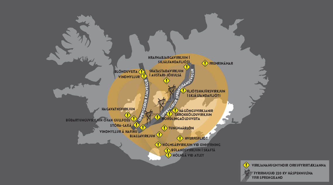
Please Sign the petition: Central Highlands of Iceland under threat

The Icelandic wilderness is under threat with plans to build highways and power lines, despite the will of the majority of Icelanders to make it into a national park. Bjork, the famous Icelandic singer is leading the opposition and calling for help from all over the world to sign this petition in order to put pressure on the Icelandic government. 

The central highlands of Iceland is like nowhere else I know: it is a vast landscape of natural wonders, and what I love about it, is that there is very little in the way of development there. Some of the regions like the Fjallabak nature reserve and Vatnajokull National park do have protection status for good reason. But there are many, many other special areas of this region that I think need protection also.

You can sign the petition here: http://heartoficeland.org/

The yellow areas are the central highland region, and the grey and yellow I believe, show where the proposed areas of development such as power plants and power lines.

The yellow areas are the central highland region, and the grey and yellow I believe, show where the proposed areas of development such as power plants and power lines.

When you think you're just about lost - you're probably nearly there

Last week I posted this article about keeping objectivity in what we do.  As a response to my post, I received a few emails from readers who were preoccupied with a more fundamental aspect of their creativity: that of knowing whether any of what they do is any good. The nature of the questions I received were more along the lines of 'what if you think all of your work isn't any good?' or 'how do I know when I should give up on something?'.

I came here on a hunch. I had no guarantee's that anything I would shoot in the Puna regions would be any good. I also found that the majority of what I did shoot wasn't any good. The final portfolio on this site is only a tiny fraction of what I di…

I came here on a hunch. I had no guarantee's that anything I would shoot in the Puna regions would be any good. I also found that the majority of what I did shoot wasn't any good. The final portfolio on this site is only a tiny fraction of what I did shoot, and it took me a while to see there was still something of value - because upon first review, I had assumed I'd gotten nothing.

No one is alone in feeling that their work sucks from time to time. I fully sympathise with these feelings because I get them just like everybody else does. In fact, I think it is part of the natural process of being a creative person to have doubts and feelings of dissatisfaction about what you do from time to time.

There are often spells in my own creativity when things don't happen, or that I am dissatisfied with the results. But the thing is: I understand that I am at the mercy of my own creativity. I can't control it, and I just have to accept that sometimes I am going to suck. I've just over the years realised that it's ok to suck.

I've been a creative person all of my life: whether it was drawing and painting as a kid, music composition during my teenage years and 20's, and photography since my 30's, to know that creativity has an ebb and flow to it. I can't control it. So it's best to ride it out. 

Besides, sometimes when I find the work is not going the way I wish it to, it's usually because of a change within me. Sometimes the reason why new images don't seem to work is because I'm on the cusp of something new. Other times it's just because I'm tired, or maybe needing a rest and it's time to do something else for a while.

Besides, if we created wonderful work all the time, then it would simply become our new 'average'. So I think it is natural to have this 'tug' of balancing one's own aspirations against one's own abilities.

Growth can often be painful.

If you feel your work isn't up to the standards you'd like it to be, the best bit of advice I can give you is to get it out of your system so you can move on. Everything we do is a stepping-stone - a mark in time. If you keep working endlessly on something that isn't working, then you are stuck. So best just produce it, even if the experience wasn't a good one, and move on.

I think creativity is all about letting go. It is about giving yourself permission to make mistakes and it is about deliberately getting lost. For being lost, means that you are somewhere new in your work, which is often an opportunity to learn.

Creativity is not about controlling the entire process and neither is it about knowing where you are all the time. If you want a guarantee about what you are doing, then creativity is not for you.

Each time I pick up my camera, I have no idea whether the results will be successful. So when I do start out looking for new images, I do so with an openness to failing. I fully accept that some of my images will be better than others, and because of this, I avoid giving myself a hard time about it.

So be kind to your creativity. When you feel it isn't working, best give it a rest and do something else for a while. The inspiration will return.

And also remember, that when you think you're lost with what you are doing, you're probably nearly there :-)

Short time critic

Now that I've completed work on my new collection of images - from the Puna de Atacama of Argentina, I feel it's an appropriate time to talk about being one's own critic.

Images from the Puna de Atacama. Shot in June 2015, and I didn't start to look at the transparencies until early October 2015. It is now early November, and I've had a few weeks to sit on them, periodically doing a review to see if anything needs to…

Images from the Puna de Atacama. Shot in June 2015, and I didn't start to look at the transparencies until early October 2015. It is now early November, and I've had a few weeks to sit on them, periodically doing a review to see if anything needs to be changed. But doing it for short spells, because this is the only way I can remain 'outside' of my own work.

I've mentioned many times before, that I prefer to leave a lot of time between the shoot and the editing. I deliberately hold off sending my films away for immediate processing, and if I were a digital shooter, I would deliberately hold off editing my images for several weeks (preferably more). This I firmly believe gives me distance because with time, I gain a realistic sense of objectivity about what it was I accomplished. Editing straight away I feel does not give me the chance to truly see what the images hold, because I am too close to the work: I tend to suffer from a prejudice, often holding onto ideals of what I hoped the images would be.

Giving some distance to my work allows me also to be a more honest critic of what I've done. In fact, I don't just give myself distance between the shooting and editing stages any more. I do the same thing during the editing as well.

Editing is an iterative process. For each image, I tend to go through a process of edit, then review a day later, do another fine tune edit and leave it for several days then review. If I do any further editing, it is short and then I save them again, and repeat.

The issue is this: in order to edit my work well, I have to be a critic of my own work and to do this, I need to remain objective. The nub of the problem is that I'm only able to be an objective critic for a short while, because the longer I spend on the work, the higher the risk is, that I will become too lost in it. So I tend to review for short spells only. (tip: take note of your first impressions as they are usually right).

Being a good critic of my own work has required me to be able to step 'outside of myself'. This can only happen if I take time off between the edit and review sessions and more importantly, am brief when I do review. I believe a good critic is a short-time one. Don't overwork your work.

The Labyrinth Desert, Puna de Atacama

I've often felt that the more I get to know a place, the deeper the connection becomes. Over the years I've been traveling and making images, I have slowly built up a collection of places I love and keep returning to for that very reason.

This summer I visited the Puna de Atacama. It is a new location for me despite being, on the surface, similar to the Bolivian altiplano that I know and love so well.

One place in particular that I really found most interesting is named 'the labyrinth desert' - it's yet another high elevation landscape, but it was so far removed from all the other kinds I've experienced to date in the Altiplano of Chile and Bolivia, that I felt it has been overlooked somewhat.

It's difficult to get some scale to this landscape, and you may be forgiven for thinking that this area only encapsulates the mountains you see in my shots. The mountains are actually small pink clay hills - approximately around 30 to 40 feet high. Not that big at all, and so the scale of these photos is maybe a little deceptive.

But what you can't gather from these shots is just how selective I was in making them. This is only a very tiny section of the entire area. Due to the limited time I had here - one evening of good light which lasted for about 10 minutes, I had to quickly make these shots with the time and limited positioning I had. 

Research is key to good landscape photography. I only feel I've just become acquainted with this place, and really need to spend a lot more time here - because it's the only way I will know where the best locations are for the kinds of light that I like to shoot in (often with the sun behind me).

The other complication to this landscape was its fragility. It is made up from a very soft pink clay and gypsum. The gypsum is scattered all across the surface like broken shards of glass and the terrain is really fragile to walk on - when you do go anywhere, it's like walking across the crust of a chocolate pudding. Each footstep breaks through the surface and seems to leave what I was convinced was a permanent scar on the landscape.

Cono de Arita, Puna de Atacama

Today I just published some new work. This time round, from a place I've never photographed before - the Puna de Atacama.

I visited this high plateau early on this summer. Perhaps the most startling location here is the cono de Arita - a small volcano that is only 122 meters high.

I was really taken with its conical shape and the tonal contrasts - the white salt flat is at polar opposites to the dark tones of the cone. The place has a surreal, alien quality to it and I really wanted to convey that in the final edit you see here.

But it's a tough place to visit: at a high altitude of around 4,000 metres, and very basic amenities (more basic than in Bolivia), plus very very long traveling distances between locations - I found my time here a challenge.

I missed a lot of places because we were passing through at the wrong time of day, or because we simply ran out of time. In my minds-eye I can still see so many key locations that I failed to capture, that I know I really do have to come back. So I've already begun planning some time there again in 2016.

I love how photography has the ability to steer you in new directions and take you on new journeys :-)

Sometimes it's about the sky, or ground, but seldom both

Disclaimer: Please note, that I write these articles to stimulate some thought. I will sometimes generalise a point or simplify an argument  in an attempt to convey a message. Ultimately,  it is just my point of view and of course is not the definitive word on the matter (as much as I'd love to think so!) ;-)

As much as I would love to fit both sky and ground into my compositions, I only have so much area within my frame to work with. So I have to figure out what is central to the story I'm telling in the image I'm composing. If I add a lot of sky in, then it should either compliment the foreground in some way (if both sky and ground have a relationship - by mirroring shapes or mirroring textures / patterns), or it should dominate the scene.

Picture 1Despite many thinking this image is about the desert and the mountains, it's really about the sky. So much so, that the sky covers 3/4 the area of the frame, while the ground only covers 1/4 the area. My eye moves mostly around the sky with…

Picture 1
Despite many thinking this image is about the desert and the mountains, it's really about the sky. So much so, that the sky covers 3/4 the area of the frame, while the ground only covers 1/4 the area. My eye moves mostly around the sky with occasional visits to the two mountains - often in a triangular motion around the frame.

For me, it has to be either / or. You either have a lot of foreground and little sky in the frame, or you have a lot of sky and little ground in the frame. 

We have to figure out what is it that we're trying to say, when we choose the proportions of sky and ground. Is the photo really about the desert and mountains? Or is the image really about the sky, and the mountains are in the frame to give some kind of context?

Settling for something in the middle often results in a confused message. The end result is that the viewer is pulled between both sky and ground and a competition race between sky and ground ensues for the viewers attention (see Picture 2).

But it's hard to choose the sky over the ground as a dominant subject. We tend to give foreground or ground subjects more prominence than they deserve because they are usually what draws us to a location in the first place. In the first image above (see Picture 1), I had that very circumstance. I was first drawn to this place by the strange rocks and mountains to be found there. We can be so wrapped up in what grabbed our attention, that we may fail to see other motifs or interesting patterns elsewhere (such as in the sky). Picture 1 is all the cloud shapes and the light scattering upon them. It is a 'sky photo' with some contextual mountains in the foreground. Not the other way around. 

I've re-cropped the image so we can look at it from another point of view. In Picture 2, it would have been so easy for me to compose the shot in a more traditional format - with the sky only taking up 2/3rd's of the frame and the ground taking up 1/3rd. The net effect is that the horizon is more central and my eye is being pulled between two competing subjects: sky & ground. 

Picture 2In my original shot, the ground covered 1/4 area of the picture. In this crop where I've reduced the sky, the ground has now 'gained' and covers 1/3 the area of the picture. The result is that the sky has less dominance while the ground has…

Picture 2
In my original shot, the ground covered 1/4 area of the picture. In this crop where I've reduced the sky, the ground has now 'gained' and covers 1/3 the area of the picture. The result is that the sky has less dominance while the ground has gained in dominance and I find my eye is being pulled between sky and ground in a competition between the two for my attention.

My advice would be to do the following:

1. Set up your shot the way you want it and make an image for comparison.
2. Adjust the camera so that you get a lot more ground in the frame than sky, and make an image.
3. Adjust the camera so that you get a lot more sky than ground in the frame, and make an image.
4. Compare.

I guess I try to avoid central horizons where I can, because mostly they just make a composition feel less focussed. But there are times when going central does work. If the sky and the ground have a tight relationship (such as similar tones, or textures, or perhaps a pattern in the landscape that is also encountered in the sky). I also find I will go central when I feel that sky and ground have little to add to a photo - the main point of attention is to be found in the middle of the frame, By doing this, I can use the sky and ground equally to give a lot of space around a subject, as in Picture 3:

Picture 3.The horizon is just slightly above centre. I can get away with this composition due to the requirement to have a lot of space around the island. Note however, that I still didn't go central, because that would introduce the feeling of the …

Picture 3.
The horizon is just slightly above centre. I can get away with this composition due to the requirement to have a lot of space around the island. Note however, that I still didn't go central, because that would introduce the feeling of the island sinking (see Fish Tank article from a few days ago).

Ultimately, often trying to have both sky and ground with equal attention leads to competition between the two, unless they are contextual (such as in Picture 3 above - where they just contribute a sense of space to the composition). I prefer to make things as clear as I can - either the image is about the ground (and therefore there is a whole lot more ground in the frame than sky) or it's about the sky (and therefore there is a whole lot more sky in the frame than ground).

Most often, you can't have both without it seriously compromising the strength of your composition.