Longevity through Ambiguity & Suggestion

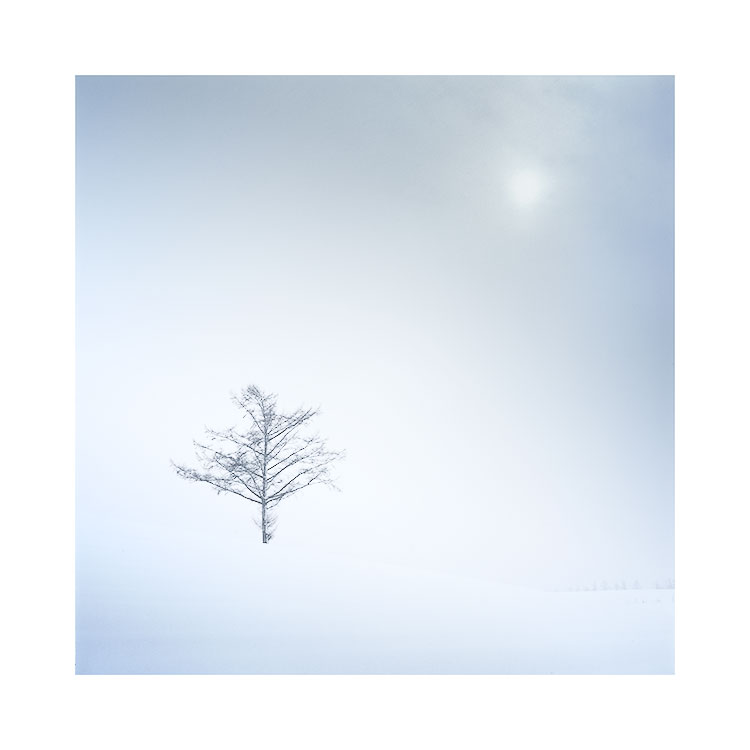
There is real danger in overworking an image to the point that the viewer has little chance to attach or develop their own sense of personal interpretation to it.

Hokkaido, Japan, December 2015Image © Bruce Percy 2015

Hokkaido, Japan, December 2015
Image © Bruce Percy 2015

As a beginner, I was blinded by strong colours and contrasts and looking back, my eye was not tuned to appreciating subtle shades or hues. Everything had to be obvious, and for want of a better word - loud.

I feel that it has been a long journey (that is still in progress)  for me to begin to appreciate the finer and more subtle nuances of the art of image editing.  This has lead me to believe that the appreciation of the more subtle aspects of image 'reading'  tends to develop at the same time as our photographic eye develops. Where once I had to work at seeing what was really in front of my camera, so too, I overlooked the more subtle shades and tones of some of the finer imagery out there.

Without wishing to offend anyone, or take sides, I do feel that this is one reason why we sometimes see such heavily edited work on image forums. Sometimes the approach works well and we know the executor has a deft hand at the dramatic, but sometimes it is simply because the photographer is still learning to balance between what should be spelled out to the viewer what should be left to suggestion. With the later, I may be left feeling that the photographer behind the work is simply trying too hard. None of this is judgemental, but instead, I give this as an observation to how we start when we are new to photography and how our sensibilities alter and hopefully become more acute as time goes on.

We all, I believe, go through different periods of visual awareness. And there is really no short-cut to arriving at a sense of refinement.  For instance, in my own case, you wouldn't have been able to convince me a decade ago that what I liked may have lacked subtlety. I just liked what I liked.  Nowadays I may balk at what I did back then, but I realise I had to go through the growing pains (and still am) of learning to understand what makes a good image and what makes a great print.

Indeed, there is a place for everything. In music we have pop bands that are more like an audio bubblegum, and at the other end of the spectrum we have some music that some or perhaps many of us would find impenetrable, or just downright hard to listen to, let alone understand. And some music is instantly disposable while other pieces can become real growers that embed themselves into our lives.

I think the proof in one's own photography is in the staying power of the images we create. If we can make images that still resonate and work for us a few years down the line, then this would be a great achievement. The ultimate achievement however, is to create work that we are still proud of many decades later.

I think the only way to do this, is to try to build in some kind of depth to the work, a subtlety or perhaps deliberate ambiguity. It is through suggestion that the story can always be changed or reinterpreted as the years go by.

If your images are too forced, or lack any kind of space in which to allow the viewer to reinterpret them, then they may fail to have the longevity that you seek. But If your images do have room for further growth, through the use of subtitles such as delicate use of shade & colour,  then you may be on to something great

Hasselblad Cable Release Adaptor

If you have a Hasselblad V series (500 series) camera, and like me, find that you cannot get a cable release that will fit the body when using a short lens (such as the 80mm), then I thought it would be nice to let you know that it's possible to get either an L or U shaped adaptor from this company:

The website shopping cart system is a bit complicated to actually try to buy anything, but I've seen the U shape adaptor and it's perfect for the Hasselblad 500 series of cameras:

http://www.xn--drahtauslser-djb.com/SITE/PAdapter.html

Ellipses in the landscape

Those of you who have read my 'Simplifying Composition' eBook that was published a few years ago will know that I'm a big proponent of utilising shapes and patterns in the landscape. I think that curves and diagonals work well because they follow the way the human eye likes to walk around a frame.

Volcanic crater, Veiðivötn, Central Highlands of IcelandImage © Bruce Percy 2016

Volcanic crater, Veiðivötn, Central Highlands of Iceland
Image © Bruce Percy 2016

The eye tends to prefer to scan around images diagonally, and it's not too comfortable if it has to scan horizontally or vertically, unless of course the composition is all about strong horizontals (for instance, the trunks of trees can emphasise the vertical aspect of a composition) or with a panoramic image, strong horizontals aid the composition rather than deter.

Below is an excerpt from my e-Book 'Simplifying Composition':

In general, we tend to enjoy scanning images in diagonal movements. If we are forced to do otherwise, it causes discomfort and the image becomes tiresome or frustrating to look at.For example, if our eye is forced to walk horizontally between two su…

In general, we tend to enjoy scanning images in diagonal movements. If we are forced to do otherwise, it causes discomfort and the image becomes tiresome or frustrating to look at.

For example, if our eye is forced to walk horizontally between two subjects, then flow through the image is interrupted and the eye begins to boomerang back and forth between the two.

The same is true with verticals. When my eye is forced into jumping erratically backwards and forwards between the top and bottom of a frame, I find it very displeasing.

However, If my eye is forced to walk through an image diagonally, I find I can comfortably traverse it without any desperate feeling to jump from one end to the other.

See how your eye feels as you follow the arrows in the diagrams above.

But what of circles in the composition? Do they work? Well I'm not really too sure that they often do. Each time I've shot rock pools, they never look pleasing to the eye is they are entirely round, and I find that shooting them from an incident angle, thus turning them into an eclipse more pleasing.

Consider my image in todays post. In the background of the shot the volcano has taken on a very strong graphical elliptical shape. It's not by any stretch the main focal point of the image, but I feel that the eclipse is there anyway. 

If we think about s-curves, they are really compound curves, and curves when we break them down to what they really are - they are really curved diagonals. Ellipses are really compound curves!

Back to the shot: I was initially attracted to the little stream in the foreground. I felt it would make a suitable interest focal point for the composition. But it was really the sweeping curves of the horizon and the ellipse of the volcanic cone that chose the final composition for me.

I enjoy also working with very definite tonal ranges in my landscapes. I can find not only interesting graphical shapes to work with in this landscape, but so too do I find dramatic tonal ranges also.

As I continue with my own photographic development, I just think that everything is ultimately broken down to shapes and tones. There seems no better place for me to do that, than in the vast abstract wilderness of the central highlands of Iceland.

Graphical elements, or landscape?

The Landmannalaugar region of the central highlands of Iceland offers up a lot of graphical elements when the conditions are right. The following images were made during the summer of 2015 when there may still be snow in the region. Winter always has a much firmer grip on the centre of Iceland for longer than the coastal regions, and it's no uncommon to find that some areas of the highlands are still inaccessible in the early summer months.

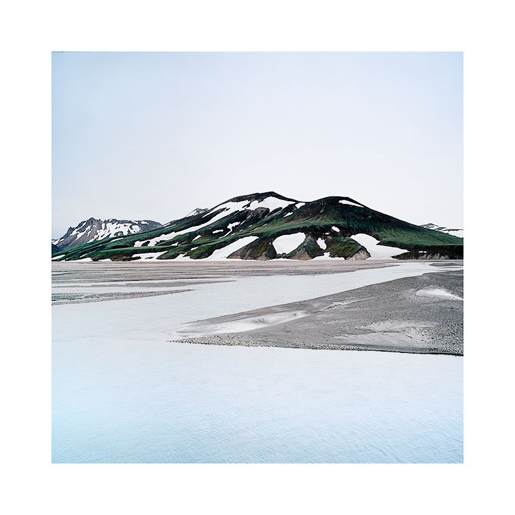
Arcs & Triangles, Landmannalaugar, Central Highlands of IcelandImage © Bruce Percy 2015

Arcs & Triangles, Landmannalaugar, Central Highlands of Iceland
Image © Bruce Percy 2015

If you're a regular here, then you'll know that I'm particularly drawn to a more minimalist style of photography. I love to play with graphical elements that occur naturally  in the landscape and use these to impart (hopefully) a more powerful composition.

Curves and diagonals as well as tonal balance or proportions in the frame balancing in some way or other are the things that I love about what I do, and some landscapes are better for working with these themes than others. The central highlands of Iceland is one of those places, but I should warn you - it's not an easy place to photograph!

Camouflage, Landmannalaugar, Central Highlands of IcelandImage © Bruce Percy 2015

Camouflage, Landmannalaugar, Central Highlands of Iceland
Image © Bruce Percy 2015

I've just been going through a lot of my images from my recent trip here  this September past, and as part of completing work on this small chapter in my photography, I felt I had the enthusiasm and time to pull out the transparencies that were shot over a year and a half ago.

I'm a big believer in doing things when they 'feel' right. I never got round to editing the work from the summer of 2015 because I just wasn't in the mood. For years, I would have never let work sit unfinished for so long, but I've become comfortable with this approach now. Dare I say that I've gained some confidence in feeling that there is no rush, no need to edit right away, and that if I leave the work until I feel inclined to work on it, then that will produce better results.

A much younger me would have felt an internal pressure to work on the images soon after, and would have worried that if I left them for more than a year, that I would never get round to working on them. Well, that ain't so. I've got a massive backlog of work from the past three years or so, and I'm aware that although some of it I may never get round to, it now seems to be a common theme for me to only get round to editing the work maybe a few months or much later on.

What I loved about working on these three images, was that I hadn't seen them for more than 18 months. I could connect with what they are, rather than what I had intended at the time. I also think my eye is looking for things in a more attuned way than I would have been a year and a half ago.

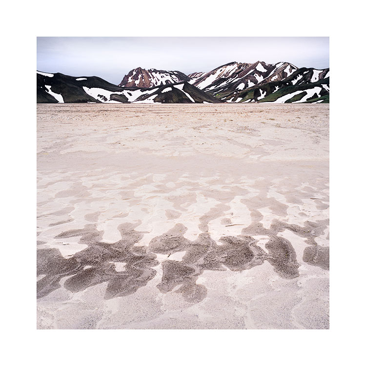
These three images are really all about shapes. Graphical elements. The landscape is often full of them, they are signs, indications of what needs to be photographed, composed a certain way and also edited a certain way. Look for them, forget that you are photographing mountains river and sky, but think instead about patterns, shapes, curves, diagonals and the occasional triangle, and I think you can't go wrong. Well, you can go wrong if this isn't something that appeals to you. So only go this way if you think it makes sense. I offer it as a suggestion if you think it does :-)

Curves & Zigzag, Landmannalaugar, Central Highlands of IcelandImage © Bruce Percy 2015

Curves & Zigzag, Landmannalaugar, Central Highlands of Iceland
Image © Bruce Percy 2015

Dalkúr & Þóristíndur

Dalkúr & Þóristíndur are two mountains in the Veiðivötn area of Iceland. Veiðivötn means 'fishing waters or lakes'. It is an immense landscape of black desert that stretches for as far as the eye can see. It´s beautifully stark, one of those places where you become very very quiet the first time you enter. For all around you is abundant space with just very subtle gradual changes in dark grey and sometimes faintly dark brown desert.  If there is colour to be found here, it is in the form of iron ore brush strokes, often highlighted on the side of small black volcanic cones that occasionally dot the landscape.

Dalkúr & Þóristíndur are two mountains quite visible from the highland-road - an unsealed track made up of nothing more than tyre tracks from high clearance vehicles that manage to make it out to this place.

I'm not one for shooting towards the light. I call this 'shooting against the light' as it always feels as if the direction of travel of the light photons is against me. This kind of shooting results in extremely contrasty light, which I often find very hard to control during exposure and afterwards in the digital darkroom. But Veiðivötn encourages me to do just that because the sand is so dark that hardly any light reflects back from it. Contrasts are required, otherwise the final negatives may appear to be extremely flat.

With this shot, my photo group and myself made a brave attempt to shoot this while rain fronts were coming in every 10 minutes or so. The rain was obviously coming in our direction because the laws of the universe state that wherever you wish to point your camera, the wind and rain direction will always be lined up to land on your lens! So we had to repeatedly dry the lenses off and hope that some of our captures would not have any rain drops.

But most importantly for me was the need to control the contrasts. This shot was taken at a lull in the intensity of backlighting that was occurring. Sometimes the sun would poke right through the background cloud cover so much that I new there was no point in shooting. From a learning perspective, I should stress that when the light looks good to our eyes, it is often still too extreme in contrast. So I waited until the clouds began to cover the sun up so much that the contrast effect was at its lowest. Although the light may appear less exciting and not worth taking, it is the perfect time to capture something that has good dynamic range on your film or sensor, and still maintain the dramatic impression you felt whilst there.

Stac Pollaidh and Cul Mhor, Loch Bad a Ghaill, Inverpolly, Scotland. 2015. Image © Michael Kenna 2015

Stac Pollaidh and Cul Mhor, Loch Bad a Ghaill, Inverpolly, Scotland. 2015. Image © Michael Kenna 2015

On a side note: last year while I spent a very enjoyable week with Michael Kenna in the landscapes of the north west of Scotland, it was interesting to note that he prefers this kind of light. He is a black and white shooter, which often means he is looking for contrasts. I hadn't appreciated just how much though until I saw one of his images taken of a place I know so well, shot in the early morning with the sun coming up behind the mountain. This location I prefer to shoot when the sun is behind me, while Michael preferred it backlit. Somehow I feel my time with Michael may be the reason why I chose to shoot Dalkúr & Þóristíndur with backlighting. I often feel things are learned by absorption.


Back to my image. I also loved the boulder patch below the mountains. With backlit light they stand out and provide another contrast to the picture. They also provide an elegant arc that is the inverse of the curve of the skyline. 

These boulder patches are few: you can drive for miles and just encounter empty desert and then out of the blue, there's a small boulder patch sitting on its own. This is similar to the Bolivian Altiplano, with both landscapes, perplexing things happen where rocks appear to lie in places with no relation to the surrounding landscape.

Interestingly for me, I find Veiðivötn to be the antithesis of the Bolivian altiplano in terms of colour and tone. Both are vast empty minimal places and they feel like brother and sister to me, only with the Altiplano I'm encouraged to open up the tones and shoot the bright colour landscape, whereas with Veiðivötn, its power is in its shadows and mysterious dark tones. It is a landscape full of suggestion, a place where the mind wishes to peer below the surface, and on each visit there, I feel as though I have yet to scratch below the surface of what is there.

Central Highlands of Iceland

In September I returned to Iceland to conduct a photographic tour in the central highlands of Iceland. It´s a place that has been drawing my interest for the past few years as I´ve made several visits there over the Summer and Autumn months.

Hraybeyjalón,, Central Highlands, 2016Image © Bruce Percy

Hraybeyjalón,, Central Highlands, 2016
Image © Bruce Percy

I think this is a very beautifully stark, exceedingly special place. A jewel amongst jewels in the Icelandic landscape in my opinion, but it is not for everybody. Those that seek to shoot sunsets and sunrises will be mostly disappointed here, because this landscape really doesn't suit that kind of treatment. If one embraces the monochrome aspects of it, then I feel we may be on the right path to not only accurately represent what we saw and felt, but also, to excel at getting the best out of this landscape.

Veiðivötn, Central Highlands, 2016Image © Bruce Percy

Veiðivötn, Central Highlands, 2016
Image © Bruce Percy

The central highlands is abstract. It is a photographer's building site of strange shapes and minimalist tones, and it is also often highly complex.

Being able to see motifs and graphical elements that work well to make a beautiful photograph are often at odds with what the landscape offer. These elements are often suggested, or hidden in a complexity of fractured geology. This I feel, is the skill in photographing this place: to tell a clear and concise story that can be easily read and understood without any overcomplexity.

And what about visiting here? Well, the Fjallabak nature reserve requires delicate handling. although it can be a harsh place - you need to understand and respect that you are dealing with a less adulterated version of nature, it is also a place that requires your respect because it is delicate. It's remoteness and difficulty in getting in here for the general tourist has to a large degree, saved it from being damaged. If you do come, treat it well and understand that it is one of the last true wildernesses that most of us can visit in northern Europe.

Minimalism in the central highlands of Iceland

I'm just back home from Iceland where I've spent the past nine days in the central highlands. It's a fascinating place that I became acquainted with several years ago. This however, has been my first tour here with a group and I, and the group loved it.

Fjallabak Nature reserve, IcelandImage © Steve Semper 2016

Fjallabak Nature reserve, Iceland
Image © Steve Semper 2016

I thought it would be nice to show an image that Steve Semper and myself worked on while on the tour together. I think the attraction for me about this landscape is on three levels:

1. The possibilities of abstraction and graphic elements that can be found here if one really works hard at it.

2. The range of tones from monochromatic landscapes to places where there are extreme colours. This is a landscape that asks to be what it is: it is a highly beautifully stark place, where sometimes there feels as if there is no colour, just different shades of grey.

3. It is a landscape full of compositions and possibilities at every turn in the road, yet most are not 'honey pot' or 'iconic' places. It is a landscape that encourages you to step away from the obvious.

Back to Steve's image. We spent quite some time at this location - a purely arbitrary point for me which I loved simply because of the tonal separation between black sand desert and waters edge. What you see in this photo is actually a black sand bar - a small island of sand poking out from the surface of a lake.

What I love about finding arbitrary places to stop at, is that you never quite know what is there until you get out of the car and start to explore. I feel that choosing one part of this lakeside over another is a process of reduction. We started out with some edges of the lake that felt promising only to find towards the end of the shoot that a particular sand bar held the most promise in terms of graphical shapes to make a pleasing composition from.

Even when we did find this sand bar, we spent quite some time fine-tuning the composition so the edge of the sand bar touched the far left-hand side of the frame. There was further additional parts of the sandbar that if left inside the frame, would have prevented the elegant shape that you see here to stand out. Often I feel that making good images is more about what to leave out rather than what to leave in.

I shot around 40 rolls of film whilst on this trip. It was a real adventure - a real process of discovery and surprise each day and I'm now looking forward to going back next year. In the meantime, it was a pleasure to see other's work come up on their digital camera's live-view features, as it reminded me of how much potential may be lurking inside my films once I get home and have them processed.

Many thanks to Steve Semper for letting me show his image on this blog.

Simple in design: the art of reduction

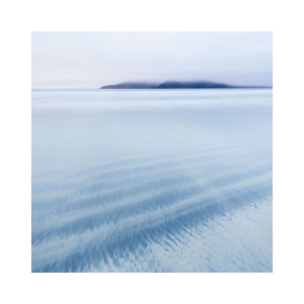
My good friend and client Stacey Williams made this shot on our Eigg workshop last week. I think it's highly atmospheric, effectively simple in composition and tonally very finely balanced. It tells me all I need to know without trying to spell it out either: there are no loud colours or over the top contrasts here, just an inner confidence to show you the beauty of one of Scotland's most photogenic beaches.

Bay of Laig, Isle of Eigg, Scotland.Image © Stacey Williams 2016, post-edit Bruce Percy

Bay of Laig, Isle of Eigg, Scotland.
Image © Stacey Williams 2016, post-edit Bruce Percy

And yet, to pull of a very simple composition like this is not easy for many of us. We struggle with the reduction that's required to distill a scene into one simple message.

I have a theory why this is.

For a long while, I've realised that when most of us start off making pictures, we tend to over complicate them. The final image often has a lot going on and within this complexity is the added dimension of tonal / colour conflicts. Photography is one of the few past-times where we start complex and spend a life-time aiming to make our photographs more effective by simplifying what we put into the frame (or perhaps more importantly, what we choose to leave out).

The reason why we start with overly-complex pictures is because we haven't learned to truly 'see'. Photography is a life-long discipline on being able to really see what is before us and translate that into an effective photograph and if we aren't really aware of tonal conflicts, or distracting objects in the frame, we will tend to leave them in. This is why we can often find our final image doesn't look the way we thought it would. We tend to 'see' differently at the time of capture than the way we 'see' when we look at an image on our computer screen later on.

I've been asking myself for a long while: why this is so? And the only thing I can come up with, is that we tend to look at scenery differently than we do when we look at images. The art behind many successful images is to be able to see the photograph within the scenery while we are on location. Many of us don't do this because we are overwhelmed by the elements of being there, and we still can't abstract a 3D location down into a 2D image.

But composition isn't just about where to place objects within the frame, and choosing what to leave outside of the frame. It is also about understanding the relationships between colours and tones within the scene. In fact, both are interrelated. 

Again, if you aren't able to truly 'see' the relationship between colours and tones within the frame, then the final image may be fraught with overcomplexity. 'I never saw that red telephone box in the corner of the frame', or 'the stone in the foreground is really dark and I can't recover it in post, I wish I'd noticed how dark it was at the time of capture'. This is a typical response because at the time of capture we were too busy thinking about stones rather than the tone or dynamic range of them and whether they would render enough detail in the final picture.

Visual awareness of what is really in front of us, is really at the heart of all of our photographic efforts. If we can't see the tonal distractions or see the conflicting colours at the time of capture, then it means a lot of massaging and coaxing in the edit phase, which isn't a great idea. In sound recording the idea of 'fixing it in the final mix' was always a bad approach and it's better to be aware of the problem at the time of capture and do something about it. If the colours are conflicting, then look for an alternative composition, if the stone is too black to render and will come out as a dark blob in your photo, then maybe go find a rock that is lighter in tone and will render much more easily.

Back to Stacey's picture. She chose a very empty part of the beach. She also chose some very simple foreground sand patterns that she knew were strong enough tonally, to attract interest. She also gave the background island a lot of space. The edit was very simple: we added a lot of contrast to the island to make it the dominant object in the frame, but we did it while doing almost nothing else to the picture because the picture was already working.

If you are struggling with composition, my advice would be to seek out simple empty places and work with one or two subjects within the frame. Add a rock into the picture and experiment with placing it at different areas. Also try rocks of different tonal responses. How would a jet-black rock look in this scene? Will it stand out from the background sand tones? How about a rock that is similar in tone to the beach? Will it stand out just as effectively?

The problem is, that what our eye thinks is pleasing, is often overly complex for our imagery. Good composition is not simply just the act of reducing down the subjects within the frame, but also of understanding which ones will work best tonally as well. Our eye loves more complex objects around us but they don't work when they are all crammed into one picture.

Good landscape composition is not something we master in a matter of weeks or months. It is a life-long journey in building up one's own visual awareness, of noticing what will work, and just as importantly what won't. If you're in it for the long haul, and you have a curious mind, then that's a very good start indeed.


Johanna under the Ice

This is a very beautiful and inspiring short movie. The cimematography is excellent and I was pulled in from the very first frame.

Movies and photography are highly related. If you love photography, you *should* love those kinds of films that are an art-house experience. We can learn a lot from how a film has been shot, not just from the compositional elements, but also from the lighting, colour palette used throughout. This little movie had all those criteria as well as a beautiful story.

Once I'd watched this movie, the lasting impression was that it was in black and white. It was only once I'd watched it a few times that it dawned on me that the entire thing is shot in colour. The use of the black wetsuit against the snow is perhaps the image that stays with me. Even now.

Many thanks to Ming for sending me this link :-)