Chronology

I’ve just spent some time over the past week curating the images on my website. To me, my website is like a garden of images. A space in which to let things grow over time.

I have just re-introduced a few portfolios that I couldn’t find space for. There are a few reasons why I take some of the portfolios off-line for a while, but mainly it is due to layout concerns:

1) I may have a portfolio that does not fit with the rest, maybe due to the tonal palette or subject matter.

2) I may have too many portfolios of the same region shot over many years, and in order to give the site some kind of clarity, will remove portfolios which I feel aren’t necessary to convey where my style is going.

3) I think my website is also a place where you can see the adaption or change in my style over time.

4) I am maybe unsatisfied with some of the work, so it gets shelved. Over the years, I have found it increasingly difficult to keep my older work on the site, because it feels too far removed from where I am now. Or I am now quite embarrassed by the work (which in my view is an indication of growth).

I thought it would be good to show the new sections of the site, and perhaps describe how I have chosen to lay them out.

Screenshot 2020-11-01 at 09.01.38.png

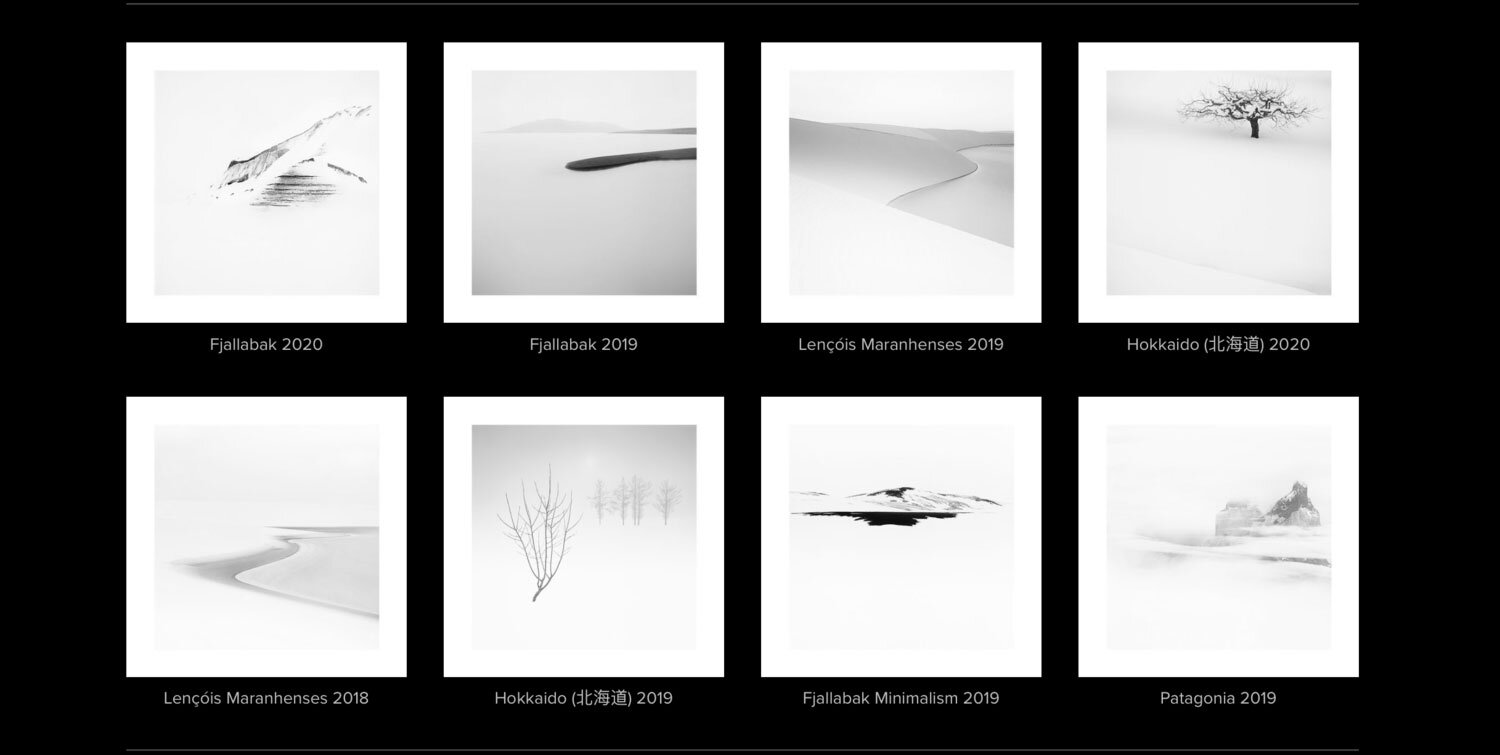
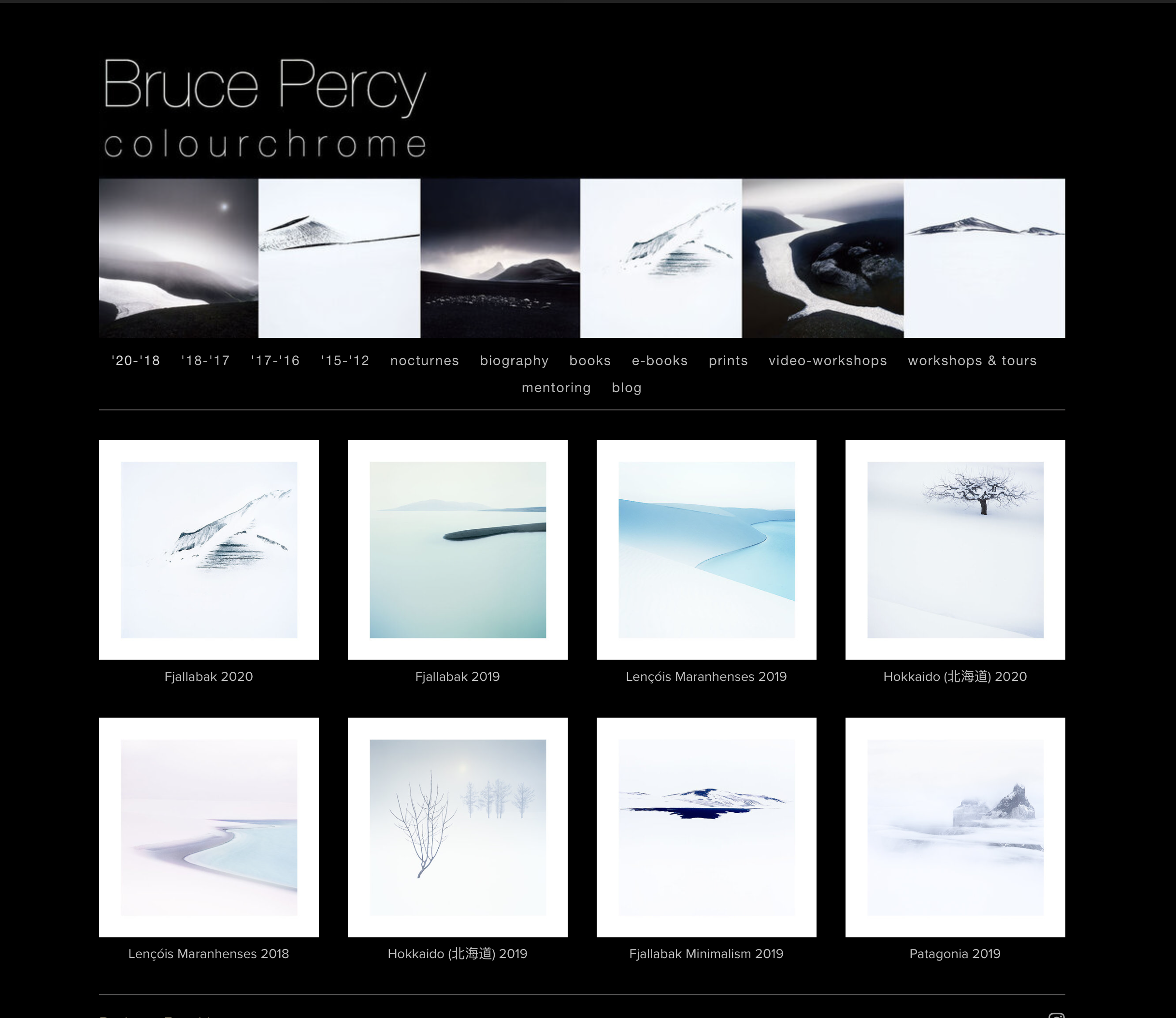
The page above is my most recent work. As a beginner photographer I am convinced I would have considered this work to have no colour whatsoever. But just for comparison, I show you the images below converted to black and white. You can now see that there is indeed colour in the work above. But I am sure for many they may perceive it as having none.

7.jpg

It’s interesting to find that looking at my older work from eight years ago and beyond, the colours feel too strong, too obvious and the older work speaks of trying too hard. It is my own view that muted colour comes from an understanding that you don’t need to shout to get your point across. I’d of course love to think that it comes from a place of maturity (hee hee hee), but I do wonder in all seriousness, that once you get past the need to impress others with your work, you settle into a place where you are comfortable doing what you do, and feel that you’ve figured out just how much contrast and colour is required to make your point.

I’d like to point out that none of this has been done with any premeditated intent. It’s just been an evolution of sorts and I’m never too clear as to whether this is just a case that my tastes have changed over the years, or whether it’s more a case that I’m seeing and noticing things more. I’d of course love to think it’s the latter ;-)

Screenshot 2020-11-01 at 09.01.26.png

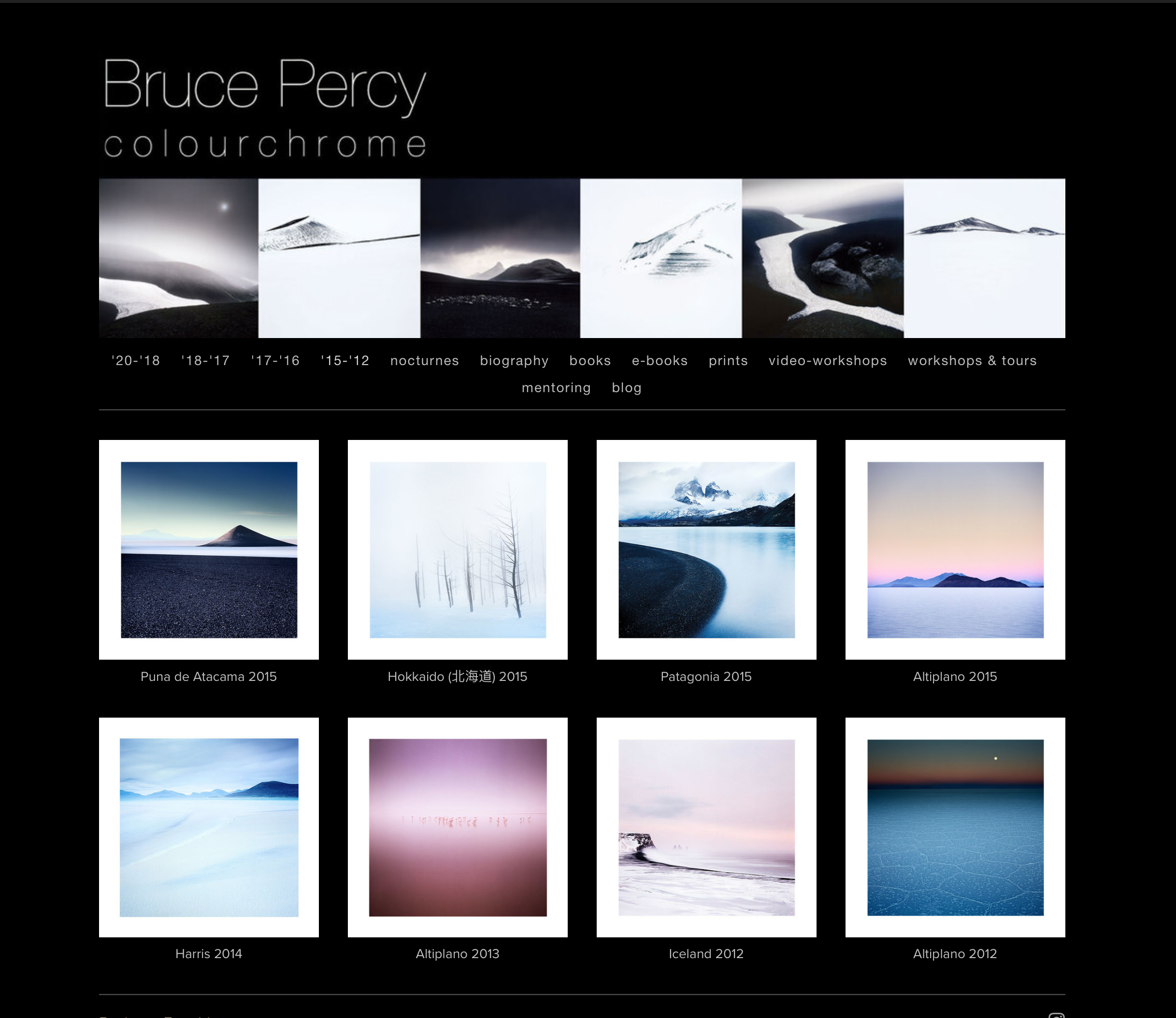
In the page above, if I were to look at this in isolation, I’d maybe assume that my work hasn’t changed much since 2017. It’s only when I do a direct comparison with my more recent work that I can see that the more recent work is taking the colour reduction and subject reduction further. A fine-tuning perhaps? (I’d love to think so!)

But you can see there’s still a bit more colour in this collection of image. I think the muting down of colour has been a learned experience for me. Going to the Fjallabak region of Iceland in winter time (bottom right), where there was almost no colour - I was shooting black and white scenes with colour film, I learned so much from this.

I have often said that certain landscapes, if you meet them at the right time in your own photographic development - can move your photography along in leaps and bounds. I am convinced that had I stayed in IT, and never been able to shoot so much, and go to so many of these winter places over the past 10 years, that my style maybe wouldn’t have moved on so much, if at all. I’m convinced that working in the Interior of Iceland, reducing things down to their utmost basic elements, gave me the permission to attempt to do the same with less empty landscapes.

I’m pleased to re-introduce my Romania, Harris and some of the more minimal Fjallabak portfolios. I’d almost forgotten about them :-) But now that I’ve re-introduced them on my site, I think there’s a more completed story of my own progress (for me at least).

Screenshot 2020-11-01 at 09.01.12.png

In the page above, you can see there’s a mix of more ‘traditional’ looking landscapes with the graphic elements that I like to play with. At the time of making these, I was thinking that I’d maybe gone as far as I could with simplification. Not that I was consciously trying to strive towards it. Everything I’ve done has been purely emotional, despite others thinking that I deconstruct landscapes. I don’t. I just shoot what appeals to me.

But looking at these, that cone shape in Argentina (top left), taught me so much about the graphic nature of composition. That sometimes shape, is all that’s needed to make a powerful image. I’d certainly say for me, there are a few epiphanies in this collection of work from 2016 to 2017. Working with the Fjallabak region of Iceland allowed me to start to subtract colour, to embrace blacks as negative space. I also find it telling that personally for me, the Altiplano shots here, are not my strongest. I feel that by this point, I had ‘mined’ as much as I could out of the Bolivian altiplano and this was at the tail-end of my work there. I knew my book about Altiplano was almost ready because I was starting to run out of ideas and to see new things in this landscape. I think this is perfectly natural and it either signals that your work in a region has come to an end, or your current level of style and ability can’t go much further in it at present. Perhaps if I return in 10 years time, I may find that I am able to see new things in a old friend?

Screenshot 2020-11-01 at 09.00.58.png

In the page above, I’ve been able to re-introduce some early work from Iceland’s coastline from 2012, and also some earlier work from the Bolivian altiplano from 2012 (last two portfolios).

By contrasting this page to my more recent work, it’s evident that I’ve been subconsciously on a colour-reduction quest, as well as tonal-distraction-reduction quest also. As I say, none of this was consciously any decision on my part. I just think my style has evolved.

What is interesting to me, is that these images are just on the periphery of what I feel is acceptable to show you. Older work from 2011 back to when I started out - does not work for me at all any more. I find the colours too gaudy and the contrasts too hard, and I feel that in my much older work there was a need to get my point across, perhaps too much.

I do feel that all the landscapes I’ve shot over the years have been great teachers. There are many places that I went to that never amounted to anything (Yosemite valley springs to mind) where I could do nothing with the subject matter, or where I found the location too hard, too difficult to work with (I still think Scotland is like that - there is just too much chaos in the landscape, too much tonal distractions for example). I tend to go back to landscapes that allow me to grow and I think I’m good at figuring out when a landscape allows me to do that.

I have often said that many photographers try to shoot landscapes that are too difficult for their current level of ability. It is much better to focus on the landscapes where you feel you are getting somewhere with. I am convinced that they are growing places for you. It is my view therefore that returning to a key number of places over the years, as I have done, allows for more intimate study and growth of one’s own style. The subject matter to a degree informs the style, and the style to a degree informs what you choose to shoot.

As I said at the beginning of this post today, I look at my website as a garden. I am often able to see where my style has evolved over time, and also how my images in certain landscapes have changed over the years.

Page Sequencing & Balancing

A few days ago I began work on proofing the images for inclusion in my next book. As suspected, I’ve found loads of issues with the images once printed. Some of them it’s to do with the blacks and white points of the images, but also, clipping that is incurred by the reduced gamut of the paper I’m proofing onto. I am finding I am having to calm the higher tonal registers to allow the image to sit on the page without any flat-wall-clipping occurring.

I knew I would have a challenge ahead of me, in terms of sequencing the work. In the proof snapshot you see above, I spent a lot of time matching images to each other so that images on the left and right page compliment or sit well with each other. For me, this is about choosing the right images to begin with. Then once I have them sitting next to each other (I use View / 2-up vertical in Photoshop to view two images side by side, I can notice if there are luminosities that jar between the two side by side images, or colour casts - perhaps in the blacks that work against each other. For instance, one black desert may have more blue in it while the complimentary image that is to sit on the opposite page may have more of a reddish black. These things can sometimes be ‘tuned’ to sit better together and other times, I just find that the image doesn’t work when its colour balance is tuned away from its current colour temperature.

To me, this is ‘mastering’. I am trying to get the entire set of images to sit well together, and for that to happen, it’s never really about subject matter, or geographic location. It’s all about whether the tones and colours (or perhaps for some of you, monochromatic tones) that matters. Images have to sit on opposite pages in a way that they work together as a set. But the work also has to flow through the book as well.

I’m really enjoying this process. Images that I thought were nice, become something special when I print them out and notice further adjustments and enhancements. It’s like putting the icing on the cake.

Printing is indispensable in really getting the best out of your work. And it is giving me a lot of confidence in knowing the work is as good as it can be for publishing in my forthcoming book.

The Pendulum Swing of Colour use

I find that each time I edit a new set of images, my application of colour varies. Some times the work has very muted tones. Other times the work has too much colour and I find that a few days later I’m re-adjusting the work to be more muted.

Part of the problem is colour constancy, or the lack of ability in oneself to correctly gauge the strength of colour, the more that one stares at the work. Part of the problem is that I’m still figuring out what my style is, and I find as my mood changes, my feeling towards the work also changes. Sometimes the work is stark and monochromatic, devoid of any colour at all. Other times the work is very colourful, and I feel a need to tone it down.

Lencois-Maranhenses-2019-(2).jpg

This is not just a case of my mood changing. It mostly has to do with how our brain ‘auto-white-balances’ what we see. Our visual system innately compensates. What we perceive is not always true .

And I’m sure I’m not alone. Most of us have a hard time judging the level of colour to use in our work.

I’ve seen some photographers who completely lack any colour judgement at all. The work is overly garish, the colours sci-fi, horrific in application because there’s just simply too many strong colours competing with each other. I am convinced that photographers who create this kind of work are at the beginning of their photographic journey. They haven’t developed their colour awareness yet, and are still very much in love with the need to over-excite the work they create. They are so enraptured by having strong colour in their work that we can’t get past it. I believe this, because I suffered from this in my early years.

When I look back at my earlier work, delicate application of colour is pretty non-existent. Despite thinking at the time that the colours were great in my photographs, I now realise that I was working from the belief that ‘more is good’. I had a lot to learn.

At the time, I had no idea about colour relationships, let alone that having too much colour, or competing colours in the frame could sabotage the composition. I also had no idea that composition was more than just the art of placing subjects within a frame. Composition is also about the application of colour, as well as tone and form. Each of these three elements has to work with the other for the composition to be successful. Simply plastering lots of strong colour across my images was clumsy at best, and at worst made my images look infantile.

Lencois-Maranhenses-2019-(4).jpg

And now twenty years later I’m still wresting with colour. In that I’m wrestling with ‘just how much’ to use. In other words I struggle with the degree of colour to use. I appreciate that colour is dependent on the subject matter, what the actual landscape offered. Some places are simply more colourful while others are naturally less so. So I understand that some photos or portfolios call for very little colour, while others require the colour to be applied selectively to aid the composition.

My recent images from Brazil are interesting because there appears to be a return to stronger colour for me. They are the strongest set of colour images I’ve made in a while.

But if I look at how I used to use colour over a decade ago, I’m aware that the application was more broad, more clumsy back then. Nowadays, I’m more selective. I feel I can produce a colourful image, without swamping the composition.

Colour is a balancing act.

Put too much in and you can swamp your compositions and ruin your work. Put in too little, and the image can appear dead or lifeless. Some sets of images require more colour than others, and of course we have our visual perception of colour to struggle with while we are deciding upon just how much colour is required.

The use of colour is a skill. Just like working on composition is as life long learning experience that never ends, so too is our application of colour. For colour application cannot not mastered overnight and we should expect our perception of it to pendulum swing from too much to too little, and back again.

Landscape as director

I’ve just had to accept that certain landscapes are what they are. They have an uncanny knack of knowing how to direct you: they tell us what needs to be done. We just have to listen.

Therein lies the problem. Most of the time we don’t listen to what the landscape is telling us. Instead, we often try to force upon it what we want. What we are looking for. Instead, we shouldn’t be looking for anything. We should be a clean slate, ready to work with whatever conditions we are given.

How many of us go to places with pre-visualised expectations? Hoping to get a certain shot we’ve seen before, or the same conditions?

I’ve been having problems this past year with my use of colour. Or perhaps the lack of it. I was very happy to find that my South Korean image had quite a bit of colour in them. I feel there’s been a pendulum-swing as I’ve gone from reducing colour further, and then further still, to feeling I’m starting to re-introduce it into my work.

Not so with Hokkaido.

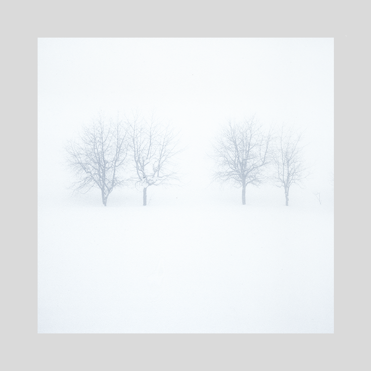
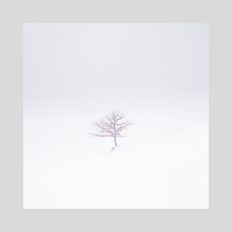
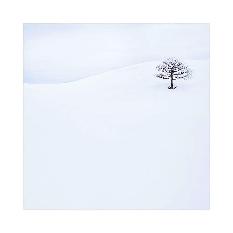
As you can see above. These images may ‘appear’ to have little or perhaps no colour to you. All I can say in my defence is : it’s what the landscape directed me to do. I can’t make the landscape be anything it isn’t and rather than have an up-hill struggle to make it so, if I follow what the landscape tells me, things just tend to ‘flow’ much easier.

Hokkaido is not a landscape of strong colours. But it does have them. I think the art in making good photos of Hokkaido isn’t necessarily about working with negative space. Neither is it about working with snow scenes only. I think it’s about working with tone and colour responses. These are where the emotion of the picture reside.

Snow is not white. Neither is it just one continuous tone. Snow is a vast array of off-whites, with subtle graduations running through the landscape. Our eyes are often blind to these subtleties as we start to photograph it, but with some well informed time behind the computer monitor editing and reviewing, we should all come to learn that white has a tantalisingly vast array of shades and off-white colours.

Hokkaido has been my director. It has guided me in my lessons over the past four or five years. I’ve learned so much from working in this landscape when I have chosen to listen to it.

The pendulum of colour

You have to go too far one way, in order to know where to dial it back. If you never go beyond your boundaries, then you’ll never know where they are.

I see changes in my photography happen slowly throughout the years I’ve been making images. I think we have several muscles that need to be exercised: our visualisation muscle, our composition muscle, our tonal muscle and also with regards to today’s post: our colour muscle.

South-Korea-2017-(11).jpg

Learning to use Colour is something many of us don’t even know we have to do. I remember in the early years of my photography how happy I was to just have very strong colour in my images. I never gave colour much thought except ‘is it punchy enough’.

Now I see very differently and understand that some colours:

  1. May not compliment the scene

  2. May cause distraction if too dominant

  3. May cause the scene to be too busy if there is too much of it

  4. May cause the scene to be too ‘dead’ if there isn’t some form of colour in there

  5. Colour needs to be used carefully because it is a component of what we call ‘Composition’.

I think I’ve been working on my Colour-muscle for the past 4 or 5 years. Where I was once happy to just load up the photos with oversaturated colours that caused my eye to be thrown everywhere at the same time, I began a process of reduction. And further reduction, until I began to feel as if my work was just a shade away from being monochrome. I have a theory about this which I’d like to call ‘the pendulum of colour’.

The Pendulum of Colour

We have to learn where the boundaries are. Boundaries are personal: your boundaries will be different from mine. But we all have to find them. Boundaries are important because they tell us a few things:

  1. That we’ve really explored the realm

  2. That we know where the limits of acceptability are to us

  3. Most importantly, that we have found we can go much further than we thought we could.

If you don’t go beyond what you think is acceptable, then how do you know you’ve gone far enough? If you are conservative with your use of colour, tone, composition, focal lengths and stick to the same formats all the time, then you’re never really exploring what’s possible. You aren’t reaching your full potential.

So you have to go way beyond what you think is acceptable to find out where your limits of acceptability are.

South-Korea-2017-(16).jpg

I think, for most of us, our use of colour tends to have this kind of trajectory:

  1. We begin our photography by being delighted at having strong colours in the work. Any form of strong colour is great. But we still have to learn how to use colour selectively

  2. As the years go by, we begin to tire of strong coloured photographs and begin to feel we need to find something more. We start to notice that some of the colours are displeasing and we want to reduce them, or desaturate selectively This is what I would call the first pendulum swing: we are now going the other way with our colour use.

  3. Years may pass, but we find we become more aware of colour casts, of shadows having deep hues we never saw when we began our photography. Indeed, looking back at our first attempts causes us embarrassment.

  4. We begin to tune out certain colour casts. The photos become more muted as a result.

At some point, you may feel you’ve reduced colour far too much in what you do. That’s where the 2nd pendulum swing happens. This pendulum swing is different though, for one reason: you have gained experience and understanding of colour. Although you may be re-introducing colour back into your work, you’re much more informed about where, when and just how much you need to use.

As I said at the start of this post today: “You have to go too far one way, in order to know where to dial it back. If you never go beyond your boundaries, then you’ll never know where they are.”

Your use of colour is like a muscle that needs to be exercised. You need to push it far beyond what you’re normally capable of to find out if there’s more potential for you. You also need to do this to understand where the limits are for you. Dialling it back is informative because you begin to understand that you don’t often need as much colour as you once used. When you’ve been doing this for a while you realise that you can re-introduce colour, but it works best when applied selectively and with a much more considered approach.

We change all the time. Our tastes, aesthetics are all on their own pendulum swings, but each time we revert back to something we did a while ago, we do so as a changed person. We don’t repeat: instead we become better at what we do.

South-Korea-2017-(12).jpg

The quietness of colour

We’re always changing. Developing or regressing, fluctuating even. But all of these changes accumulate to ultimately say ‘you are different now’.

Perhaps the start of my ‘colour reduction’ phase in my own photography.

Perhaps the start of my ‘colour reduction’ phase in my own photography.

When I look back at my earlier work, I see that it had a lot more colour in it. I’ve been discussing my ‘progress’ with a friend of mine today and I was explaining that for me, composition comes in three layers that are all inter-related.

  1. Structure

  2. Luminance (tone)

  3. Colour

When we all start out, we all work and focus on structure. The placement of objects in the frame. Indeed, I think that most of us think that composition is ultimately about where we place subjects in the frame.

2018-2017

2017-2015

2015-2011

For me, it took about maybe six years or so, before I started to realise that the luminance, or tonal properties of my subjects also affected the composition. Indeed, I think that tone and structure are interrelated. You can’t just place objects in the frame by thinking about structure only. I’m sure you will find that the reason why some arrangements of subjects in the frame work better than others is due to their luminance / tonal qualities. So these two layers of composition are connected.

The last stage, is colour. Yep, that’s right - although colour is where most of us start, and we are often delighted with our red-sky photos, a picture washed in garish colour soon becomes tiring for those that are developing a sensibility towards colour as a contributing factor to compositional success.

I think that all good colour photographs still work, when you strip the colour out. Open any colour photo and turn it to black and white. Does it still work? Are the tones there able to support the image without the colour? Good photographs will still work without their colour component.

For me, I feel I’ve been on a quest the past four or so years to quieten the colour in my images. I worked on structure in my compositions for a long time, then I was thinking about luminance and how it related to structure. These days, I think I’ve been reducing down the colour and in sense, have been playing with ‘how far can I reduce it?’.

One needs to find the boundaries, to understand the terrain that they are working in, so they can then let loose where they need to go.

Colour is a vital part of composition. Too much of it, or too many colours can cause the viewer’s attention to be thrown in many directions at the same time. But to a beginner, lots of colour seems exciting, attractive. It just becomes a little tiring after many years when you realise that by reducing colour or de-saturating certain objects in the frame allow others to shine.

Want to get better at colour composition? Take an art-class. Photography and composition are no different in a camera than they are on a canvas or piece of paper. It’s not a problem if you can’t draw, forget whether you need to learn to do that. An art class will give you the understanding of how composition works, structurally, tonally and with colour.

The value of understanding Colour Theory

I'd like to say a big thank you to those of you who bought my Tonal Relationship series of e-Books so far. If you've been reading and following them, you should know by now, that I'm big on working with tones in a photograph, much like how an artist painter would.

colour-theory.jpeg

Photography is not just about clicking a shutter and 'getting it right in-camera'. Camera's do not see the way we see. And besides, if one considers that anything after the shutter has been clicked is 'manipulation', then they are forgetting that the choice of lens they used, the position they were in, are all interpretive.

For me, photography is no different from being a painter. I may not paint with oils or watercolours, but I have to abide by the same rules and concepts that a painter has to: if you do an art class you will learn a lot of valuable lessons about composition. Indeed, I encourage you to attend an evening art class. You will learn so much about tone and form that is all applicable to the art of landscape photography.

Which brings me to the point about my post today: as landscape photographers, we not only need to understand tone and form, but if we shoot colour, we also need to understand colour. How many times have you thought you could boost a certain colour in your picture only to find that although it seems as if it's present in the scene, it actually isn't there. This my friend, is all down to a lack of understanding colour, how certain tones are made up by multiple colours. 

For me, understanding colour, is paramount in removing colour casts, and by tuning certain colours to fit with others. Rather than boosting a colour, I often find myself reducing colours that are at the opposite side of the colour wheel to the colour I want to boost. And it's not just a case of boosting / reducing colour that is required. Often I find I have to 'tune' a colour - by adjusting its hue I can remove casts or even 'tune' the colour to fit more in-line with other aspects of the photograph.

So I think this is what I want to write about in my 3rd instalment of my 'Tonal Relationships' series. Right now, it's more a flicker of an idea. I haven't really figured out exactly what the e-Book will entail and I find that sometimes leaving it for a while helps me clarify the aim of such a book. This is what happened with the Tonal Relationships part 2 e-book. That one took me more than a year to work on. I got stuck at times, unclear if I was heading in the right direction and when that happens the best thing you can do is back off, and go and do something else for a while. So when you return to the problem in hand, it is often much clearer to see.

So that's my intention. I wish to write an e-Book about colour, and how it applies to editing photographs and also what it means when we are out in the field choosing our compositions. You may have noticed that over the past while, I've become a colour obsessive. Perhaps you feel my photographs have become more muted, almost monochrome (and for some of you they probably do look monochrome now), but colour once you begin to really work with it, becomes something that you want to apply delicately. Overly-vibrant, loud colour photographs, I have a theory - belong to the beginner. Once you start to really see all the colour distractions, it becomes a case of trying to calm things down a little (or in my case: a lot). I'm not for one second saying that everyone should go for the more muted look that I have adopted of late: I'm saying that if you are able to interpret colour and understand it better: you'll make more sensitive and worthy choices during your editing.

Please don't hold your breath for this e-Book. I'm pretty sure it will take me a while to find the right approach to tackling this subject, and due to my workshop schedule, time is in short supply.

Sometimes too much colour, is simply too much

When photographers talk about minimalist images, we often think of compositions where there is lots of space with very simple subjects in the frame. There is a predisposition to thinking more about objects in the frame and one aspect that is often overlooked is that of colour.

Lencois-Maranhenses-2018-(6).jpg

Images can be simpler (or quieter) by being very selective about the colour that is used. As a beginner I would often welcome as much colour as I could to my images. When I started out on this road to producing more simplified images, I think I got a handle on the compositional elements within the frame pretty quickly, but one aspect of my compositions that let me down was my use of colour: I knew that something was wrong or missing, and it took me years to realise that sometimes there was simply too much colour.

Lencois-Maranhenses-2018-(7).jpg

So if you're looking to simplify your photographs, it's not just about visiting minimalist places, or shooting one or two subjects within the frame. It's also about reducing colour, or being more selective on the amount of colour you use in your work.

I do believe that we all have to go through certain learning stages. The first being to reduce the number of subjects within a frame down to a more coherent assemblage that can support a strong composition. This is really the first stage for many of us. The 2nd stage is to work on the tones contained within the photograph : we are now juggling two balls: object placement and tonal relationships between the objects. And the third stage that comes along at some point is our evaluation of colour. As time goes on, we begin to realise that images can become simpler when we reduce or remove certain subjects with certain colours as they overcomplicate the scene. We also understand that sometimes we don't need a lot of colour for the image to work. In my own case, I sometimes feel I create monochrome images in colour. Some are often reduced down to simple colour palettes of one colour using many shades.

But this can only happy when we are ready. And by being ready, I mean that we are now 'able to see'. I think the reason why I have become more comfortable with reducing the colour palette of my photographs is because my awareness of colour has become more acute over time. Where I would once need to have a colour explosion of saturated hues thrown in my face, I now find it too overwhelming. If I'd tried to reduce the colour palette of my work 10 years ago, I wouldn't have been satisfied because I was still very much in love with the deeply saturated image.

You can't force things. You can only be aware of how your tastes and perception of your visual world is changing, and adjust your work accordingly. That's all you can ask for, and by being sensitive to your own aesthetic changes, and applying them to your work - you move forward.

Lencois-Maranhenses-2018-(12).jpg

The three ingredients to composition

Composition is often thought about in terms of where to place the subject within the frame. But what if I throw the subject out of the frame, or at the most, give you a very limited set of subjects to work with? How would you compose your shots, and would you consider how each of them would fit together in a portfolio? What would be the unifying theme if you had to relate them in some way? Is it the subject, the location, or would it perhaps be the colour palette that would be a more useful way of uniting a set of images together?

Subjects are only one aspect of composition. Colour palettes and colour relationships are another, and lastly, there are also tonal responses. My own compositions are often sparse in terms of subject matter, so I think what unifies my work is either the colour palettes I play with, or the tonal responses.

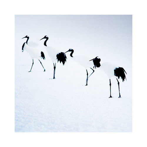
In my latest Hokkaido work, I've deliberately gone for an almost black and 'light blue' tonal response to the work. The absolute blacks of the Crane birds match and unify with the dark tones of the trees of the Hokkaido landscape: this is one part of a two part ingredient list for making this portfolio work. The second part is the colour palette. Despite actually shooting a lot of 'pink sunrise' during my time on the island, I felt they were at odds with some of the stronger 'colder' colour palette images that I found lurking in my processed films. 

I've realised over the past few years just how important tonal responses within a collection of images is to unifying the set. Images are really made up of three dimensions: subject, colour and tone. For me, to think of composition as being about subject only, is to ignore colour and tone at your peril.

This is why I think my work in the Digital Darkroom is a vital ingredient to what I do. Clicking the shutter is only one small part of the image creation process. Identifying themes and relationships in my work is an important part of this process and is crucial in  bringing these themes tighter together.

The proof is in the print

I've been working on my images for next year's exhibition (I know, it's a long way away, but I really need to utilise my free time - which is in short supply, when I have it). 

Despite having a calibrated monitor which I feel gives a very close representation of what I might expect to see on my prints, I have found that the only way to truly spot errors or inconsistencies in the tones of my images, is to print them and leave them lying around my house.

This does not mean there are any short comings in my monitor, nor any errors in the calibrating or profiling of it either. In fact, any issues I notice in the final print can often be seen on the monitor if I go back to check. This suggests a few things:

1. The human eye perceives electronic images differently than printed images

2. To get the best out of your work, you really need to print it.

I pride myself in having a tightly calibrated system as you can see below - my Eizo monitor is so well matched to my daylight viewing both, that I seldom find prints 'way off'. But this doesn't get round the fact that once I see an image in print form, I may find that either it's tonal aspects aren't as strong as I thought they were. Going back to the monitor to look again, I will find that the print has shown me problems in the work that are visible on the monitor, but somehow, I only became aware of them once I saw them in print form.

Daylight viewing booth and verification test print to confirm monitor is actually calibrated! (it's the only way to confirm calibration and profiling).

Daylight viewing booth and verification test print to confirm monitor is actually calibrated! (it's the only way to confirm calibration and profiling).

As much as I think that *all* photographers *should* print. I realise that many of us don't. Now that we live in the digital age, it seems as if printing is becoming something that many of us don't require. We edit, we resize for the web and we upload.

But if you do care about your work, and wish to push it further along, then I can think of no better thing to do than print it out. If you have a calibrated, colour managed system, then any problems you see in the print are most likely problems that you somehow weren't 'seeing' on the monitor. It is a chance for you to 'look again' and learn.

I've gained so much from my printing. I've realised that my monitor can only be trusted up to a point, and that if after reviewing prints I further tune them to give me a better print, I also improve them in electronic form also. But mostly, I'm teaching my eye to really see tonal inconsistencies and spot them more easily in the future. And that's no bad thing indeed, as photography is after all, the act of learning to see.