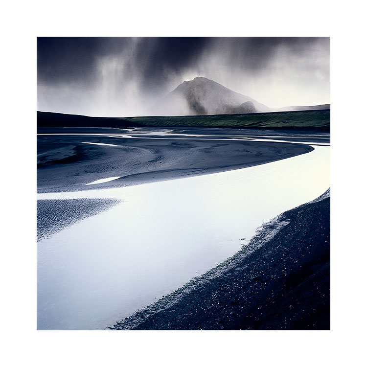
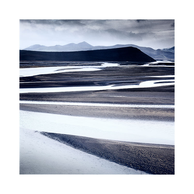
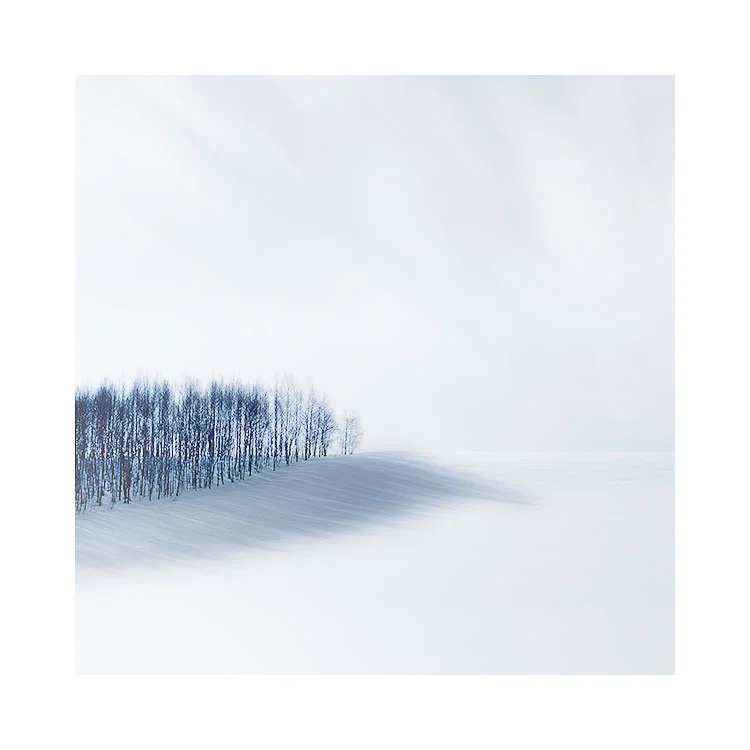
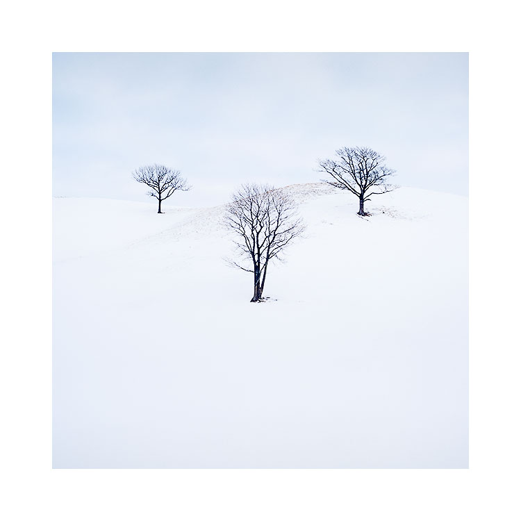
Square Variations

Today I feel like posting an old post. The post below was written in 2012. I feel it’s just as valid now as it was back then. Today I’ve been talking to a few people about aspect ratios. Since I wrote this piece, I’ve seen a few camera manufacturers offer more aspect ratios in their cameras, but it’s still not enough. Aspect ratios should be programmable on all contemporary cameras. It should also be implemented in a way that works without it being a bit of an afterthought (Canon, Nikon). Through the more recent introduction of mirrorless cameras, some have embraced aspect ratios (my favourite is the Fuji GFX50s which has just about every conceivable aspect ratio available, and it can be programmed as a dedicated button on the body).

Anyway, I hope you enjoy this article about me shooting images in Scotland.

Enjoy, Bruce.

April 2012

This past weekend, I was in Torridon conducting a weekend workshop. We had some very rainy weather, and one of the group - Steve - mentioned to me that he was glad the weather had been bad, as it gave him a chance to see he could actually make some good images despite the weather.

Top right

Top right

I often feel, that the reason why Scotland is so photogenic, is because of the changes in the weather. One minute it's misty, the next it's clear. And fog or low cloud levels can be a great way of making simpler images. Take the shot above for instance. This is Loch Maree. Normally, this group of trees have the massive Slioch mountain dominating the background. But with a bit of rain and poor visibility, Slioch was invisible. We were left with no horizon - nothing to give the shot context.

I loved the group of three or four trees clumped together. They were actually a subset of a larger group of trees, but I felt that we could easily 'remove' the rest and keep the entire shot very simple if we just had this small gathering of trees.

Variations

Variations

I made this shot on my little Lumix GF1. It's a great camera because it has interchangeable aspect ratios. I felt that square worked really well for this shot, as I could easily place the trees in three quadrants of the frame - top right, bottom right and middle right, as you can see in the above triptych. Question is, is one better than the other? And I like to consider that there is always more options than just one. So I guess the answer is 'it depends'. My personal favourite composition out of the three images is the first one. I feel the picture has a more 'uplifting' feeling than the rest, and it has more presence, because I'm really exaggerating the empty space in the frame more than the others. I also love the reflection of the trees.... I feel they have space below them to 'breathe'.

The middle composition, where the trees are placed in the bottom right, is perhaps less engaging for me, because the trees aren't so tight against the bottom of the frame. The picture feels less focussed for me, in terms of composition. I'd liked to have moved the trees even further down the frame, but I felt the reflections would not have enough space. I felt I had to keep moving the trees further up the frame. But it's a more relaxed composition than the first one - which I feel is more 'graphic' than being a photograph.

The far right composition is perhaps my less favourite. It is more of a 'standard' composition. I feel the horizon has been carelessly composed - for my taste. It's just a little below centre, and I think it might have benefited from being slightly above centre - giving that 'uplifting' feeling I was talking about in the first image, while at the same time, being more in-line with a 'standard' landscape image.

As much as I love square, maybe it might have suited more a 4x5 aspect ration as seen above?

4x5 crop

4x5 crop

Ultimately, when you have a simple subject such as this - trees and reflection, and nothing else, it's much easier to get down to the basic tasks of composition and placement in a frame. The less objects you have in the frame - the better, I feel.

I was immediately attracted to this scene when we were driving past, because there's little in there to distract. When was the last time you went out with your camera to shoot when the atmospheric pressure is so low, that almost nothing is visible?

Themes and variations upon themes

I believe that photographic work becomes stronger if there is a concept behind it. Concepts can be whatever you want them to be. There are no rules. There shouldn’t be.

I have a dear friend from Massachusetts who tells me ‘You know Bruce, you seem to be able to go anywhere in the world and take the same photograph’. He is of-course right. But I do hope it was intended as a compliment as I think it is. I think what Steve was telling me was ‘you have a style’.

But there is more to this than meets the eye. I do like to focus on certain concepts or themes, and it is not unusual for me to shoot the same scene in numerous variations. I even publish these variations in the same collection. Which leads me to another interesting comment I sometimes hear from viewers : ‘what is different between these two shots?’. The answer should be plainly obvious to us photographers: they are compositional variations. Rather than just picking one to publish, I sometimes can’t decide, as I feel each variation has something to say its partners do not.

Repeating themes in the work also makes the work thematically stronger. The work becomes greater than the sum of its parts.

But the trick I feel, or the talent in working with themes, is in finding them to begin with. It takes a rare eye to be able to see a theme in something that others may pass over as mundane, or in the case of some of my more recent Iceland images, landscapes that look quite close to being man-made quarries.

Themes can also go beyond a body of work, and leak into adjacent projects. You may find over time, that you have a propensity to steer towards certain subjects, or tonal responses. Again the trick, or ‘talent’, is in recognising this in yourself and your own work.

I feel that all too often photographers don’t ask themselves ‘why’, or ‘how did I create this?’, or ‘why did I create it?’. Too many of us are just busy making pictures without joining the dots, without recognising themes or variations in what we do.

We are missing clues that can help drive us forward in what we do.

Landscapes are never 'done'

With the proliferation of the ‘same view’ on many social media sites, it would be so easy to say that certain places in the world have been ‘done’. But I find that such an off-hand, reactionary view and quite absurd.

No place is ever ‘done’. Instead, what is often ‘done’ is the derivative view.

Image made in 2017, on my second visit. The sky was less blue, and the contrasts of the cone and black desert stood out more. I also choose to tighten the crop a bit to focus more on the conical shape of the volcano.

Image made in 2017, on my second visit. The sky was less blue, and the contrasts of the cone and black desert stood out more. I also choose to tighten the crop a bit to focus more on the conical shape of the volcano.

Of course, there is nothing wrong with photographers going to iconic places to reproduce a shot they have seen before: we are all into photography for many different reasons and motivations. For many of us, simply being able to go to the location of a shot we love and make our own version of it is very enjoyable, and dare I say it - educational. I know that when I have encountered locations that have inspired me, I often learn a lot by walking in the footsteps of the photographers that have influenced and inspired me.

I think that when we hear the statement ‘it’s been done’, it’s a way of saying ‘most of us can’t think of an original way of looking at the same landscape’. And so, I am always enthusiastic when I see a really interesting / different / original view of a well known place. More so if the picture is beautiful.

Similarly, being able to say we’ve ‘done’ a place, is just as folly. I’ve been going to the same landscapes for more than a decade and I still find something new on each visit. We have to go back, because a first encounter only gives us a hint of what is there. To really get under the skin of the place, we need to return and spend time becoming acquainted with it, and allowing the relationship to deepen.

For example, I’ve visited the Cono de Arita in Argentina three times now. On each occasion, it has offered up a new view of itself. One that I never saw, let alone failed to capture the previous time. Plus, I think that each time I return to a location, I am often looking for something different. Perhaps I have grown / changed, or perhaps it is that I just see something new in the same landscape. I am aware that any feelings of a place ‘being done’ say more about my approach to it, than anything about the landscape itself.

Landscapes are fluid changing places. If we are seeing many shots of the same scene, then that has noting to do with the landscape, but more to do with us. Being original has never been easy, because if we could all do it, then it wouldn’t be worth doing :-)

Originality is hard, and good photography is hard work. To be exceptional at what you do requires something that is intangible to qualify, something more than just making nice photos.

Original shots of landscapes may require a lot of effort and a new way of looking at them, but they are possible. No landscape is ever ‘done’.

My original shot of the Cono de Arita, shot in 2015. In this view, I’m more interested in trying to give it context. I felt it vital that I show the far off distant volcanoes on the horizon and give the Cono de Arita more salt-flat space.

My original shot of the Cono de Arita, shot in 2015. In this view, I’m more interested in trying to give it context. I felt it vital that I show the far off distant volcanoes on the horizon and give the Cono de Arita more salt-flat space.

The value of understanding Colour Theory

I'd like to say a big thank you to those of you who bought my Tonal Relationship series of e-Books so far. If you've been reading and following them, you should know by now, that I'm big on working with tones in a photograph, much like how an artist painter would.

colour-theory.jpeg

Photography is not just about clicking a shutter and 'getting it right in-camera'. Camera's do not see the way we see. And besides, if one considers that anything after the shutter has been clicked is 'manipulation', then they are forgetting that the choice of lens they used, the position they were in, are all interpretive.

For me, photography is no different from being a painter. I may not paint with oils or watercolours, but I have to abide by the same rules and concepts that a painter has to: if you do an art class you will learn a lot of valuable lessons about composition. Indeed, I encourage you to attend an evening art class. You will learn so much about tone and form that is all applicable to the art of landscape photography.

Which brings me to the point about my post today: as landscape photographers, we not only need to understand tone and form, but if we shoot colour, we also need to understand colour. How many times have you thought you could boost a certain colour in your picture only to find that although it seems as if it's present in the scene, it actually isn't there. This my friend, is all down to a lack of understanding colour, how certain tones are made up by multiple colours. 

For me, understanding colour, is paramount in removing colour casts, and by tuning certain colours to fit with others. Rather than boosting a colour, I often find myself reducing colours that are at the opposite side of the colour wheel to the colour I want to boost. And it's not just a case of boosting / reducing colour that is required. Often I find I have to 'tune' a colour - by adjusting its hue I can remove casts or even 'tune' the colour to fit more in-line with other aspects of the photograph.

So I think this is what I want to write about in my 3rd instalment of my 'Tonal Relationships' series. Right now, it's more a flicker of an idea. I haven't really figured out exactly what the e-Book will entail and I find that sometimes leaving it for a while helps me clarify the aim of such a book. This is what happened with the Tonal Relationships part 2 e-book. That one took me more than a year to work on. I got stuck at times, unclear if I was heading in the right direction and when that happens the best thing you can do is back off, and go and do something else for a while. So when you return to the problem in hand, it is often much clearer to see.

So that's my intention. I wish to write an e-Book about colour, and how it applies to editing photographs and also what it means when we are out in the field choosing our compositions. You may have noticed that over the past while, I've become a colour obsessive. Perhaps you feel my photographs have become more muted, almost monochrome (and for some of you they probably do look monochrome now), but colour once you begin to really work with it, becomes something that you want to apply delicately. Overly-vibrant, loud colour photographs, I have a theory - belong to the beginner. Once you start to really see all the colour distractions, it becomes a case of trying to calm things down a little (or in my case: a lot). I'm not for one second saying that everyone should go for the more muted look that I have adopted of late: I'm saying that if you are able to interpret colour and understand it better: you'll make more sensitive and worthy choices during your editing.

Please don't hold your breath for this e-Book. I'm pretty sure it will take me a while to find the right approach to tackling this subject, and due to my workshop schedule, time is in short supply.

Forest Shadow

Great photos aren't about pixels. Neither are they about resolution. They aren't about technology and they aren't about plug-in's or software. Great photos aren't about the camera we used to make them.

Great photos are about engagement. They are about having a great idea, a strong composition to start with.

Hokkaido-2018-(15).jpg

Much like a good story, good photographs don't need to be supported by gimmicks. Just as good songs don't require expensive production techniques to make them good, great songs can be played on simple instrument because the strength of the idea behind them carry them along. 

Good images just need a good idea. They shouldn't need much more to make them work.

Yet we live in an age where we can become lost in the technology. Where we are convinced we need another software-app, HDR, Focus-stacking or to blend images to produce good work.  This is not true. We just need our images to be strong ideas to begin with. An ill-conceived image will always be an ill-conceived image, no matter how much gloss we apply to it.

Jon Hopkins shows us that some very simple chords on a piano can bewitch us. Strip it back and it still works. It's a reminder that great ideas have a knack of carrying themselves.

When I'm out making images and selecting which ones to use later on, I always respond to how I feel about them. If they are strong, I usually know because strong work tends to let you know what it wants. Like strong song ideas that tend to write themselves, good images tend to come from nowhere and dictate to you what needs to be done.

Weak work on the other hand doesn't. Weak ideas often lack conviction and send confused muddled messages about what they are and where they want to go.

If you want to improve your photography, then I would suggest you dump your technology. Put to one side the HDR, focus-stacking, blending, software-apps for a moment, and instead, go out and listen to your intuition as it's the best photography tool you possess.

The quiet background

The same location can be much more simple to photograph when the background disappears. Using fog, snow showers or rain to obliterate the background can reduce the complexity of the image and it's something to consider when you visit a location. In fact, I love to repeatedly go back to a location under different weather conditions because the whole scene will be transformed if parts or the whole of the background disappears or comes back in to view.

Below I show you three images: the first two are variations on the same subject but both have varying degrees of success in removing the background for the scene. In the third and final image the background is evident and the picture is a little more complex as a result.

Before you look at the images below, I would like to stress that I am not saying one image is better than another. Each and every one of us will have our own preferences. So let's get beyond comparing them from the point of view of which you like most and instead, it would be ideal if you can just consider whether the image is more complex or less complex when the background disappears.

Lake Kussharo, Hokkaido Japan, January 2018Image © Bruce Percy 2018.

Lake Kussharo, Hokkaido Japan, January 2018
Image © Bruce Percy 2018.

Lake Kussharo, Hokkaido Japan, January 2018Image © Bruce Percy 2018.

Lake Kussharo, Hokkaido Japan, January 2018
Image © Bruce Percy 2018.

Hokkaido-2018-(32).jpg

Again, I wish to reiterate: I am not saying that one image is better than another. I am saying that when you remove more elements in the frame the image may become less complex or quieter. It's up to you which you prefer.

Going back to the same location and trying it again under different conditions can yield surprising results and it just goes to prove that the tired mantra of 'it's been done to death' is never true.

The importance of wallpaper

Space in photographs

With music, the space between notes is just as important as the notes themselves. Similarly, with photographs the space between the subjects is important.

But I think 'space' in music is easier to define to a point. With music we often use the word 'space' rather than 'Silence'. Except with Music, space in the music isn't simply conveyed by having silence between notes. Space can be conveyed though tempo and intensity and density (or lack off) of the sound.

Similarly, with photographs space isn't necessarily 'empty areas' of the frame. Although this is can be true at times it is not the whole story. Space can also be conveyed through the use of a pause, something that makes you wait before moving on to another area of the frame. How many times have you felt yourself wait at one area of a picture before moving on?

In addition, 'space' can also be conveyed by areas of the picture that are texturally dense but have nothing of particular for the eye to settle upon. I call these spaces 'wallpaper'. Wallpaper can be texturally rich, may even contain patterns, but ultimately, the eye tends to float over it because there is no one singular point of focus.

Fjallabak-Sept-2017-(18).jpg

If I am to interpret the image above, I would say that the bottom two thirds of the picture is wallpaper. It is texturally rich but I don't think there is one particular area of the frame that I focus upon or more specifically, feel is a compositional anchor point.

I would also say that the sky and water are wallpaper. They are silent areas where there is nothing going on. They are just used to create a pause between the foreground and the background hills. 

Even with the background hills, the black tones and the curving shape of the hills take the eye for a few seconds before we are pulled towards the groove marks in the green moss. So even the hillside is a kind of space in the picture.

It seems a picture can contain many things and yet still have a lot of space. For me, the main object of focus in the picture is the vertical grooves in the green moss on the hill. Everything else is there to just give context and space and although some of this space is texturally rich, it is ultimately wallpaper. Our eye spends just a moment in it, and is still free to move towards the main point of focus of the picture.

Thoughts on approaching a location

Sometimes you find a location that is so sweet, you know as you approach it, that it's going to work.

The above image was just exactly like that for me.

Below is a 'contextual' image showing me approaching these trees. I'd seen this location from a far distance, and felt that a telephoto would not be sufficient to work around parallax issues with the trees.

Before I'd even set foot outside of the car, I could already see the potential in my mind's-eye - I had already begun to visualise and dream how the final images might turn out!  

But sometimes as I approach a landscape, it turns into something entirely different. I am pleased to say in this circumstance it held up to what I was visualising in my mind.

Context shot, showing me on location in Hokkaido. Image shot by my Hokkaido guide, January 2017

Context shot, showing me on location in Hokkaido. 
Image shot by my Hokkaido guide, January 2017

Although I love to edit my work and will often depart radically from what was there by using dodging and burning techniques, the final images you see here are pretty much verbatim. The only difference between the photograph of me on location, and my final images is that the sky clouded over once I got into the location, so there was more of a marriage between land and sky. 

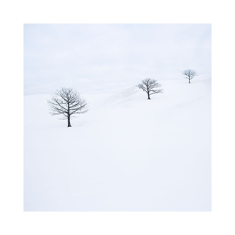
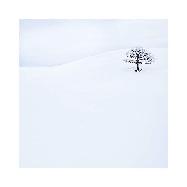
My only on-site decisions were more about placement - of where I should be standing to get different vantage points of the trees, and to be observant to any patterns that the trees made (see central image of the three trees at perfect placement to one another). Further, it was also paramount that I remove the background hedge from the shot at all costs, so I spent a bit of time looking for vantage points where the hedge would disappear from view.

I'd like to finish today's post by stating that often as a photographer i'm tempted to go closer towards the subjects I wish to photograph. Whether it's the edge of a lake or the edge of a cliff. This can sometimes be a real failing because of two points:

1) If you like your subject from where you are standing, then chances are it's not going to look the same once you get closer. So shoot it from where you've noticed it, before moving in. Practice using different focal lengths such as telephoto view to accomplish this.

2) As you approach a location you like, the elements start to move around and sometimes things get lost or hidden from view. See point 1.

Your journey can sometimes become an exercise in 'chasing rainbows'. You think that by getting in close, the composition will get stronger, but as you do approach, the scene falls apart and the subjects do not hold together in the way you first saw them. Often times, it's because the best vantage point was from where you started.

I'm glad to report that although I was worried that the big hike into this location,  on snowshoes might have resulted in the trees becoming obstructed by hills, or by my being too low to photograph the trees straight on, the location worked beautifully.

I knew it at the time things were going well. As I slowly made my way forward, the trees and the compositions I had in my mind's eye remained in place. But I did keep an eye on how the compositions were changing as I approached.

I'm a great believer that when something is working well, whether it be in my photography or in my life, it tends to flow and come together easily. That's exactly how these images happened. It was as if they fell into my lap.

The Validity of a deliberate construction

What is the purpose of landscape  photography? Is it the act of capturing the natural world? Or is it the act of creating art? Is it perhaps both?

I think that many of us come to landscape photography through an appreciation for the outdoors and the quality of the light we enjoy. Photography seems to be a natural progression to want to be able to capture what we saw and felt.

Some of us, like myself,  come to photography through art. As a young kid, I was always drawing and painting, and when I was around eight years old, I was dabbling with charcoal pencils and paper and oil paints that my aunt Helen would send me (she married a famous painter). So for me, the art world had been part of my creative outlet from an early age and when I came to photography, it was through a love of the beautiful art that Ansel Adams created.  In his pictures I saw the same application to composition as I had studied while drawing still life's and painting pictures. Photography was a new way of painting pictures. I was drawn to the interpretive side of it from the beginning.

(Close) Christmas tree, Biei, Hokkaido, January 2017Image © Bruce Percy 2017

(Close) Christmas tree, Biei, Hokkaido, January 2017
Image © Bruce Percy 2017

Even though many of us come to landscape photography through an appreciation for nature, I believe there is still space in our lives for the manufactured landscape.

Although I do love nature, and think that there is so much beauty in nature's 'randomness', I do however think that manufactured landscapes can also possess beauty. even though they are deliberate (read contrived) constructions.

In the case of my two photographs shown in today's post, there is very little about this scene that is natural.  The tree has been carefully planted in a farmers field. It has been manicured to be a precise shape. I think why this location works is because of its contrived-ness rather than in spite of it.  There is symmetry present, and I would go as far as to suggest that somehow, we all picture Christmas tree's as having perfectly symmetrical shapes. I think we would also like to believe that out there somewhere is the perfect Christmas tree, sitting in its own space. Well, now you know it exists: this place is indeed called the Christmas tree of Biei, Hokkaido.

But there is still one more aspect to this scene which makes it appealing. Despite it being a manufactured landscape, there is still a degree of nature at play here: the properties of light are at play here and the atmosphere of the location is wonderful as a result. It was an overcast morning with very very soft light. While I was there, I could not discern any difference between the ground and the sky as both were full of snow. With such soft wonderful light, the tree cast a diffused shadow on the ground. It was as if I was being shown the basic properties of shadow and light.

And so, I can't help but think that the reason why I love images like these, is because they are an interesting mix of the manufactured and the natural. They blur boundaries and make me look again. To the viewer who knows nothing about this location, it could simply be a rare occasion where nature has produced something so aesthetically pleasing, and I think the uncertainty of how natural a scene this is, intrigues us.

Isn't there space in our lives for images where the landscape has been constructed?

I think so.

 In fact, I think that if an image is compelling in some way, perhaps because it is at odds with nature, then that can be a good thing.

( Distant ) Christmas tree, Biei, Hokkaido, January 2017Image © Bruce Percy 2017

( Distant ) Christmas tree, Biei, Hokkaido, January 2017
Image © Bruce Percy 2017

The three ingredients to composition

Composition is often thought about in terms of where to place the subject within the frame. But what if I throw the subject out of the frame, or at the most, give you a very limited set of subjects to work with? How would you compose your shots, and would you consider how each of them would fit together in a portfolio? What would be the unifying theme if you had to relate them in some way? Is it the subject, the location, or would it perhaps be the colour palette that would be a more useful way of uniting a set of images together?

Subjects are only one aspect of composition. Colour palettes and colour relationships are another, and lastly, there are also tonal responses. My own compositions are often sparse in terms of subject matter, so I think what unifies my work is either the colour palettes I play with, or the tonal responses.

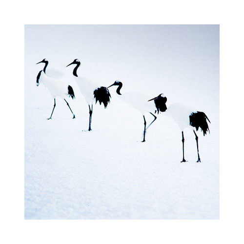
In my latest Hokkaido work, I've deliberately gone for an almost black and 'light blue' tonal response to the work. The absolute blacks of the Crane birds match and unify with the dark tones of the trees of the Hokkaido landscape: this is one part of a two part ingredient list for making this portfolio work. The second part is the colour palette. Despite actually shooting a lot of 'pink sunrise' during my time on the island, I felt they were at odds with some of the stronger 'colder' colour palette images that I found lurking in my processed films. 

I've realised over the past few years just how important tonal responses within a collection of images is to unifying the set. Images are really made up of three dimensions: subject, colour and tone. For me, to think of composition as being about subject only, is to ignore colour and tone at your peril.

This is why I think my work in the Digital Darkroom is a vital ingredient to what I do. Clicking the shutter is only one small part of the image creation process. Identifying themes and relationships in my work is an important part of this process and is crucial in  bringing these themes tighter together.