slow growth

A few days ago I wrote a very short post about the neuroscientist Susan Rogers. She was the sound engineer for Prince in the 80's and early 90's. In her interview she finishes up by saying:

'slow growth is real growth.
You have to be patient, and you have to go the distance'

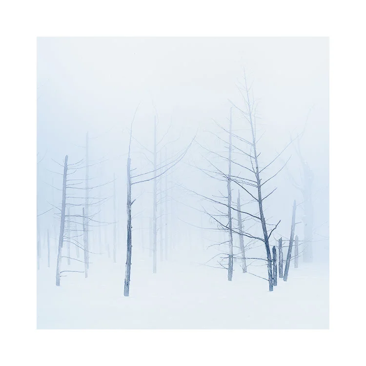
Getting to know a tree, Hokkaido 2018

Getting to know a tree, Hokkaido 2018

Nothing worth pursuing comes easily, and if it does, I would be suspicious of it. You don't create great work by talent alone - there has to be a lot of effort put into it. Likewise, you don't create great work from putting the hours in - you still need talent.

If I were to say what's required, it's dedication, commitment and a sense of drive to pursue what you love. Great work doesn't come from following formulas or templates, nor does it come from using software-plug'ins or reading cheap e-Books that promise to get you there in 10 easy steps. It simply doesn't work that way.

Slow Growth through intimacy

I've learned so much from the places I am so fortunate to visit. I mean, who else has the fortune to go to Iceland twice a year? or Patagonia every year? And yet doing so has taught me so much. I know it's a great privilege to do this, but it has taught me that improving one's own photography comes from developing an intimate knowledge of the places I photograph. This is why I often suggest to students on my workshops to go back to places, if they feel they have a connection with them. That connection is telling them something: namely, that there is potential here, there is work to be done.

Again and again and again

It would be understandable to think that each time you return somewhere, you get to see things in a new way. But as much as I think this is a valid part of learning, it's only one part of the story. For me, what I do learn a lot from, is seeing places in exactly the same way. If I go back to a location each year around the same time or same season, I often find that there is commonality in what I'm seeing. It confirms that places have seasons, that a tree will look a certain way, but rather than it allowing me to think 'If I don't capture it this year, I can always do it next year', it makes me realise that with the same lighting, the same weather conditions, and the same subject, I am forced to find something new there, that doesn't rely on different weather, different light, or the subject being different. Being confronted with the same thing each year, makes me think 'what else can I do here that I haven't done before?'. That is where the real learning comes from.

Going the distance

Working on my photography is like investing money in a fund. You have to be patient. You have to take delight in the subtle changes as the fund slowly grows over time. Photography is not about instant hits. It's not about instant gratification. It's about the long haul. It's about standing where you are in 10 years time and noticing that things have changed. You are now seeing things with a more mature eye. You're more aware of what's before you. And you know, that this couldn't come any other way, than going the distance.


Sometimes too much colour, is simply too much

When photographers talk about minimalist images, we often think of compositions where there is lots of space with very simple subjects in the frame. There is a predisposition to thinking more about objects in the frame and one aspect that is often overlooked is that of colour.

Lencois-Maranhenses-2018-(6).jpg

Images can be simpler (or quieter) by being very selective about the colour that is used. As a beginner I would often welcome as much colour as I could to my images. When I started out on this road to producing more simplified images, I think I got a handle on the compositional elements within the frame pretty quickly, but one aspect of my compositions that let me down was my use of colour: I knew that something was wrong or missing, and it took me years to realise that sometimes there was simply too much colour.

Lencois-Maranhenses-2018-(7).jpg

So if you're looking to simplify your photographs, it's not just about visiting minimalist places, or shooting one or two subjects within the frame. It's also about reducing colour, or being more selective on the amount of colour you use in your work.

I do believe that we all have to go through certain learning stages. The first being to reduce the number of subjects within a frame down to a more coherent assemblage that can support a strong composition. This is really the first stage for many of us. The 2nd stage is to work on the tones contained within the photograph : we are now juggling two balls: object placement and tonal relationships between the objects. And the third stage that comes along at some point is our evaluation of colour. As time goes on, we begin to realise that images can become simpler when we reduce or remove certain subjects with certain colours as they overcomplicate the scene. We also understand that sometimes we don't need a lot of colour for the image to work. In my own case, I sometimes feel I create monochrome images in colour. Some are often reduced down to simple colour palettes of one colour using many shades.

But this can only happy when we are ready. And by being ready, I mean that we are now 'able to see'. I think the reason why I have become more comfortable with reducing the colour palette of my photographs is because my awareness of colour has become more acute over time. Where I would once need to have a colour explosion of saturated hues thrown in my face, I now find it too overwhelming. If I'd tried to reduce the colour palette of my work 10 years ago, I wouldn't have been satisfied because I was still very much in love with the deeply saturated image.

You can't force things. You can only be aware of how your tastes and perception of your visual world is changing, and adjust your work accordingly. That's all you can ask for, and by being sensitive to your own aesthetic changes, and applying them to your work - you move forward.

Lencois-Maranhenses-2018-(12).jpg

Tonal Relationships e-Book Part 2 Update

Just a very short post today to update you. I'm around 2/3rds of the way through writing my new ebook, but it's taking some time. I just haven't had much free time over the past year. I am coming up to a quiet spell this June where I will have a few months at home. I'm hoping to have most of the work done on the remainder of the eBook by then. But I just don't want to rush it. If it takes longer, then so be it.

7d1a2b47-432a-4a56-971e-0f151fdff5be.jpg

Curves is, in my view (this is what a blog is about - someone's point of view), the most powerful editing tool available for adjusting tones in a photograph. Your mileage may vary from mine. 

On the surface the Curves tool seems relatively straight forward, but I've learned that many of my workshop participants have a rudimentary understanding of it. The curves-tool is the tool I've been using for 18 years and I'm still learning about it each time I edit. It is a tool that you do not master overnight.

I'm aware that my views may be contentious to many: a lot of people like Lightroom and love it. For me, there is still a wide gap between what Lightroom offers and what Photoshop offers. I do believe that the gap is narrowing with every release of Lightroom, but it still isn't there. Lightroom's tonal adjustment tools are broad, and they don't give you the degree of control I feel is required for very fine editing. Although Photoshop is not an intuitive program, and neither is the curves tool, with some dedication and time applied to it, it is worth the investment for finer tonal editing.

I hope to have the e-Book finished this summer. But it is kind of growing as a project. I'm now thinking I need to have some accompanying videos to go with it, but I will see.

Slow growth is real growth

If you're a regular reader of my blog, then you'll know that I see so many parallels between music and photography and that I'm fascinated by what creativity is. If you're interested in creativity, and how to get better at what you do, then I'd suggest watching Susan Rogers (used to engineer records for Prince) talk about it. She is a neural scientist these days. There is so much wisdom in this interview. A must see.

Let the work dictate its tonal signature

There is a reason why the word 'tone' is used in the world of photography, as well as in the world of music. The photographic-tone has the same function as that of its musical counterpart. In both mediums of music and photography a tones operate the same way: it can exist in its own space, allowing us to perceive it as separate from other tones, or it can be deliberately clustered together with other tones, in the case of music, one sound, or in the case of photography one continuous area of varying tone.

The darkest tones in this image are mid-tones. I find it interesting that the darker tones - in this case - the mid-grey lines in the image appear much darker than they are because the adjacent tones are much brighter.I've become more considerate ab…

The darkest tones in this image are mid-tones. I find it interesting that the darker tones - in this case - the mid-grey lines in the image appear much darker than they are because the adjacent tones are much brighter.

I've become more considerate about the range of tones I wish to use on an image by image basis. Not every image requires the same tonal signature and it is a skill as a photographer to find out what signature each photograph needs.

In music, when we have tones that compliment each other, they sound pleasing or 'harmonious' and we tend to associate them with feelings of calm. Conversely, when we have several tones that seem to be at odds with each other they can be dis-pleasing or 'dis-harmonious' and this may create tension in the music. The same is true with photographs: tones that work well together are considered harmonious and tend to convey a sense of peace, while tones that don't work well together are dis-harmonious and tend to create tension in the picture.

This in no way to suggests that 'dis-harmonious' tones in a photograph are a bad thing: I often think that good photographs intentionally use degrees of both 'harmonious' and 'dis-harmonious' tones. But the use of them is done in such a way that it works and by doing so, we create contrasts not just in terms of differences between light and dark, but also in terms of areas of the image being at rest with other areas containing tension.

I think it may be easy to make a broad assumption that we should all be aiming to create images that contain harmonious tones only, but the use of tension in a photograph cannot be understated. It is just another way to create contrast when done well.

The problem in all of this, is being able to introduce tension when it's needed, and not as a result of a lack of expertise, or an untrained eye. Many beginners images will often contain areas where the tones do not work and may have unwanted or unintended tension. Applying careful amounts of tension in a photograph I believe, is a skill that only comes after some time. To impart disharmony into a photograph without it being judged as a poor edit or poor compositional choice is a hard one to pull off: there is a great difference between work that contains dis-harmony when it is unintentional, and work that contains dis-harmony as an intention.

I often see a correlation between the musical octaves of a keyboard and the tones of a photograph.

I often see a correlation between the musical octaves of a keyboard and the tones of a photograph.

Most beginners work suffers from a lack of application of tone. Tonal relationships are often not at the forefront of their compositions or edits. Tones tend to be muddled and confused or less thought out, because the photographer is still working on composition, and for most of us that means 'placement of objects within the frame'. Only composition is much more than that: it is not only the placement of objects within the frame, but also the application of tone and colour. In my own case, I think the use of tone and colour has been something that has become more apparent to me in the last few years of my photography. And that's after almost 20 years of editing and composition. For along while I only saw the objects within the frame and colour and tone were often a welcome but often unconsidered addition to my photographs.

And this is where today's post begins: I've come to realise that each photographer has a tonal-range signature. In other words, we have a tendency to live within a certain range of tones and most of our work is often edited or selected to work within that range.

You may find that one person's work is consistently dark, while another's work always uses the entire range from absolute black to absolute white. Another photographer may always create hi-key soft images: we all have our own pre-disposition towards a certain tonal response in our work. It's based on our own aesthetics: we gravitate to doing what we like, or what we feel most comfortable with.

But we often do it based on what we like, and seldom whether it's what the image is asking for. Applying the same range of tones to all of our images does not work. The same way that applying the same techniques to different subject matter will not always succeed: not every photograph requires the same treatment, and it is a skill for us to 'see' or recognise the tonal range that the body of work is asking to be worked within.

Lencois-Maranhenses-2018-(15).jpg

Each portfolio, or collection of work has its own tonal signature. That tonal signature should not be defined by the photographer, but instead the images should tell you what they need. Each landscape we visit often tells us what tones to use, and our edited work should reflect that, or at the very least be sensitive to it.

Much like certain songs live within certain octaves, so too do photographs tend to require to live within certain tonal ranges. Some may require a deft approach to high key tones, while others may require to use the full tonal range available. The key is in knowing what each image needs, rather than what we wish to force upon them.

We need to step away from our habits. If you are always creating dark images, then you are missing out on the upper tonal ranges that may offer some of your work a new avenue. If you are always creating bright work, then you are also missing out on the depth of what darker tones may do for some of your images. And if you are often creating work that use the full tonal range, as I think many of us do, then you should reconsider that sometimes using narrower tonal ranges can have great benefits and suit the work better.

As I said at the start of this article: we all tend to fall into using certain tonal registers or ranges in our work. We have our habits. Rather than forcing the same usual techniques and tonal habits on your new work, I would suggest you ask it what it needs. Let the work tell you. Often the work has a way of letting you know what it needs, and it's just up to you to develop the skills to listen.

Why you shouldn't set Levels

If you want your files to look like medium format images, then you should try to stay away from the Levels command. Regardless of what tutorials you see out there that say 'set the levels'.

Here is why:

  • The Level's command makes the tonal transitions more sudden, and therefore harder.
  • Tones that had soft graduations become harder as you move the left and right level adjusters towards the middle.
  • You are in effect adding contrast to the image, and that by definition means the tonal responses in your file become more sudden, and therefore harder.
Blue Pond Shirogane, 1.jpg

I only use the Levels command occasionally and never at the beginning of an editing session. It is a blunt tool which applies itself globally, and although is useful for fine-tuning a completed picture where the tonal relationships need to remain intact, is a recipe for disaster if it's used at the beginning of the session.

Indeed, global edits should be shied away from until the very end of your editing sessions, because global edits are lazy edits. I have rarely ever found an image that I can adjust the entire picture with one edit and if I've believed so, it is usually due to an oversight about what is really going on in the picture.

Photographs need to be approached sensitively. You need to work on each individual area that you wish to either bring forward or suppress. Attempting to do this with one global edit won't give you the best results and you'll only nail things down that shouldn't be touched.

If the edit session is just starting out, you need to keep the file as soft as possible, and only introduce depth or contrast in local areas. It is this 'contrast' between soft areas and hard areas, or unedited and edited areas that will give your images the contrasts you seek, whilst retaining smooth tones.

But! you say; 'I wish to make the image more punchy, and make sure I'm using the full tonal range of tones from absolute black to white in my prints. Shouldn't I use the level's for this?'

No. Not every scene you work on requires the full-tonal range approach. Some images may have softer qualities, and don't use the full tonal range available. Consider the images in this post today. If you open them in Photoshop and go around with the Curve Hand-tool and inspect the tones, you won't find any absolute blacks in these. They don't need them, and to have make them more punchy would have killed the tonal response that was present in the scene.

Blue Pond Shirogane, 3.jpg

Globally adding contrast to a picture is to apply the same brush to everything. It's a very blunt way of trying to bring presence to a photograph. It also means you aren't reading the contents of your images or that you understand what is going on in them.

Selectively choose the areas you wish to emphasise, and leave the others alone. Good images have quiet areas as well as loud areas, whereas badly edited images often suffer from everything vying for your attention.

If you wish your images to have more punch to them, the best way to do that is to keep some areas of it soft, so that the more harder areas have something to contrast against. That means using local edits, and it also means individually adding or reducing presence selectively. If you do this correctly, you'll find that your images retain their smooth tonal responses while also having presence. But by starting off by setting the Levels in your picture and therefore making all the tones in the picture harder, you leave yourself no room to manoeuvre and there is no room for your editing session to grow.

Gerhard Richter

I was in Norway last week, visiting a photo-pal. Except that my friend and I came down with a really bad cold and spent most of the week just trying to breathe, as our lungs were a mess.

While I was at my friend's home, he showed me some DVD's. One of them was about Gerhard Richter. I must confess I did not know of him, but I was intrigued. Particularly by his portraits, which look like photographs, except they're made by oils.

So I've just received some books and more DVD's to accompany my recuperation. Here is one of them. I've had a brief look and it's wonderful. So I hope to write a more detailed review later.

81gc3Ca5dJL.jpg

Film Lab Recommendation

I can recommend 'AG Photolab - https://www.onlandscape.co.uk'

I've chosen to write this post today, to help other film photographers. If you are having problems getting good processing done, then I can recommend AG Photolab here in the UK. I'm not doing this because I have any business or financial interest in AG Photolab, and they haven't asked me to write a review either. I am just doing this because I receive emails all the time asking me where i get my processing done, and I have been using this company now for around 5 years, so I feel I have sufficient experience with them to recommend them.

All my films have been processed by AG Photolab since 2014.

All my films have been processed by AG Photolab since 2014.

I often receive emails from film photographers asking me if I can recommend a processing lab for them. The short story is that good quality processing is becoming harder to come by. Film sales are up, but lab experience is down.

About 5 years ago, I began to notice that many labs weren't producing good results for me and it was becoming a lottery as to what would happen if I sent my films in. I had many films ruined by bad processing. 

This wasn't good enough and so I started to hunt around and ask people for advice. I'm glad I talked to Tim Parkin from On-Landscape magazine as he put me in touch with Matthew Wells company 'AG Photolab' in Birmingham.

I have been using AG Photolab now for around 5 years. The processing has been consistently perfect. No steaks, no strange artefacts in the processing. When I have contacted them about altering my order, or perhaps cutting the films into sections of 3 (for my film scanner tray) they have been very responsive also.

But it's the quality of the processing that has made me stick with them, that and also Matthew Wells (the owner) dedication towards analog film and processing. I've had may conversations with Matthew on the telephone where it's been very clear he is passionate about doing the best processing he can, and has helped me on many occasion with my enquiries.

I know that they can deal with your film processing from overseas if you choose to ship to them. But I would definitely say that if you do - you need to be patient. I find it takes around two weeks to get my films processed and delivered back to me. I take great comfort in this: they have repeatedly stated to me that the reason why it takes so long, is that they don't want to rush things and that they realise that the most important thing to make sure that they keep the quality high.

Should you choose to send film to AG Photolab, I should let you know that they are great at keeping you updated:

1) the first thing that happens is you receive an email from them saying that your films have been received.
2) another email when the films are now being processed
3) and another email when the films are being shipped
4) depending on the carrier you choose, you also get updates on the tracking and where your film is!

Everyone's experiences vary, but I have been recommending AG Photolab to those who ask because they've given me consistency to my processing. Matthew Wells has told me that they often use my transparencies as an example to show other customers because, as he says so himself 'you have a lot of negative space in your images, and that is where you can really see any errors in the processing'. 

AG Photolab - http://www.ag-photolab.co.uk

Portfolio Development Skills

This post originally offered a space on my September portfolio skills workshop.
It has now been filled.

You may have noticed that I'm offering more 'skills development' style workshops over the coming year. Going on location is great, and shooting is fun and that is mostly why I have tours. Workshops on the other hand should be just that - a space where you learn and develop your skills.

Portfolio Skills Development with Photoshop CS Masterclass
£448.00

Image Interpretation Techniques for building cohesive portfolios

September 3 - 8, 2018

Price: £1,495
Deposit: £448

5-Day Photographic Mentoring Workshop
Wester Ross, Scottish Highlands


Add To Cart

Shooting is just one part of our workflow. There is also the question of editing, which in my view, is as much of a skill and art as shooting is.

I personally feel I've learned more about my photography and my 'style' during the editing stage than the shooting stage, and would also suggest that the things you learn about your images whilst editing, often bleed back in to your visual skills whilst out in the field. Shooting and editing become symbiotic: one informs the other.

It's one of the reasons why I detest the phrase 'post-process'. Words can influence our attitudes and I believe this phrase just encourages us to think that editing is something we do as an afterthought. As if it is unrelated.

Further, I think the word 'process' encourages us to think of editing as some kind of activity that has no art to it. It's an incredibly creative part of the birth of one's images and I find it a hugely inspiring space to work in..

Well, further to this is the skill of developing one's own style. I believe that most of us don't know if we have one, and I think this is because we aren't really given tools with which to look for it.

One of the best ways to figure out who you are as a photographer, and how best to move forward with your art - is by looking at your work from a 'project' or 'portfolio' basis. Working towards building stronger portfolio's of your work can only lead you to be a stronger photographer.

That is why I've put together the workshop you see listed here. I'm really keen to show others how to recognise themes in their work and build cohesive portfolios, with the aim of helping them become clearer about where they are with their photography and how to make it stronger.

Vanishing Point II

It's often been said that the eye is attracted to the brightest part of the frame. And I have added to this by saying that I think the eye is attracted to the tone that is less like the rest of the picture. So in a bright image, your eye is attracted to the darker tones, and in a dark image your eye is attracted to the brighter tones.

In my image below, I find my eye is pulled right towards the middle of the frame to the darker tones of the curve of the foreground slope and also the thin dark line of the hill.

Fjallabak-Winter-2018.jpg

I've deliberately brightened the edges of the picture: it is in effect an inverse vignette. Can you see it now that I've mentioned it?

As with all good edits, they should touch you in some way without you being consciously aware that anything has been done. You should instantly buy the illusion that is being cast upon you.

1.jpg

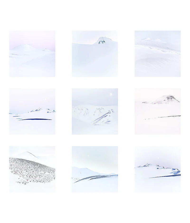
One final note today: I felt there was a danger that everyone would think that these images had no colour in them, that they are just black and white. I've found that some of us are very aware of colour casts and can spot when white snow is really blue-white, or magenta-white, or grey-white. I've chosen to show you the work here now with a white background, as I think it allows you to notice the colours in the pictures more. You should perhaps ask yourself what colour is the snow in each of these images, or in particular, what tint does the whites in each picture have?

2.jpg