2nd Biggest Challenge is being objective

The 2nd biggest challenge you have as a photographer, is in developing the skill to look at your work from the outside.

Fjallabak-Sept-2017-(12).jpg

Being connected to your work is important. But in order to be able to judge and tune your work accordingly, you need to be able to step outside of yourself, and view / judge your work like you would if you were looking at someone else’s work.

Good artists are able to be part of their work while at the same time exist outside of their work.

How you achieve that is not something I can advise you on. But I would imagine that we are all self-editors. In our jobs and daily encounters we often have to audit how well our work is being done, how much time we are spending with our family, and whether we have the right balance in our lives. This process is no different from the act of looking at one’s own art and judging it. We all step outside of our lives to look within, and we do that in order to try to get some sense of objectivity about it.

Creating art has always been about the marriage between creating an idea, and then shaping the idea. Often new ideas are roughly formed. They then go through a process of being shaped and finely-tuned. That is where a sense of judgement about the work comes in. It is also when we need to be able to self-judge what we are doing.

2nd hardest thing to do as a photographer, is to learn to be objective about what we do. To be able to step outside of our work while at the same time maintain a connection to it.

Biggest challenge is being original

I’ve been thinking recently, that my blog has been about one thing: about trying to work on our creativity, with the aim of producing work that is our own.

We live in an age now, where there is a glut of good work. It’s now a case that making well crafted images is something that is within the grasp of many.

What I’ve been thinking about lately, is that I think we need to celebrate originality a lot more. Being able to produce a nicely crafted image is fine, but I think we need to be thinking about how to foster and develop our own individuality - or perhaps ‘originality’?

Fjallabak-(6).jpg

Which I suppose leads to the question - what is originality? Is there indeed such a thing as being original? Or isn’t everybody just influenced by everyone else? In other words, isn’t it ok to go to all the same places that everyone else is going to, and to make similar images as everyone else?

“I was there all along,
except that all my influences were mostly so strong,
that I just couldn’t see me in the work at all.”

Everyone’s images, even the highly-influenced close copies of our heroes work will have elements of ourselves in them. You are always in the images you make, even if you choose to go and make a homage to the work that inspired you. It’s just that it’s quite hard to see who you are from the layers of influences that are often overlapping and perhaps hiding you, from you.

When I look back at my earlier photographs, most of course showed very strong influences in Kenna’s work, and also Galen Rowell’s work. I was always attracted (at the beginning) to strong colour and dramatic compositions. My photography has changed a lot over the years but as I look back, I can see traces, elements of ‘me’ in my emulations of my heroes work. I was there all along, except that all my influences were mostly so strong that I just couldn’t see me there at all.

It is only with a great deal of insight, self-reflection and looking at my older work, that I’m able to see ‘me’ in my work. There is an audit-trail in the chronology of my work that shows my style adapting and changing, but there has always been something in the work that has always inherently been ‘me’. It’s that part of the image making that you can’t seem to change. That’s you. It’s who you are. And you need to find it, embrace it, and let it grow.

It’s really hard to find out who you are as an artist and I think it only becomes obvious over a great amount of time, and a great amount of image making and by looking back. Over time, I think we surface, and when we go and look at the earlier work, can often see more clearly that we were there all along.

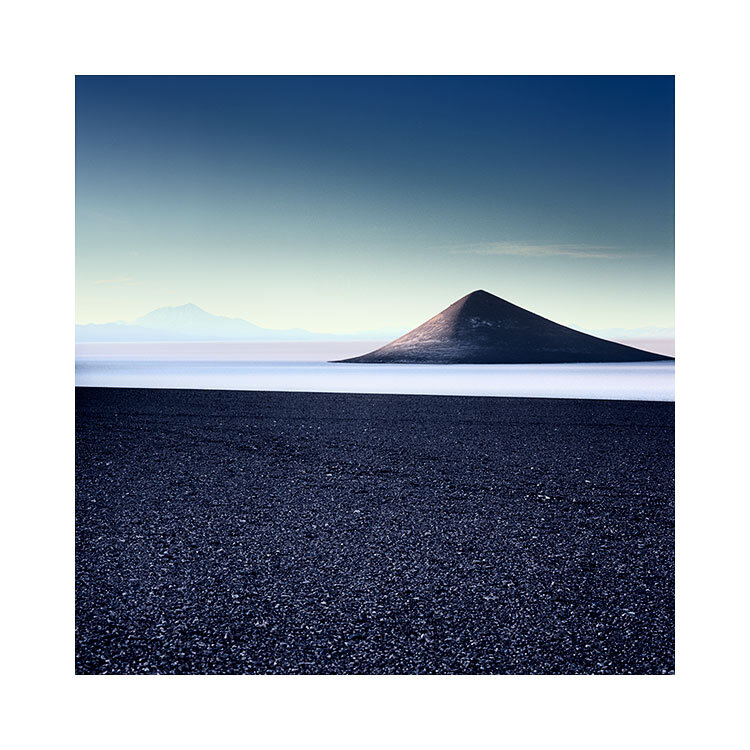
Cone-de-Arita-1.jpg

The biggest challenge in photography now, is in being individualistic. Being individualistic means you’re creating work that others aren’t. It also just makes photography for all of us a whole lot more interesting!

But being an individual is a tough place to be. When you follow a trend, you are (in my view) conforming. And you’re not leading. But conversely, when you are doing your own thing, it’s a much lonelier place to be, because you aren’t part of the pack. It also means you have to be strong to follow your convictions, and not care that what you are doing, isn’t widely accepted. Heck, you may even find that what you are doing isn’t appreciated, or understood by others. That’s the price of being different from everyone else.

And this brings me to this point: being more original about what you do, means caring less (or not at all) about what others think of your work. It means having the confidence to follow your own convictions, and follow a path that no one else may be on.

For me, the web and many platforms show a lot of accomplished work. But the icing on the cake, is to do something that helps you stand out from that massive volume of proficient work.

Biggest challenge facing photographers now, Is not being proficient. It’s in being original.

Imperceptible Horizons

When you take the horizon away from a landscape photograph, the viewer is inclined to invent one.

Hokkaido-2019.jpg

We tend to imagine what we need to complete (to make sense of) what we see. This is true of photography, but it is also true of how we use our visual cortex in our daily activities.

Everything we see is a ‘construction’, and it’s so innate to us that we’re not even aware of it.

Consider the Necker cube. You immediately know it’s a wire frame cube. But what is interesting to me is that our ‘construction’ can be influenced. You can choose which walls of the cube become the back wall and the front wall. After a while you can flip them so what was the back wall is now the front wall, and what was the front wall is now the back wall. The necker cube is great at illustrating that your vision is a ‘construction’.

Necker cube. Can you imagine this cube in different ways?

Necker cube. Can you imagine this cube in different ways?

When we look at photographs, we ‘imagine’ the scene in our mind’s eye. We essentially construct it. And most interestingly to me, we tend to create any missing supporting elements we need to help us make sense of an image. This means that we may imagine things that aren’t actually there.

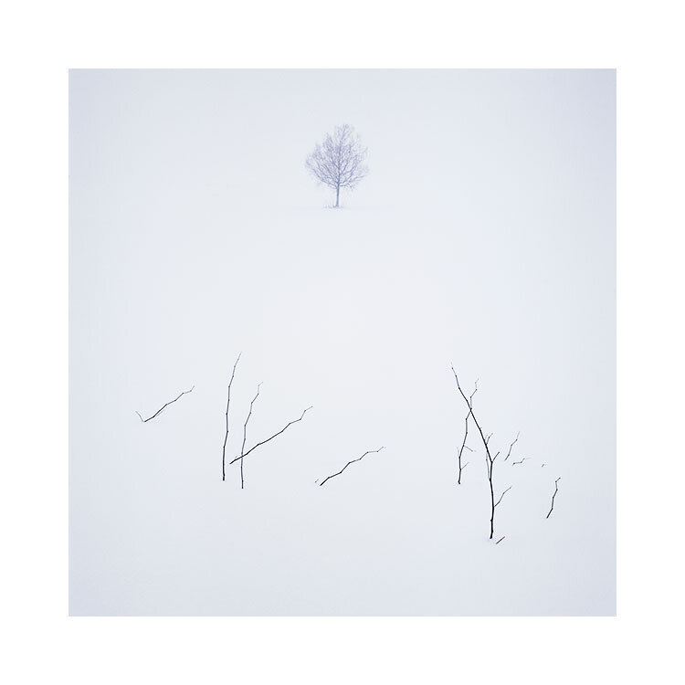
In the three photographs in this post today there are no horizons in the shot. Yet I think most viewers of these three photographs will ‘imagine’ a horizon. They will essentially imagine what isn’t there to help them complete (or make sense of) the image.

There are many ways in which we tend to ‘imagine’ what isn’t there. For example:

  1. What is outside of the frame. We tend to ‘continue’ the photograph outside of the frame. In our mind’s eye we tend to imagine beyond the perimeters of the frame.

  2. Objects at the end of the frame tend to continue outside of the frame. If a mountain begins to slop up and out of the frame, we tend to imagine the rising angle continuing outside of the frame.

  3. If there is no real horizon, we either tend to invent one in our mind’s eye, or if there is something within the photograph that can act as a substitute, we will use that. This is what false horizons are.

Knowing about this ‘feature’ of the visual cortex to ‘fill in the gaps’ can be a great photographic tool.

Indeed, in the case of point 1. above, (we imagine what is outside of the frame). I tend to use this a lot to help viewers imagine that the landscape is very empty. If there is nothing around the perimeter of the frame then one tends to imagine that everything outside of the frame is a continuation of that ‘nothingness’.

So in today’s post, I’ve selected three of my images where there isn’t a clear horizon. You can ‘imagine’ where the horizon is, even though in some of the images there really isn’t a horizon. No really, there really is absolutely no horizon in one of the images in this set. Do you know which one?

Imperceptable horizon, Lençois Maranhenses. The horizon does exist. Except that I’ve chosen to edit it to make it ‘almost’ invisible.

Imperceptable horizon, Lençois Maranhenses. The horizon does exist. Except that I’ve chosen to edit it to make it ‘almost’ invisible.

In the above image, perhaps, depending on your monitor, the horizon is perceptible. It is there, but it’s so faint that it’s almost become invisible.

Deliberately making things imperceptible

Indeed, this was my intention during the edit of this photo.

My aim was to reduce or simplify the image down to one subject : the graphic nature / shape of the lagoon edge. Remove the horizon line and the lagoon edge starts to float. It becomes the sole reason for looking at the photo.

And yet I know that most viewers will ‘construct’ or ‘invent’ a horizon if one isn’t present.

I’ve had to think about why I love making the horizon disappear in some of my photographs. I think there are several answers to this:

  1. Pictures become more ‘mystical’, or ‘dreamy’ when things aren’t so obvious.

  2. The mind has to work harder at figuring out what’s going on.

  3. It reduces down and simplifies the image so it’s easy to ‘digest’.

  4. The mind tends to fill in the gaps where there is missing crucial information. The viewer is forced into their own ‘dream state’ by imagining what isn’t there.

Hokkaido-(16).jpg

Which image really has no horizon?

As I promised you at the beginning of this post, here is the photograph that has no horizon. It was shot on a sloping field where the background behind the tree is actually the field rising up above the top of the frame. So I know from being there that the sky was never in the photograph.

Yet isn’t it interesting that we can’t help but imagine there’s a horizon in there!

I love playing with images where things are left open to interpretation. In my view, why should everything in an image be crystal clear? Why indeed do we need high-resolution all the time? And why do many of us strive to make everything so obvious to the viewer?

Well, my take on this is that for most of us, there’s an insecurity in worrying that the viewer may not see what we saw, feel what we felt. So we either tend to over-emphasise it (and almost everything else) in the edit to try to spell it out. And this can at best make the image too conventional, or at worst ruin it completely.

Final thoughts

I think it’s completely fine to leave things unanswered, to allow things to be inconclusive for the viewer. If it helps create an imaginary world of sorts for your viewer to disappear into, then it’s a feature rather than a problem.

This is why I love imperceptible horizons, because I know that often it’s best to leave as much of the interpretation to the viewer. It promotes engagement.

Steve Watkins, Outdoor Photographer Magazine Editor

I’m very sad today to hear of the passing of Steve Watkins, the editor of the UK publication Outdoor Photographer Magazine.

213_web.jpg

Steve was very encouraging towards me and very supportive of my work. And I know this will be expressed by other photographers who worked with Steve.

In the UK, being a ‘landscape photographer’ or ‘artist’ is a very difficult living to be in. So to have someone like Steve being utterly enthusiastic and supportive meant a lot to all of us who worked with Steve over the years.

Indeed, one of the reasons why I was featured in Outdoor Photography magazine so much over the past decade was not through my own doing. It was purely Steve who contacted me every single time ‘with an idea for an article’, and sometimes even suggesting to me that the remit could be as loose as I wanted it to be. I was very flattered of course to be asked to write for the magazine, but it was Steve’s easy going and transparent nature that I found worked the magic for me.

Often times, Steve would tell me ‘I love your work Bruce and when I get a chance to put it on the front cover of the magazine, I try very hard to’. Not all of my images suited the front cover you see. And sometimes he would send me some examples of how he thought the front cover may look, and I would say ‘can we use something that’s less traditional’ and he would do it. As the example of the Cono de Arita shot you see above illustrates.

To me, Steve was what an editor of a Magazine should be like. He was completely enthusiastic, encouraging, supportive, and willing to give contributors to the magazine free rein in coming up with ideas.

Thank you Steve, for all the encouragement. It was a real pleasure to work with you. Condolences to your family and friends. You will be greatly missed.

Bruce.


Completed Image Proofs

It took about three weeks to complete the images for the Hálendi book.

You may be wondering what I had to do, other than just put them in a good order and print them? I rarely print all of my work, it would just be far too time intensive for me to do this and I realise when I publish them on the web, they are about 90% of the way there. Or they way I like to look at it - 100% there, but when I come to print them, I’ll notice things that need to be tightened up and the final image will now be 105%. That extra 5% is the ‘excellence’ in what we do - that extra bit of ‘going a little bit further with the work’.

Truth be told, if you care about your photography, it’s something we all do - we agonise over the smaller details.

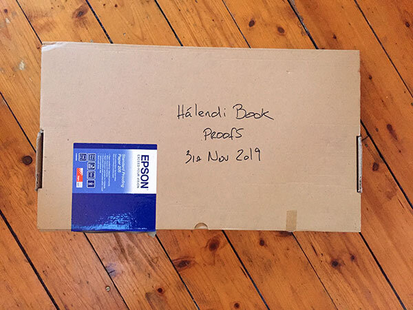
proofs-1.jpg

Proofs are a way of verifying to me that the images are right. But there’s more to it than this. These proofs will be sent to the printer as a hard-copy - to tell them ‘look, this is what we expect to see in the final print’. Sending files on their own is not enough as each offset press has their own custom ‘colour management’ or maybe ‘no colour management’ in place. So the hard-copies are references for them.

But I find that going through the slow progress if printing 100 images is immersive and instructive. Although I had done an initial image selection and sequencing, I still found about 10 images were dropped from the final book and about 5 or 6 images were added in their place. Sequencing was tightened up as I felt there was a broken flow to the work as you walk from one page to another.

Seems I had to print them to find this out. Seems I needed to go through each image tightening up the tones and colour casts to ‘marry’ with each other to notice find it out also. Seems I had to live with the work over several weeks of printing and editing.

proofs-2.jpg

And rarely did I find an image just went straight to print. Every one of them needed work done to make them sit on the page. In some instances the image was too dark, too light, too soft, too hard, lacking contrast, requiring contrast reduction.

Printing always teaches me about my deficiencies. The way I interpret transmitted electronic light from a computer monitor is not the same way I look at light reflected off a piece of paper. I seem to ‘see differently’ and I know it is not a unique trait that I have, but one we all have.

So what’s next? Well we’re still about six months away at least from a printed book in my hands. The book artwork has to be finalised and the materials chosen for the book. We’ve had some price quotes through for soft-back and hard-back books. This is always a trade-off as I don’t have a large audience, so a smaller print run is important, and with smaller print runs the costs go up if you want to go hard-back. Quite a bit. So we will see.

Then when we send the final work to the printer, I would like this time to turn up for the actual printing to see it in progress.

I am going to go quiet now on the book. The rest of the process isn’t that interesting for most, so it’s time for me to talk about other things on this blog.

Proofing off, and on

I’ve just completed the sequencing and ‘grading’ of the images that will be in the Hálendi book. I feel I’m getting closer to the completion of the book.

two-pages of the book as they are intended to be laid out.

two-pages of the book as they are intended to be laid out.

I just need to proof the work now, and make sure that what I am seeing on my monitor holds up when it’s printed. I’ve been a little bit delayed in doing this for the simple reason of running out of ink for my printer late last week! Seems it’s impossible to buy ink for next day delivery here in the UK and I can only assume it’s because I’m using an older printer.

Proofing, as the name suggests, is about simulating how the images will look once printed on the paper of your choice. It’s really useful to help you figure out if there will be any significant loss of contrast, colour or anything in your interpretation that is critical to keep. The reason why you may lose something while printing is because each paper has a reduced contrast ratio and gamut of colours. So something will get lost in the conversion.

Since the contrast ratio of a piece of paper is much smaller than what a computer monitor can display, some images may not transfer well when being squeezed down to work on paper, and compromises will have to be made to allow the image to be acceptable to you.

Every device out there has its own physical limits to the gamut (range of colours) it can reproduce. Colour management is often more about managing how you deal with out-of-gamut colours as you move from one device with a large colour gamut to one with a smaller one.

This is where rendering intents come in. Intents allow you to chose how ‘out of gamut’ colours are treated. You essentially get to choose how the compromise is made. For example, one rendering intent says ‘any colour that is easy to transfer over with no change, do it, but any colour that is outside the gamut of the new device, move the colour to the nearest available one’. You have a options and the best way to work out which rendering intent to use, is to proof the image on your monitor and flip through all the rendering intents to find one that gives you the closest match to what you hope the image will look like in print.

Truth is, rendering intent should be chosen on a case by case basis per image + media combo. One image may print well on one paper but less so on another. Experimenting (in proof mode) with different rendering intents per image on your chosen paper will give you the best compromise. You may find that one rendering intent does a better job at giving you a closer rendition of what you intended.

Proofing is important because it allows you to cut out a lot of guess work. You essentially see the image as it will look once printed - on the chosen media, while saving on paper and ink.

Proofing off. Note the whiteness of the paper.

Proofing off. Note the whiteness of the paper.

In the image above, I’ve got proofing switched off. When you edit your work, you should always work with proofing switched off. You are editing an image which is neutral of any medium you print it on.

When you come to print it, that is when you should make a copy of the master file and perhaps name it for the paper of choice it’s intended to be printed on. Then while proofing is switched on for your duplicate file, make adjustments that are relevant for the paper you are proofing under.

Proofing on. Note that the colour of the paper is now duller. This is the proofing simulating the paper colour.

Proofing on. Note that the colour of the paper is now duller. This is the proofing simulating the paper colour.

The image above illustrates what may happen when proofing is enabled. You can now see that the whites of the border have dulled down a lot (to simulate the colour of the paper). I notice the two images have less ‘presence’, but after a few seconds my eye adapts and I start to believe that the images look as powerful as they did with the proofing is switched off. This is key.

The eye is highly adaptable, to a point. We’re also extremely poor at judging relative colour. Have two slightly different prints and place them in separate rooms, and walk between both rooms - I doubt you will notice any changes in the images. But side by side - that’s when you’ll notice colour differences. So the eye is easily fooled.

Most of the time when you proof, the images should still stand up, even if it is now being simulated on a less contrasty, less dynamic medium. But occasionally I find some aspect of the image that is important to me becomes lost. In these cases it’s either that you’re working with the wrong medium. Certain papers excel at colder / whiter images than others. A warm paper will smother snow scenes for instance. So you need to experiment and find the right paper with the right gamut for your image, or try to make adjustments (with proofing switched on) to see if you can regain what you lost. I usually find the solution is in the former option. Not all image work well on all papers so paper choice is critical.

In the case of my own proofing this week for my book, I have no choice in paper. I am using a proofing paper that gives me a reasonably close rendition of what an offset press can do. So I’ve found one or two of the images has required a lot of work to get it to sit well on the page.

Pages 68 & 69

Tonight I’m working on print evaluations of the images for my forthcoming Hálendi book. It’s a lot of fun just seeing my images in print, or in the example below, showing the page layout.

Seeing these two images is a reminder of why I love to go into the interior in the winter time.

Equipment failure and work arounds

It is an inevitable fact that your camera gear is going to malfunction at some point. Especially if you keep on travelling the law of averages simply mean that at some point something is going to go wrong.

P1020474.jpg

A few weeks ago I travelled with my Ebony field camera only to discover that two of the lenses were broken because the shutters had failed. I also found that one of my film backs wouldn’t wind on correctly, and just wound the film all the way through the back.

I’ve had many other incidents where lenses have given up on me (usually due to a screw becoming loose while travelling on unsealed road). I’ve also had the occasional mishap where the entire camera body as slipped out of my hands only to drop into a river (completely unsalvageable), or drop onto some ice and the prism smash.

It’s inevitable that at some point, things are going to go wrong.

I usually travel with spare items. When I travel with my Hasselblad outfit I tend to carry two bodies, three film backs and some overlap in lenses. Or to put it another way - if you take two wide angle lenses such as a 20mm and 24mm then you’re at least covered if your 24mm fails. I also make sure I travel with a duplicate standard lens.

The way I see it, is that there are certain ‘core’ focal lengths that you need to cover for failure. For me that’s the equivalent of a 24mm and 50mm. So in my Hasselblad medium format system that equates to 50mm and 80mm. I always go with two 80mm lenses and I double up on the wide angle with a 40mm and 50mm. Both are useful in their own ways but they can also work as a substitute for the other if one fails.

I also travel with two light meters, several cable releases and even a spare ball head, and also a complete dupliate set of ND grad filters (stored away in a small Pelican case in my main luggage).

Having backups is necessary, but you don’t have to exactly duplicate things as your camera bag may just become unwieldy. So if you’re keen to double up, you just need to think more along the lines of maybe cheaper, less sophisticated (or pricey) items to carry as backups, and hopefully lighter and smaller.

You may think ‘that’s completely out of my budget’, but the truth is - if you’ve spent a few thousand dollars on a trip somewhere, it’s going to hurt pretty badly if you get there and find you can’t make any photos because your camera is dead.

One other way to get around this issue, is to travel with friends who have similar setups to yourself. Got a Nikon camera and your friend also has one, then you can share lenses.

I can’t state how important it is to have a back up for your gear. You don’t have to spend a fortune doubling up on everything but you do perhaps need to think about backups for the more critical components (camera, main lenses you tend to use), and a cheap ball head.

Ultimately, you will never be 100% failsafe. That’s just life for you. But by having the spares, you will have peace of mind.

One last thing - if you are travelling with backups, best travel with a 2nd small camera bag (I stuff my spare bag in my main luggage - usually filled with clothes) so I have a 2nd bag to put my backup items in. Storing your backups in the same bag on location is just asking for trouble, and if say your bag gets stollen or trashed, than not only does your main system get trashed, but also your backup items as well.

So here’s how I pack for going away:

  1. My main luggage has inside it a small Pelican case with my resin filters (not glass as they will break) in it.

  2. My main luggage has my main camera back inside it - either flattened down, or if I can’t do that - I fill it with clothing so it become part of the luggage space of the bag.

  3. My tripod + two ball heads are in my main luggage

  4. I travel to the airport with a trolley bag with all my camera gear and laptop in it.

  5. For film, I store it in a small ‘personal item’ case that I am allowed to carry onto the plane along with my main trolley bag.

The reason for having the trolley bag, and also the main camera bag is that while I am on location shooting, I put my spare items in the trolley bag, and port all my main camera items into my camera bag. It ensures that all my backup items are in a separate bag - in the car, so they are less likely to get damaged along with my main items if an accident happens.

Page Sequencing & Balancing

A few days ago I began work on proofing the images for inclusion in my next book. As suspected, I’ve found loads of issues with the images once printed. Some of them it’s to do with the blacks and white points of the images, but also, clipping that is incurred by the reduced gamut of the paper I’m proofing onto. I am finding I am having to calm the higher tonal registers to allow the image to sit on the page without any flat-wall-clipping occurring.

I knew I would have a challenge ahead of me, in terms of sequencing the work. In the proof snapshot you see above, I spent a lot of time matching images to each other so that images on the left and right page compliment or sit well with each other. For me, this is about choosing the right images to begin with. Then once I have them sitting next to each other (I use View / 2-up vertical in Photoshop to view two images side by side, I can notice if there are luminosities that jar between the two side by side images, or colour casts - perhaps in the blacks that work against each other. For instance, one black desert may have more blue in it while the complimentary image that is to sit on the opposite page may have more of a reddish black. These things can sometimes be ‘tuned’ to sit better together and other times, I just find that the image doesn’t work when its colour balance is tuned away from its current colour temperature.

To me, this is ‘mastering’. I am trying to get the entire set of images to sit well together, and for that to happen, it’s never really about subject matter, or geographic location. It’s all about whether the tones and colours (or perhaps for some of you, monochromatic tones) that matters. Images have to sit on opposite pages in a way that they work together as a set. But the work also has to flow through the book as well.

I’m really enjoying this process. Images that I thought were nice, become something special when I print them out and notice further adjustments and enhancements. It’s like putting the icing on the cake.

Printing is indispensable in really getting the best out of your work. And it is giving me a lot of confidence in knowing the work is as good as it can be for publishing in my forthcoming book.

Proofing has begun for next book

Printing is the final stage in finishing your images. If you don’t print, you are trusting your monitor 100%. I’ve learnt that even if my monitor is very tightly profiled and calibrated correctly, I still can’t see certain discrepancies in the image until it is printed. And once I see it in print, I am now able to notice it on the monitor also.

Two images from the forthcoming book, printed on Epson Soft Proofing paper.

Two images from the forthcoming book, printed on Epson Soft Proofing paper.

So each time I come round to preparing images for a new book, I print every single one of them. I’ve done this now for the last two books and it has allowed me to get the best out of my work. I have often found just about every image needs some further work to tune it as best as it can be. For me, that extra 5% or 10% is crucial because I think printed images are more exposed, more vulnerable to inconsistencies than a computer monitor will show.

Screen grab from my computer monitor. I’ve got the proofing switched on to simulate the Epson Soft Proofing paper.

Screen grab from my computer monitor. I’ve got the proofing switched on to simulate the Epson Soft Proofing paper.

Through this process, I have also learned to ‘interpret’ what my monitor is showing me. I now understand that shadows and highlights and hues in those areas are more obvious in the print than on monitor (yes, I’ve profiled and adjusted the black point of my monitor). I have also learned that colour casts become more visible in print than on the monitor.

I think most importantly for me, is the luminosity or ‘dynamics’ of the print that I’ve noticed more in print. The eye is adaptable, and after staring at a monitor for too long, the eye adjusts and you start to believe things that aren’t true. We can convince ourselves that a duller luminance is brighter than it actually is. For instance, what you may interpret as white in the image may actually turn out to be around 50% L: a mid-grey tone. Printing out helps you recognise if the image is as vibrant as you think it is.

So a few weeks ago, I asked Neil Barstow from Colourmanagement.net to build me a custom profile for the Epson Soft Proofing 205 paper. This paper is a pretty good standard paper to convey what the images will be like when printed on an offset press.

I printed the Verification test image that I bought from him, and compared it with the proofing switched on in Photoshop.

I’m really pleased to have a ‘standard’ to print to. I can evaluate my images for offset printing.

One final thought: when you send your actual files to the printer for printing, I always send a printed copy of them. You can’t get more truthful than a hard-copy and I think it is always prudent to give this to your printer, as it means that you can avoid any possibility that their colour management is different from yours. They should be able to match the offset press to your hard copy prints.