Discovery Series - Conceptual at heart

I think that photography can be a lot stronger if it is created with a concept in mind, or if it exists as part of a concept. 

Individual images, like individual sentences can be quite nice, but there’s often more depth to the work if the sentences are strung together to create a story. So too, with the photographic image.

Images on their own only go so far to tell us something but I often find I’m left feeling part of the story is missing. That’s why I find collections of images, arranged within a theme or as part of a narrative so much more engaging.

Hans Strand - Intimate 1

Hans Strand - Intimate 1

Chris Friel - Framed

Chris Friel - Framed

Greg Whitton - Mountainscape

Greg Whitton - Mountainscape

This month, Triplekite have just announced a series of books which fit into this category. Rather than producing individual books, they are focussing on producing a series that all fit together to create a unified body, which I think is a great idea.

David from Triplekite explained to me that: “It’s the ‘wholeness’ of the project that interested us when we began to work on it. Rather than looking at individual titles, I think there’s a strength to a body of work if it belongs as part of a larger theme”.

He struck a chord with me, because this is something that is at the heart of my own photography. I believe that when we prepare our work, we should consider how it fits into the bigger picture. I’m not a piecemeal photographer, and I believe that my ‘message’ is stronger when my images are presented in theme based portfolios.

With the three books I’m going to review here, they are presented with the same aesthetic values: all titles here have the same dimensions, the same page count, and although each book is a flexible vehicle for illustrating a wide range of photographer’s and also a wide range of projects, they ask to be considered as part of a whole.

David also explains that “for Triplekite, we are looking at this as an ongoing project - one in which we can, over time, add new titles, showcase lesser known photographers as well as some really well known ones - which we already have in the pipeline, but ultimately, make the collection a cohesive effort".

So clearly the the Discovery Series has been put together with the hope that owners of the collection will be attracted by the diversity and on-going exploration into different photographers work along with varying project remits.


Abisko Canyon, Sweden, September 2013, Image © Hans Strand. Used by kind permission.

Abisko Canyon, Sweden, September 2013, Image © Hans Strand. Used by kind permission.

Hans Strand - Intimate I

The first book in the Discovery series i'd like to review is Hans Strand's 'Intimate 1'. Clearly the title suggests that there are more intimate series to come, and I'm looking forward to them very much since Strand's work is of particular interest to me.

Until now, I was only aware of Strand's ariel 'abstractions'. In 'Intimate 1' he takes us in, closer - to a smaller intimate landscape. Seldom will you see the sky in any of the images contained in this collection which is something I admire, because quite frankly - I suck at it. It's very hard indeed to make such beautiful yet anonymous images and Strand excels at this. He is a meticulous photographer. His compositions are extremely well thought out and very fine indeed. He takes time to simplify them right down and show you only what you need to see, and nothing more. I can fully understand why this may be series 1 in an on-going collection for him. 

I should note that this is by far my favourite book out of the Discovery series (at present).

Before I leave this book, I should take time now to say that I was particularly taken with Strand's Iceland book - also published by Triplekite - if you don't own it - then I strongly suggest you read my review of it here.

Reed, Lake Teen, November 2011, Image © Hans Strand. Used by kind permission.

Reed, Lake Teen, November 2011, Image © Hans Strand. Used by kind permission.

Nianån River, February 1992, Image © Hans Strand. Used by kind permission.

Nianån River, February 1992, Image © Hans Strand. Used by kind permission.


Greg Whitton - Mountainscape

Loch Coire Mhic Fhearchair, Torridon, Scotland. Image © Greg Whitton. Used by kind permission.

Loch Coire Mhic Fhearchair, Torridon, Scotland. Image © Greg Whitton. Used by kind permission.

"A love for all high places" - is perhaps the sentence that resonated with me upon reading Whitton's introduction to his book 'Mountainscape'.

Like Whitton, I had to endure endless hill walks as a youngster with my mountain-mad father. I'd often yearned for the time when I could choose for myself to avoid them. But just like Whitton has found in later life, the passion for the hills had already been ingrained from an early age. It seems we both could not escape the beauty of the mountains in our later years.

This book then, is a homage to his acknowledgement that he loves the high places, and perhaps without knowing it - it is also a tribute to his father's love of high places also.

Liathach, Torridon, Scotland. Image © Greg Whitton. Used by kind permission.

Liathach, Torridon, Scotland. Image © Greg Whitton. Used by kind permission.

'Mountainscape' contains images shot up high, around many parts of the UK: Snowdonia in Wales, the Lake District in England, and many places in the Scottish highlands such as Torridon and Wester Ross to name a few.

Whitton's images are more intent on capturing the atmospherics of a place, rather than showing you some literal translation. I can almost feel the 'liquid-air' of the misty days I spent up in the mountains with my 'mountain-mad' dad.


Image © Chris Friel. Used by kind permission

Image © Chris Friel. Used by kind permission

Chris Friel - Framed

I've left this book till last, because it is perhaps the most adventurous of the three. The first two books could be easily classified as belonging to what many of us consider landscape photography.

But landscape photography should be, and can be, a whole lot more than the idea of recording verbatim scenery. As a creative person, I believe that photography is an art-form. I'm not particularly interested in recording a verbatim scene, but instead, I'm more intrigued by how we can interpret what we see and feel. This book falls distinctly into that realm for me.

Image © Chris Friel. Used by kind permission

Image © Chris Friel. Used by kind permission

Friel's images are like wild brush strokes. As Doug Chinnery notes in his fine introduction "they mimic the tantalising half glimpses we get of light and beauty through windows". So often I've been mesmerised by these 'half glimpses', and I would go so far as to suggest that many of us, if not all who love photography, are often caught by moments when the light shifts and a scene is altered for a fleeting moment.

Perhaps it is the short lived sense of something only being for a moment that I find most arresting when I'm drawn to something I wish to photograph.

Image © Chris Friel. Used by kind permission

Image © Chris Friel. Used by kind permission

Friel also uses frames found in the real world to frame his landscapes. Again, Chinnery notes "His frames are not regular, perfect, geometric shapes. Rather, they are the wild, free brush strokes of an artist at work". I think this is an accurate description of Friel's interesting use of the landscape to frame itself.

It's an interesting book and one which I think suggests that this discovery series may allow us to explore the wide gamut of what photography really is about. 


These three titles on an individual basis, offer excellent value for money at £18.50 each. They are inexpensive, yet beautifully reproduced. They encourage me to think of collecting the set that Triplekite intend to release over the coming years, and I feel it's worth noting that keeping an eye on this series will reap rewards: you'll get to find out about photographers you hadn't heard of before, but you'll also be open to looking at a wide variety of projects. If you're a book collector like I am, then I would imagine that some of the titles may be very popular indeed, and knowing which ones to collect just makes it more enticing to collect the entire set.

I think Triplekite have offered a concept in photography book publication, which they should be admired for.

For more information, please see: Triplekite Publishing Website

Hans Strand's Iceland - a photographic book review

It's no surprise to many of you that I own many fine photographic books.

What you may not know, is that many of them have been the catalyst that got me to go to some of the places I now know and love so well. Galen Rowell's 'Mountain Light' for instance inspired me to go all the way to Patagonia to witness for myself the grandness of Torres del Paine's stunning landscape.

Landmannalaugar, central highlands of Iceland, shot - I believe - from a helicopter. Image © Hans Strand

Landmannalaugar, central highlands of Iceland, shot - I believe - from a helicopter. Image © Hans Strand

I love how photography books can instil a sense of wonder and inspire me in my own photographic pursuits, but they can also take me inside myself for an hour or two where I feel I connect with my creative self. Give me a good book of images and I'm lost, entranced. Time becomes irrelevant, as too does the past or future. All that matters is the present moment - how I interact and feel about the work I'm viewing.

Hans Strand's book on Iceland is a very good book, because it does exactly that for me. I get lost and absorbed in the wonder of Iceland because the work presented inside the book is so beautiful.

 Image © Hans Strand. The book has many abstracts taken from the air.

 Image © Hans Strand. The book has many abstracts taken from the air.

When I received the book, I thought I'd have a short glimpse through it, but I got so caught up in the landscape, my quick few seconds to look through it extended to over an hour. I lost myself in the landscape and Strand reminded me that Iceland is still relatively untouched, unknown and un-photographed. He takes us on a very different journey through the landscapes of Iceland. His book shows us the abstract nature of many unknown locations from the air as well as the ground: sometimes at a very disconnected (read satellite view) and other times at a more intimate vantage point, just hovering a few hundred feet above. 

 Images © Hans Strand

 Images © Hans Strand

Indeed, places like the Landmannalaugar region of the fabulous Fjallabak area of Iceland are perhaps best photographed from up high. With its rhyolite and green moss hillsides intermixed with snow that remains until the very tail end of the summer, there are fabulous patterns to be enjoyed - more so if one has a helicopter. I think his images of the Landmannalaugar region are perhaps some of the strongest in this book: because they successfully capture what I see in my own mind's eye when I am there myself but am unable to capture. They are also beautifully abstract and well composed images. More art than document.

But why would anyone want to own a photographic monograph? I ask this, because over the years I've been writing about some of my favourite books, I've had emails from readers of this blog who have either told me that:

1) They have never owned a photographic book (imagine just what they are missing!)

2) or that they only wish to buy a book if there is text inside which explains how the images were created (and therefore missing out on what can be learned by just studying and enjoying someone's work)

Front cover of Hans Strand's book

Front cover of Hans Strand's book

It’s no surprise to me that many photographers do not buy other photographer’s work. They may enjoy it on a web browser, but the interest seems to go no further than that. This is a shame, because photographic monographs are inspiration food for us photographers. If they are well printed, as is the case with Strand’s wonderful book on Iceland, they can teach us and inspire by illustration. They also feed us with the possibilities of what is there and what we may experience if we so choose to go there ourselves. They also remind us of why we love photography so much.

Ultimately, photography books like Strand's allow us to connect to our creative selves: if I can't get outside to make photos, then sitting gazing upon a beautifully printed book is the next best thing. In this regard, Strand's book is one of the nicest, and inspiring books on Iceland that I've seen in a while.

If you would like to find out more, or perhaps buy a copy, this book is available as a special signed edition from Beyond Words at £40.

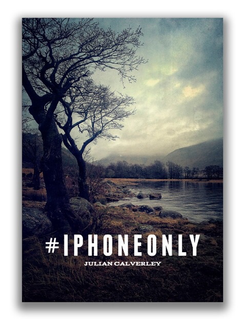
#IPHONEONLY A book of landscape photographs made entirely on an iPhone.

It's interesting to note that the largest growth market in digital cameras is in the 35mm arena. This is interesting to me because we now live in an age where we have numerous formats to choose from and many of them are just as capable of making good pictures as the trusty old 35mm format. The reason for this current growth in DSLRs as I understand it, is that many mobile phone users who discover an interest in photography through their phone assume that the next logical progression is to buy a decent DSLR. I can appreciate that if you're new to photography, and don't know much about the new smaller formats, that this appears to be the way to go.

My own personal feeling on the matter is that the DSLR is tied to an historical format and as such, I think there are many smaller lighter systems available that would be just as valid, and much less bulky to use for many projects. In other words, DSLRs are not the only way to go if you want to get into digital photography seriously. In fact, I think the system of choice is often a personal one and the quality of the work is really in the skill of the photographer. Not the gear.

Julian Calverley is known mostly for his advertising work in which he uses an ALPA camera with a state of the art Phase-One digital back. It's heartening to know that Julian is just as creative behind an iPhone as he is behind his ALPA and his terrific book #IPHONEONLY illustrates. It gives credence to his abilities regardless of what format he chooses and also to the stark truth that any camera is good enough, even an iPhone. If you have dreams to create beautiful work, and can't afford a camera system, Julian's book will confirm to you that you can get started right now with your mobile phone and a few inexpensive processing apps.

So what of Julian's book?

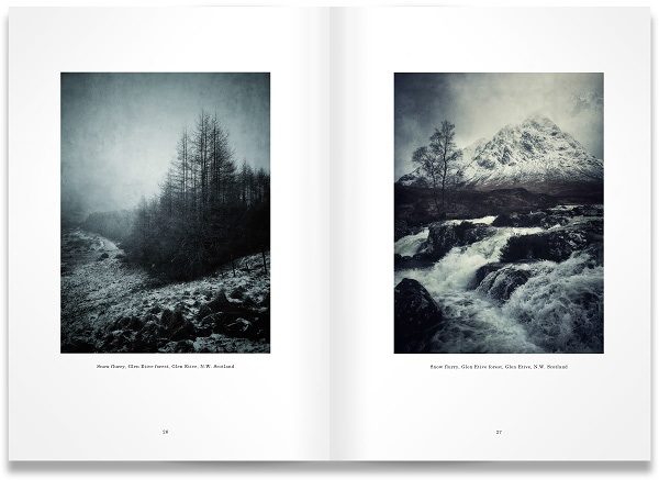
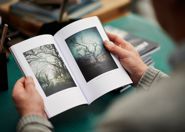
Firstly, let's get the physical properties out of the way and then I'll talk about the quality of the work contained within. It's a small book A5 in size and it's printed on very high quality paper via a waterless lithographic printing process. The print quality is really nice and Julian's notes about his images are subtle, allowing the work to speak for itself.

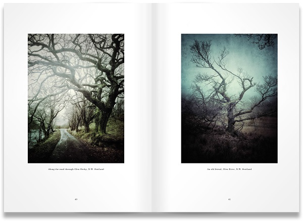
About the work itself. The book mostly contains landscape images of Scotland. It's a place I obviously know well so I had great pleasure in seeing some very different and refreshing views of well known places. But I think for me what stands out is the overall feel of the work. Julian likes dark moody days. There are images where I can almost feel I'm sitting in a car staring out at the landscape as the rain lashes against the windscreen. Growing up in Scotland, I often found my holidays involved a lot of rain and abrupt changes in atmosphere. Because of this I felt a connection with the work immediately.

I also think that the work has a spontaneous feel to it, which says more about the freedom that using a mobile phone has brought to Julian's work than anything about quality - the images are superb. Many of them illustrate that he is comfortable photographing in any kind of weather which is something we could all learn from. If we only make photos when it's dry then we are restricting ourselves to what might be. Sometimes owning expensive equipment makes us scared to use it in inclement weather. It seems a mobile phone can, and is, an extremely liberating way to make photographs.

Julian uses colour in the same sense that I do. He uses his chosen colour palette, which reminds me of rainy autumn days to convey emotion and mood in his work.

I'm surprised that it's taken this long to have a book published that has been made solely with a mobile phone. If you're looking for some inspiration that can help you to shake up what you're doing, or maybe encourage you to stop going down the equipment buying route and focus more on your own development, then this book is a great example that it's the photographer not the gear that is responsible for making art. But the book Is also a thing of small beauty as well. A lovely object to add to your book collection.

It's just so encouraging to see someone embrace his mobile phone and create great images. It's proof to me that the equipment is always a means, a personal choice and the art we create with it solely lies within us.

The standard edition of #IPHONEONLY is available from the Lionhouse Bindery.

And Exclusively to BeyondWords books, a signed edition at £20.

New e-Books in-Progress

Way back in 2007, after a lot of nudging by a good friend of mine, I ran some of my very first workshops. I chose Torres del Paine national park in Chilean Patagonia of all places to start on my little adventure (a rather grand entrance into the world of photography workshops don't you think?). I knew the park well, had visited it more than a dozen times, and felt it was as good a place as any to commence a possible career in workshops.

Looking back, the workshops were more 'tours' than anything, but they were a great learning experience for me (in fact - all my workshops and tours have been great learning experiences for myself as well as hopefully, my clients too). Seven years on, and I now find myself in a position where I feel the structure and format of my teaching based workshops is very honed now. This I feel, is due to many factors.

Firstly, as a workshop leader, having to teach someone else something, really makes you have to think harder and get a much clearer picture in your head about it. Through trying to explain something to someone, you discover holes in your own understanding. Getting a clearer picture helps not only the participant on my workshops, but it has also helped me a great deal in my own development as a photographer.

Secondly, my own style of photography has morphed and changed over the years. I've found that applying a sense of self-awareness has helped me enormously. I find that I consider and reflect a lot about what it is that I do, and why I do it.It's been greatly beneficial to notice the changes in my style and use any new-found awareness in my critique sessions and time in the field with my clients.

One of the aspects of this, is that I often find that there are topics within photography that I hadn't thought about, or didn't appreciate might need to be taught.

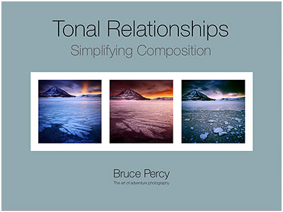
One of them that I feel has been lurking away for a good few years - popping it's head up - trying to get my attention is that of  tonal-relationships. Which is why you see the proposed cover for a new e-Book I'm working on at the head of this post today.

For most, composition is all about where to place objects within the frame, but I think it goes further than that. One aspect of good composition is that of the inter-relationship of tones between objects within the frame. Many of us often think of meaningful things like 'sand' and 'rock', but few of us recognise that sometimes sand and rocks have similar tonal values which means that when they are recorded in 2D, the merge to become one confused object.

But there is more to tonal relationships than this - there is the meaty subject of how to balance an entire composition. If you consider darker tones as 'heavy' tones, and brighter tones as 'lighter', then you can often find some photographs are light-headed, or bottom-heavy, or maybe there are patches of tone around the frame that are too dominant. For instance, brighter tones will stand out if they are the minority in a dark image. Conversely, darker tones may stand out more in a  pre-dominantly bright-toned image.

But tonal relationships don't end there. We have the thorny subject of noticing that a certain tone in the frame may become more or less dominant by adjusting the tone of an adjacent object. This tends to move into the realms of colour theory.

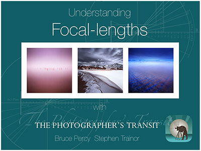
Proposed Focal-Length's e-Book

But there's more yet. Over the past few years, I've found myself trying to ween participants away from using zooms in their compositions. It's not that I don't think zooms are good. It's just that until we master a few focal-lengths, zooms tend to complicate things by giving us too much, too soon. In my own view, It has taken me a decade to learn to 'see' in three focal lengths - 24mm, 50mm and 75mm. That is enough for anyone to be getting on with.

So there is work in progress for another e-Book, that I'm writing with Stephen Trainor - author of The Photographer's Ephemeris sunrise/sunset application that many of you know I use. Stephen has developed a really nice new application called Photo Transit that you may wish to look into further.

In this e-Book, Stephen and I will aim to convey how different focal lengths behave, and how to compose with them. Standing at one spot and zooming in and out with your zoom lens is not the way forward to create great compositions. As participants of my workshops will know, I prefer the idea that you should zoom with your feet. Fix a focal length, and hunt the landscape to fit your focal-length, not the other way round. See this post about focal-lengths for further detail.

I'll be busy over the next few months working on these e-Books. But I may share some observations over the next while during my writing phases for them. I hope these titles may spark some interest for you.

Paul Wakefield Book Review & Exhibition

When I started out on my photographic journey, there were a few key photographers that I think helped point me in the right direction.

For instance, Galen Rowell gave me permission to follow my traveling-dreams, while Michael Kenna showed me that it was totally ok to create a 'new reality' through heavy manipulation in the dark room. But there is one photographer that showed me that nature and natural scenery often possess an abstract depth to them that can be utilised to create strong imagery. That photographer is Paul Wakefield.

Wakefield's compositions of well known places are often unique, showing that there is always an abstract shape or form to nature's design. I find his images of anonymous landscapes - the kind that many of us tend to overlook - just as powerful as his images of the iconic places we know so well.

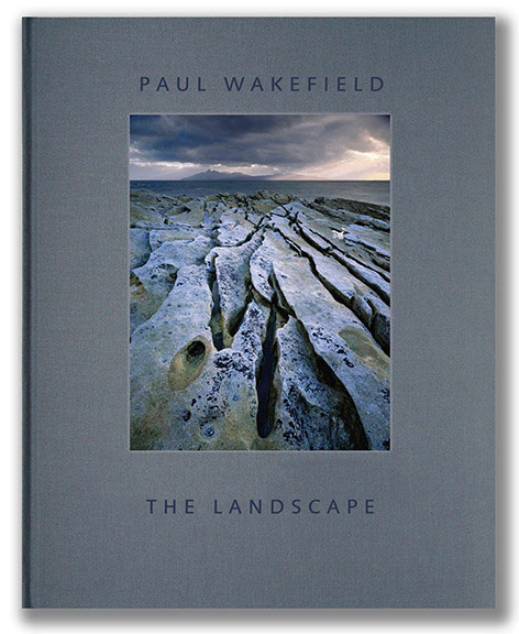
Paul Wakefield's newly published book

For those of you who aren't familiar with Wakefield's work, he has been a terrific influence on many notable landscape photographers. I know for instance that Joe Cornish often cites Wakefield's images of Elgol on Skye to be the catalyst for him deciding to venture there in the first place.

A few months ago, I received news that Wakefield was due to release a monograph of his work to date. I bought my copy in a matter of seconds, because I so wished to experience his beautiful work in more detail than I can on a website. The edition I bought is the £175 collectors edition in a clam-shell case with a print signed by him. There is also a standard edition at £48 available from Beyond Words books here in the UK.

The book is beautifully presented and printed on very nice matt paper. It is a large book and is very much in the style of a classic Ansel Adams monograph. I think all landscape photography monographs should be printed with a timeless-air of design to them, and Paul's book fits this category unreservedly. It is perhaps my favourite landscape monograph since Michael Kenna's Huangshan book (which you can read about here).

On a side note, there are a few images in Wakefield's book that take me to places I know well: the Lofoten islands of Norway, Torres del Paine in Patagonia and the isles of Harris, Skye and Eigg. It seems that Paul has been more of an influence on my own journey this past decade than I had originally thought. What is so joyful for me then, is to experience a different perspective of these places - sometimes I found myself doubting if his images were of the places I know, because his compositions often offer an unexpected view.

It is his skill for assembling great compositions in such a way that I find the most enjoyable in his work. I remember asking him a few years back if he could confirm that one of his images was of Lago Sarmiento in Torres del Paine, to which he replied  "don't you think images become more powerful when you don't know where they are from?" I would certainly agree with this.

The book does indeed tell you where his beautiful images were shot, but it saves us from any interruption by  leaving the images untitled, to enjoy for what they are, rather than for where they are a study of. For those of us with an enquiring mind, the locations are listed at the back of the book. I find this design choice a welcome one, because it removes any possibility of distraction while enjoying the work - images should be enjoyed first and foremost and analysed later.

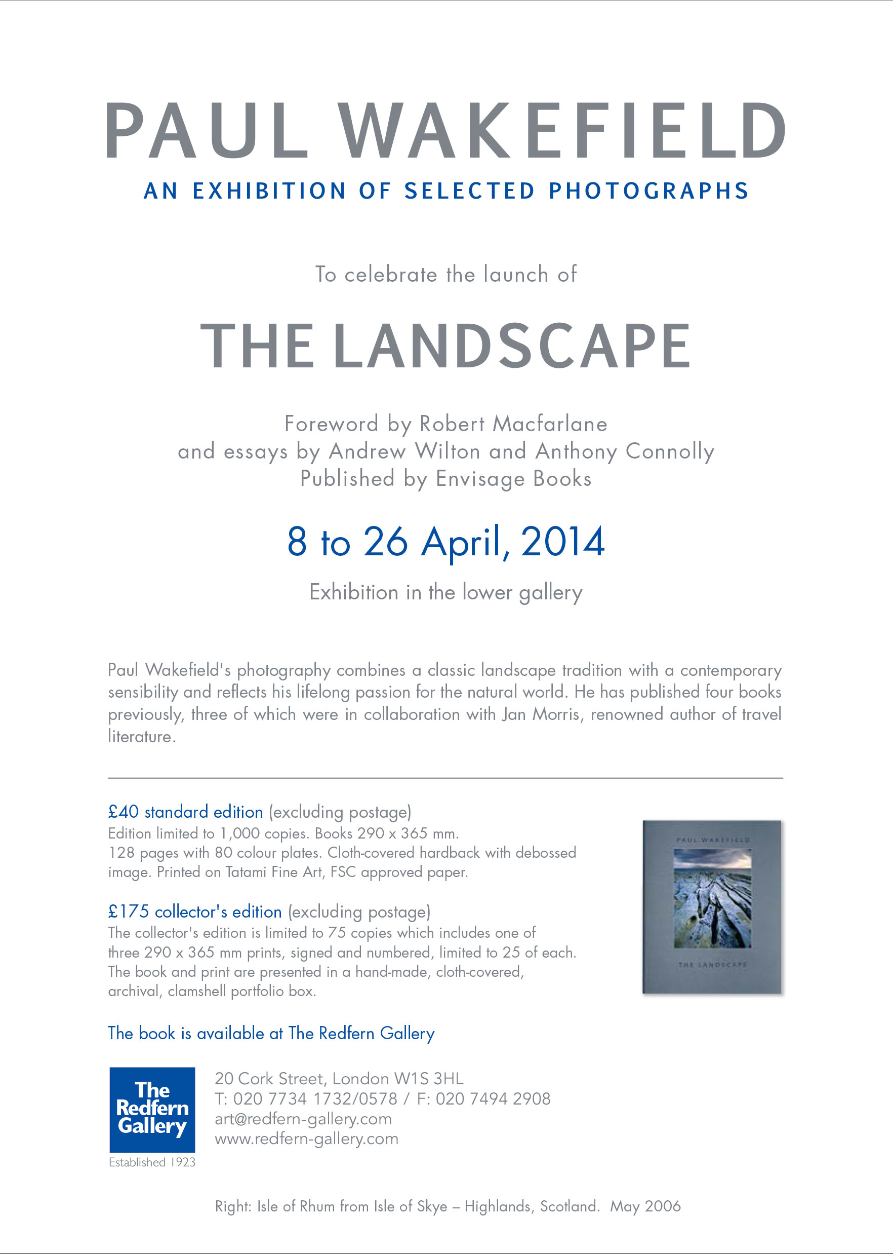
Paul-Wakefield-E-card

So I end this post with news that Paul Wakefield is holding an exhibition this month at the Redfern Gallery in London from the 8th to the 26th. The gallery currently has stock of his beautiful hard bound book. The standard edition is available on-line from Beyond Words books here in the UK.

Redfern Gallery, 20 Cork Street, London W1S 3HL T: 020 7734 1732/0578 / F: 020 7494 2908 www.redfern-gallery.com

A life of its own?

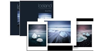
It's just over a year now, since my Iceland book came out. Which I can't believe. In some ways, it feels as though it has been a lot longer, but a year isn't much time at all, so I'm finding it interesting to feel as if the book has been around for a long time. Perhaps it was already a thought in my mind long before I even began working on it?

Iceland-45

It was really interesting to decide on the special edition print runs for the book. It was also a lot of fun too.

I spent a bit of time deciding which group of three images would go together to form the triptych. The idea being that if they are put together, they are complimentary and can be framed as such. The final touch for me, was to create a dedicated envelope for them. The envelope has the same layout and font-set as used for the slipcase. The idea being that the prints will be stored alongside the book in this special edition envelope, as a collectors edition. Well I've just done a stock count, and it seems I only have 8 copies of this edition left.

When creating special edition sizes, it's a difficult task to decide upon the quantities. Make the edition size too small, and the edition will sell out too quickly. Make it too large, and the stock will sit around for some time.

But selling books should not be entered upon, if you are going for a quick-win result. Books take a long time to sell, and even small print runs of 1000 copies need a few years at least to sell out, if they are going to sell at all. Creating books and selling them, is ultimately a risky endeavour, and one that is embarked upon, if you feel you really need to do it, and can accept the possibility that you might not get your money back. Books are not cheap to print, and even more difficult to store somewhere dry.

The idea when I decided to put together my two books, was to create products that I could offer to workshop participants, and visitors to my website, for several years to come. If I sold all the books out in a year, then I would have nothing left to offer.

Like my prints, I feel a well printed book is a 'calling card'. It is a statement of who the photographer is, and the aesthetics / design of the book, right down to the layout and font-set used, should give you a sense of who the photographer is. The entire thing, not just the photos contained inside, should be carefully chosen, and should fit the aesthetic tastes of the photographer. In fact, I can't imagine any photographer who wouldn't want to be involved in the design of their book as much as possible. It is such a personal thing to do. So many photog's get that part wrong, and I've come across books that have wonderful photos in them, but the overall design or layout is at odds with the work contained within.

I'm still hoping to do a 3rd book sometime. My initial plans were to come out with a book about the Altiplano of Chile and Bolivia sometime next year, but I feel this is too soon. The work I have begun to create in Bolivia, seems to be getting stronger each year I return. So I think I need to wait a while and see what transpires there when I go back this June.

Well, just some thoughts and observations. It's good to check in on where things are, and I find christmas and new year a time to reflect, to look back and think about how far I have come as a photographer, as in life, as in everything.

It seems that making the photos, and designing the layout and appearance of this book with my friend Darren Ciolli-Leach, was just the start. It seems that even a year after publication, the book is still finding its place in my heart and mind. It's a grower, and it's heartening to note that sometimes, when I think I've finished a project, it's only really just begun. I think my iceland book has taken on a life of its own. So I will be watching it with interest over the years to come.

Hardbound & Electronic Bound

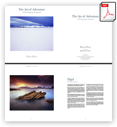
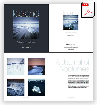
I'm a big proponent of the hardback book. So much so, that I've released two hard back's in the past three years: 'The art of adventure, 40 Photographic Examples', and also 'Iceland, a journal of nocturnes'. Both were printed to a very high standard, and are roughly about Album size. But I've been thinking for a while now, that we live in a multi-format society. We tend to like to access what we own, when we want to. We like the convenience of having our books and music available to us wherever we are.

So what I've decided to do, is offer both my hardback books with a bundled PDF version. I figure that most folks who want to buy the book, would also like to be able to carry around with them an electronic version of it on their iPad or similar device. I still believe that the books should be bought as hardbacks, so I'm afraid that the PDF versions will not be available for sale separately. If this is bad news for you - then maybe you can look at it as buying an e-book and getting a hard-back version of it as a bonus ;-)

So I'm very pleased to announce that both my books now come with a PDF version along side it as part of the purchase. I'm also additionally pleased to let you know that if you already purchased a copy of one of these books from my site already, we have just sent an email to you with a link to download the PDF version for free.

You can purchase the books here.

A Walk through Nature

As many of you know, photographic books are perhaps some of the most treasured objects I own. I really love them for many reasons, and I've always wondered why not all lovers of photography own them. They not only give us a better experience of someones work compared to viewing it on a website, but also, they allow for a more intimate setting where we can lose ourselves for half an hour or more as the photographer takes us on a journey through their own world. With Trees, by Dav Thomas

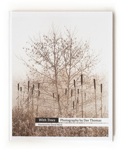
One such book that I've had the delight of getting to know for this very reason, is Dav Thomas' 'With Trees'.

I've just spent the past few days returning again and again to this book, because it has a wonderful way of letting my mind reconnect with what it's like to be outside, roaming through woods and remote landscapes. It is a beautiful journey where I seem to lose myself each time I pick it up and roam through its pages.

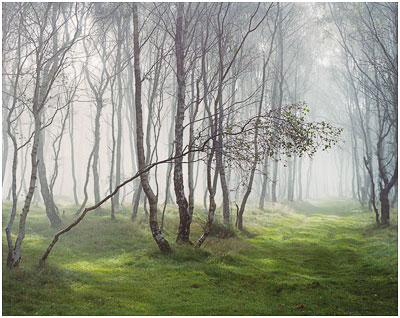
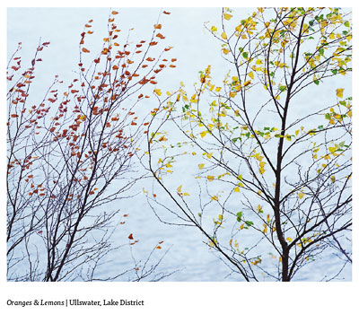
Thomas celebrates the nature of trees as they are. He does not seek to simplify or create an illusion of what is there, but instead works very much with what the trees themselves have to offer. And what they offer is a recognition that even in the middle of one of the smallest and most densely populated countries in Europe, there is always a forest not too far away, where one can gain some space and remove themselves from the existence of every day life.

Thomas mainly focusses on the forests of the Peak and Lake district, but there are occasional entries to places such as Elgin in northern Scotland. What is interesting for me to note however, is that there is a sense of uniformity to the landscapes he has photographed. He reminds me that one doesn't have to go far to find their muse, and I suspect that these locations have not been picked purely because they are within reach of where Thomas lives, but because he has had a life long relationship with the environment he has chosen to photograph.

tilted

His book is not simply a celebration of trees, but an empathetic understanding of the undergrowth, grasses and mosses that in his own words are a 'supporting cast for the trees they surround'. I loved this sentiment particularly, because in it, Thomas is telling me he understands that each element in a scene has a relationship to one another not just photographically, but also in nature.

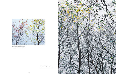
244-45-ft Although the book is a monograph, it is interspersed with Thomas' observations of how trees exist and relate to their surrounding environment. I loved the text, because for me, it echoed pretty much what I saw and felt in his work: a deep fascination for the relationship between tree, undergrowth and moss. Thomas seemed to me very much like someone who has spent time around his subjects getting to know them in all their seasons and different atmospheric environments.
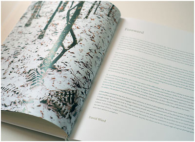
In one such observation by Thomas, he notes that Oak and Limestone are often hard to separate, because they blend in a way where mosses covering the limestone take on an extended quality to the surrounding trees, and he uses this well in his compositions. He is comfortable to show you that both these compositional elements are intertwined, and can be interpreted as one, rather than discreet elements which have to stand apart. That I feel, is a difficult thing to execute well, because forests are difficult subjects at best to produce strong photographs from. And Thomas seems extremely comfortable with this task.

On a more personal note, at times I felt that I was enjoying images that would compliment the work of naturalist Eliot Porter. Whereas some photographers seek drama and mood in their work, others are more content to convey nature the way it is, and celebrate it's beauty for 'just being'. This is what I see in this book, and I think that's why I feel it should proudly sit next to my collection of Eliot Porter books: a high commendation indeed.

with-trees-foreword-david-ward

On the subject of the quality of the printing and presentation, the book is a beautiful hardbound A3 sized monograph, with a lovely introduction by David Ward. I had the great delight in noticing that even the cardboard box it comes in, is beautifully presented with the same themes as contained on the front cover of the book. It is one piece of cardboard I will not be throwing out, because for me - it is part of the book where packing and content are one concept. I'm a big believer in the collectibility of books, so if you do decide to buy this book, then hold onto the carton as well.

Thomas I feel, is just at the start of a great future. I think he has vision, not only in his photographic work, but also in his message. He knows his motivations well. This is a hard act to pull off for many and I feel that Thomas understands his own sense of aesthetics and along with it, his own vision and style. He has found his own path, and is on a journey, which I feel I understand well, because photography has been a journey for me also.

I hope this is the first of many books by Thomas. It was been executed well, which considering this is his first book, illustrates that Thomas knows his message and  has a strong sense of how to convey it.

For me, It will sit proudly alongside my Eliot Porter collection. As I said earlier; a high commendation indeed.

'With Trees' is available from Beyond Words books @ £40.

And also available directly from the Triplekite publishing in different limited editions.


Image interpretation techniques

It's been a long time in the works, but I'm almost nearing completion of an ebook about image interpretation (what most people call post-processing - except I detest that phrase). Forthcoming ebook


I'm in Patagonia right now, at the end of a great trip we had to Torres del Paine national park. The weather was spectacular, and plenty of new material from it, i'm sure.

While i've been in south america, I've been working on this e-book in my downtime. I had great difficulty with this one, as I think I needed to get the Fast-Track-to-Photoshop ebook out of the way first. And I've felt that since that was done, this ebook has come really quickly to me. I expect it to be a few weeks or maybe a month or so, before it is out.

Heading home tomorrow to my own bed, Scottish tea bags, and my beloved hi-fi !

Adios amigos, Bruce

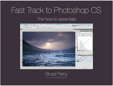
Fast-Track to Photoshop CS e-Book

When I first decided to run photographic workshops, I sat around for a few months wondering just what a workshop should entail. As my good friend Kathy said to me - 'don't copy anybody, do what you think a workshop should be all about' - this has been extremely good advice, and since then, I've taken it very much to heart in everything I've done regarding my own photography career. Fast-Track-Photoshop CS

So when I set up my workshops, I decided there should be some kind of structure to what I wanted to convey. One of the things I felt was a 'must', was to include a tutorial on Photoshop CS* (not elements), something that my participants could take home and walk through under their own pace. So I put together a nice tutorial that walks the reader through an entire edit of one of my images, from start to finish. The tutorial comes prepared with the TIFF image I use throughout the edit, and also a final Photoshop version for reference purposes.

I've had many participants tell me that by walking through my tutorial a few times, they were up and running using Photoshop CS! That's pretty encouraging news to hear, because Photoshop CS is not an easy application to start with, but it is, in my opinion still the best application for photo editing because the degree of control you have is very precise.

So, with this rather long pre-amble done. I wish to tell you that I've decided to offer in the form of an e-Book, my fast-track to Photoshop CS tutorial that I give all my workshop participants. It comes along with the two files I mentioned - the raw TIFF file, and also the completed Photoshop file, so you can look at the edits.

So if you're in the market for learning Photoshop CS, but you're a bit overwhelmed by the application (Photoshop CS is not intuitive), and you can't face months of reading massive books which aim to tell you everything about Photoshop CS, then this eBook is for you.

Mytutorial is condensed and tells you the core of what you need to know.

If you wish to buy it, you can buy it here.

*Please note: this e-book is for Photoshop CS. It is not suitable for Photoshop Elements.