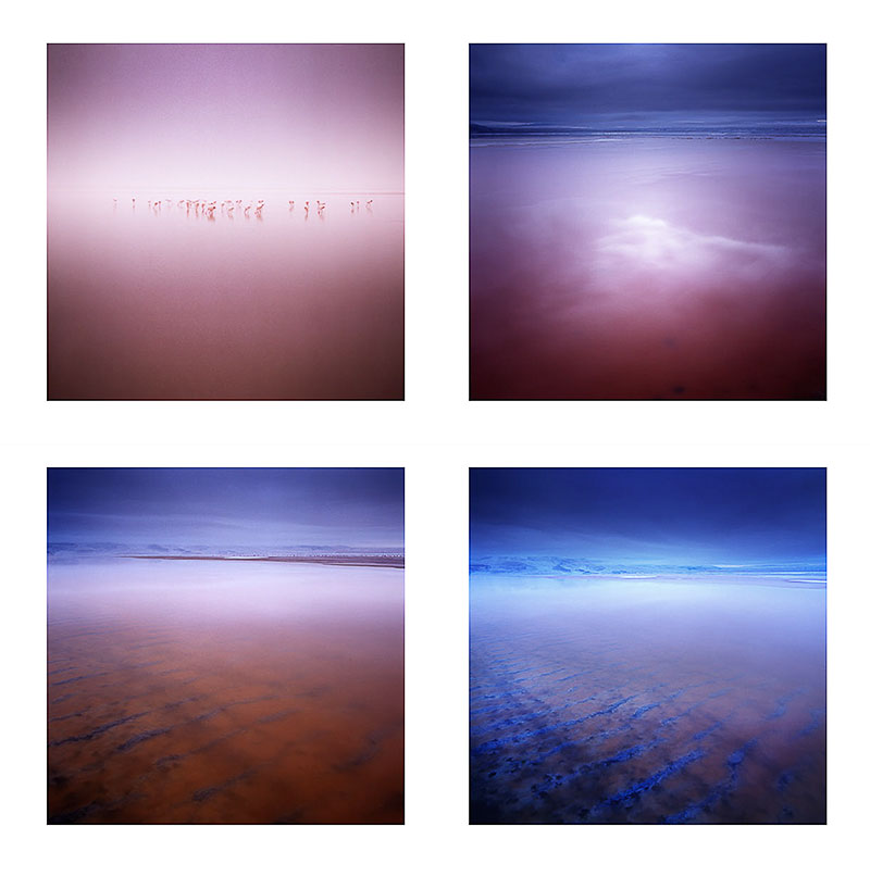
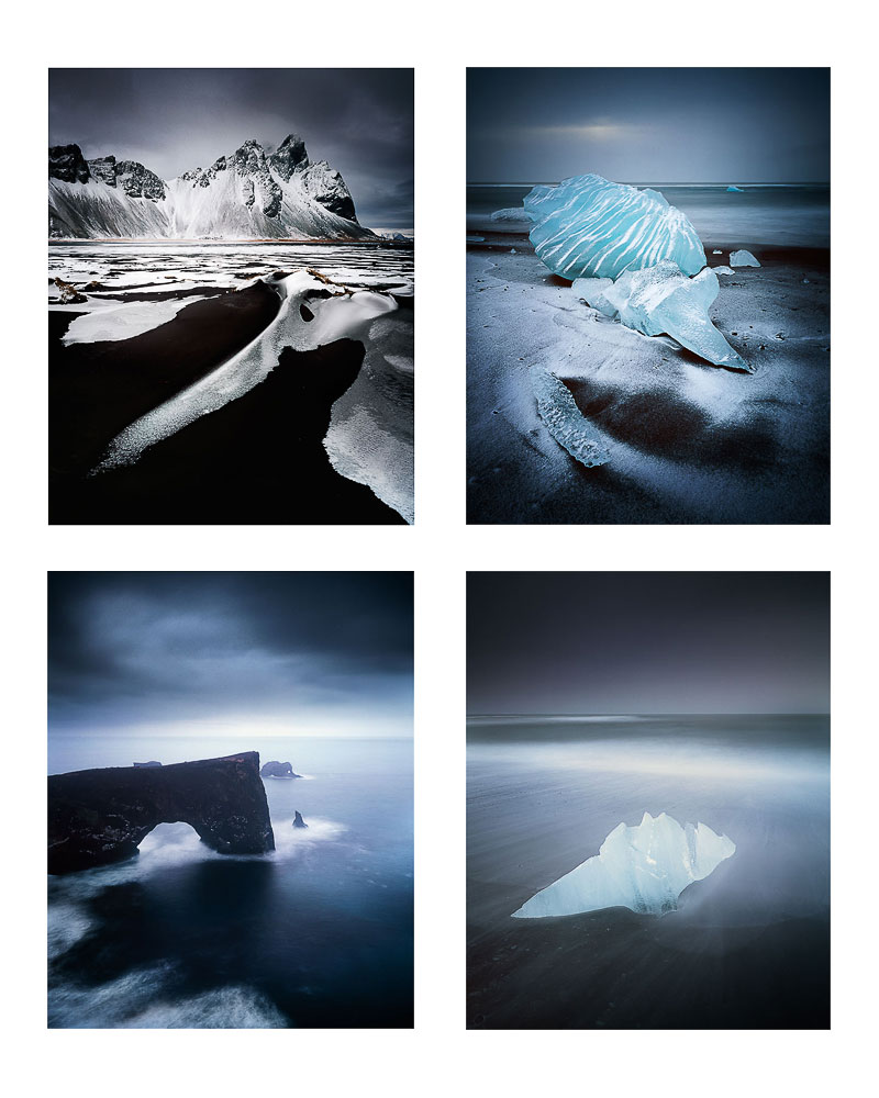
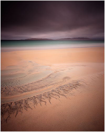
Heading towards the edge? Then take your time.

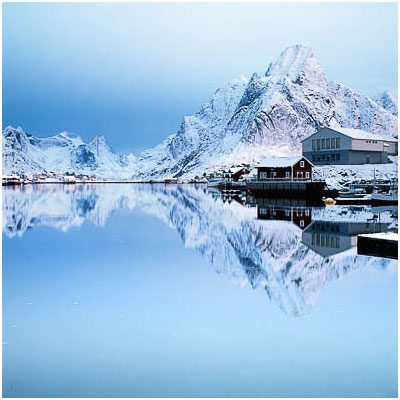
A few months ago I posted an article about using focal lengths, and more precisely, how they can be used to control the balance or dominance between foreground and background subjects.Stoksness, Iceland
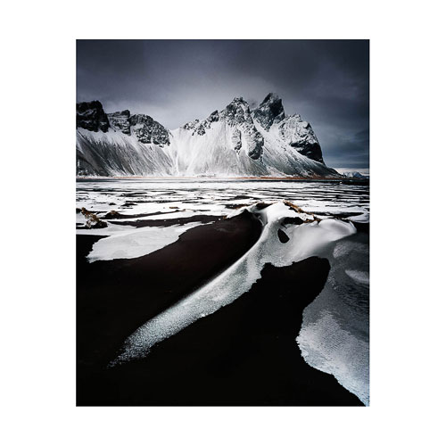
In it, I spoke about how it's not uncommon to be attracted to the edges of a landscape. For instance, I'll often find myself heading towards the edge of a lake, or the edge of the sea and I've also found myself on occasion close to the edge of a cliff.

If my habit is to always go straight down to the edge of the sea/lake/loch/cliff, this can be a real limitation in terms of controlling background and foreground dominance. As explained in my previous article about focal lengths, part of my technique in balancing foregrounds with backgrounds is by how near/far I choose to be to my foreground. Anything at infinity stays at infinity and does not change in size as I move ten feet forward/back but my foreground changes in size dramatically. By automatically heading towards the very edge of a lake, I'm reducing any opportunity to use this technique to it's fullest.

I'm also losing out in another way too though. I miss out on exploring the parts of the landscape that I pass over to get to the edge of the water. This is the main point of this post today.

I've often found many great compositions whilst on the way somewhere. I think this is because as much as I can latch on to one area of a landscape and feel it might be very interesting to work with, I actively keep my mind open to finding and noticing other things while I make my way towards it. I'm just wondering though - is this something you do when you choose to head from the car to a designated spot?

A little bit like a life-metaphor, I think we can often miss out on opportunities as photographers because we're too focussed on being somewhere else.
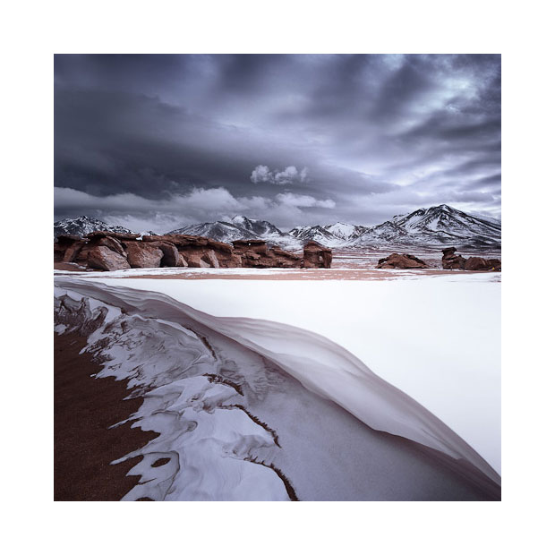
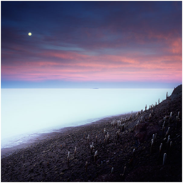
Siloli desert, Bolivia

These days, I like to start at the back of a beach and slowly work my way forward. I'm well aware that small areas of a landscape can yield interesting compositions and I'll often find myself working with an area of a beach which is around 4 feet long for an hour or so.

This is why I prefer prime lenses because they force me to fit to the landscape, rather than me command the landscape to fit to my own rules. With a prime lens, I'm forced to move around to fit things in, whereas with a zoom it's often too easy to feel I can just stay in one spot and change focal lengths to get everything to fit together. By doing the later, I miss out on finding new compositions in my immediate surroundings whereas with the  former, I'm encouraged to explore.

I feel good photography is not simply about technique or being there at the right time. But more about temperament - how patient/impatient I am, and how I tend to latch onto an area of the landscape and become blinkered and ignore the rest.

Self-awareness, of knowing how I can behave,  has become  a vital photographic skill for me. I know I can sometimes choose to close my eyes to many photographic opportunities. Just having this knowledge has helped me reconsider what I may be passing up on - particularly so when I'm heading towards the edge of landscape.

New e-Books in-Progress

Way back in 2007, after a lot of nudging by a good friend of mine, I ran some of my very first workshops. I chose Torres del Paine national park in Chilean Patagonia of all places to start on my little adventure (a rather grand entrance into the world of photography workshops don't you think?). I knew the park well, had visited it more than a dozen times, and felt it was as good a place as any to commence a possible career in workshops.

Looking back, the workshops were more 'tours' than anything, but they were a great learning experience for me (in fact - all my workshops and tours have been great learning experiences for myself as well as hopefully, my clients too). Seven years on, and I now find myself in a position where I feel the structure and format of my teaching based workshops is very honed now. This I feel, is due to many factors.

Firstly, as a workshop leader, having to teach someone else something, really makes you have to think harder and get a much clearer picture in your head about it. Through trying to explain something to someone, you discover holes in your own understanding. Getting a clearer picture helps not only the participant on my workshops, but it has also helped me a great deal in my own development as a photographer.

Secondly, my own style of photography has morphed and changed over the years. I've found that applying a sense of self-awareness has helped me enormously. I find that I consider and reflect a lot about what it is that I do, and why I do it.It's been greatly beneficial to notice the changes in my style and use any new-found awareness in my critique sessions and time in the field with my clients.

One of the aspects of this, is that I often find that there are topics within photography that I hadn't thought about, or didn't appreciate might need to be taught.

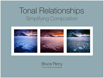
One of them that I feel has been lurking away for a good few years - popping it's head up - trying to get my attention is that of  tonal-relationships. Which is why you see the proposed cover for a new e-Book I'm working on at the head of this post today.

For most, composition is all about where to place objects within the frame, but I think it goes further than that. One aspect of good composition is that of the inter-relationship of tones between objects within the frame. Many of us often think of meaningful things like 'sand' and 'rock', but few of us recognise that sometimes sand and rocks have similar tonal values which means that when they are recorded in 2D, the merge to become one confused object.

But there is more to tonal relationships than this - there is the meaty subject of how to balance an entire composition. If you consider darker tones as 'heavy' tones, and brighter tones as 'lighter', then you can often find some photographs are light-headed, or bottom-heavy, or maybe there are patches of tone around the frame that are too dominant. For instance, brighter tones will stand out if they are the minority in a dark image. Conversely, darker tones may stand out more in a  pre-dominantly bright-toned image.

But tonal relationships don't end there. We have the thorny subject of noticing that a certain tone in the frame may become more or less dominant by adjusting the tone of an adjacent object. This tends to move into the realms of colour theory.

Proposed Focal-Length's e-Book

But there's more yet. Over the past few years, I've found myself trying to ween participants away from using zooms in their compositions. It's not that I don't think zooms are good. It's just that until we master a few focal-lengths, zooms tend to complicate things by giving us too much, too soon. In my own view, It has taken me a decade to learn to 'see' in three focal lengths - 24mm, 50mm and 75mm. That is enough for anyone to be getting on with.

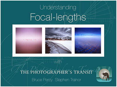
So there is work in progress for another e-Book, that I'm writing with Stephen Trainor - author of The Photographer's Ephemeris sunrise/sunset application that many of you know I use. Stephen has developed a really nice new application called Photo Transit that you may wish to look into further.

In this e-Book, Stephen and I will aim to convey how different focal lengths behave, and how to compose with them. Standing at one spot and zooming in and out with your zoom lens is not the way forward to create great compositions. As participants of my workshops will know, I prefer the idea that you should zoom with your feet. Fix a focal length, and hunt the landscape to fit your focal-length, not the other way round. See this post about focal-lengths for further detail.

I'll be busy over the next few months working on these e-Books. But I may share some observations over the next while during my writing phases for them. I hope these titles may spark some interest for you.

The invalidity of spirit-levels

I've been in Norway for the past three weeks running two consecutive tours. While I've been here, I've had a few discussions with participants regarding the validity of using spirit-levels when composing.

In this post, I'd like to put forward a counter-argument for using spirit-levels when doing landscape photography. I'm sure some people will disagree with me or feel that spirit-levels have helped them a lot, but this is really just my point of view, so bear with me on this one.

Many of us use a spirit-level of some kind to help us get our horizons level. There are a couple of issues with this as I see it:

1) The first is that we are only levelling our camera with gravity. We are not balancing the objects within the frame when we use a spirit level, and this is where we get it wrong.

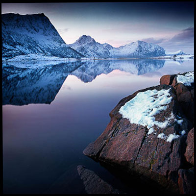
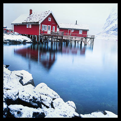
Many horizons are what I call 'false-horizons'. A false-horizon is one where the contours of the land are not in sympathy with gravity. In the image example below, the edge of the lake appears to be higher at the right-hand side of the image and lower at the left-hand side. The camera had been levelled with a spirit level, yet the false horizon is not level with the frame of the image.

False horizon is not level

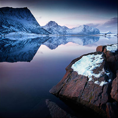
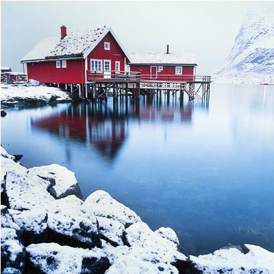
What is happening here is that the contour of the lake rises as we move further towards infinity in the frame. Leveling with gravity makes no sense because the horizon is actually rising. If we are to level our horizon, there is only one thing we must level it with - and that is the edge of the frame. Here is an adjusted image to illustrate how the image was recomposed to ensure the false-horizon is in balance with the frame of the picture:

False horizon corrected

I now no longer use a spirit-level for a few reasons:

a) I need to level  objects within the frame - with the actual frame, and not with gravity.

b) balancing objects without the aid of a tool such as a spirit-level means I am more in control of the overall composition. I have to think more about where all the objects are and how they balance with each other. I believe using a spirit-level takes this level of awareness away from me, and thus the compositions I would come up with are less focussed as a result.

2) The second issue I have with using a spirit level is that they allow us to compose images while we are not able to interpret the composition correctly. The reason why many horizons can be so far off the mark for many photographers is to do with how we physically stand behind our camera. Many of us often cock our heads sideways to view either through the eye-piece, or at the live-view screen. Most of us are not aware we're doing it, but what we're attempting to do is balance a composition while our head is not level with the viewfinder. This may not seem like a problem, but it really is. It is extremely difficult to balance a composition when viewing sideways because we simply can't interpret the scenery so clearly when we do. Take this image for instance:

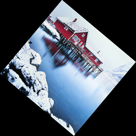
I've rotated this image by 40 degrees to simulate how you would see this composition if you were viewing it through an eye-piece or on a live-view screen with your head cocked to 40 degrees. In the process of doing so, we find the image a little harder to interpret and understand compositionally. But here is the point: it's not easy to tell if the horizon is level in relation to the picture's frame. It looks level within the context of the frame its in, but is it really?

In the image below, I've rotated the entire frame to 0 degrees, to simulate how you would see the above composition if you were viewing it through an eye-piece or live-view with your head level to the camera:

Looking straight on to the picture, we can now see that the horizon is actually off. That's because we're able to interpret things more easily when we are head-on with the camera. Not when we've got our head cocked sideways.

But let me ask you this... what exactly is the horizon in this image? We actually build up an 'imaginary horizon' based on the contents of the frame. In the instance of this image, it's a strange combination of vertical lines in the red house, and also the struts of the pier. But there's a degree of 'keystone' effect to this image because I actually had the camera pointed down toward the ground. If I show you the levelled image, you can still see distortion in the house:

Levelled

You could argue that the image is still not straight. I think the real answer is that the image is as straight as it can be, taking into consideration all the keystone distortions that are apparent in the composition. We've somehow balanced the left-had side of the house with the right-hand side, and decided there is some level of balance in there. We levelled the contents of the picture within the context of the frame. Not with gravity.

Ok, I know it's not easy sometimes to get your head level with the eye-piece of your camera, but I always make a concious effort to try to get my head as level as I can. If it means I need to lie down on the ground to keep my head level with the camera, then I do it. If it means I need to bend my legs to keep my head level, then I will do it. Because when I am level, I'm not only able to notice if my false-horizons are level, but also if all the objects within the frame balance with each other. In other words, having my head level with the camera enables me to improve my compositions.

A spirit-level only levels our camera with gravity, but it does nothing to help us understand and fine-tune our compositions, and it does nothing to help us balance false-horizons. We must learn to level our images based on what is within the frame, and the only way to achieve this, is to keep our eye level with our camera.

Let your eye, rather than a spirit-level decide what is good. It's really up to your own internal sense of balance and composition to get it right.

Colour as a Unifying Theme

Over the years, as my own photographic 'style' has been changing, I've had the good fortune to be in a position where I spend a lot of time 'noticing' the changes. This is perhaps one of the benefits of being a photographic workshop leader. In order to convey a message, and illustrate things, I've had to look at my own work and get to know myself a bit better as a result.


I wrote a nice little e-book about 'self-awareness' a while back, because I think that in order to grow as an artist, we need to become more aware of how we react to our environment. we need to get to know our moods and responses, as this will allow us to understand ourselves better.

One aspect of making good photographs, that I think is seldom discussed, is that of using colour as a theme. We are often very absorbed by the idea of composition in terms of form only, that I believe we spend very little time considering how colour may affect our style. Or more importantly, how colour can be utilised as a theme to bring a body of work together - and make it stronger than the sum of its parts.

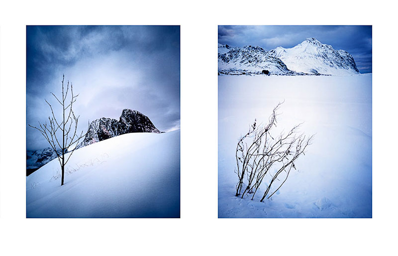
I've noticed in my own work, over the past couple of years, that the colour palette of a location figures largely in influencing what I choose to shoot. I think this all began in 2011 when I first visited the black volcanic beaches of Iceland. In venturing here, I discovered that I could shoot monochromatic scenes with colour film, but also, that the final work had more unity because the colours and tones present in the work were similar.


Certainly, being presented with the reduced monochromatic colour palette of black sand and white ice, should have spelled out for me the direction where the work might go. But I'm not so convinced that most of us observe colour in this way, during the making of images on location (back to my point about developing a sense of self-awareness).

My impressions of the trip just after getting home, was that it had been a complete failure. My head had been so full of the cold that I came home thinking I'd gotten nothing out of the trip. The epiphany happened once I got my films back from the lab. It was only upon viewing the processed transparencies that I saw unity in the reduced colour palette. I saw a way forward and I consciously decided to run with it.

I think there's an opportunity in every place we go to make photographs, to notice colour as a potential theme to the work. This is also true whilst editing the work afterwards. it should be possible to notice that perhaps a handful of the images go together more strongly than others - all because they have a similar colour 'feel' to them.

Utilising colour in this way, is now pretty much at the heart of my photography.

I tend to hone right in on those particular images that have a strong colour aesthetic. I will look through the entire shoot to see if I have others that fall in-line with this mood, or usually, it comes about naturally as I build up a body of work. Some of the images relate to each other more, because there is a strong colour relationship between them.

I will even, after collecting many completed images, distill them down to those that have a strong colour relationship, because it has become a 'signature' - a unifying theme to the whole portfolio.

I don't expect others to be as literal with colour as I am. But I do feel that being more aware of colour relationships as a unifying theme that goes right through a body of work is beneficial.

Composition of an image does not just end at where we place objects within the frame, object placement is only really one dimension. Colour adds an additional dimension.

Just like black and white photographers will often tone a collection of images so that they have a similar feel, colour photographers should consider utilising the same approach in their work. If it brings forward a direction in which one wishes to explore further, then that's a good thing.

Black and White Canvas

Following on from my previous two posts (white Canvas and then Black Canvas) where I discussed the use of snow (white canvas) or black sand (black canvas) as a blank canvas in which to place isolated objects thus creating a simplified composition / photograph, it's time to talk about incorporating the two.

Of course, the title of this post suggests I'm talking about black and white photography. I'm not. I'm just amalgamating the previous two posts together. If you've not read them, then I suggest that you do, as they are really the foundation to where I'm going with all of this.

You see, for me, photography is not about great scenery. It's about tonal compositions. If we abstract a scene down to the basic building blocks we have tone and form. That's all we have. We don't have trees, we don't have rivers, we don't have beaches. Forget all those 'meaningful' handles we have for things out there in the world. They're really irrelevant and a massive distraction to what we're really doing in photography. So what is it that I think we're trying to do in photography?

Well, a number of things actually. But perhaps the most important one is that we're trying to make sense of the world, to distill what we see in front of us, down into a digestible, accessible message. We wish to compartmentalise what we see down into something we can understand, and that hopefully everyone else will too. We do this by using maths (spacial distances between related objects within the frame), and by mood (dark tones convey a sense of mystery or low feelings, while brighter tones are more uplifting and transparent).

But ultimately, everything we see within the frame is a tone. It is somewhere between absolute black and absolute white. I honestly wonder sometimes - if we could paint onto the sensors / film of our cameras what we want, we would. We're just dealing in tones.

So am I suggesting we all start working in black and white? Sort of, but not quite, but yes. I am.

Recently, while I was in Lofoten, one of my clients - John - was working with his D800 camera and I noticed he was working with his live-view screen set to black and white only.

I loved this.

To me it was the perfect summary of what it is we're trying to do as photographers.

What John was trying to do, was consider the tones in front of him. By removing the colour element, he was able to be more focussed on the tonal relationships before him, and the form they convey throughout the scene. By working with a black and white preview screen, he was abstracting.

Photographs aren't about scenery, they're about form and tone.

I began this discussion by presenting a white landscape (snow), to illustrate how we can reduce our photography down to the absolute zero in terms of content to a frame, and if we're good at it, we can make stronger images. I feel working in blank landscapes such as snow and beach locations can help us fine tune our photography. We start to realise we don't need much, and everything that is put into the frame should have a purpose.

Like Mark Hollis fromTalk Talk said "Before you play two notes learn how to play one note - and don't play one note unless you've got a reason to play it." The same holds true for photography. We must distill our image making down to what it really is, and it's not about scenery, it's about form and tone. Start with less form and work up from there is my advice.

Black Canvas

Several months ago, I wrote a blog posting about tonal relationships in photographs, and how dark areas of a frame create mystery. This was all spurred on by something I read in Galen Rowell's excellent book 'Inner game'. In it, he had envisioned a time in the future when something like HDR would arrive and he (correctly) suggested that with the power of such a tool, it would be very easy to remove all depth and mystery from an image. He died in 2001, so this was well before the advent of HDR.

But the main point that Galen wrote about in his article, was that he felt that dark areas of an image convey a sense of mystery, because as part of our primal instinct is to associate dark with danger. For example a dark cave or a dark forest would be considered a possible threat to our ancestors.

I bring all this up, as a precursor to what I'd like to discuss in this post.

Dark areas in a photograph should be considered as a welcome dimension, if they do not disturb the harmony of the rest of the image.

A few days ago, I discussed how using Snow in a photograph can create a sense of having a blank canvas, a space where the eye can float freely away (or over). Snow can simplify or distill our compositions down, reduce the landscape to the core elements that we wish our viewer to be attracted to. Similarly, black areas of a frame can be used in exactly the same way.

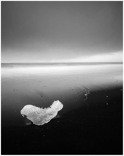
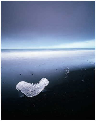
Take the above shot of my 'ice seal', shot in Iceland in 2011. Part of my attraction to a scene is often the lack of clutter around any interesting objects. This little sculpture was sitting on the beach separated from other ice debris. The black beach acts as a kind of 'filler' or blank canvas, pretty much in the same way as snow does. If anything it seems that there is a rule here - large areas of black act exactly the same way as large areas of white snow do. What this comes down to is recognising that spaces we encounter in a landscape can be put to just as much good use as the main objects of interest. If a photograph could be compared to a musical score, we would say that it's not just the notes of the melody that are important, it's the spaces between them as well.

I've always been intrigued that most photographers go looking for scenes with far too many things going on in them. It seems to be a natural conclusion that when we first think about landscape photography, we think about what we want to include in a shot, and seldom do we consider what we wish to exclude. Composing is partly an act of editing on location.

But when we do find good compositions, it's often because we have isolated out a few key objects in the scene for interest. It takes us a lot longer to learn to really see all the remaining clutter that was also present in the scene. So often do we return home only to discover that the scene we recorded, contains additional distracting elements that we never saw whilst there. This happens because we are selective in what we choose to 'see' at the point that the image was made. It takes years to begin to really see beyond what we have been attracted to, and notice subtexts. So in essence, landscape photography is a difficult thing to master, mainly because we have decided to start off with too many things competing for our interest within the frame. This is at odds with how many people find empty landscapes intimidating. I've often heard participants express a feeling of being overwhelmed by too little going on in the frame, when I have often believed that the less you have to worry about - the easier it should be to make an effective photograph.

Blank empty spaces in our landscape should be considered as inviting spaces to work in. They should be easy to work with, rather than hard, because we are trying to juggle a lot less than we would be, if we had to worry about numerous objects, each with their own conflicting shapes and tones.

Lastly, let's consider what a black canvas is for us, compared to a white canvas. I find snow scenes generally uplifting. The degree of bright tones within the frame convey a sense of openness and transparency. Darker images, like my 'ice seal' photograph do not. The adage that 'white reveals, and black conceals' is true. Black presents a less optimistic mood, and I often feel the images convey a less uplifting mood to them. So tones are an important element of our compositions, but I often feel they aren't considered until we are back home, viewing our image on a screen. It seems that while we are out in the landscape, we aren't entirely able to convert what is in the frame of our camera's eye piece into an abstraction (i.e photograph). We're still holding on to the notion of scenery to a degree. We may recognise objects, shapes and patterns and may have constructed a meaningful composition around what we've found, but all too often, we don't recognise the tonal aspects of what we have. A tree line across a snowy landscape can look like a line of trees while we are there, but when we're back home looking at the image on a computer screen, we see a black caterpillar crawling across a white piece of paper. Our line of trees have turned into something all together different from what we saw, because we did not understand that trees will render muddy and dark when encompassed by a much brighter tone (in this case, snow).

Maybe that's something for a further post.

White Canvas

Last year, on my Bolivia trip, Jezz said to me 'it's not that you like snow Bruce, it's just that you like white'.

I think Jezz hit on something with his humorous comment.

I do like white.

Over the past few years, as my photographic style has simplified, it's as if that 'white' that Jezz speaks off, has become something I seek, because it has a few properties about it that I find are an aid to my compositions and inspiration.

Like a blank canvas, these white spaces allow me to reduce the content of the frame down to the most elemental building blocks. Less objects in the frame can often suggest a much simplified view.

But these white spaces also allow the objects that I do include in the frame to be more separated out; for them to have breathing space around them. This breathing space implies a sense of calm to the photograph.

Snow is the epitome of space and 'nothingness'. Which is why I think I'm often attracted to the colder regions. There is something unblemished about Snow and Ice. It rarely has the mark of man on it, and through it, we are allowed to place upon it our own visions of what is or isn't there. And that's what space in photographs does for us - it allows us to have more freedom to conjure up our own thoughts and dreams.

So although Jezz thinks I like white, I really like space. Space in a photograph allows for things to be more calm. Space also allows for the image to be more simplified. Space is good.

But it's not just Snow that gives us this. We can reach similar levels of space and simplification by using other surfaces. Large areas of sand on beaches is another example, and so too is anything that has a simple texture and area to it with almost no break to its own continuity. This continuity I speak off, allows the eye to pass over, to float by and head towards the subjects we do wish the viewer to rest their eyes upon.

By isolating out regions of the landscape where it seems as though nothing is going on, we can create images where it feels as though there is more going on than meets the eye. Less is more. And by removing distracting tones, or overly complex structures in our images, we reduce our message down to one that is concise. Our message becomes much easier to digest, and more coherent as a result. Good images have often simple, but strong messages.

Yes, space in the landscape is good.

A matter of 'flow'

One of the things I love about square aspect-ratio right now, is it's ability to help project the 'graphic' elements within the frame.

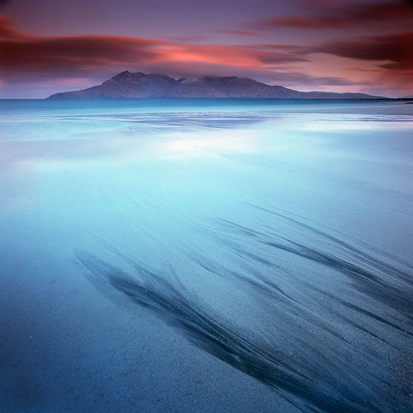
I found these dark sand lines - from a river outflow on Lagg bay on the Isle of Eigg during last April's workshop there. I was showing others how they act as a beautiful lead in, so long as we could distill it down to the most elegant sections of the 'fingers' - i.e, not have too much of them in. I felt I wanted to get closer, but as you'll see if you look at the final image in this post - that didn't quite happen when I tried the same shot with the Hasselblad 40 mm lens. So I think this 50mm version works the best.

But this image is really about reading from right to left I feel. Let's now look at an image shot from up on Pescado island, on the Bolivian Altiplano Salar de Uyuni....

My eye walks into the frame from the bottom left and then up to the mid far right. Your eye may walk the scene differently, as I've discovered during my workshops that everyone has a different way of interpreting images.

While we were on Pescado island, I was really drawn to the colour of the sky, and it's so hard to get a nice shot of the cactus, when Jezz, on the trip pointed to what was happening behind us, I could sense that I should use the curve in the foreground to lead up into the frame. It was also a great opportunity to show the cactus on Pescado island too (so that made me very happy).

And returning back to Eigg, I loved the arc in the sky - that red cloud banding across the landscape like a vignette, it helps keep my eye inside the frame. I feel a flow between the cloud and the dark sand bars in the foreground, each guiding my eye back towards the horizon, while the isle of Rum sits nestled in between the space between cloud and sand pattern.

I often see my compositions like that. There has to be a sense of flow to the objects and the tonal relationships as they work together, hopefully to produce a nice image or two.

Looking for the essence (part 3)

A few days ago I titled a blog entry 'finding the essence'. I felt the title was apt at the time because my posting was about objectivity. When reviewing your own images after a shoot, being able to see the essence or beauty that is there, rather than being blinded by a desire to see what we wished the image to be.

Well, I've been thinking about the word 'essence' and also the particular image of Harris I showed on the blog in that particular posting.

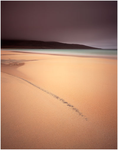
I responded to that image of Harris (reproduced here - image #1), because there's a lot of harmony going on in it for me. The tones really resonated with me and I also felt the composition was very simple too. When these two elements are married together, often the resulting image seems to be a more powerful statement. I think this image works so well for me because the 'essence' of the landscape has been conveyed very clearly - the message is strong.

Compare image #2 that you see further on in this post. It's got similar light, and was shot on the same evening. Except I think this image does not work so well. It's missing that extra 'something'. I think it's failed to reveal the 'essence' of the landscape.

I often feel that simplification is a complex thing to pull off. What looks simple is often harder than it appears. Landscape images for me, must contain a soul, they must resonate with you on an emotional level, and breaking things down to colour, tone and form is the best way forward to make images that do that.

Image #2 is too clever. There's too much going on in it, even though there's not that much at all in the shot. But things are competing with each other. There's perhaps too much texture in that sky to sit in the background and let the eye fall on the patterns in the sand in the foreground. It feels as if I've put the wrong sky in with the wrong foreground. Both are not working in harmony.

Image #1 on the other hand is a different case. That sky sets a mood, but there's almost no texture in it. That lack of texture complements the lack of texture in the sand in the foreground. It is as if the sky and ground are working together - a form of visual empathy. And then we have that diagonal streak in the sand. It's allowed to be the focal point of the image and everything else around it is there to support it - not take away from it.

As much as I've tried to explain the images, and get you to think about why one works better than the other, I don't think there's such a thing as a rule book, and I have to confess that although image #1 is my favourite - it was a complete surprise to see it in my processed transparencies. In other words - I did not plan it. And i don't think I could have.

That's what I love about photography. It's those surprise elements. You only know what it was that you were looking for, once you've found it. That was certainly the case with this image.

Balancing Stones

When Andy Gray balances stones to make his beach sculptures, he says he listens to the stones with his hands. I feel I know what he means. He becomes very focussed on the weight of the stone in his hands and how the balance moves and rolls around, until eventually, he finds that magic spot where the stone will balance all on its own.


I see a symmetry with composing images. When I look for compositions, I feel when the composition is just right. A step to far forwards, a slight movement of the tilt of the tripod, a millimetre adjustment, is often all it takes to make something feel right.

Andy Gray's sculptures are the best analogy I can come up with, on how one should know when a composition is right. Your attention to detail and to a gut reaction, are essentially all you need.