Colour compression & colour spaces

I’ve been working on some notes about printing lately. So this post today is all about colourspaces and what happens when we move an image from one colour space to another.

In the article I point out that colour management is not about colour accuracy, but more about how we choose to work around physical limitations as we move from one device to another, each with different colour gamuts.

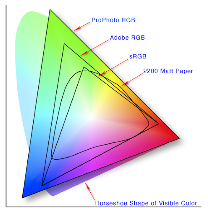
2200 Matt paper has a small colour gamut, than Pro Photo RGB. So what can we do to make our image look good on 2200 Matt Paper even though it is physically impossible to do a direct conversion?

2200 Matt paper has a small colour gamut, than Pro Photo RGB. So what can we do to make our image look good on 2200 Matt Paper even though it is physically impossible to do a direct conversion?

The problem

Each device has its own physical limits to the range of colours it can record or reproduce. This is the problem: what do we do as we move an image from one device to another?

For example, when sending a file with a wide gamut of colours to a monitor or printer with a smaller gamut of colours, something has to be done with the colours that fall outside the physical range of the device’s effective gamut. Do we ignore those colours, or should we do something else with them?

The solution : Rendering Intent

The answer is : we decide, and we tell the colour management system our decision by way of a feature called Rendering Intent. Rendering Intent is where we tell the colour management system which rules to apply with respect to out of gamut colours.

There are several different rendering intents available. The two most commonly used rendering intents are Perceptual and Relative Colourmetric, which kind of do this:

Perceptual : shrink all the colours from the larger colourspace to fit the destination colourspace.

Relative Colourmetric : out of gamut colours are clipped, moved to their nearest relative within the new colourspace. All the other colours remain unchanged.

That’s a brief summary. Let’s consider them in more detail:

Perceptual

This rendering intent as the name suggests tries to adjust the content of the image so you perceive it as similar to the original image even though the colourspace is smaller. It does this by adjusting all the colours while keeping their relationship to each other intact. Although it is not ‘colour accurate’, most photographs look about right when it’s chosen as more often than not, it’s the relationships between the colours in the picture rather than their colour accuracy that is important. Here is an illustration to show how all the colours are shifted to fit the new colourspace:

Rendering-Intent-Perceptual.jpg

The other most common way of working around out of gamut colours is to choose relative colourmetric:

Relative Colourmetric

This rendering intent keeps all the colours that were within gamut unchanged. It’s a useful rendering intent when you want to ensure colour accuracy for certain colours - perhaps skin tones for example. Only the colours outside the gamut are clipped. They are moved to their nearest available in-gamut colour relative. As you can see below:

Rendering-Intent-Relative-Colourmetric.jpg

As you may now realise, colour reproduction is a compromise. And colours often have to get compressed if we are moving from a device with a wide gamut to a device with a smaller gamut.

We have to make the decision about which rendering intent to use. And the best way to choose the right one, is to demo them. If you are printing, then under the proofing preview, you can move between the different rendering intents to see how the colours are changed. Choose the rendering intent that suits your image the best.

No right or wrong way

Rendering Intent is best auditioned on a per image basis. Further, although an image may suit one rendering intent when printed on paper X, you may find that the same image prefers another rendering intent when printed on paper Y.

So you need to experiment on a per image basis.

But what about monitors? Do we have to compromise with them also?

As it happens, yes. Standard monitors have their own colour spaces (profiles), and when viewing something that comes from a larger colourspace on the monitor, a compromise has to be made.

Monitor Profile Rendering Intent

From what I understand, Monitor profiles are matrix based and this means that they have no idea how to deal with out of gamut colours. So they are simply clipped. In other words, when displaying out of gamut colours on a monitor, the monitor is essentially using a rendering intent of ‘Relative colourmetric’ (as illustrated above). We don’t have a choice about rendering intent when displaying an image on a monitor. It’s always ‘relative-colourmetric’.

In the diagram below, I have a Pro Photo colourspace image open in Photoshop, but I am viewing it on a monitor that has a smaller colourspace than Pro Photo. The colour management system responsible for the conversion from the image profile simply displays the colours unchanged, and any colour that it can’t display is just clipped to its nearest relative within the monitor colourspace.

monitor-profile-rendering-intent.jpg

In summary

  • Colour management is not the same thing as colour accuracy.

  • To manage colours, we need to have profiles that describe the colour gamut of each device, but we also have to make decisions on how to deal with colours that fall outside the gamut of a particular device. This is called the rendering intent.

  • We can choose which rendering intent to use when printing.

  • But we have no control over how out-of-gamut colours are displayed on computer monitors, they are just clipped to fit the nearest colour within the destination colour space.

Cameras and Colourspace Confusion

A lot of photographers think that the colour space option of ‘sRGB’ or ‘Adobe RGB’ on the back of their camera is used to set the colourspace of their camera.

It doesn’t do that.

The colourspace settings are only for the jpegs that are produced in-camera.

RAW-Conversion.jpg

RAW data is unaffected. Indeed, RAW can’t be modified. Think of RAW as a 'negative’ that comes out of an old film camera. The negative can never be changed once created.

So the ‘Adobe RGB and sRGB’ settings on the back of your camera are just for any jpegs that the camera ‘generates’ from the RAW capture .

If you are shooting RAW all the time, then you don’t need to worry about colourspaces while shooting.

Q. So when is the colourspace important then?

A. When you open your RAW files

When you open (or import), you are translating, converting the content of your RAW file into the host software’s format. In Photoshop’s case, you always go through the Adobe Camera Raw software before the image is available in Photoshop. It has to go through this translation stage.

The Raw Converter is where you can set the colourspace and it’s really important to pick a colourspace large enough to contain all the data that your RAW file has.

Effectively speaking, RAW files have no colourspace that you know of. Well, it’s a bit more complicated than that, but when you open up in Photoshop, you have to go through the Adobe Raw Converter. This is where you choose the colourspace and the RA…

Effectively speaking, RAW files have no colourspace that you know of. Well, it’s a bit more complicated than that, but when you open up in Photoshop, you have to go through the Adobe Raw Converter. This is where you choose the colourspace and the RAW file is translated to that colourspace.

Pro Photo is the colourspace to choose, because it is a large enough container - much larger than Adobe RGB, and most likely much larger than any colours your camera can record.

A not too accurate illustration to show that Pro Photo is a larger colourspace than Adobe RGB. You should open your RAW files in Pro Photo.

A not too accurate illustration to show that Pro Photo is a larger colourspace than Adobe RGB. You should open your RAW files in Pro Photo.

If you choose Adobe RGB you may be clipping (throwing away) some of the colours that your camera can reproduce, because your camera may be capable of recording colours outside of the Adobe RGB colourspace.

The best option is to open up your camera files in Pro Photo. It’s a larger colour space and won’t clip the data. You’ll keep all of the colours in your file.

Q. But doesn’t the RAW format have it’s own colourspace?

A. Technically speaking there is a lot of splitting hairs about this. Some say no, some say yes.

The camera has its own proprietary way of recording the data, and this ‘specification’ is given to the developers who write the RAW converter engine. It’s up to them how they translate the information and this is why RAW converters vary (please note this is a serious oversimplification here).

Q. Why keep all the colours if your monitor or printer uses a smaller colour space?

A. Because the more data you have while editing, the better

Your camera is a glorified computer that just stores numbers. Photoshop just reads numbers, and when you alter a photograph you are truncating those numbers. It follows then, that the more data you have, the less chance you have in introducing weird problems into the file when you edit or adjust it in any way.

Although you cannot see all the colours present in Pro Photo because your monitor maybe has a smaller effective gamut, you still get the benefit of having more data to play with while editing.

In summary

  • The colourspace settings on the back of your camera are just for the jpegs it ‘generates’ from the RAW files.

  • The RAW files are unaffected and can’t be changed.

  • When you import a RAW file into a photo editing program, it has to get ‘converted’ or translated. This is when you need to choose a colourspace

  • Choose a large colourspace otherwise you may truncate colour data

A few thoughts on writing e-Books

Over the years, I’ve been writing e-books with the aim that they become more ‘reference’ material than something attributable to magazine content.

When I put ‘Simplifying Composition’ together, it took me about a year to really think it through, to figure out what I needed to say and to then formulate it on paper. It’s not the writing that takes the time, it’s the idea, the concept, and the arrangement of the words so that the message is as clear as it can be.

And that was the hardest part of all - figuring out what it is that I needed to convey in writing. The message needed to be simple. It needed to be clear, and for that to happen, I needed to be clear myself with what I wanted to say.

It is often in the process of explaining something that I find holes in my own knowledge. If I’m finding it hard to explain something it’s usually because I don’t fully understand something as much as I thought I did. Writing an e-book is a self-learner, a process of self-help. Of clarifying my own ideas and filling in the gaps in my own knowledge.

Writing an e-book about Photoshop was similar. It took about 2 years for me to do this one. I think the first year was mostly procrastination, brought on by a feeling of difficulty. You see, Photoshop’s tool set is huge. And the truth of the matter is that photographers only need about 10% of the program.

It took me a while to realise that most Photoshop book are like reference manuals. They may be in-depth and tell you everything about the program, but they suck at getting you off the ground, of cutting out the chaff, and of getting you to the tools that you really need to know.

So it took me a while to figure out that photographers just need to learn Layers, Masks and Curves to get going. Write an eBook about those features and you’ve given everyone a head-start, a push in the right direction, rather than getting lost in some massive reference manual with no idea where they are going.

How does one write a book about printing?

And this is the problem I’m at right now.

The subject of printing is massive. It has to cover monitor calibration, monitor profiling, profiles, proofing, colour spaces. Each of those is a massive topic on its own, so I have come to realise that I need to have a ‘fast track’ way of cutting out the noise, of cutting through all the technology to get people up to speed as quickly as possible.

But there is so much miss-information and miss-understanding out there.

fast-track-printing.png

Many think they need to profile their printer, many think that their camera works in Adobe RGB colour space.

Many think that all devices work in Adobe RGB colour space when in fact they don’t. They work in their own proprietary colour space and the colours they’re capable of recording or reproducing may not fit exactly any particular colour space - they have their own personal signature.

Similarly, so many people think that their printers work in RGB, they don’t. They are CMYK devices. Just go and look at the ink sets used on any Epson Ultrachrome ink printer - there’s a clue in the names - Light Cyan, Light Magenta, Yellow…. . So although there are beliefs out there that CMYK is a smaller colourspace than Adobe RGB, it’s not true - they’re just different,.

Lastly, understanding printing is about understanding that everything is a compromise.

So too, is writing an e-book about it.

The lone tree cliché

I know, trees are such a cliché aren’t they?

But I think that often a photograph isn’t about the subject. It’s about the treatment. It’s about the sensibilities applied.

Everyone can take a photo of a lone tree. But what we should be aspiring to, is to convey a level of excellence, of elegance, of beauty that is above ‘just another picture of a tree’.

Doing what everyone else is doing means you just disappear into a sea of sameness. But you can avoid it, I believe, if you try to set your work apart in some way. Often that can happen, not by the subject matter you choose, but how you choose to shoot it, and how you choose to edit it. Often the excellence is in the execution of the work.

Landscape as director

I’ve just had to accept that certain landscapes are what they are. They have an uncanny knack of knowing how to direct you: they tell us what needs to be done. We just have to listen.

Therein lies the problem. Most of the time we don’t listen to what the landscape is telling us. Instead, we often try to force upon it what we want. What we are looking for. Instead, we shouldn’t be looking for anything. We should be a clean slate, ready to work with whatever conditions we are given.

How many of us go to places with pre-visualised expectations? Hoping to get a certain shot we’ve seen before, or the same conditions?

I’ve been having problems this past year with my use of colour. Or perhaps the lack of it. I was very happy to find that my South Korean image had quite a bit of colour in them. I feel there’s been a pendulum-swing as I’ve gone from reducing colour further, and then further still, to feeling I’m starting to re-introduce it into my work.

Not so with Hokkaido.

As you can see above. These images may ‘appear’ to have little or perhaps no colour to you. All I can say in my defence is : it’s what the landscape directed me to do. I can’t make the landscape be anything it isn’t and rather than have an up-hill struggle to make it so, if I follow what the landscape tells me, things just tend to ‘flow’ much easier.

Hokkaido is not a landscape of strong colours. But it does have them. I think the art in making good photos of Hokkaido isn’t necessarily about working with negative space. Neither is it about working with snow scenes only. I think it’s about working with tone and colour responses. These are where the emotion of the picture reside.

Snow is not white. Neither is it just one continuous tone. Snow is a vast array of off-whites, with subtle graduations running through the landscape. Our eyes are often blind to these subtleties as we start to photograph it, but with some well informed time behind the computer monitor editing and reviewing, we should all come to learn that white has a tantalisingly vast array of shades and off-white colours.

Hokkaido has been my director. It has guided me in my lessons over the past four or five years. I’ve learned so much from working in this landscape when I have chosen to listen to it.

Today, colour seems louder than it was yesterday

I’ve just completed work on some new Hokkaido images. The past few weeks have been a journey in colour reduction and more specifically: colour use. Reduction can be done by anyone, just turn the colour down. But to apply colour sensitively, takes skill and a whole lot of consideration and doubt.

Hokkaido-2019 (29).jpg

Now that I’ve finished the Hokkaido images, I’m struck by how little colour there is in them. Yet if I try to put the colour back in, they just sit wrong. They don’t work. They need to be the way I’ve edited them.

Looking at my website main page today, I was struck by a feeling that there is simply too much colour. I don’t think that’s true one bit, but what it is telling me is that I’ve been working with such quiet, muted tones this past week, that somehow, every colour feels strong for me at the moment.

Hokkaido-2019 (17).jpg

Our visual perception is often changing, and I think for me, it’s as if it all depends on how I feel today. Tomorrow I may feel otherwise, find that there isn’t enough colour. All I know is, that colour needs to be used carefully, and applied only when it’s required. You can create some noisy, complex images if you let the colour run riot.

Perhaps my sensibilities are changing yet again. Perhaps it’s just a moment. A passing phase. All I know is, that today, colour seems louder than it was yesterday.

The idealised view

Photography isn’t about capturing what’s in front of us. It’s more about capturing what is within us. Often when I see workshop participants want to stop somewhere to make a photograph, it isn’t what’s in front of them that they are drawn to. Instead, they are drawn to an idealised view of what’s there.

I was laughing to myself when I saw this. It was simply too good to be true. Too symmetrical, too balanced, too orderly. Too close to an idealised view.

Image © 2019.

When we see a composition in our mind’s eye, what we do is take each element of the scene that is important to us, and discard the rest. Although the scene may be far from perfect, we focus on the parts that give us what we see in our mind, and discard the rest. This is often why many of us find our photographs never match what ‘we saw’ at the point of capture.

In other words: we have a tendency to idealise the view.

If we can find such an idealised view that requires little or no post-edit work, this is perhaps the goal we all seek. But it’s often not like that, and often most compositions out there are compromised in some way.

I think this is why I love Hokkaido so much. Although the landscape is heavily shaped by man, with a bit of work it is possible to find those rare moments when everything clicks into place and all the components before my camera lens fit into perfect symmetry. It satisfies my urge to make sense of the nonsensical, to make order of the disorderly, and to make pleasing compositions of random elements that come together for a brief moment in what seems like an intended way.

Mark Hollis, musical genius has passed away

Dear Mark Hollis,

Thank you so much for the music.

Spirit of Eden is one of my most treasured of records. Musically it is a masterpiece that many did not understand at the time of its release in 1988. But it has since garnered the badge of being one of the most influential rock albums of all time.

Spirit of Eden is hailed as the source of ‘post rock’, and cited as a major influence by bands such as Sigur Rós

Spirit of Eden is hailed as the source of ‘post rock’, and cited as a major influence by bands such as Sigur Rós

Many say that Spirit of Eden was responsible for the wave of post-rock bands such as Sigur Rós. I well remember upon its release that there was nothing to compare it to, and that this was the problem: it was too ahead of its time. It was released when there was no post-rock genre to embrace it. But people did. What started out as a sub-culture of appreciation for this work has grown over the years to the point that the album is now recognised for being the treasure that it is.

Being a creative person myself, watching your career, and how you managed to remain true to yourself and your art over the years has been a vital lesson for me. You taught me, through your music, that is much better to follow your own path than to follow others. It may be a lonelier road at times, and many people may not understand you, but being true to who you are is what counts.

Spirit of Eden has given me so much peace and beauty to my inner-life over the past thirty years. I wish to let you know.

I wish you peace Mark.

Classic locations vs anonymous locations

A few days ago, I discussed how it’s ok to go and photograph well known locations, and even copy well known compositions. I explained that you can learn a lot in the process of going through trying to emulate a shot you know so well.

I’d like to think that the reason most of the readers to this very blog are here, is because they are either seeking inspiration for what they do, or at the very least, looking for some advice on how to develop as a photographer. Particularly in finding one’s own ‘vision’ and ‘style’.

Transylvania-2018-(6).jpg

I’m afraid I can’t help you find your own style, but I can at least help you figure out how to work on your own vision. Vision for me, is all about what is seen in the mind’s eye. When we stand and look at some scenery we’re often able to imagine a completed photograph in our mind when we spot one or two compositional objects around us.

As much as I think going to well known places can be hugely instructional. I don’t think that travelling the same well trodden route as countless other photographers is an easy way to find your own vision.

Firstly, you may suffer from ‘I’ve seen this place so many times, shot a particular way, that I can’t see it any other way’. Yes, being overly familiar with a place before visiting it can actually make it more difficult for you to find your own view.

Secondly, even if you do find your own take on a well known place, it’s just extremely hard to make it ‘your own’. This is the main problem for me. Well known places are harder to stamp your own individuality upon, because of familiarity.

South-Korea-2017-(6).jpg

For me, I’d much rather find my own places to photograph. 

Firstly, I’m less burdened with pre-visualised views based on other photographer’s efforts. I feel I’m able to avoid the trap of doing what everyone else has done, because no one else has done it.

I also have more of a chance to find what ‘I see’. My ‘vision’ get’s more of a workout.

Secondly, If I’m able to find good compositions in less visited places, I’ll have more of a chance of making them ‘my own’.

Puna-2017-(41).jpg

Working with anonymous places may have all these benefits, but they also have a few challenges as well:

Firstly, it’s really really hard to work with anonymous places. The reason they are often anonymous is because easy to find, obvious compositions aren’t available (otherwise there would have already been a lot of visitors turning the location into an iconic spot).

Secondly, it takes a lot of effort to find good compositions in lesser known places. Whereas with Iconic well known places everyone knows where to stand. With anonymous places we have to go out there and scout for locations that no one has found before. This takes money, effort and a whole lot of time.

But if that isn’t enough, finding original places and compositions require creativity and talent: the skill of finding a good image where no one else has done so before is the elusive ‘x-factor’ that all photographers should seek.

Thirdly, a degree of conviction is required, and trust in one’s own judgement that there is something here to photograph that no one else has seen before. Unlike iconic places, anonymous places aren’t tried and tested. Photographing them means being vulnerable because you have no other photographers to back you up in your decisions. You may doubt yourself because you think ‘if there were compositions here, surely someone else would have found them already’?

Choosing anonymous places requires hard work, and guts. Shooting them shows independence. It shows you’re not happy to follow what everyone else is doing (in my opinion a great attribute to have). Shooting them allows you to start with a clean slate. Being the first explorer of a place that hasn’t been photographed before can be scary and exciting at the same time. Scary because you may be wondering if you’re wasting your time, and exciting when you find something beautiful when you least expected it.

I’d much rather choose anonymous places over the iconic. I’d prefer to avoid the tried and tested. At least that way I’d be working towards my own vision of the world.

The world is certainly big enough, with most of it un-photographed and undiscovered, for each of us to find our own voice. And some of it is staring you in your face, right now, just waiting for you, and easily within reach of your doorstep.

Romania, visit #2

I’m in Romania right now. I first came here in February 2018.

I seem to have a habit lately of taking friends up on their invites, and of doing zero research and just going and seeing what happens. This approach often yields images that I couldn’t have imagined if I had planned anything in advance and I like that very much. Art isn’t about guarantees.

This week is no exception to last year’s visit, where I finished the trip by thinking ‘I’m not sure if I got anything’. The Romanian landscape requires a lot of work.

But I’m ok with that. In fact, I ‘m more than ok with that. I like the ‘not knowing’.

Shooting in Romania. Image by Florin Patras. Used with kind permission.

Returning home, feeling that things are unclear is a good way to end a shoot. One shouldn’t go home thinking ‘I cracked it’. You should always be left in doubt about your efforts.

Doubt is healthy. It means you care. The most proficient always have doubts. It means they are willing to consider that the work may not be right, that there is room for improvement. Doubt is not a weakness. Being overly confident is.

You see, for me photography has never been about guaranteed results. Nor has it ever been about capturing great images. For me, photography has been about taking a chance, and getting out there. It’s been about living in the world around me and engaging with it.

Whether we create great work or not is always to be seen, but living in the moment and connecting with the world is, I believe, why we do what we do.

And if it isn’t, then we’re in trouble ;-)